Willkommen bei den Top‑Schriften – hier treffen Beliebtheit und Qualität aufeinander. Das sind die in diesem Jahr am häufigsten heruntergeladenen und genutzten Fonts. Wenn Sie sichere Optionen für Logo, Web oder Social suchen, starten Sie hier.
Jeder Top‑Font überzeugt durch Balance, Lesbarkeit und Vielseitigkeit. Sie finden moderne Sans‑Serifs, elegante Scripts, Vintage‑Serifs und minimalistische Displays.
-
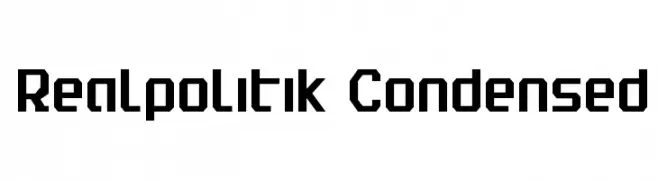
( Fonts by Daniel Zadorozny - www.iconian.com )
A bold, geometric, and condensed font with a modern industrial style.
 Herunterladen 608 Downloads@WebFont
 -
( Fonts by Daniel Zadorozny - www.iconian.com - Free for personal use )
A sleek, italicized, and expanded font with a futuristic design.
![Dodger Expanded Italic Frei Schriftart Herunterladen]() Herunterladen 608 Downloads@WebFont
Herunterladen 608 Downloads@WebFont -
( Fonts by Peter Wiegel - www.peter-wiegel.de )
A tall, narrow, and modern font with clean lines and a sleek aesthetic.
![BerlinEmail2 Frei Schriftart Herunterladen]() Herunterladen 608 Downloads@WebFont
Herunterladen 608 Downloads@WebFont -
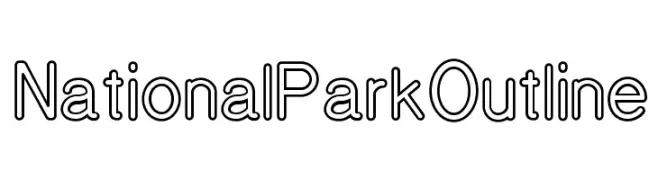
( Fonts by Design Outside (DO) Studio - nationalparktypeface.com - Personal-use only. For commercial use please contact owner. )
A clean, geometric outline font with uniform line weight and modern appeal.
![National Park Outline Frei Schriftart Herunterladen]() Herunterladen 608 Downloads@WebFont
Herunterladen 608 Downloads@WebFont -
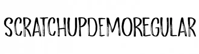
![Scratch Up DEMO Regular Frei Schriftart Herunterladen]() Herunterladen 608 Downloads@WebFont
Herunterladen 608 Downloads@WebFont -
-
![The Angels Frei Schriftart Herunterladen]() Herunterladen 607 Downloads@WebFont
Herunterladen 607 Downloads@WebFont -
( Font-a-licious - www.fontalicious.com/ )
A pixelated, dot-based display font with a digital, futuristic style.
![Omega Frei Schriftart Herunterladen]() Herunterladen 607 Downloads@WebFont
Herunterladen 607 Downloads@WebFont -
( Font by Jonathan Harris - www.tattoowoo.com )
A textured, hand-stitched style font with a playful, crafty appearance.
![A Stitch Plus Nine Frei Schriftart Herunterladen]() Herunterladen 607 Downloads@WebFont
Herunterladen 607 Downloads@WebFont -
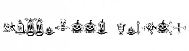
( Fonts by Omega Font Labs )
Halloween-themed border font with spooky illustrations.
![Halloween Borders Frei Schriftart Herunterladen]() Herunterladen 607 Downloads@WebFont
Herunterladen 607 Downloads@WebFont -
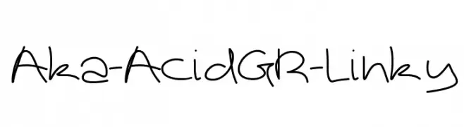
( Fonts by www.aka-acid.com )
A playful, informal handwritten font with smooth, flowing lines.
![Aka-AcidGR-Linky Frei Schriftart Herunterladen]() Herunterladen 607 Downloads@WebFont
Herunterladen 607 Downloads@WebFont


Welche Schriften sind gerade am populärsten?
Poppins, Roboto, Montserrat, Open Sans und Lato sind wegen ihrer klaren Formen und breiten Einsetzbarkeit sehr gefragt – von Markenauftritt über Landingpages bis hin zu Postern.
Welche Fonts eignen sich für Logos?
Geometrische Sans‑Serifs (z. B. Poppins, Familien im Gotham‑Stil) sind ein häufiger Griff für sauberes, skalierbares Branding. Für eine persönlichere Note bleiben Scripts und Handschrift‑Stile beliebt. Kombinieren Sie einen prägnanten Headline‑Font mit einer neutralen Brotschrift für Wiedererkennung und Harmonie.
Wie oft wird die Top‑Liste aktualisiert?
Regelmäßig – basierend auf realen Downloads und Interaktionen. Schauen Sie öfter vorbei, um aufstrebende Favoriten früh zu entdecken.
💡 Tipp: Seite bookmarken – Trends wechseln schnell, und heutige Top‑Schriften inspirieren morgen vielleicht das Rebranding.