Willkommen bei den Top‑Schriften – hier treffen Beliebtheit und Qualität aufeinander. Das sind die in diesem Jahr am häufigsten heruntergeladenen und genutzten Fonts. Wenn Sie sichere Optionen für Logo, Web oder Social suchen, starten Sie hier.
Jeder Top‑Font überzeugt durch Balance, Lesbarkeit und Vielseitigkeit. Sie finden moderne Sans‑Serifs, elegante Scripts, Vintage‑Serifs und minimalistische Displays.
-
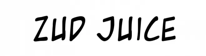
( Fonts by www.blambot.com - Personal-use only. For commercial use please contact owner. )
A playful, casual handwritten font with smooth, rounded strokes.
 Herunterladen 601 Downloads@WebFont
 -
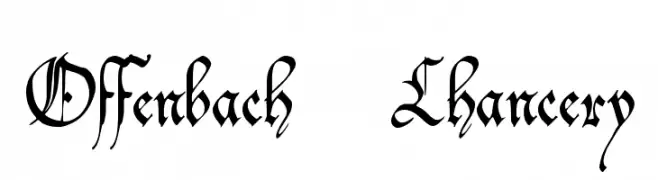
( Fonts by The Scriptorium - Dave Nalle )
An ornate and classic font with intricate, flowing letterforms and sharp serifs.
![Offenbach Chancery Frei Schriftart Herunterladen]() Herunterladen 601 Downloads@WebFont
Herunterladen 601 Downloads@WebFont -
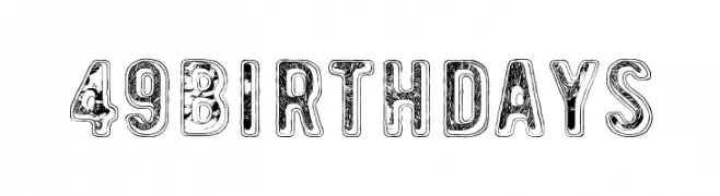
( Fonts by junkohanhero )
A bold, distressed font with a textured, vintage appearance.
![49 birthdays Frei Schriftart Herunterladen]() Herunterladen 601 Downloads@WebFont
Herunterladen 601 Downloads@WebFont -
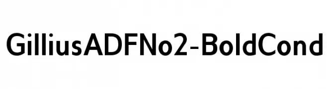
( Fonts by Arkandis Digital Foundry )
A bold, condensed sans-serif font with a modern and clean appearance.
![GilliusADFNo2-BoldCond Frei Schriftart Herunterladen]() Herunterladen 601 Downloads@WebFont
Herunterladen 601 Downloads@WebFont -
![ScrapiCons Frei Schriftart Herunterladen]() Herunterladen 601 Downloads@WebFont
Herunterladen 601 Downloads@WebFont -
-
![Oil Age Heiroglyphs Frei Schriftart Herunterladen]() Herunterladen 601 Downloads@WebFont
Herunterladen 601 Downloads@WebFont -
( Fonts by Filipe Rolim - Personal-use only. For commercial use please contact owner. )
A bold, geometric font with modern, assertive letterforms.
![Brig Regular Frei Schriftart Herunterladen]() Herunterladen 601 Downloads@WebFont
Herunterladen 601 Downloads@WebFont -
![Texture Regular Frei Schriftart Herunterladen]() Herunterladen 601 Downloads@WebFont
Herunterladen 601 Downloads@WebFont -
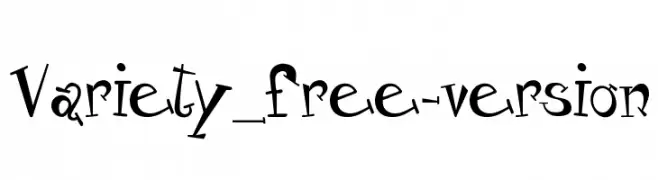
( - fonts-lab.com/ )
A playful and whimsical font with quirky, uneven letterforms.
![Variety_free-version Frei Schriftart Herunterladen]() Herunterladen 601 Downloads@WebFont
Herunterladen 601 Downloads@WebFont -
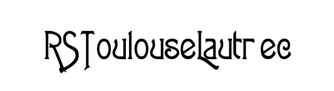
![RSToulouseLautrec Frei Schriftart Herunterladen]() Herunterladen 601 Downloads
Herunterladen 601 Downloads
Welche Schriften sind gerade am populärsten?
Poppins, Roboto, Montserrat, Open Sans und Lato sind wegen ihrer klaren Formen und breiten Einsetzbarkeit sehr gefragt – von Markenauftritt über Landingpages bis hin zu Postern.
Welche Fonts eignen sich für Logos?
Geometrische Sans‑Serifs (z. B. Poppins, Familien im Gotham‑Stil) sind ein häufiger Griff für sauberes, skalierbares Branding. Für eine persönlichere Note bleiben Scripts und Handschrift‑Stile beliebt. Kombinieren Sie einen prägnanten Headline‑Font mit einer neutralen Brotschrift für Wiedererkennung und Harmonie.
Wie oft wird die Top‑Liste aktualisiert?
Regelmäßig – basierend auf realen Downloads und Interaktionen. Schauen Sie öfter vorbei, um aufstrebende Favoriten früh zu entdecken.
💡 Tipp: Seite bookmarken – Trends wechseln schnell, und heutige Top‑Schriften inspirieren morgen vielleicht das Rebranding.