Willkommen bei den Top‑Schriften – hier treffen Beliebtheit und Qualität aufeinander. Das sind die in diesem Jahr am häufigsten heruntergeladenen und genutzten Fonts. Wenn Sie sichere Optionen für Logo, Web oder Social suchen, starten Sie hier.
Jeder Top‑Font überzeugt durch Balance, Lesbarkeit und Vielseitigkeit. Sie finden moderne Sans‑Serifs, elegante Scripts, Vintage‑Serifs und minimalistische Displays.
-
 Herunterladen 2004 Downloads@WebFont
 -
( Fonts by Jean-Baptiste Morizot. Personal-use only. For commercial use please contact owner. )
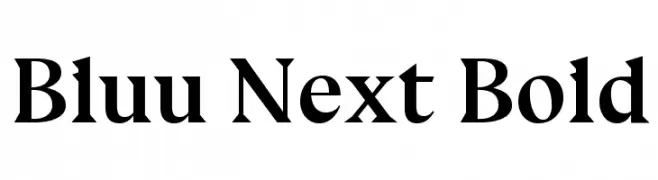
A bold serif font with strong strokes and sharp serifs, offering a classic yet modern look.
![Bluu Next Bold Frei Schriftart Herunterladen]() Herunterladen 2003 Downloads@WebFont
Herunterladen 2003 Downloads@WebFont -
( Fonts by Castcraft Software - opti.netii.net - check the website before use )
A bold, modern font with a strong, uniform appearance and slightly condensed width.
![OPTIAdset Frei Schriftart Herunterladen]() Herunterladen 2003 Downloads@WebFont
Herunterladen 2003 Downloads@WebFont -
( Fonts by allsuperfont.com - Personal-use only. For commercial use please contact owner. )
A bold, playful font with thick, rounded characters and a whimsical style.
![Super Enjoy Frei Schriftart Herunterladen]() Herunterladen 2002 Downloads@WebFont
Herunterladen 2002 Downloads@WebFont -
( Fonts by Khurasan )
A bold, rounded font with a playful and friendly style.
![Mabook Frei Schriftart Herunterladen]() Herunterladen 2002 Downloads@WebFont
Herunterladen 2002 Downloads@WebFont -
( Copyright 2016 The Nunito Project Authors (contact@sansoxygen.com) )
A modern, semi-bold sans-serif font with a clean and approachable design.
![Nunito Sans SemiBold Frei Schriftart Herunterladen]() Herunterladen 2002 Downloads@WebFont
Herunterladen 2002 Downloads@WebFont -
( Copyright (c) 2012, Pablo Impallari (www.impallari.com|impallari@gmail.com) )
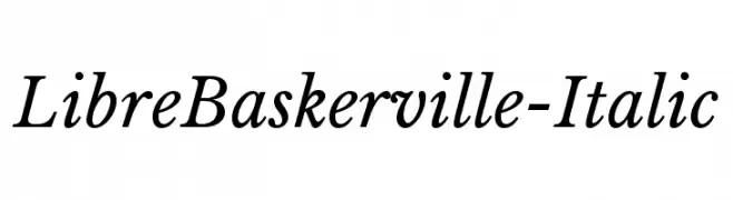
A classic serif font with elegant italics and refined character design.
![LibreBaskerville-Italic Frei Schriftart Herunterladen]() Herunterladen 2002 Downloads@WebFont
Herunterladen 2002 Downloads@WebFont -
( Fonts by German Olaya - www.typo5.com )
A bold, italicized decorative font with strong outlines and a retro vibe.
![oil Frei Schriftart Herunterladen]() Herunterladen 2002 Downloads@WebFont
Herunterladen 2002 Downloads@WebFont -
( Fonts by Grzegorz l - www.glukfonts.pl )
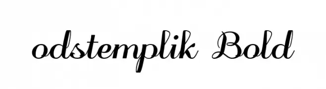
An elegant, bold script font with flowing, cursive characters.
![odstemplik Bold Frei Schriftart Herunterladen]() Herunterladen 2002 Downloads@WebFont
Herunterladen 2002 Downloads@WebFont -
![Gubblebum Blocky Frei Schriftart Herunterladen]() Herunterladen 2002 Downloads@WebFont
Herunterladen 2002 Downloads@WebFont -
![Ajitjanmeja22 Frei Schriftart Herunterladen]() Herunterladen 2002 Downloads@WebFont
Herunterladen 2002 Downloads@WebFont -
( Fonts by Apostrophic Lab )
A sleek, modern font with tall, narrow characters and a minimalist aesthetic.
![Castorgate - Upright Frei Schriftart Herunterladen]() Herunterladen 2002 Downloads@WebFont
Herunterladen 2002 Downloads@WebFont -
![Cantabile Frei Schriftart Herunterladen]() Herunterladen 2002 Downloads@WebFont
Herunterladen 2002 Downloads@WebFont -
( Fonts by Behnam - Personal-use only. For commercial use please contact owner. )
A bold, clean sans-serif font with excellent readability and a modern aesthetic.
![XM Traffic Bold Frei Schriftart Herunterladen]() Herunterladen 2001 Downloads@WebFont
Herunterladen 2001 Downloads@WebFont -
( Zetafonts - www.zetafonts.com )
A bold, modern italic font with angular lines and a slightly condensed form.
![Sugo Pro Classic Trial Italic Frei Schriftart Herunterladen]() Herunterladen 2001 Downloads@WebFont
Herunterladen 2001 Downloads@WebFont -
( Copyright (c) 2011, Santiago Orozco (hi@typemade.mx) )
A modern sans-serif font with clean lines and excellent readability.
![Antic Frei Schriftart Herunterladen]() Herunterladen 2001 Downloads@WebFont
Herunterladen 2001 Downloads@WebFont -
( Fonts by Kimberly Geswein - kimberlygeswein.com )
A playful, casual handwritten font with uneven strokes and a friendly appearance.
![A Safe Place to Fall Frei Schriftart Herunterladen]() Herunterladen 2001 Downloads@WebFont
Herunterladen 2001 Downloads@WebFont -
Schriftart von spideraysfonts. For commercial use please contact the owner.
![Witches Magic Frei Schriftart Herunterladen]() Herunterladen 2001 Downloads@WebFont
Herunterladen 2001 Downloads@WebFont -
![Bordofixed Tryout Frei Schriftart Herunterladen]() Herunterladen 2001 Downloads@WebFont
Herunterladen 2001 Downloads@WebFont -
( Fonts by Andrzej Wroz - Personal-use only. For commercial use please contact owner. )
A bold, geometric font with uniform stroke width and strong presence.
![FORTA Frei Schriftart Herunterladen]() Herunterladen 2000 Downloads@WebFont
Herunterladen 2000 Downloads@WebFont -
![Somerton Dense Frei Schriftart Herunterladen]() Herunterladen 2000 Downloads@WebFont
Herunterladen 2000 Downloads@WebFont -
( Copyright 2016 The Asap Project Authors (omnibus.type@gmail.com) )
A modern, italic sans-serif font with medium weight and normal spacing.
![Asap Medium Italic Frei Schriftart Herunterladen]() Herunterladen 2000 Downloads@WebFont
Herunterladen 2000 Downloads@WebFont -
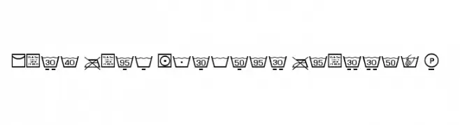
( Fonts by Mohammed Rahman )
Functional, icon-based font for wash care and laundry symbols.
![Wash Care Symbols Classic M54 Frei Schriftart Herunterladen]() Herunterladen 2000 Downloads@WebFont
Herunterladen 2000 Downloads@WebFont -
( Fonts by nurfdesigns - Personal-use only. For commercial use please contact owner. )
A classic script font with elegant, flowing lines and connected characters.
![Alleyster Frei Schriftart Herunterladen]() Herunterladen 1999 Downloads@WebFont
Herunterladen 1999 Downloads@WebFont -
Schriftart von antipixel. For commercial use please contact the owner.
![AracneUltraCondensedLight Frei Schriftart Herunterladen]() Herunterladen 1999 Downloads@WebFont
Herunterladen 1999 Downloads@WebFont -
( Fonts by www.someshinzz.com )
A bold, dripping font with a playful and creative style.
![Honeydripper Frei Schriftart Herunterladen]() Herunterladen 1999 Downloads@WebFont
Herunterladen 1999 Downloads@WebFont -
![Zahariel Demo Frei Schriftart Herunterladen]() Herunterladen 1999 Downloads@WebFont
Herunterladen 1999 Downloads@WebFont -
( Fonts by Hanken Design Co. - Personal-use only. For commercial use please contact owner. )
A sleek, minimalist font with thin lines and a modern aesthetic.
![Now-Thin Frei Schriftart Herunterladen]() Herunterladen 1998 Downloads@WebFont
Herunterladen 1998 Downloads@WebFont -
![Gravedigger Frei Schriftart Herunterladen]() Herunterladen 1998 Downloads@WebFont
Herunterladen 1998 Downloads@WebFont -
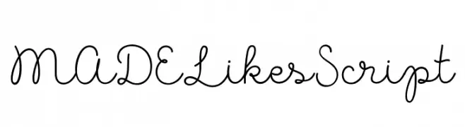
( Fonts by MADE Type )
A playful script font with smooth, flowing lines and a whimsical, handwritten style.
![MADELikesScript Frei Schriftart Herunterladen]() Herunterladen 1998 Downloads@WebFont
Herunterladen 1998 Downloads@WebFont -
( Fonts by a Neale Davidson - www.pixelsagas.com. Personal-use only. For commercial use please contact owner. )
A bold, playful font with a comic book style and dynamic, rounded strokes.
![Comic Book Frei Schriftart Herunterladen]() Herunterladen 1998 Downloads@WebFont
Herunterladen 1998 Downloads@WebFont -
![Amethyst Zucchini Frei Schriftart Herunterladen]() Herunterladen 1998 Downloads@WebFont
Herunterladen 1998 Downloads@WebFont -
![Getho Bold Frei Schriftart Herunterladen]() Herunterladen 1997 Downloads@WebFont
Herunterladen 1997 Downloads@WebFont -
( Fonts by Ryan Prasetya )
An elegant and flowing script font with bold uppercase and delicate lowercase letters.
![ShellaheraScriptDemo Frei Schriftart Herunterladen]() Herunterladen 1997 Downloads@WebFont
Herunterladen 1997 Downloads@WebFont -
![Super Raw Frei Schriftart Herunterladen]() Herunterladen 1997 Downloads@WebFont
Herunterladen 1997 Downloads@WebFont


Welche Schriften sind gerade am populärsten?
Poppins, Roboto, Montserrat, Open Sans und Lato sind wegen ihrer klaren Formen und breiten Einsetzbarkeit sehr gefragt – von Markenauftritt über Landingpages bis hin zu Postern.
Welche Fonts eignen sich für Logos?
Geometrische Sans‑Serifs (z. B. Poppins, Familien im Gotham‑Stil) sind ein häufiger Griff für sauberes, skalierbares Branding. Für eine persönlichere Note bleiben Scripts und Handschrift‑Stile beliebt. Kombinieren Sie einen prägnanten Headline‑Font mit einer neutralen Brotschrift für Wiedererkennung und Harmonie.
Wie oft wird die Top‑Liste aktualisiert?
Regelmäßig – basierend auf realen Downloads und Interaktionen. Schauen Sie öfter vorbei, um aufstrebende Favoriten früh zu entdecken.
💡 Tipp: Seite bookmarken – Trends wechseln schnell, und heutige Top‑Schriften inspirieren morgen vielleicht das Rebranding.