Willkommen bei den Top‑Schriften – hier treffen Beliebtheit und Qualität aufeinander. Das sind die in diesem Jahr am häufigsten heruntergeladenen und genutzten Fonts. Wenn Sie sichere Optionen für Logo, Web oder Social suchen, starten Sie hier.
Jeder Top‑Font überzeugt durch Balance, Lesbarkeit und Vielseitigkeit. Sie finden moderne Sans‑Serifs, elegante Scripts, Vintage‑Serifs und minimalistische Displays.
-
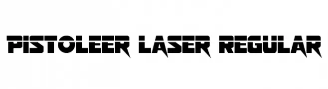
( Fonts by Daniel Zadorozny - www.iconian.com )
A bold, futuristic font with sharp, angular edges and a sci-fi aesthetic.
 Herunterladen 109 Downloads@WebFont
 -
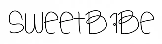
( Fonts by Des Gomez )
A playful, handwritten font with whimsical doodles and a friendly style.
![SweetBabe Frei Schriftart Herunterladen]() Herunterladen 109 Downloads@WebFont
Herunterladen 109 Downloads@WebFont -
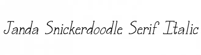
( Fonts by www.kimberlygeswein.com - Kimberly Geswein )
A playful serif font with an italic style and medium contrast.
![Janda Snickerdoodle Serif Italic Frei Schriftart Herunterladen]() Herunterladen 109 Downloads@WebFont
Herunterladen 109 Downloads@WebFont -
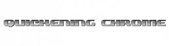
( Fonts by Daniel Zadorozny - www.iconian.com )
A bold, futuristic font with horizontal stripes and geometric shapes.
![Quickening Chrome Frei Schriftart Herunterladen]() Herunterladen 109 Downloads@WebFont
Herunterladen 109 Downloads@WebFont -
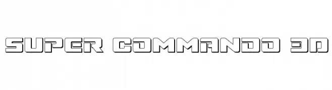
( Fonts by Daniel Zadorozny - www.iconian.com )
A bold, geometric font with a 3D effect, perfect for futuristic designs.
![Super Commando 3D Frei Schriftart Herunterladen]() Herunterladen 109 Downloads@WebFont
Herunterladen 109 Downloads@WebFont -
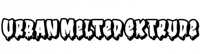
( Fonts by Bangkit Tri Setiadi )
Bold, graffiti-inspired font with a melted, dripping effect.
![Urban Melted Extrude Frei Schriftart Herunterladen]() Herunterladen 109 Downloads@WebFont
Herunterladen 109 Downloads@WebFont -
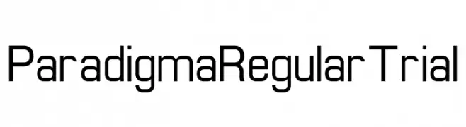
( Fonts by Human Design - Gilang Ramadhan - Personal-use only. For commercial use please contact owner. )
A modern, geometric font with a clean and uniform appearance.
![Paradigma Regular Trial Frei Schriftart Herunterladen]() Herunterladen 109 Downloads@WebFont
Herunterladen 109 Downloads@WebFont -
( Fonts by blue studio09 - Personal-use only. For commercial use please contact owner. )
A sophisticated script font with flowing, interconnected letters and elegant flourishes.
![Carllitos Frei Schriftart Herunterladen]() Herunterladen 109 Downloads@WebFont
Herunterladen 109 Downloads@WebFont -
![Blnker Frei Schriftart Herunterladen]() Herunterladen 109 Downloads@WebFont
Herunterladen 109 Downloads@WebFont -
( Fonts by Manfred Klein. Free for private and charity use. Free for commercial with donation to organizations )
A whimsical, decorative font with vine-like embellishments.
![Imre Bold Frei Schriftart Herunterladen]() Herunterladen 109 Downloads@WebFont
Herunterladen 109 Downloads@WebFont -
( Fonts by Manfred Klein. Free for private and charity use. Free for commercial with donation to organizations )
Whimsical, face-themed decorative font with abstract circular glyphs.
![RoundFacesTwo Frei Schriftart Herunterladen]() Herunterladen 109 Downloads@WebFont
Herunterladen 109 Downloads@WebFont -
( Fonts by Inermedia Studio )
A playful and elegant handwritten font with flowing curves and decorative swashes.
![Talld Frei Schriftart Herunterladen]() Herunterladen 109 Downloads@WebFont
Herunterladen 109 Downloads@WebFont -
( Noto is a trademark of Google Inc. Noto fonts are open source. All Noto fonts are published under the SIL Open Font License, Version 1.1 )
A classic, readable serif font with balanced proportions and moderate contrast.
![Noto Serif Armenian Regular Frei Schriftart Herunterladen]() Herunterladen 109 Downloads@WebFont
Herunterladen 109 Downloads@WebFont -
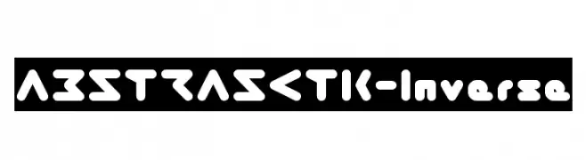
( weknow - Wino S Kadir - www.creativefabrica.com/designer/weknow/ )
A bold, futuristic font with geometric and abstract elements.
![ABSTRASCTIK-Inverse Frei Schriftart Herunterladen]() Herunterladen 109 Downloads@WebFont
Herunterladen 109 Downloads@WebFont -
( Fonts by www.houseoflime.com )
A playful, balloon-inspired decorative font with bold outlines.
![Balloons Frei Schriftart Herunterladen]() Herunterladen 109 Downloads@WebFont
Herunterladen 109 Downloads@WebFont -
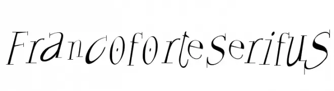
( Fonts by Manfred Klein. Free for private and charity use. Free for commercial with donation to organizations )
A modern serif font with dynamic strokes and elegant serifs.
![FrancoforteSerifus Frei Schriftart Herunterladen]() Herunterladen 109 Downloads@WebFont
Herunterladen 109 Downloads@WebFont -
( Fonts by Daniel Zadorozny - www.iconian.com - Free for personal use )
A bold, jagged font with dripping edges, ideal for horror themes.
![Bloodlust Leftalic Frei Schriftart Herunterladen]() Herunterladen 109 Downloads@WebFont
Herunterladen 109 Downloads@WebFont -
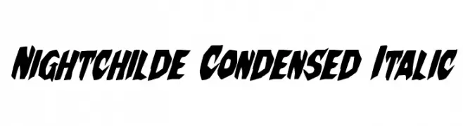
( Fonts by Daniel Zadorozny - www.iconian.com )
A bold, condensed, and italicized font with sharp, angular characters.
![Nightchilde Condensed Italic Frei Schriftart Herunterladen]() Herunterladen 109 Downloads@WebFont
Herunterladen 109 Downloads@WebFont -
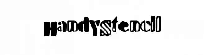
( Fonts by a Max Infeld - XEROGRAPHER FONTS - xerographer.blogspot.com . Personal-use only. For commercial use please contact owner. )
A bold, playful stencil font with a modern-retro vibe.
![HandyStencil Frei Schriftart Herunterladen]() Herunterladen 109 Downloads@WebFont
Herunterladen 109 Downloads@WebFont -
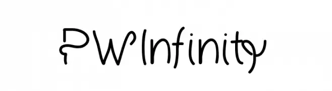
( Fonts by Peax Webdesign - www.peax-webdesign.com. Personal-use only. For commercial use please contact owner. )
A playful, handwritten-style font with rounded, flowing characters.
![PWInfinity Frei Schriftart Herunterladen]() Herunterladen 109 Downloads@WebFont
Herunterladen 109 Downloads@WebFont -
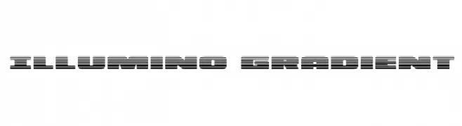
( Fonts by Iconian Fonts )
A bold, futuristic font with a unique striped pattern and dynamic visual effect.
![Illumino Gradient Frei Schriftart Herunterladen]() Herunterladen 109 Downloads@WebFont
Herunterladen 109 Downloads@WebFont -
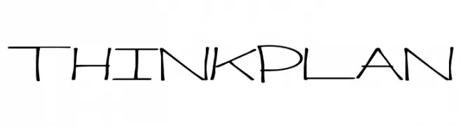
( Fonts by a Max Infeld - XEROGRAPHER FONTS - xerographer.blogspot.com . Personal-use only. For commercial use please contact owner. )
A modern, geometric font with thin, elongated letterforms and a futuristic style.
![ThinkPlan Frei Schriftart Herunterladen]() Herunterladen 109 Downloads@WebFont
Herunterladen 109 Downloads@WebFont -
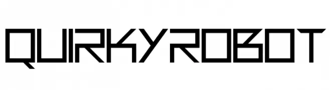
( Darrell Flood )
A futuristic, geometric font with sharp angles and a mechanical aesthetic.
![Quirky Robot Frei Schriftart Herunterladen]() Herunterladen 109 Downloads@WebFont
Herunterladen 109 Downloads@WebFont -
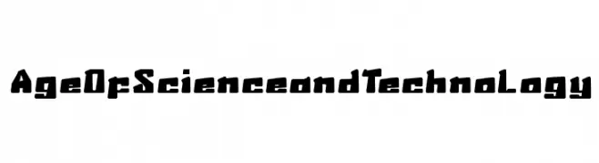
( weknow - Wino S Kadir - www.creativefabrica.com/designer/weknow/ )
A bold, futuristic font with a geometric and industrial design.
![AgeOfScienceandTechnology Frei Schriftart Herunterladen]() Herunterladen 109 Downloads@WebFont
Herunterladen 109 Downloads@WebFont -
( Fonts by www.lifewithouttaffy.com )
A dynamic and expressive handwritten font with irregular strokes.
![Lacquerhead Frei Schriftart Herunterladen]() Herunterladen 109 Downloads@WebFont
Herunterladen 109 Downloads@WebFont -
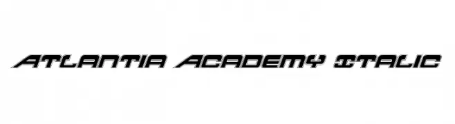
( Fonts by Daniel Zadorozny - www.iconian.com - Free for personal use )
A bold, italicized font with a futuristic and dynamic style.
![Atlantia Academy Italic Frei Schriftart Herunterladen]() Herunterladen 109 Downloads@WebFont
Herunterladen 109 Downloads@WebFont -
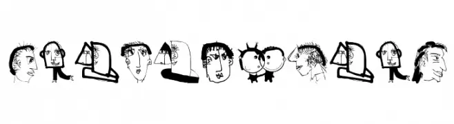
( Fonts by Manfred Klein. Free for private and charity use. Free for commercial with donation to organizations )
Hand-drawn, illustrative font featuring quirky faces and figures.
![VectorFaces Frei Schriftart Herunterladen]() Herunterladen 109 Downloads@WebFont
Herunterladen 109 Downloads@WebFont -
![Stray Cat Condensed Oblique Frei Schriftart Herunterladen]() Herunterladen 109 Downloads@WebFont
Herunterladen 109 Downloads@WebFont -
( Fonts by Eknoji Studio - Personal-use only. For commercial use please contact owner. )
An elegant script font with ornate floral embellishments and high contrast strokes.
![Ralgani Frei Schriftart Herunterladen]() Herunterladen 109 Downloads@WebFont
Herunterladen 109 Downloads@WebFont -
( Fonts by Tokokoo Studio )
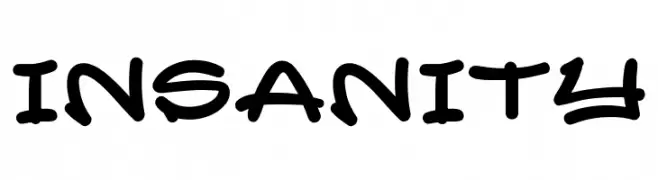
A bold, handwritten-style font with dynamic, playful characters.
![INSANITY Frei Schriftart Herunterladen]() Herunterladen 109 Downloads@WebFont
Herunterladen 109 Downloads@WebFont -
![4th of July Reflections Frei Schriftart Herunterladen]() Herunterladen 109 Downloads@WebFont
Herunterladen 109 Downloads@WebFont -
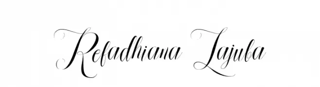
( Fonts by Aqeela Studio - Muhammad Nasir - Personal-use only. For commercial use please contact owner. )
An elegant script font with flowing, ornate swashes and flourishes.
![Refadhiana Lajuba Frei Schriftart Herunterladen]() Herunterladen 109 Downloads@WebFont
Herunterladen 109 Downloads@WebFont -
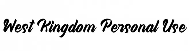
( Fonts by PutraCetol Studio - www.putracetol.com - Personal-use only. For commercial use please contact owner. )
A bold, dynamic script font with flowing, cursive letterforms and elegant swashes.
![West Kingdom Personal Use Frei Schriftart Herunterladen]() Herunterladen 109 Downloads@WebFont
Herunterladen 109 Downloads@WebFont -
( Iconian Fonts - Daniel Zadorozny - www.iconian.com )
A bold, italic, futuristic font with a dynamic, modern design.
![Quasar Pacer Laser Italic Frei Schriftart Herunterladen]() Herunterladen 109 Downloads@WebFont
Herunterladen 109 Downloads@WebFont -
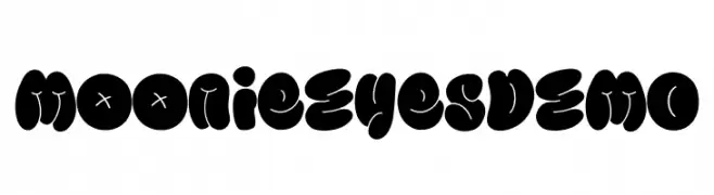
( Fonts by Ikiiko Type )
A bold, playful font with rounded, bubble-like characters and a whimsical style.
![Moonie Eyes DEMO Frei Schriftart Herunterladen]() Herunterladen 109 Downloads@WebFont
Herunterladen 109 Downloads@WebFont


Welche Schriften sind gerade am populärsten?
Poppins, Roboto, Montserrat, Open Sans und Lato sind wegen ihrer klaren Formen und breiten Einsetzbarkeit sehr gefragt – von Markenauftritt über Landingpages bis hin zu Postern.
Welche Fonts eignen sich für Logos?
Geometrische Sans‑Serifs (z. B. Poppins, Familien im Gotham‑Stil) sind ein häufiger Griff für sauberes, skalierbares Branding. Für eine persönlichere Note bleiben Scripts und Handschrift‑Stile beliebt. Kombinieren Sie einen prägnanten Headline‑Font mit einer neutralen Brotschrift für Wiedererkennung und Harmonie.
Wie oft wird die Top‑Liste aktualisiert?
Regelmäßig – basierend auf realen Downloads und Interaktionen. Schauen Sie öfter vorbei, um aufstrebende Favoriten früh zu entdecken.
💡 Tipp: Seite bookmarken – Trends wechseln schnell, und heutige Top‑Schriften inspirieren morgen vielleicht das Rebranding.