Willkommen bei den Top‑Schriften – hier treffen Beliebtheit und Qualität aufeinander. Das sind die in diesem Jahr am häufigsten heruntergeladenen und genutzten Fonts. Wenn Sie sichere Optionen für Logo, Web oder Social suchen, starten Sie hier.
Jeder Top‑Font überzeugt durch Balance, Lesbarkeit und Vielseitigkeit. Sie finden moderne Sans‑Serifs, elegante Scripts, Vintage‑Serifs und minimalistische Displays.
-
( Fonts by Pizzadude )
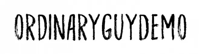
A hand-drawn, textured font with a rugged, organic appearance.
 Herunterladen 594 Downloads@WebFont
 -
( Fonts by Jacob Fisher - www.pizzadude.dk )
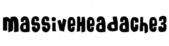
A bold, playful font with chunky, hand-drawn letterforms.
![MassiveHeadache3 Frei Schriftart Herunterladen]() Herunterladen 594 Downloads@WebFont
Herunterladen 594 Downloads@WebFont -
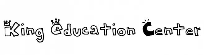
![King Education Center Frei Schriftart Herunterladen]() Herunterladen 594 Downloads@WebFont
Herunterladen 594 Downloads@WebFont -
( Fonts by www.fontmenu.com )
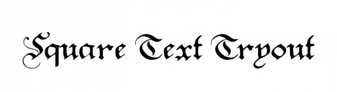
A classic blackletter font with ornate, decorative letterforms.
![Square Text Tryout Frei Schriftart Herunterladen]() Herunterladen 594 Downloads@WebFont
Herunterladen 594 Downloads@WebFont -
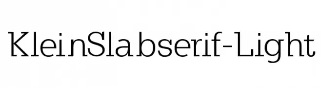
( Fonts by Manfred Klein - manfred-klein.ina-mar.com )
A modern, light slab serif font with medium contrast and clean lines.
![KleinSlabserif-Light Frei Schriftart Herunterladen]() Herunterladen 594 Downloads@WebFont
Herunterladen 594 Downloads@WebFont -
-
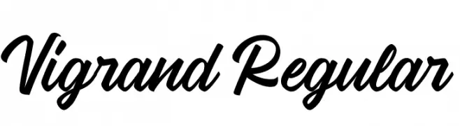
( Fonts by Aluyeah Studio - Personal-use only. For commercial use please contact owner. )
A bold, expressive script font with fluid, cursive strokes.
![Vigrand Regular Frei Schriftart Herunterladen]() Herunterladen 594 Downloads@WebFont
Herunterladen 594 Downloads@WebFont -
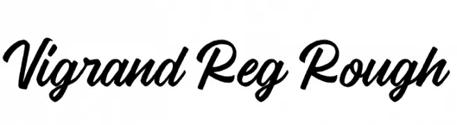
( Fonts by Aluyeah Studio - Personal-use only. For commercial use please contact owner. )
A bold, cursive font with a rough, hand-drawn texture.
![Vigrand Reg Rough Frei Schriftart Herunterladen]() Herunterladen 594 Downloads@WebFont
Herunterladen 594 Downloads@WebFont -
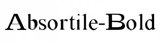
( Fonts by Malre )
A bold, classic serif font with high contrast and elegant details.
![Absortile-Bold Frei Schriftart Herunterladen]() Herunterladen 594 Downloads@WebFont
Herunterladen 594 Downloads@WebFont -
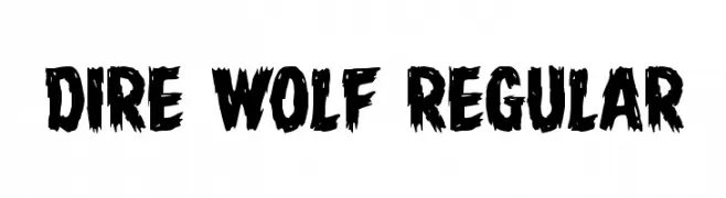
( Fonts by Daniel Zadorozny - www.iconian.com )
A bold, distressed font with jagged, claw-like edges.
![Dire Wolf Regular Frei Schriftart Herunterladen]() Herunterladen 594 Downloads@WebFont
Herunterladen 594 Downloads@WebFont -
( Muhammad Hasan - www.behance.net/lemet )
A delicate, handwritten cursive font with an elegant and flowing style.
![BreceletsDemo Frei Schriftart Herunterladen]() Herunterladen 594 Downloads@WebFont
Herunterladen 594 Downloads@WebFont

Welche Schriften sind gerade am populärsten?
Poppins, Roboto, Montserrat, Open Sans und Lato sind wegen ihrer klaren Formen und breiten Einsetzbarkeit sehr gefragt – von Markenauftritt über Landingpages bis hin zu Postern.
Welche Fonts eignen sich für Logos?
Geometrische Sans‑Serifs (z. B. Poppins, Familien im Gotham‑Stil) sind ein häufiger Griff für sauberes, skalierbares Branding. Für eine persönlichere Note bleiben Scripts und Handschrift‑Stile beliebt. Kombinieren Sie einen prägnanten Headline‑Font mit einer neutralen Brotschrift für Wiedererkennung und Harmonie.
Wie oft wird die Top‑Liste aktualisiert?
Regelmäßig – basierend auf realen Downloads und Interaktionen. Schauen Sie öfter vorbei, um aufstrebende Favoriten früh zu entdecken.
💡 Tipp: Seite bookmarken – Trends wechseln schnell, und heutige Top‑Schriften inspirieren morgen vielleicht das Rebranding.