Willkommen bei den Top‑Schriften – hier treffen Beliebtheit und Qualität aufeinander. Das sind die in diesem Jahr am häufigsten heruntergeladenen und genutzten Fonts. Wenn Sie sichere Optionen für Logo, Web oder Social suchen, starten Sie hier.
Jeder Top‑Font überzeugt durch Balance, Lesbarkeit und Vielseitigkeit. Sie finden moderne Sans‑Serifs, elegante Scripts, Vintage‑Serifs und minimalistische Displays.
-
( Fonts by Roland Huse - rolandhuse.com )
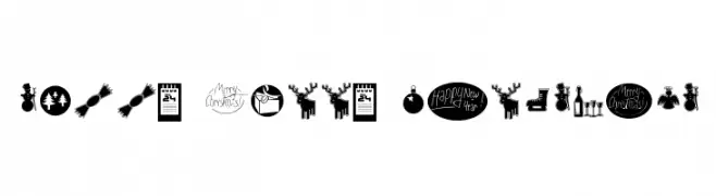
A festive collection of Christmas-themed icons and symbols in a playful style.
 Herunterladen 108 Downloads@WebFont
 -
( Fonts by Iconian Fonts )
A futuristic, outlined, italic font with geometric shapes and sharp angles.
![Gunrunner Ouline Italic Frei Schriftart Herunterladen]() Herunterladen 108 Downloads@WebFont
Herunterladen 108 Downloads@WebFont -
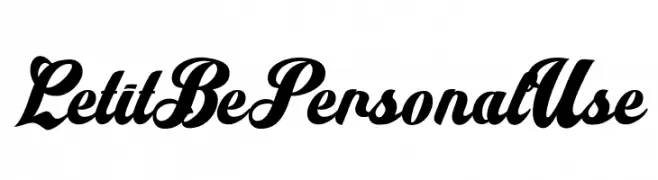
( Fonts by Billy Argel Fonts - www.billyargel.com - Personal-use only. For commercial use please contact owner. )
A bold, flowing script font with high contrast and elegant, interconnected characters.
![Let it Be Personal Use Frei Schriftart Herunterladen]() Herunterladen 108 Downloads@WebFont
Herunterladen 108 Downloads@WebFont -
( Fonts by Behind the Ink )
A fluid and elegant script font with a handwritten quality.
![The Hologram Frei Schriftart Herunterladen]() Herunterladen 108 Downloads@WebFont
Herunterladen 108 Downloads@WebFont -
( Markus Schröppel - www.mschroeppel.de/ )
A modern, dotted font with a digital and structured appearance.
![LLMirai Regular Frei Schriftart Herunterladen]() Herunterladen 108 Downloads@WebFont
Herunterladen 108 Downloads@WebFont -
( Fonts by scratchones )
A playful, bold handwritten font with smooth, rounded edges.
![Music Stars Frei Schriftart Herunterladen]() Herunterladen 108 Downloads@WebFont
Herunterladen 108 Downloads@WebFont -
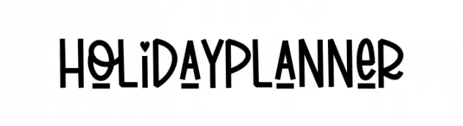
( Fonts by Kurnia Setyadi - Personal-use only. For commercial use please contact owner. )
A playful, bold, and handwritten-style font with a quirky charm.
![Holiday Planner Frei Schriftart Herunterladen]() Herunterladen 108 Downloads@WebFont
Herunterladen 108 Downloads@WebFont -
( Iconian Fonts - Daniel Zadorozny - www.iconian.com )
A bold, geometric font with a three-dimensional effect and strong presence.
![Aircruiser Academy Frei Schriftart Herunterladen]() Herunterladen 108 Downloads@WebFont
Herunterladen 108 Downloads@WebFont -
( Fonts by Kong Font - fontkong.com - Personal-use only. For commercial use please contact owner. )
A dynamic and flowing script font with elegant, fluid strokes.
![Delliga Frei Schriftart Herunterladen]() Herunterladen 108 Downloads@WebFont
Herunterladen 108 Downloads@WebFont -
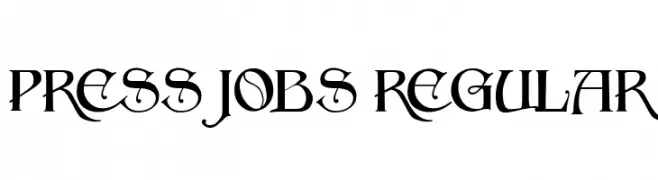
( Fonts by Vladimir Nikolic - www.creativefabrica.com/designer/vladimirnikolic/ - Personal-use only. For commercial use please contact owner. )
A decorative font with sharp serifs and unique flourishes, ideal for creative projects.
![Press Jobs Regular Frei Schriftart Herunterladen]() Herunterladen 108 Downloads@WebFont
Herunterladen 108 Downloads@WebFont -
( Fonts by Fikryal studio )
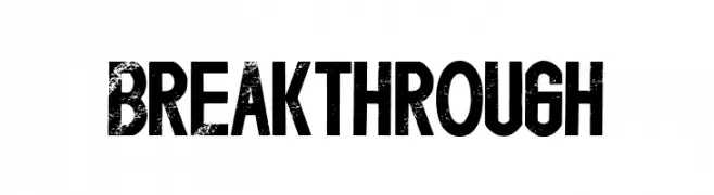
A bold, distressed font with a vintage, textured appearance.
![Breakthrough Frei Schriftart Herunterladen]() Herunterladen 108 Downloads@WebFont
Herunterladen 108 Downloads@WebFont -
( Iconian Fonts - Daniel Zadorozny - www.iconian.com )
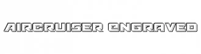
A bold, geometric font with a 3D engraved effect, ideal for futuristic designs.
![Aircruiser Engraved Frei Schriftart Herunterladen]() Herunterladen 108 Downloads@WebFont
Herunterladen 108 Downloads@WebFont -
( Fonts by OCSstudio - Oki Candra Setiawan - Personal-use only. For commercial use please contact owner. )
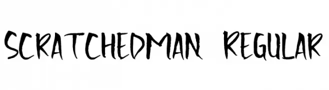
A bold, textured, hand-drawn font with a brush-like appearance.
![Scratchedman-Regular Frei Schriftart Herunterladen]() Herunterladen 108 Downloads@WebFont
Herunterladen 108 Downloads@WebFont -
( Fonts by Daniel Zadorozny - www.iconian.com - Free for personal use )
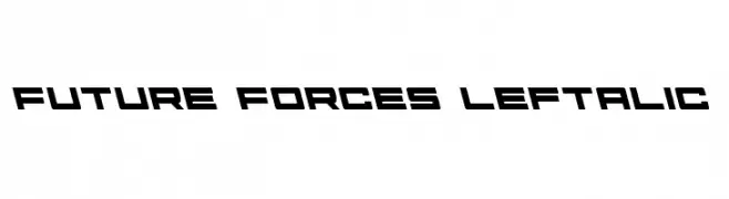
A futuristic, angular font with bold, slanted letterforms.
![Future Forces Leftalic Frei Schriftart Herunterladen]() Herunterladen 108 Downloads@WebFont
Herunterladen 108 Downloads@WebFont -
( Fonts by Thirtypath - Personal-use only. For commercial use please contact owner. )
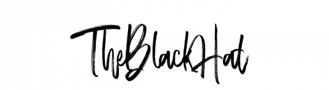
A bold, brush-style font with an expressive, hand-drawn appearance.
![TheBlackHat Frei Schriftart Herunterladen]() Herunterladen 108 Downloads@WebFont
Herunterladen 108 Downloads@WebFont -
( Fonts by Daniel Zadorozny - www.iconian.com )
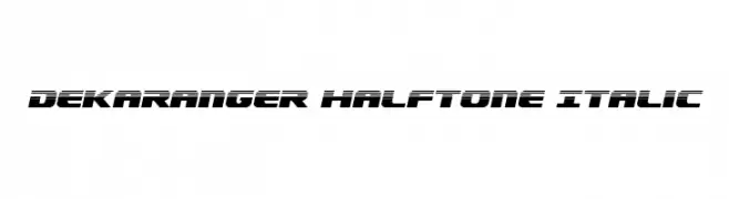
A bold, italicized font with a futuristic halftone effect.
![Dekaranger Halftone Italic Frei Schriftart Herunterladen]() Herunterladen 108 Downloads@WebFont
Herunterladen 108 Downloads@WebFont -
( Fonts by Manfred Klein. Free for private and charity use. Free for commercial with donation to organizations )
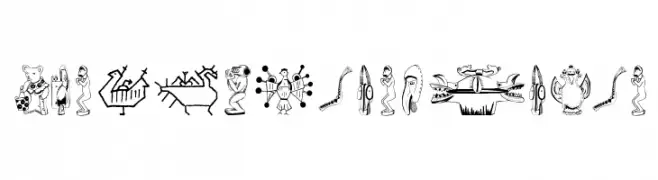
Intricate tribal designs featuring animal motifs and abstract forms with bold lines and cultural symbolism.
![TribalDesignsSei Frei Schriftart Herunterladen]() Herunterladen 108 Downloads@WebFont
Herunterladen 108 Downloads@WebFont -
( Fonts by Misti`s Fonts - mistifonts.com - Personal-use only. For commercial use please contact owner. )
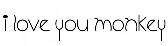
A playful and whimsical font with rounded, elongated letterforms and consistent stroke width.
![I Love You Monkey Frei Schriftart Herunterladen]() Herunterladen 108 Downloads@WebFont
Herunterladen 108 Downloads@WebFont -
( Fonts by Haksen Studio - Sarwo Edhi Prayitno - Personal-use only. For commercial use please contact owner. )
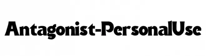
A bold, dramatic font with unique inward curves, perfect for headlines.
![Antagonist - Personal Use Frei Schriftart Herunterladen]() Herunterladen 108 Downloads@WebFont
Herunterladen 108 Downloads@WebFont -
( Fonts by Balpirick Studio - https://www.creativefabrica.com/designer/balpirick/ref/308299/ - Personal-use only. For commercial use please contact owner. )
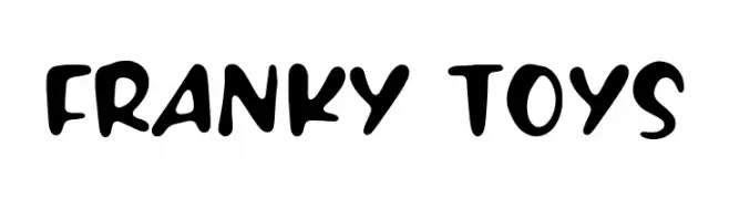
A playful, bold font with rounded, bubbly characters and a hand-drawn style.
![FRANKY TOYS Frei Schriftart Herunterladen]() Herunterladen 108 Downloads@WebFont
Herunterladen 108 Downloads@WebFont -
( Fonts by NJ Studio - Personal-use only. For commercial use please contact owner. )
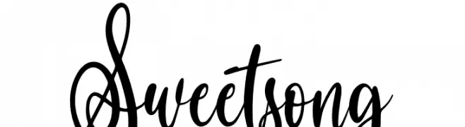
A lively, cursive font with elegant loops and a handwritten feel.
![Sweet song Frei Schriftart Herunterladen]() Herunterladen 108 Downloads@WebFont
Herunterladen 108 Downloads@WebFont -
( Fonts by www.lars-manenschijn.nl )
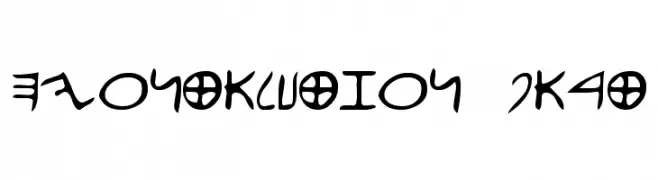
An abstract, symbolic font with a blend of sharp angles and smooth curves.
![efontalution_part1 Frei Schriftart Herunterladen]() Herunterladen 108 Downloads@WebFont
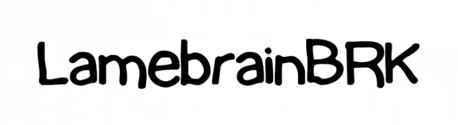
Herunterladen 108 Downloads@WebFont -
![Lamebrain BRK Frei Schriftart Herunterladen]() Herunterladen 108 Downloads@WebFont
Herunterladen 108 Downloads@WebFont -
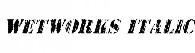
( Fonts by Daniel Zadorozny - www.iconian.com - Free for personal use )
A bold, distressed italic font with a grunge aesthetic.
![Wetworks Italic Frei Schriftart Herunterladen]() Herunterladen 108 Downloads@WebFont
Herunterladen 108 Downloads@WebFont -
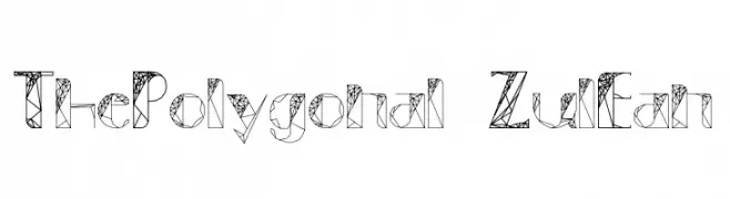
( Fonts by Low Polyonal )
A geometric font with polygonal shapes and interconnected lines.
![ThePolygonal-ZulEan Frei Schriftart Herunterladen]() Herunterladen 108 Downloads@WebFont
Herunterladen 108 Downloads@WebFont -
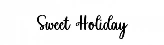
( Fonts by Fikryal studio - Fikry Alif - Personal-use only. For commercial use please contact owner. )
A playful and elegant script font with a handwritten style.
![Sweet Holiday Frei Schriftart Herunterladen]() Herunterladen 108 Downloads@WebFont
Herunterladen 108 Downloads@WebFont -
( Fonts by Vladimir Nikolic - www.creativefabrica.com/designer/vladimirnikolic/ - Personal-use only. For commercial use please contact owner. )
Bold, decorative font with a 3D shadow effect and textured interior.
![Range Regular Frei Schriftart Herunterladen]() Herunterladen 108 Downloads@WebFont
Herunterladen 108 Downloads@WebFont -
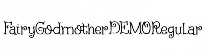
( Hanoded - David Kerkhoff - www.hanodedfonts.com )
A whimsical, fairy-tale inspired font with decorative, magical elements.
![Fairy Godmother DEMO Regular Frei Schriftart Herunterladen]() Herunterladen 108 Downloads@WebFont
Herunterladen 108 Downloads@WebFont -
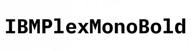
( Fonts by IBM )
A bold, monospaced font with a modern and clean design, ideal for coding and data presentation.
![IBM Plex Mono Bold Frei Schriftart Herunterladen]() Herunterladen 108 Downloads@WebFont
Herunterladen 108 Downloads@WebFont -
( Fonts by Attype Studio )
A bold, decorative font with clover leaf patterns for a playful touch.
![Happy Clover Leaf Display Frei Schriftart Herunterladen]() Herunterladen 108 Downloads@WebFont
Herunterladen 108 Downloads@WebFont -
![Michigan Condensed Laser Frei Schriftart Herunterladen]() Herunterladen 108 Downloads@WebFont
Herunterladen 108 Downloads@WebFont -
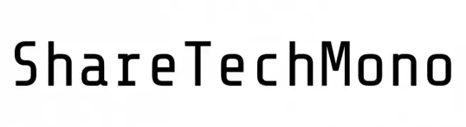
( Fonts by Carrois Type Design - Personal-use only. For commercial use please contact owner. )
A modern, monospaced font with low contrast and geometric shapes, ideal for technical use.
![Share Tech Mono Frei Schriftart Herunterladen]() Herunterladen 108 Downloads@WebFont
Herunterladen 108 Downloads@WebFont -
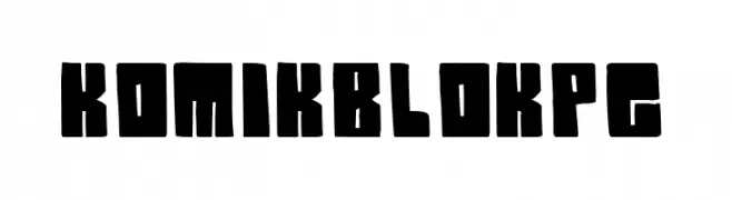
( Fonts by PressGang Studios )
A bold, blocky font with a playful, comic-like style.
![Komik Blok pg Frei Schriftart Herunterladen]() Herunterladen 108 Downloads@WebFont
Herunterladen 108 Downloads@WebFont -
( Fonts by CannotIntoSpaceFonts - KineticPlasma Fonts - Personal-use only. For commercial use please contact owner. )
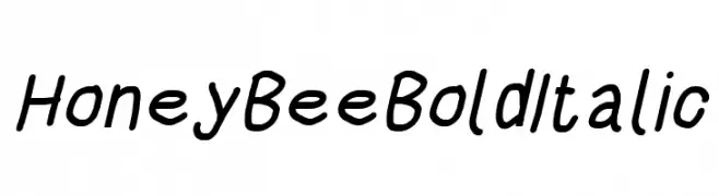
A bold, italicized handwritten font with a playful and dynamic style.
![HoneyBee Bold Italic Frei Schriftart Herunterladen]() Herunterladen 108 Downloads@WebFont
Herunterladen 108 Downloads@WebFont -
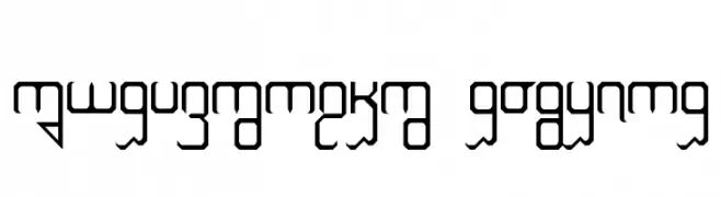
( Fonts by www.omniglot.com )
A decorative and geometric font with a futuristic and abstract design.
![Vorizhaskh Regular Frei Schriftart Herunterladen]() Herunterladen 108 Downloads@WebFont
Herunterladen 108 Downloads@WebFont


Welche Schriften sind gerade am populärsten?
Poppins, Roboto, Montserrat, Open Sans und Lato sind wegen ihrer klaren Formen und breiten Einsetzbarkeit sehr gefragt – von Markenauftritt über Landingpages bis hin zu Postern.
Welche Fonts eignen sich für Logos?
Geometrische Sans‑Serifs (z. B. Poppins, Familien im Gotham‑Stil) sind ein häufiger Griff für sauberes, skalierbares Branding. Für eine persönlichere Note bleiben Scripts und Handschrift‑Stile beliebt. Kombinieren Sie einen prägnanten Headline‑Font mit einer neutralen Brotschrift für Wiedererkennung und Harmonie.
Wie oft wird die Top‑Liste aktualisiert?
Regelmäßig – basierend auf realen Downloads und Interaktionen. Schauen Sie öfter vorbei, um aufstrebende Favoriten früh zu entdecken.
💡 Tipp: Seite bookmarken – Trends wechseln schnell, und heutige Top‑Schriften inspirieren morgen vielleicht das Rebranding.