Willkommen bei den Top‑Schriften – hier treffen Beliebtheit und Qualität aufeinander. Das sind die in diesem Jahr am häufigsten heruntergeladenen und genutzten Fonts. Wenn Sie sichere Optionen für Logo, Web oder Social suchen, starten Sie hier.
Jeder Top‑Font überzeugt durch Balance, Lesbarkeit und Vielseitigkeit. Sie finden moderne Sans‑Serifs, elegante Scripts, Vintage‑Serifs und minimalistische Displays.
-
 Herunterladen 1933 Downloads@WebFont
 -
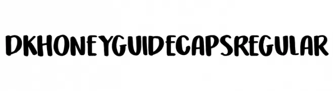
Schriftart von Qbotype. For commercial use please contact the owner.
( Fonts by www.phuxerdesigns.com.ar - Non-commercial use of any typeface free version, only buying the full version )
A bold, geometric font with a futuristic and digital aesthetic.
![Basica 2.0 Frei Schriftart Herunterladen]() Herunterladen 1933 Downloads@WebFont
Herunterladen 1933 Downloads@WebFont -
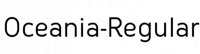
![Oceania-Regular Frei Schriftart Herunterladen]() Herunterladen 1933 Downloads
Herunterladen 1933 Downloads -
( Fonts by Iconian Fonts - Daniel Zadorozny )
A sleek, futuristic font with angular, slanted characters.
![Concielian Alpha Frei Schriftart Herunterladen]() Herunterladen 1933 Downloads@WebFont
Herunterladen 1933 Downloads@WebFont -
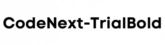
( Fonts by Fontfabric - Svetoslav Simov - Personal-use only. For commercial use please contact owner. )
A bold, modern sans-serif font with clean lines and strong presence.
![Code Next-Trial Bold Frei Schriftart Herunterladen]() Herunterladen 1932 Downloads@WebFont
Herunterladen 1932 Downloads@WebFont -
-
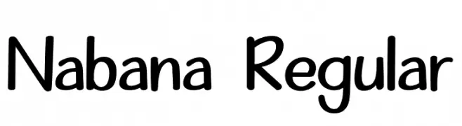
( Fonts by Alifinart Studio - Personal-use only. For commercial use please contact owner. )
A playful, handwritten font with smooth, rounded strokes and a casual style.
![Nabana Regular Frei Schriftart Herunterladen]() Herunterladen 1932 Downloads@WebFont
Herunterladen 1932 Downloads@WebFont -
( Fonts by Pentagram / MCKL - Personal-use only. For commercial use please contact owner. )
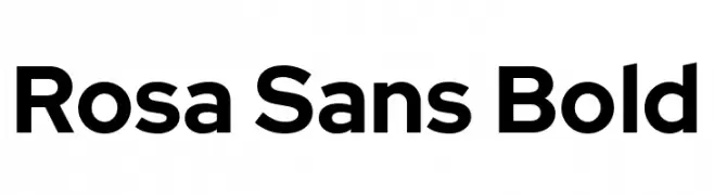
A bold, modern sans-serif font with clean lines and rounded edges.
![Rosa Sans Bold Frei Schriftart Herunterladen]() Herunterladen 1932 Downloads@WebFont
Herunterladen 1932 Downloads@WebFont -
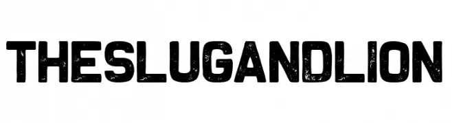
![The Slug and Lion Frei Schriftart Herunterladen]() Herunterladen 1931 Downloads@WebFont
Herunterladen 1931 Downloads@WebFont -
( Font by Jayvee D. Enaguas - grandchaos9000.deviantart.com )
A bold, italicized sans-serif font with a modern and dynamic style.
![Tepeno Sans Bold Italic Frei Schriftart Herunterladen]() Herunterladen 1931 Downloads@WebFont
Herunterladen 1931 Downloads@WebFont -
( Fonts by uatype.faithweb.com - UnAuthorized Type )
A playful, bubbly font with a fluid, organic design perfect for creative projects.
![Flubber Frei Schriftart Herunterladen]() Herunterladen 1931 Downloads@WebFont
Herunterladen 1931 Downloads@WebFont -
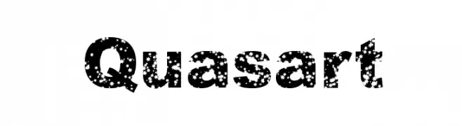
![Quasart Frei Schriftart Herunterladen]() Herunterladen 1931 Downloads
Herunterladen 1931 Downloads -
![Bluefish Demo Frei Schriftart Herunterladen]() Herunterladen 1930 Downloads@WebFont
Herunterladen 1930 Downloads@WebFont -
( Fonts by Castcraft Software - opti.netii.net - check the website before use )
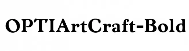
A bold, expressive serif font with rounded serifs and a classic yet elegant style.
![OPTIArtCraft-Bold Frei Schriftart Herunterladen]() Herunterladen 1930 Downloads@WebFont
Herunterladen 1930 Downloads@WebFont -
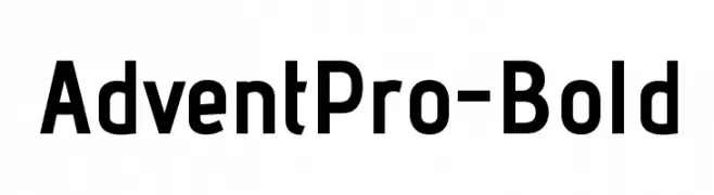
( Copyright (c) 2011, Andreas Kalpakides (hello@inderesting.com) )
A bold, modern sans-serif font with clean lines and a slightly condensed style.
![AdventPro-Bold Frei Schriftart Herunterladen]() Herunterladen 1930 Downloads@WebFont
Herunterladen 1930 Downloads@WebFont -
![M+ 2p thin Frei Schriftart Herunterladen]() Herunterladen 1930 Downloads@WebFont
Herunterladen 1930 Downloads@WebFont -
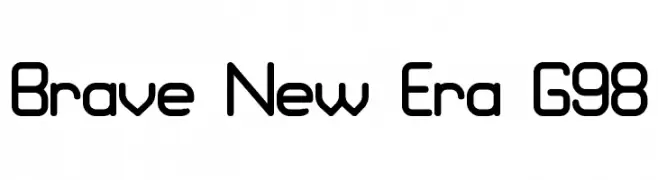
( Fonts by Graham Meade - GemFonts )
A modern, geometric font with rounded edges and consistent stroke width.
![Brave New Era G98 Frei Schriftart Herunterladen]() Herunterladen 1930 Downloads@WebFont
Herunterladen 1930 Downloads@WebFont -
![KidTYPEPaint Frei Schriftart Herunterladen]() Herunterladen 1930 Downloads@WebFont
Herunterladen 1930 Downloads@WebFont -
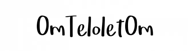
( Fonts by Locomotype )
A playful handwritten font with a lively and informal style.
![OmTeloletOm Frei Schriftart Herunterladen]() Herunterladen 1929 Downloads@WebFont
Herunterladen 1929 Downloads@WebFont -
( Fonts by a Situjuh Nazara - c7n1.wordpress.com. Personal-use only. For commercial use please contact owner. )
A bold, modern sans-serif font with clean lines and uniform strokes.
![Manophiser Frei Schriftart Herunterladen]() Herunterladen 1929 Downloads@WebFont
Herunterladen 1929 Downloads@WebFont -
( Fonts by Andrew McCluskey - nalgames.com. Personal-use only. For commercial use please contact owner. )
A modern, geometric sans-serif font with smooth, rounded edges.
![Blissful Thinking Frei Schriftart Herunterladen]() Herunterladen 1929 Downloads@WebFont
Herunterladen 1929 Downloads@WebFont -
![Xolonium Frei Schriftart Herunterladen]() Herunterladen 1929 Downloads@WebFont
Herunterladen 1929 Downloads@WebFont -
![Happy Hell Frei Schriftart Herunterladen]() Herunterladen 1929 Downloads@WebFont
Herunterladen 1929 Downloads@WebFont -
( Fonts by DeNada Industries - Mike Allard )
A decorative script font with a modern, calligraphic flair.
![E-BrantScript Frei Schriftart Herunterladen]() Herunterladen 1929 Downloads@WebFont
Herunterladen 1929 Downloads@WebFont -
( Fonts by www.fontalicious.com )
A sleek, modern font with thin, geometric strokes and a minimalist aesthetic.
![Kravitz Frei Schriftart Herunterladen]() Herunterladen 1929 Downloads@WebFont
Herunterladen 1929 Downloads@WebFont -
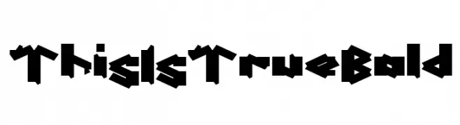
( weknow - Wino S Kadir - www.creativefabrica.com/designer/weknow/ )
A bold, angular display font with a modern, edgy aesthetic.
![This Is True Bold Frei Schriftart Herunterladen]() Herunterladen 1928 Downloads@WebFont
Herunterladen 1928 Downloads@WebFont -
![Spantaran Frei Schriftart Herunterladen]() Herunterladen 1928 Downloads@WebFont
Herunterladen 1928 Downloads@WebFont -
( ingoFonts - Ingo Zimmermann - www.ingofonts.com )
A bold, modern font with high contrast and strong visual impact.
![AnalogueReduced-Black Frei Schriftart Herunterladen]() Herunterladen 1927 Downloads@WebFont
Herunterladen 1927 Downloads@WebFont -
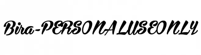
( Måns Grebäck - www.mansgreback.com )
A bold, flowing script font with smooth, connected strokes.
![Bira - PERSONAL USE ONLY Frei Schriftart Herunterladen]() Herunterladen 1927 Downloads@WebFont
Herunterladen 1927 Downloads@WebFont -
( Copyright (c) 2017, Ek Type. All rights reserved. )
A clean, modern typeface with balanced proportions and excellent readability.
![Mukta Mahee Medium Frei Schriftart Herunterladen]() Herunterladen 1927 Downloads@WebFont
Herunterladen 1927 Downloads@WebFont -
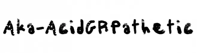
( Fonts by www.aka-acid.com )
A bold, distressed font with a grunge, textured style.
![Aka-AcidGRPathetic Frei Schriftart Herunterladen]() Herunterladen 1927 Downloads@WebFont
Herunterladen 1927 Downloads@WebFont -
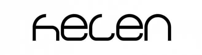
( Fonts by weknow - Wino S Kadir )
A modern, geometric font with a futuristic and minimalistic design.
![helen Frei Schriftart Herunterladen]() Herunterladen 1927 Downloads@WebFont
Herunterladen 1927 Downloads@WebFont -
![Typo3-Medium Frei Schriftart Herunterladen]() Herunterladen 1927 Downloads@WebFont
Herunterladen 1927 Downloads@WebFont -
( Fonts by Pinisiart )
A playful, bubbly font with rounded, bold characters and whimsical patterns.
![Happy-Dance Frei Schriftart Herunterladen]() Herunterladen 1926 Downloads@WebFont
Herunterladen 1926 Downloads@WebFont -
( Fonts by Kong Font - https://fontkong.com/ - Personal-use only. For commercial use please contact owner. )
A modern, elegant script font with fluid curves and a refined style.
![Alloystan Frei Schriftart Herunterladen]() Herunterladen 1926 Downloads@WebFont
Herunterladen 1926 Downloads@WebFont -
( Alexander Pravdin )
A bold, modern sans-serif font with clean, geometric lines and uniform width.
![NEXTART-Bold Frei Schriftart Herunterladen]() Herunterladen 1926 Downloads@WebFont
Herunterladen 1926 Downloads@WebFont


Welche Schriften sind gerade am populärsten?
Poppins, Roboto, Montserrat, Open Sans und Lato sind wegen ihrer klaren Formen und breiten Einsetzbarkeit sehr gefragt – von Markenauftritt über Landingpages bis hin zu Postern.
Welche Fonts eignen sich für Logos?
Geometrische Sans‑Serifs (z. B. Poppins, Familien im Gotham‑Stil) sind ein häufiger Griff für sauberes, skalierbares Branding. Für eine persönlichere Note bleiben Scripts und Handschrift‑Stile beliebt. Kombinieren Sie einen prägnanten Headline‑Font mit einer neutralen Brotschrift für Wiedererkennung und Harmonie.
Wie oft wird die Top‑Liste aktualisiert?
Regelmäßig – basierend auf realen Downloads und Interaktionen. Schauen Sie öfter vorbei, um aufstrebende Favoriten früh zu entdecken.
💡 Tipp: Seite bookmarken – Trends wechseln schnell, und heutige Top‑Schriften inspirieren morgen vielleicht das Rebranding.