Willkommen bei den Top‑Schriften – hier treffen Beliebtheit und Qualität aufeinander. Das sind die in diesem Jahr am häufigsten heruntergeladenen und genutzten Fonts. Wenn Sie sichere Optionen für Logo, Web oder Social suchen, starten Sie hier.
Jeder Top‑Font überzeugt durch Balance, Lesbarkeit und Vielseitigkeit. Sie finden moderne Sans‑Serifs, elegante Scripts, Vintage‑Serifs und minimalistische Displays.
-
( Fonts by Timur Type )
Handwritten, playful sans-serif with tall, narrow letters.
 Herunterladen 105 Downloads@WebFont
 -
![Proton Hairline Condensed Italic Frei Schriftart Herunterladen]() Herunterladen 105 Downloads@WebFont
Herunterladen 105 Downloads@WebFont -
( Fonts by EFOS Studio - Personal-use only. For commercial use please contact owner. )
A playful, rounded font with smooth curves and a whimsical style.
![Locanita Regular Frei Schriftart Herunterladen]() Herunterladen 105 Downloads@WebFont
Herunterladen 105 Downloads@WebFont -
( Fonts by Aldy Sidik )
A bold, distressed font with a vintage industrial style.
![Frankenstainer Demo Font Bold Frei Schriftart Herunterladen]() Herunterladen 105 Downloads@WebFont
Herunterladen 105 Downloads@WebFont -
( Fonts by Manfred Klein. Free for private and charity use. Free for commercial with donation to organizations )
A tall, narrow, and angular font with a modern artistic flair.
![SpontanoCondenso Frei Schriftart Herunterladen]() Herunterladen 105 Downloads@WebFont
Herunterladen 105 Downloads@WebFont -
( Zetafonts - www.zetafonts.com )
A bold slab serif font with strong, well-defined characters.
![Radcliffe Casual Bold Frei Schriftart Herunterladen]() Herunterladen 105 Downloads@WebFont
Herunterladen 105 Downloads@WebFont -
( Fonts by Iconian Fonts - Daniel Zadorozny - Personal-use only. For commercial use please contact owner. )
A bold, geometric font with strong, uniform strokes and high contrast.
![Force Runner Frei Schriftart Herunterladen]() Herunterladen 105 Downloads@WebFont
Herunterladen 105 Downloads@WebFont -
( Fonts by wepfont - Wahyu Eka Prasetya - Personal-use only. For commercial use please contact owner. )
A bold, flowing script font with elegant curves and dynamic style.
![Amylase Script Frei Schriftart Herunterladen]() Herunterladen 105 Downloads@WebFont
Herunterladen 105 Downloads@WebFont -
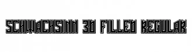
( Vladimir Nikolic - www.coroflot.com/vladimirnikolic )
A bold, 3D geometric font with filled interiors and strong outlines.
![Schwachsinn 3D Filled Regular Frei Schriftart Herunterladen]() Herunterladen 105 Downloads@WebFont
Herunterladen 105 Downloads@WebFont -
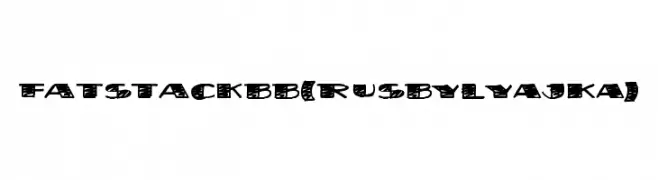
( Fonts by FONTS BY LYAJKA - Personal-use only. For commercial use please contact owner. )
A bold, hand-drawn font with a playful, textured design.
![FatStack BB(RUS BY LYAJKA) Frei Schriftart Herunterladen]() Herunterladen 105 Downloads@WebFont
Herunterladen 105 Downloads@WebFont -
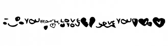
![LoveShock Frei Schriftart Herunterladen]() Herunterladen 105 Downloads@WebFont
Herunterladen 105 Downloads@WebFont -
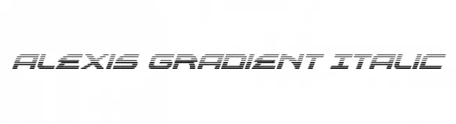
( Fonts by Daniel Zadorozny - www.iconian.com - Free for personal use )
A futuristic italic font with a gradient line effect.
![Alexis Gradient Italic Frei Schriftart Herunterladen]() Herunterladen 105 Downloads@WebFont
Herunterladen 105 Downloads@WebFont -
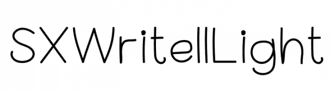
( Anastasis Nanopoulos - sxediasmos.com )
A clean, rounded font with a friendly and approachable style.
![SX Write II Light Frei Schriftart Herunterladen]() Herunterladen 105 Downloads@WebFont
Herunterladen 105 Downloads@WebFont -
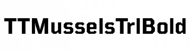
( Fonts by TypeType Foundry )
A bold, geometric font with angular lines and a modern look.
![TT Mussels Trl Bold Frei Schriftart Herunterladen]() Herunterladen 105 Downloads@WebFont
Herunterladen 105 Downloads@WebFont -
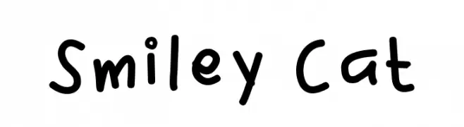
( Fonts by Aisyah - Nur Aisyah Amalia - Personal-use only. For commercial use please contact owner. )
A playful, handwritten font with a casual and friendly style.
![Smiley Cat Frei Schriftart Herunterladen]() Herunterladen 105 Downloads@WebFont
Herunterladen 105 Downloads@WebFont -
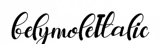
( Fonts by Letterena Studios - letterena.com - Personal-use only. For commercial use please contact owner. )
An elegant, flowing script font with an italicized slant and interconnected characters.
![belymole Italic Frei Schriftart Herunterladen]() Herunterladen 105 Downloads@WebFont
Herunterladen 105 Downloads@WebFont -
( Fonts by Vigilante Typeface Corporation Larry Yerkes. Personal-use only. For commercial use please contact owner. )
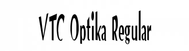
A bold, modern font with tall, condensed characters and strong visual impact.
![VTC Optika Regular Frei Schriftart Herunterladen]() Herunterladen 105 Downloads@WebFont
Herunterladen 105 Downloads@WebFont -
![Inter-Bureau 3D Italic Frei Schriftart Herunterladen]() Herunterladen 105 Downloads@WebFont
Herunterladen 105 Downloads@WebFont -
( Fonts by Jetsmax Studio - Khairil Anwar - Personal-use only. For commercial use please contact owner. )
A playful, bold font with rounded edges and a smooth, flowing style.
![Sirukota Frei Schriftart Herunterladen]() Herunterladen 105 Downloads@WebFont
Herunterladen 105 Downloads@WebFont -
( Fonts by Mans Greback - Personal-use only. For commercial use please contact owner. )
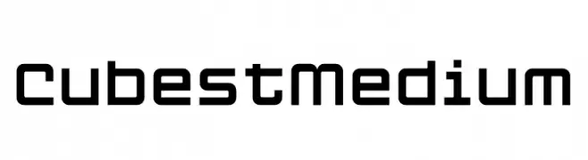
A geometric, modern font with a structured, monospaced appearance and slightly rounded edges.
![Cubest Medium Frei Schriftart Herunterladen]() Herunterladen 105 Downloads@WebFont
Herunterladen 105 Downloads@WebFont -
( Fonts by Gartype Studio - Gartype Studio - Personal-use only. For commercial use please contact owner. )
A playful, casual handwritten font with smooth, flowing lines.
![Story Maker GT Demo Frei Schriftart Herunterladen]() Herunterladen 105 Downloads@WebFont
Herunterladen 105 Downloads@WebFont -
( Fonts by Miss Tiina at www.misstiina.com (please check the website before use) )
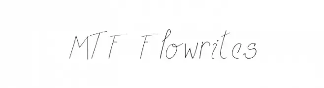
A delicate, handwritten font with a light, airy feel and elegant slant.
![MTF Flowrites Frei Schriftart Herunterladen]() Herunterladen 105 Downloads@WebFont
Herunterladen 105 Downloads@WebFont -
( Fonts by Vladimir Nikolic - www.creativefabrica.com/designer/vladimirnikolic/ - Personal-use only. For commercial use please contact owner. )
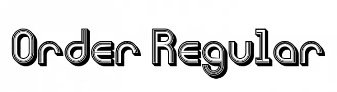
A bold, three-dimensional font with geometric lines and layered outlines.
![Order Regular Frei Schriftart Herunterladen]() Herunterladen 105 Downloads@WebFont
Herunterladen 105 Downloads@WebFont -
( Fonts by www.chequered.ink - Chequered Ink - Personal-use only. For commercial use please contact owner. )
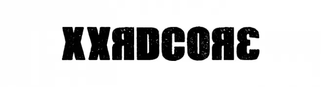
A bold, distressed font with a rugged, vintage texture.
![Xxrdcore Frei Schriftart Herunterladen]() Herunterladen 105 Downloads@WebFont
Herunterladen 105 Downloads@WebFont -
( Fonts by Manfred Klein. Free for private and charity use. Free for commercial with donation to organizations )
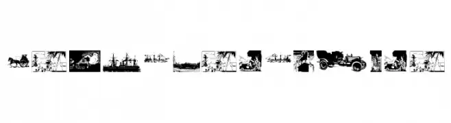
Vintage travel-themed dingbat illustrations.
![OldStyleTravel Frei Schriftart Herunterladen]() Herunterladen 105 Downloads@WebFont
Herunterladen 105 Downloads@WebFont -
( Fonts by Saeful Bahri )
An elegant, artistic script font with a whimsical, handwritten style.
![Syaquita Frei Schriftart Herunterladen]() Herunterladen 105 Downloads@WebFont
Herunterladen 105 Downloads@WebFont -
( Fonts by Typetemp Studio - Personal-use only. For commercial use please contact owner. )
A flowing, cursive script font with smooth, rounded edges and elegant flourishes.
![Eunila Script Free Personal Use Regular Frei Schriftart Herunterladen]() Herunterladen 105 Downloads@WebFont
Herunterladen 105 Downloads@WebFont -
( Fonts by Fadlilah Studio - Personal-use only. For commercial use please contact owner. )
A flowing, cursive font with elegant, sweeping curves and consistent stroke width.
![Letizia Frei Schriftart Herunterladen]() Herunterladen 105 Downloads@WebFont
Herunterladen 105 Downloads@WebFont -
( Fonts by Alit Design )
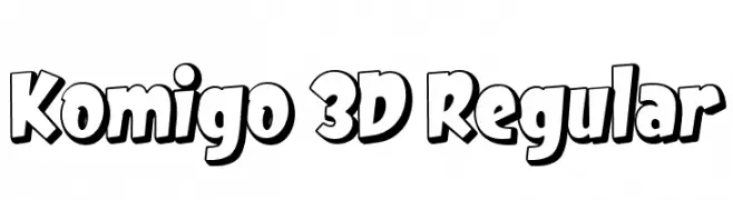
A bold, playful 3D font with a dynamic and eye-catching style.
![Komigo 3D Regular Frei Schriftart Herunterladen]() Herunterladen 105 Downloads@WebFont
Herunterladen 105 Downloads@WebFont -
( Fonts by kotakkuning - Personal-use only. For commercial use please contact owner. )
A playful, handwritten font with a casual and friendly style.
![Kidosplay Bold Frei Schriftart Herunterladen]() Herunterladen 105 Downloads@WebFont
Herunterladen 105 Downloads@WebFont -
( Fonts by Daniel Zadorozny - www.iconian.com - Free for personal use )
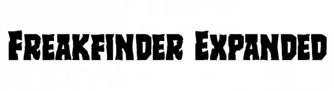
A bold, rugged font with jagged edges and a distressed appearance.
![Freakfinder Expanded Frei Schriftart Herunterladen]() Herunterladen 105 Downloads@WebFont
Herunterladen 105 Downloads@WebFont -
( Fonts by Geronimo Fonts - Personal-use only. For commercial use please contact owner. )
A clean, modern sans-serif font with geometric influences and uniform structure.
![Dispensations Frei Schriftart Herunterladen]() Herunterladen 105 Downloads@WebFont
Herunterladen 105 Downloads@WebFont -
( Fonts by Rezastudio - Reza Mukhtazar - Personal-use only. For commercial use please contact owner. )
A bold, decorative font with artistic and intricate designs.
![Abigdon Frei Schriftart Herunterladen]() Herunterladen 105 Downloads@WebFont
Herunterladen 105 Downloads@WebFont -
( Fonts by Iconian Fonts )
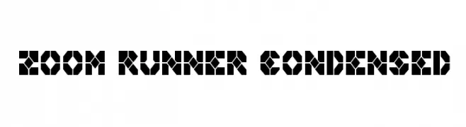
A bold, geometric font with a futuristic, digital aesthetic.
![Zoom Runner Condensed Frei Schriftart Herunterladen]() Herunterladen 105 Downloads@WebFont
Herunterladen 105 Downloads@WebFont -
( Fonts by Daniel Zadorozny - www.iconian.com )
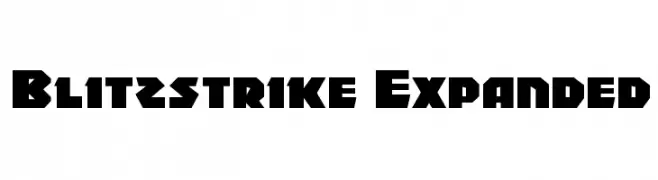
A bold, angular font with a modern, geometric style.
![Blitzstrike Expanded Frei Schriftart Herunterladen]() Herunterladen 105 Downloads@WebFont
Herunterladen 105 Downloads@WebFont


Welche Schriften sind gerade am populärsten?
Poppins, Roboto, Montserrat, Open Sans und Lato sind wegen ihrer klaren Formen und breiten Einsetzbarkeit sehr gefragt – von Markenauftritt über Landingpages bis hin zu Postern.
Welche Fonts eignen sich für Logos?
Geometrische Sans‑Serifs (z. B. Poppins, Familien im Gotham‑Stil) sind ein häufiger Griff für sauberes, skalierbares Branding. Für eine persönlichere Note bleiben Scripts und Handschrift‑Stile beliebt. Kombinieren Sie einen prägnanten Headline‑Font mit einer neutralen Brotschrift für Wiedererkennung und Harmonie.
Wie oft wird die Top‑Liste aktualisiert?
Regelmäßig – basierend auf realen Downloads und Interaktionen. Schauen Sie öfter vorbei, um aufstrebende Favoriten früh zu entdecken.
💡 Tipp: Seite bookmarken – Trends wechseln schnell, und heutige Top‑Schriften inspirieren morgen vielleicht das Rebranding.