Willkommen bei den Top‑Schriften – hier treffen Beliebtheit und Qualität aufeinander. Das sind die in diesem Jahr am häufigsten heruntergeladenen und genutzten Fonts. Wenn Sie sichere Optionen für Logo, Web oder Social suchen, starten Sie hier.
Jeder Top‑Font überzeugt durch Balance, Lesbarkeit und Vielseitigkeit. Sie finden moderne Sans‑Serifs, elegante Scripts, Vintage‑Serifs und minimalistische Displays.
-
( Fonts by Lhotive Studio - Chairul Fuadi - Personal-use only. For commercial use please contact owner. )
A bold, high-contrast Blackletter font with intricate, medieval-inspired designs.
 Herunterladen 104 Downloads@WebFont
 -
( Fonts by PutraCetol Studio )
A bold, artistic font with high contrast and playful cutouts.
![Kiera Display Frei Schriftart Herunterladen]() Herunterladen 104 Downloads@WebFont
Herunterladen 104 Downloads@WebFont -
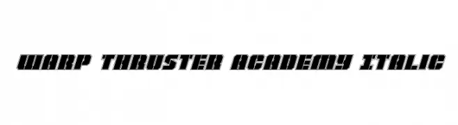
( Iconian Fonts - Daniel Zadorozny - www.iconian.com )
A bold, italic, futuristic font with geometric, blocky characters.
![Warp Thruster Academy Italic Frei Schriftart Herunterladen]() Herunterladen 104 Downloads@WebFont
Herunterladen 104 Downloads@WebFont -
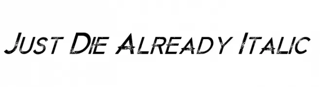
( Chris Vile - www.chrisvile.com )
A bold, italicized font with a distressed texture and dynamic slant.
![Just Die Already Italic Frei Schriftart Herunterladen]() Herunterladen 104 Downloads@WebFont
Herunterladen 104 Downloads@WebFont -
( Digital Magic - www.graphicdesignplus.com/helen/digitalmagic/ )
An ornate and decorative font featuring intricate patterns and embellishments.
![Design 6 Frei Schriftart Herunterladen]() Herunterladen 104 Downloads@WebFont
Herunterladen 104 Downloads@WebFont -
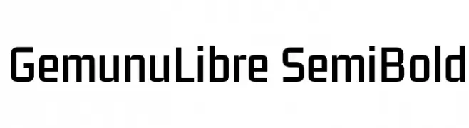
( Fonts by Mooniak - Personal-use only. For commercial use please contact owner. )
A modern, geometric sans-serif font with consistent stroke width and clear characters.
![GemunuLibre SemiBold Frei Schriftart Herunterladen]() Herunterladen 104 Downloads@WebFont
Herunterladen 104 Downloads@WebFont -
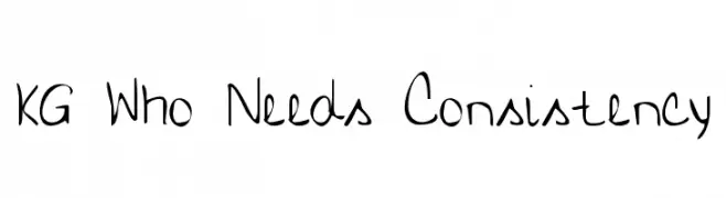
( Fonts by www.kimberlygeswein.com - Kimberly Geswein )
A playful, casual handwritten font with uneven strokes and a whimsical appearance.
![KG Who Needs Consistency Frei Schriftart Herunterladen]() Herunterladen 104 Downloads@WebFont
Herunterladen 104 Downloads@WebFont -
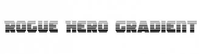
( Fonts by Daniel Zadorozny - www.iconian.com )
A bold, geometric font with a distinctive horizontal striped pattern, perfect for modern and impactful designs.
![Rogue Hero Gradient Frei Schriftart Herunterladen]() Herunterladen 104 Downloads@WebFont
Herunterladen 104 Downloads@WebFont -
![Charger Sport Defiance Narrow Oblique Frei Schriftart Herunterladen]() Herunterladen 104 Downloads@WebFont
Herunterladen 104 Downloads@WebFont -
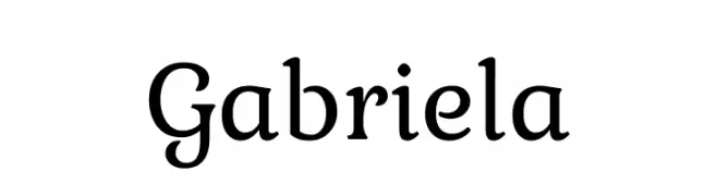
( Fonts by Madatype Studio - Andri Ardianto - Personal-use only. For commercial use please contact owner. )
A classic serif font with elegant curves and moderate contrast.
![Gabriela Frei Schriftart Herunterladen]() Herunterladen 104 Downloads@WebFont
Herunterladen 104 Downloads@WebFont -
( Fonts by Daniel Zadorozny - www.iconian.com )
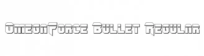
A bold, geometric font with a futuristic, industrial style.
![OmegaForce Bullet Regular Frei Schriftart Herunterladen]() Herunterladen 104 Downloads@WebFont
Herunterladen 104 Downloads@WebFont -
( Fonts by Rochart Studio )
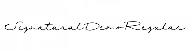
Elegant cursive script with a handwritten feel.
![Signatural Demo Regular Frei Schriftart Herunterladen]() Herunterladen 104 Downloads@WebFont
Herunterladen 104 Downloads@WebFont -
( Fonts by Leonard Posavec - leosupply.co - Personal-use only. For commercial use please contact owner. )
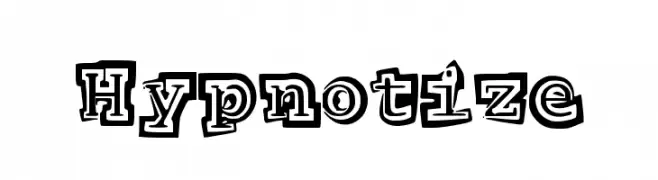
A bold, playful font with a three-dimensional outline and whimsical style.
![Hypnotize Frei Schriftart Herunterladen]() Herunterladen 104 Downloads@WebFont
Herunterladen 104 Downloads@WebFont -
( imagex - www.imagex-fonts.com )
A bold, distressed font with a gritty, urban style.
![Pusher Frei Schriftart Herunterladen]() Herunterladen 104 Downloads@WebFont
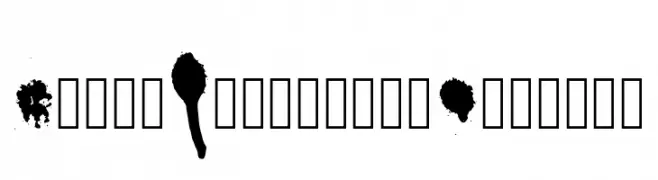
Herunterladen 104 Downloads@WebFont -
![Drips Splatters Regular Frei Schriftart Herunterladen]() Herunterladen 104 Downloads@WebFont
Herunterladen 104 Downloads@WebFont -
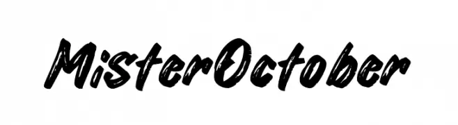
( Fonts by Khurasan - Syaf Rizal - Personal-use only. For commercial use please contact owner. )
A bold, brush-style script font with dynamic strokes and artistic flair.
![Mister October Frei Schriftart Herunterladen]() Herunterladen 104 Downloads@WebFont
Herunterladen 104 Downloads@WebFont -
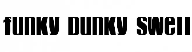
( Fonts by Thomas Canale - Personal-use only. For commercial use please contact owner. )
A bold, high-contrast font with blocky, dynamic characters.
![funky dunky swell Frei Schriftart Herunterladen]() Herunterladen 104 Downloads@WebFont
Herunterladen 104 Downloads@WebFont -
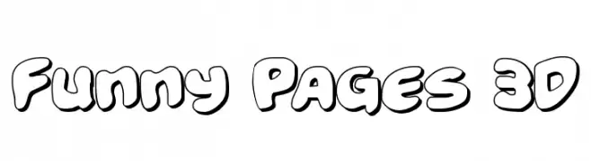
( Iconian Fonts - Daniel Zadorozny - www.iconian.com )
A playful, 3D cartoon-style font with bold, rounded edges and a whimsical appearance.
![Funny Pages 3D Frei Schriftart Herunterladen]() Herunterladen 104 Downloads@WebFont
Herunterladen 104 Downloads@WebFont -
( Fonts by a Neale Davidson - www.pixelsagas.com. Personal-use only. For commercial use please contact owner. )
A pixelated, retro-style font with a blocky, digital appearance.
![Pixel Symtext Frei Schriftart Herunterladen]() Herunterladen 104 Downloads@WebFont
Herunterladen 104 Downloads@WebFont -
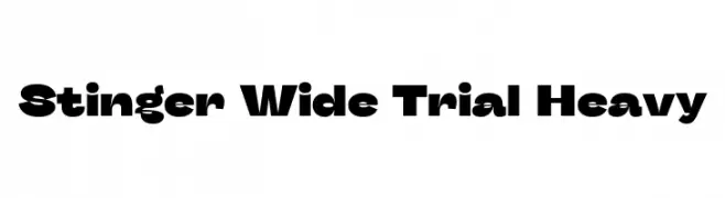
( Fonts by Zetafonts - Personal-use only. For commercial use please contact owner. )
A bold, wide font with heavy strokes, perfect for impactful headlines.
![Stinger Wide Trial Heavy Frei Schriftart Herunterladen]() Herunterladen 104 Downloads@WebFont
Herunterladen 104 Downloads@WebFont -
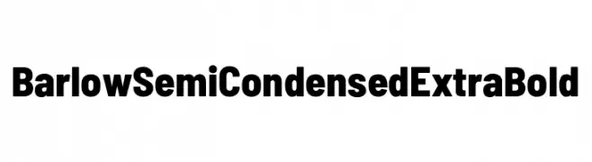
( Fonts by Tribby )
A bold, semi-condensed sans-serif typeface with a modern and impactful design.
![Barlow Semi Condensed ExtraBold Frei Schriftart Herunterladen]() Herunterladen 104 Downloads@WebFont
Herunterladen 104 Downloads@WebFont -
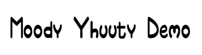
( Fonts by Faceless Creative - Personal-use only. For commercial use please contact owner. )
A playful, bold font with rounded edges and whimsical character shapes.
![Moody Yhuuty Demo Frei Schriftart Herunterladen]() Herunterladen 104 Downloads@WebFont
Herunterladen 104 Downloads@WebFont -
![Bottons Social Media Frei Schriftart Herunterladen]() Herunterladen 104 Downloads@WebFont
Herunterladen 104 Downloads@WebFont -
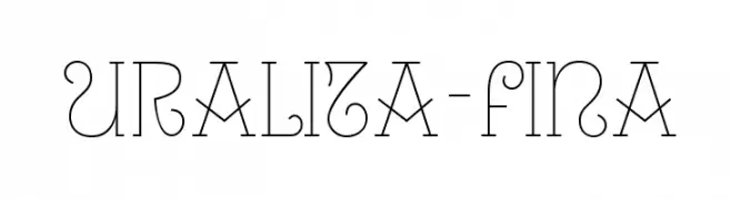
( Fonts by Ipanema Gráfica - Personal-use only. For commercial use please contact owner. )
An elegant and decorative font with thin lines and artistic curves.
![Uralita-Fina Frei Schriftart Herunterladen]() Herunterladen 104 Downloads@WebFont
Herunterladen 104 Downloads@WebFont -
( Fonts by EvasUniqueFonts )
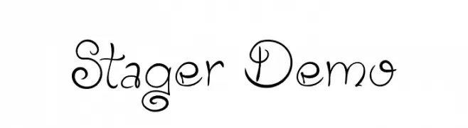
A whimsical and decorative font with elegant, flowing letterforms and unique curls.
![Stager Demo Frei Schriftart Herunterladen]() Herunterladen 104 Downloads@WebFont
Herunterladen 104 Downloads@WebFont -
( Fonts by Iconian Fonts )
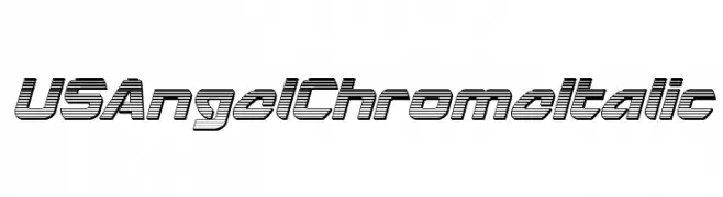
A bold, italicized, chrome-like font with a futuristic and dynamic style.
![USAngel Chrome Italic Frei Schriftart Herunterladen]() Herunterladen 104 Downloads@WebFont
Herunterladen 104 Downloads@WebFont -
( Fonts by Syaf Rizal - Khurasan - Personal-use only. For commercial use please contact owner. )
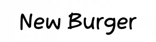
A playful, handwritten font with rounded, consistent strokes and a friendly vibe.
![New Burger Frei Schriftart Herunterladen]() Herunterladen 104 Downloads@WebFont
Herunterladen 104 Downloads@WebFont -
( Fonts by Burhan Afif - hanscostudio.com - Personal-use only. For commercial use please contact owner. )
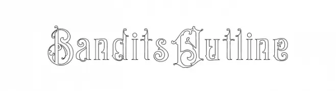
An ornate, vintage-style outline font with decorative elements.
![Bandits Outline Frei Schriftart Herunterladen]() Herunterladen 104 Downloads@WebFont
Herunterladen 104 Downloads@WebFont -
( Fonts by Daniel Zadorozny - www.iconian.com - Free for personal use )
A futuristic, italicized font with sharp angles and a sleek design.
![Alpha Men Laser Italic Frei Schriftart Herunterladen]() Herunterladen 104 Downloads@WebFont
Herunterladen 104 Downloads@WebFont -
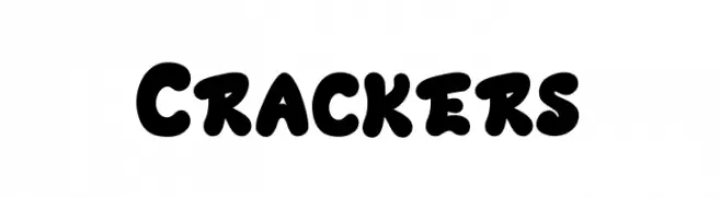
( Fonts by Basni.std )
A bold, playful font with thick, rounded characters and a bubbly appearance.
![Crackers Frei Schriftart Herunterladen]() Herunterladen 104 Downloads@WebFont
Herunterladen 104 Downloads@WebFont -
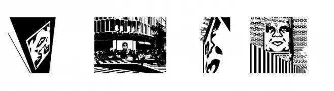
( Fonts by bob istheowl http://luc.devroye.org/bobistheowl.html )
A decorative font with intricate, graffiti-inspired illustrations within each letter.
![ObeyTownAltCaps Frei Schriftart Herunterladen]() Herunterladen 104 Downloads@WebFont
Herunterladen 104 Downloads@WebFont -
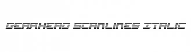
( Fonts by Daniel Zadorozny - www.iconian.com - Free for personal use )
A futuristic italic font with a scanline pattern, ideal for tech and digital projects.
![Gearhead Scanlines Italic Frei Schriftart Herunterladen]() Herunterladen 104 Downloads@WebFont
Herunterladen 104 Downloads@WebFont -
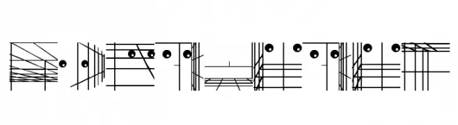
( Fonts by Manfred Klein. Free for private and charity use. Free for commercial with donation to organizations )
An abstract, artistic font with complex line patterns and geometric shapes.
![GridDadaA Frei Schriftart Herunterladen]() Herunterladen 104 Downloads@WebFont
Herunterladen 104 Downloads@WebFont -
( Fonts by Geronimo Fonts - Personal-use only. For commercial use please contact owner. )
A modern, geometric sans-serif font with a clean and balanced appearance.
![Andersans Frei Schriftart Herunterladen]() Herunterladen 104 Downloads@WebFont
Herunterladen 104 Downloads@WebFont -
( Manuel Lage - napojozare.jimdo.com )
A bold, 3D geometric font with a shadow effect, perfect for impactful designs.
![LGFLAGELOGOtresD-Regular Frei Schriftart Herunterladen]() Herunterladen 104 Downloads@WebFont
Herunterladen 104 Downloads@WebFont


Welche Schriften sind gerade am populärsten?
Poppins, Roboto, Montserrat, Open Sans und Lato sind wegen ihrer klaren Formen und breiten Einsetzbarkeit sehr gefragt – von Markenauftritt über Landingpages bis hin zu Postern.
Welche Fonts eignen sich für Logos?
Geometrische Sans‑Serifs (z. B. Poppins, Familien im Gotham‑Stil) sind ein häufiger Griff für sauberes, skalierbares Branding. Für eine persönlichere Note bleiben Scripts und Handschrift‑Stile beliebt. Kombinieren Sie einen prägnanten Headline‑Font mit einer neutralen Brotschrift für Wiedererkennung und Harmonie.
Wie oft wird die Top‑Liste aktualisiert?
Regelmäßig – basierend auf realen Downloads und Interaktionen. Schauen Sie öfter vorbei, um aufstrebende Favoriten früh zu entdecken.
💡 Tipp: Seite bookmarken – Trends wechseln schnell, und heutige Top‑Schriften inspirieren morgen vielleicht das Rebranding.