Willkommen bei den Top‑Schriften – hier treffen Beliebtheit und Qualität aufeinander. Das sind die in diesem Jahr am häufigsten heruntergeladenen und genutzten Fonts. Wenn Sie sichere Optionen für Logo, Web oder Social suchen, starten Sie hier.
Jeder Top‑Font überzeugt durch Balance, Lesbarkeit und Vielseitigkeit. Sie finden moderne Sans‑Serifs, elegante Scripts, Vintage‑Serifs und minimalistische Displays.
-
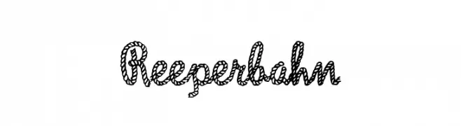
( Fonts by Dieter Steffmann )
A decorative rope-themed font with a nautical and playful style.
 Herunterladen 576 Downloads@WebFont
 -
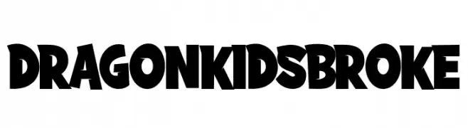
( Fonts by Fachranheit )
A bold, playful font with chunky, irregular shapes and a whimsical style.
![DRAGONKIDSBROKE Frei Schriftart Herunterladen]() Herunterladen 576 Downloads@WebFont
Herunterladen 576 Downloads@WebFont -
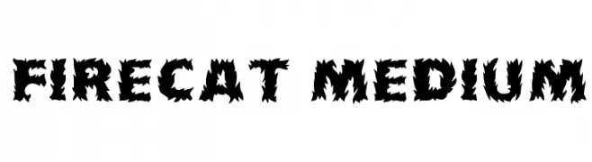
( Fonts by David Rakowski )
A bold, flame-inspired font with jagged edges and strong visual impact.
![Firecat Medium Frei Schriftart Herunterladen]() Herunterladen 576 Downloads
Herunterladen 576 Downloads -
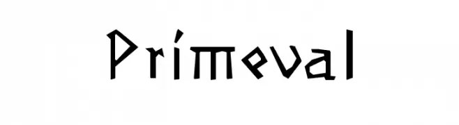
( Fonts by Manfred Klein. Free for private and charity use. Free for commercial with donation to organizations )
An angular, primitive font with a tribal aesthetic.
![Primeval Frei Schriftart Herunterladen]() Herunterladen 576 Downloads@WebFont
Herunterladen 576 Downloads@WebFont -
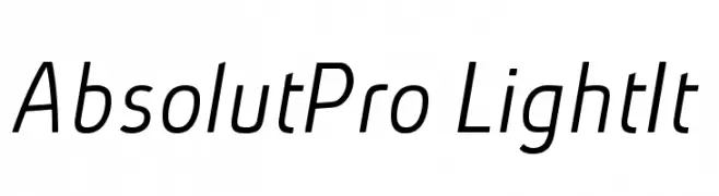
( Fonts by Ingo Zimmermann - www.ingofonts.com )
A sleek, modern, and slightly italic font with a minimalist design.
![AbsolutPro-LightIt Frei Schriftart Herunterladen]() Herunterladen 576 Downloads@WebFont
Herunterladen 576 Downloads@WebFont -
-
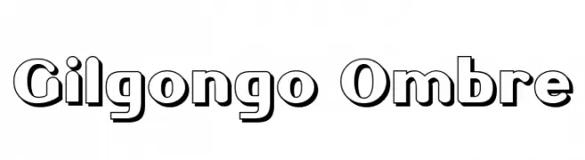
( Fonts by Apostrophic Lab )
A bold, outlined font with a modern and playful style.
![Gilgongo Ombre Frei Schriftart Herunterladen]() Herunterladen 576 Downloads@WebFont
Herunterladen 576 Downloads@WebFont -
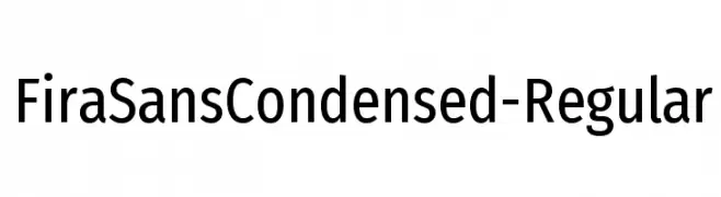
( Fonts by Mozilla Foundation - Personal-use only. For commercial use please contact owner. )
A modern, condensed sans-serif font with excellent legibility and balance.
![FiraSansCondensed-Regular Frei Schriftart Herunterladen]() Herunterladen 576 Downloads@WebFont
Herunterladen 576 Downloads@WebFont -
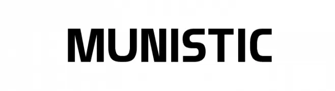
( Daymarius - www.creativefabrica.com/designer/Daymarius )
A bold, modern font with geometric lines and a monospaced appearance.
![Munistic Frei Schriftart Herunterladen]() Herunterladen 576 Downloads@WebFont
Herunterladen 576 Downloads@WebFont -
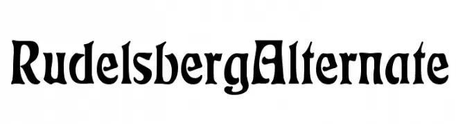
( Fonts by Dieter Steffmann )
A bold, medieval-inspired font with sharp, angular edges and pronounced serifs.
![RudelsbergAlternate Frei Schriftart Herunterladen]() Herunterladen 576 Downloads@WebFont
Herunterladen 576 Downloads@WebFont -
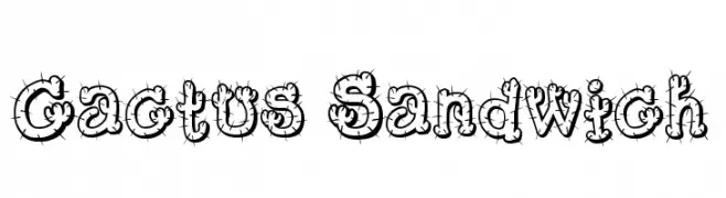
( Fonts by www.fontmesa.com )
A playful, cactus-themed font with spiny, decorative characters.
![Cactus Sandwich Frei Schriftart Herunterladen]() Herunterladen 576 Downloads@WebFont
Herunterladen 576 Downloads@WebFont
Welche Schriften sind gerade am populärsten?
Poppins, Roboto, Montserrat, Open Sans und Lato sind wegen ihrer klaren Formen und breiten Einsetzbarkeit sehr gefragt – von Markenauftritt über Landingpages bis hin zu Postern.
Welche Fonts eignen sich für Logos?
Geometrische Sans‑Serifs (z. B. Poppins, Familien im Gotham‑Stil) sind ein häufiger Griff für sauberes, skalierbares Branding. Für eine persönlichere Note bleiben Scripts und Handschrift‑Stile beliebt. Kombinieren Sie einen prägnanten Headline‑Font mit einer neutralen Brotschrift für Wiedererkennung und Harmonie.
Wie oft wird die Top‑Liste aktualisiert?
Regelmäßig – basierend auf realen Downloads und Interaktionen. Schauen Sie öfter vorbei, um aufstrebende Favoriten früh zu entdecken.
💡 Tipp: Seite bookmarken – Trends wechseln schnell, und heutige Top‑Schriften inspirieren morgen vielleicht das Rebranding.