Willkommen bei den Top‑Schriften – hier treffen Beliebtheit und Qualität aufeinander. Das sind die in diesem Jahr am häufigsten heruntergeladenen und genutzten Fonts. Wenn Sie sichere Optionen für Logo, Web oder Social suchen, starten Sie hier.
Jeder Top‑Font überzeugt durch Balance, Lesbarkeit und Vielseitigkeit. Sie finden moderne Sans‑Serifs, elegante Scripts, Vintage‑Serifs und minimalistische Displays.
-
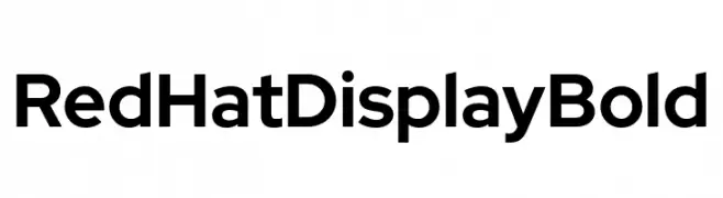
( Fonts by MCKL )
A bold, modern sans-serif font with geometric letterforms and consistent stroke width.
 Herunterladen 572 Downloads@WebFont
 -
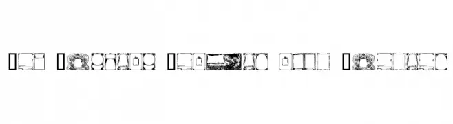
( Fonts by www.houseoflime.com )
Ornate Art Nouveau-style frames and borders as glyphs.
![Art Nouveau Frames and Borders Frei Schriftart Herunterladen]() Herunterladen 572 Downloads@WebFont
Herunterladen 572 Downloads@WebFont -
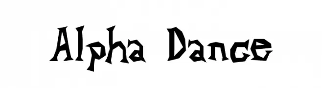
( Fonts by uatype.faithweb.com - UnAuthorized Type )
A bold, angular font with a dynamic and edgy style.
![Alpha Dance Frei Schriftart Herunterladen]() Herunterladen 572 Downloads@WebFont
Herunterladen 572 Downloads@WebFont -
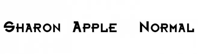
![Sharon Apple Normal Frei Schriftart Herunterladen]() Herunterladen 572 Downloads@WebFont
Herunterladen 572 Downloads@WebFont -
( Fonts by Uwe Borchert - Personal-use only. For commercial use please contact owner. )
A tall, narrow, and modern font with a sleek, condensed design.
![BStyle-Regular Frei Schriftart Herunterladen]() Herunterladen 572 Downloads@WebFont
Herunterladen 572 Downloads@WebFont -
-
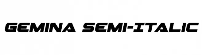
( Fonts by Daniel Zadorozny - www.iconian.com - Free for personal use )
A bold, angular, semi-italic font with a futuristic design.
![Gemina Semi-Italic Frei Schriftart Herunterladen]() Herunterladen 572 Downloads@WebFont
Herunterladen 572 Downloads@WebFont -
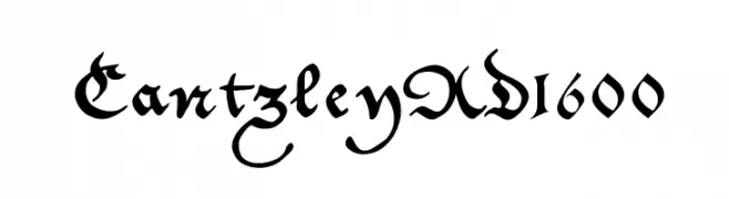
( Fonts by Manfred Klein - manfred-klein.ina-mar.com )
A classic Blackletter font with ornate, angular strokes and high contrast.
![CantzleyAD1600 Frei Schriftart Herunterladen]() Herunterladen 572 Downloads@WebFont
Herunterladen 572 Downloads@WebFont -
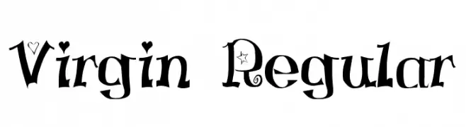
![Virgin Regular Frei Schriftart Herunterladen]() Herunterladen 572 Downloads@WebFont
Herunterladen 572 Downloads@WebFont -
![KleinsAmazon Frei Schriftart Herunterladen]() Herunterladen 572 Downloads@WebFont
Herunterladen 572 Downloads@WebFont -
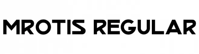
( Fonts by Fontourist )
A bold, geometric font with strong, angular lines and a modern industrial feel.
![MrOtis Regular Frei Schriftart Herunterladen]() Herunterladen 572 Downloads@WebFont
Herunterladen 572 Downloads@WebFont


Welche Schriften sind gerade am populärsten?
Poppins, Roboto, Montserrat, Open Sans und Lato sind wegen ihrer klaren Formen und breiten Einsetzbarkeit sehr gefragt – von Markenauftritt über Landingpages bis hin zu Postern.
Welche Fonts eignen sich für Logos?
Geometrische Sans‑Serifs (z. B. Poppins, Familien im Gotham‑Stil) sind ein häufiger Griff für sauberes, skalierbares Branding. Für eine persönlichere Note bleiben Scripts und Handschrift‑Stile beliebt. Kombinieren Sie einen prägnanten Headline‑Font mit einer neutralen Brotschrift für Wiedererkennung und Harmonie.
Wie oft wird die Top‑Liste aktualisiert?
Regelmäßig – basierend auf realen Downloads und Interaktionen. Schauen Sie öfter vorbei, um aufstrebende Favoriten früh zu entdecken.
💡 Tipp: Seite bookmarken – Trends wechseln schnell, und heutige Top‑Schriften inspirieren morgen vielleicht das Rebranding.