Willkommen bei den Top‑Schriften – hier treffen Beliebtheit und Qualität aufeinander. Das sind die in diesem Jahr am häufigsten heruntergeladenen und genutzten Fonts. Wenn Sie sichere Optionen für Logo, Web oder Social suchen, starten Sie hier.
Jeder Top‑Font überzeugt durch Balance, Lesbarkeit und Vielseitigkeit. Sie finden moderne Sans‑Serifs, elegante Scripts, Vintage‑Serifs und minimalistische Displays.
-
( Fonts by Khurasan )
A bold, playful font with a hand-drawn, artistic style.
 Herunterladen 571 Downloads@WebFont
 -
( Fonts by Kimberly Geswein - kimberlygeswein.com )
A bold, hand-drawn font with a playful and energetic style.
![Mighty to Save Frei Schriftart Herunterladen]() Herunterladen 571 Downloads@WebFont
Herunterladen 571 Downloads@WebFont -
![Thors Hammer Frei Schriftart Herunterladen]() Herunterladen 571 Downloads@WebFont
Herunterladen 571 Downloads@WebFont -
![Life in Space Frei Schriftart Herunterladen]() Herunterladen 571 Downloads@WebFont
Herunterladen 571 Downloads@WebFont -
( Fonts by YOFonts - Yasuhiro Yamaoka - yoworks.com - Personal-use only. For commercial use please contact owner. )
A bold, modern sans-serif font with clean lines and strong presence.
![Eau Sans Bold Old-styled Figures Frei Schriftart Herunterladen]() Herunterladen 571 Downloads@WebFont
Herunterladen 571 Downloads@WebFont -
-
( Fonts by a AlterDeco Type Foundry - Adit Saputra. Personal-use only. For commercial use please contact owner. )
A bold, decorative font with a three-dimensional effect and intricate detailing.
![JackRunnerFree Frei Schriftart Herunterladen]() Herunterladen 571 Downloads@WebFont
Herunterladen 571 Downloads@WebFont -
( Fonts by Khurasan )
A bold, playful handwritten font with thick strokes and rounded edges.
![Skincake Frei Schriftart Herunterladen]() Herunterladen 571 Downloads@WebFont
Herunterladen 571 Downloads@WebFont -
![BluelminKisaburo Frei Schriftart Herunterladen]() Herunterladen 571 Downloads@WebFont
Herunterladen 571 Downloads@WebFont -
( Copyright 2018 The Grenze Project Authors (https://github.com/Omnibus-Type/Grenze), with Reserved Font Name "Grenze". )
A bold, high-contrast serif font with a modern yet classic appeal.
![Grenze Bold Frei Schriftart Herunterladen]() Herunterladen 571 Downloads@WebFont
Herunterladen 571 Downloads@WebFont -
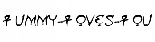
( Fonts by Nate Piekos - www.blambot.com )
A playful, hand-drawn font with an ancient Egyptian flair.
![Mummy-Loves-You Frei Schriftart Herunterladen]() Herunterladen 571 Downloads@WebFont
Herunterladen 571 Downloads@WebFont

Welche Schriften sind gerade am populärsten?
Poppins, Roboto, Montserrat, Open Sans und Lato sind wegen ihrer klaren Formen und breiten Einsetzbarkeit sehr gefragt – von Markenauftritt über Landingpages bis hin zu Postern.
Welche Fonts eignen sich für Logos?
Geometrische Sans‑Serifs (z. B. Poppins, Familien im Gotham‑Stil) sind ein häufiger Griff für sauberes, skalierbares Branding. Für eine persönlichere Note bleiben Scripts und Handschrift‑Stile beliebt. Kombinieren Sie einen prägnanten Headline‑Font mit einer neutralen Brotschrift für Wiedererkennung und Harmonie.
Wie oft wird die Top‑Liste aktualisiert?
Regelmäßig – basierend auf realen Downloads und Interaktionen. Schauen Sie öfter vorbei, um aufstrebende Favoriten früh zu entdecken.
💡 Tipp: Seite bookmarken – Trends wechseln schnell, und heutige Top‑Schriften inspirieren morgen vielleicht das Rebranding.