Willkommen bei den Top‑Schriften – hier treffen Beliebtheit und Qualität aufeinander. Das sind die in diesem Jahr am häufigsten heruntergeladenen und genutzten Fonts. Wenn Sie sichere Optionen für Logo, Web oder Social suchen, starten Sie hier.
Jeder Top‑Font überzeugt durch Balance, Lesbarkeit und Vielseitigkeit. Sie finden moderne Sans‑Serifs, elegante Scripts, Vintage‑Serifs und minimalistische Displays.
-
( Flö Rastbichler - www.elopedthought.com )
A modern slab serif font with strong serifs and uniform stroke width.
 Herunterladen 101 Downloads@WebFont
 -
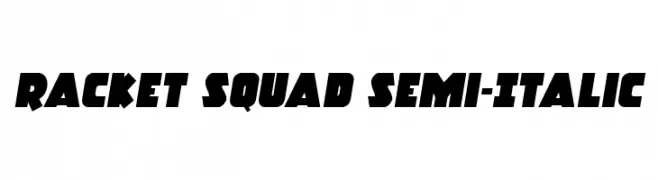
( Iconian Fonts - Daniel Zadorozny - www.iconian.com )
A bold, semi-italic font with a dynamic, angular design.
![Racket Squad Semi-Italic Frei Schriftart Herunterladen]() Herunterladen 101 Downloads@WebFont
Herunterladen 101 Downloads@WebFont -
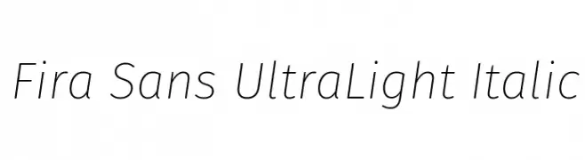
( Fonts by Mozilla Foundation - Personal-use only. For commercial use please contact owner. )
A sleek, ultra-light italic font with a modern and elegant design.
![Fira Sans UltraLight Italic Frei Schriftart Herunterladen]() Herunterladen 101 Downloads@WebFont
Herunterladen 101 Downloads@WebFont -
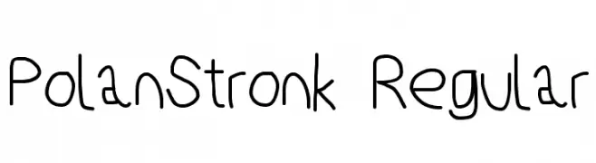
( Fonts by Cannot Into Space Fonts )
A playful, hand-drawn font with a casual and informal style.
![PolanStronk Regular Frei Schriftart Herunterladen]() Herunterladen 101 Downloads@WebFont
Herunterladen 101 Downloads@WebFont -
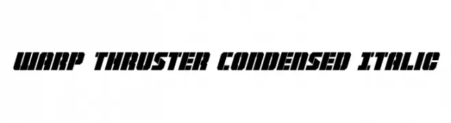
( Iconian Fonts - Daniel Zadorozny - www.iconian.com )
A bold, condensed, and italic font with a futuristic and dynamic design.
![Warp Thruster Condensed Italic Frei Schriftart Herunterladen]() Herunterladen 101 Downloads@WebFont
Herunterladen 101 Downloads@WebFont -
( Tim Mehlhorn )
A bold, geometric font with sharp angles and a futuristic design.
![Slashfold Frei Schriftart Herunterladen]() Herunterladen 101 Downloads@WebFont
Herunterladen 101 Downloads@WebFont -
( weknow - Wino S Kadir - www.creativefabrica.com/designer/weknow/ )
A whimsical, hollow font with smooth curves and playful style.
![Flattered-Hollow Frei Schriftart Herunterladen]() Herunterladen 101 Downloads@WebFont
Herunterladen 101 Downloads@WebFont -
( Fonts by FG Studios )
A bold, rounded font with a playful and friendly style.
![Osen Bold Frei Schriftart Herunterladen]() Herunterladen 101 Downloads@WebFont
Herunterladen 101 Downloads@WebFont -
( Fonts by www.omniglot.com )
A decorative and abstract font with bold, interconnected letterforms.
![Floridae Frei Schriftart Herunterladen]() Herunterladen 101 Downloads@WebFont
Herunterladen 101 Downloads@WebFont -
( Fonts by Subectype & Orenari )
Casual handwritten font with playful style.
![Master Photograph Frei Schriftart Herunterladen]() Herunterladen 101 Downloads@WebFont
Herunterladen 101 Downloads@WebFont -
![Broken Lamp Condensed Frei Schriftart Herunterladen]() Herunterladen 101 Downloads@WebFont
Herunterladen 101 Downloads@WebFont -
( Fonts by www.junkohanhero.com - Personal-use only. For commercial use please contact owner. )
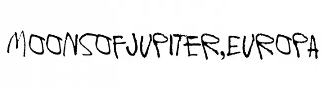
A hand-drawn, brush-like font with an organic, artistic style.
![Moons of Jupiter, Europa Frei Schriftart Herunterladen]() Herunterladen 101 Downloads@WebFont
Herunterladen 101 Downloads@WebFont -
( Fonts by belovestudio - Abdul Manan - Personal-use only. For commercial use please contact owner. )
An elegant script font with flowing, interconnected letters and a sophisticated style.
![larisa Frei Schriftart Herunterladen]() Herunterladen 101 Downloads@WebFont
Herunterladen 101 Downloads@WebFont -
( Fonts by Chris Vile - fontmonger.com - Personal-use only. For commercial use please contact owner. )
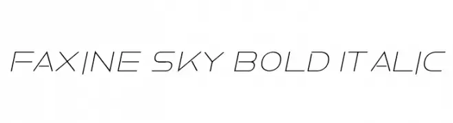
A sleek, modern italic font with geometric precision and futuristic style.
![Faxine Sky Bold Italic Frei Schriftart Herunterladen]() Herunterladen 101 Downloads@WebFont
Herunterladen 101 Downloads@WebFont -
( Fonts by Woodcutter )
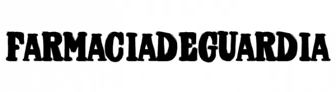
A bold, textured font with a rugged, vintage appearance.
![Farmacia de Guardia Frei Schriftart Herunterladen]() Herunterladen 101 Downloads@WebFont
Herunterladen 101 Downloads@WebFont -
( Fonts by Manuel Ramos - www.infinitismo.com - Personal-use only. For commercial use please contact owner. )
A modern, slanted script font with elegant, connected characters.
![Astralia Frei Schriftart Herunterladen]() Herunterladen 101 Downloads@WebFont
Herunterladen 101 Downloads@WebFont -
( Fonts by Manfred Klein. Free for private and charity use. Free for commercial with donation to organizations )
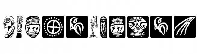
A pictorial, artifact-inspired decorative font with unique glyphs for each character.
![KLArtIFacts Frei Schriftart Herunterladen]() Herunterladen 101 Downloads@WebFont
Herunterladen 101 Downloads@WebFont -
( Fonts by Hanken Design Co. - Personal-use only. For commercial use please contact owner. )
A modern, geometric sans-serif typeface with clean lines and balanced proportions.
![HK Grotesk Regular Legacy Frei Schriftart Herunterladen]() Herunterladen 101 Downloads@WebFont
Herunterladen 101 Downloads@WebFont -
( Fonts by Daniel Zadorozny - www.iconian.com - Free for personal use )
A bold, angular font with a futuristic, industrial design.
![Gearhead Leftalic Frei Schriftart Herunterladen]() Herunterladen 101 Downloads@WebFont
Herunterladen 101 Downloads@WebFont -
( Fonts by Wino S Kadir - weknow - www.revolge.com/shop/weknow/ - Personal-use only. For commercial use please contact owner. )
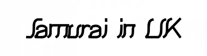
A modern, angular font with a futuristic and dynamic style.
![Samurai in UK Frei Schriftart Herunterladen]() Herunterladen 101 Downloads@WebFont
Herunterladen 101 Downloads@WebFont -
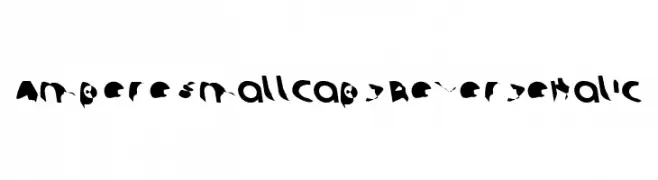
![Ampere SmallCaps ReverseItalic Frei Schriftart Herunterladen]() Herunterladen 101 Downloads@WebFont
Herunterladen 101 Downloads@WebFont -
( Fonts by Masato Shimojima - Personal-use only. For commercial use please contact owner. )
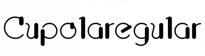
A bold, decorative font with modern curves and playful angles.
![Cupolaregular Frei Schriftart Herunterladen]() Herunterladen 101 Downloads@WebFont
Herunterladen 101 Downloads@WebFont -
( Iconian Fonts - Daniel Zadorozny - www.iconian.com )
A bold, geometric font with a strong, industrial feel.
![Camp Justice Drop Case Frei Schriftart Herunterladen]() Herunterladen 101 Downloads@WebFont
Herunterladen 101 Downloads@WebFont -
( Fonts by www.peter-wiegel.de. Personal-use only. For commercial use please contact owner. )
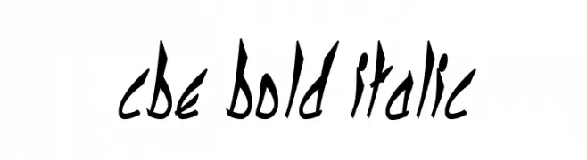
A bold, italicized font with a dynamic, hand-drawn style.
![cbe Bold Italic Frei Schriftart Herunterladen]() Herunterladen 101 Downloads@WebFont
Herunterladen 101 Downloads@WebFont -
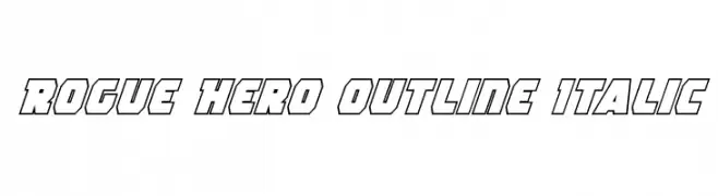
( Fonts by Daniel Zadorozny - www.iconian.com )
Bold, outlined, italic font with a modern, dynamic style.
![Rogue Hero Outline Italic Frei Schriftart Herunterladen]() Herunterladen 101 Downloads@WebFont
Herunterladen 101 Downloads@WebFont -
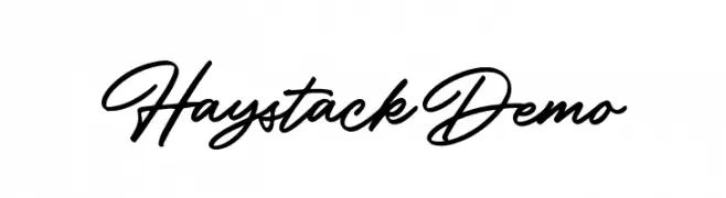
( Fonts by Letterhend Studio - Hendry Juanda - Personal-use only. For commercial use please contact owner. )
A flowing, cursive script font with elegant, connected strokes.
![HaystackDemo Frei Schriftart Herunterladen]() Herunterladen 101 Downloads@WebFont
Herunterladen 101 Downloads@WebFont -
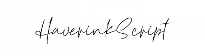
( Fonts by Vz Type - Personal-use only. For commercial use please contact owner. )
A graceful and fluid script font with elegant cursive letterforms.
![HaverinkScript Frei Schriftart Herunterladen]() Herunterladen 101 Downloads@WebFont
Herunterladen 101 Downloads@WebFont -
( Iconian Fonts - Daniel Zadorozny - www.iconian.com )
A futuristic, 3D italic font with outlined characters and a tech-inspired design.
![Radio Space 3D Italic Frei Schriftart Herunterladen]() Herunterladen 101 Downloads@WebFont
Herunterladen 101 Downloads@WebFont -
( 11th Floor - formerly www.xs4all.nl/~buro )
A bold, expressive font with an artistic, hand-painted style and ink splatter effects.
![Jean Piere Frei Schriftart Herunterladen]() Herunterladen 101 Downloads@WebFont
Herunterladen 101 Downloads@WebFont -
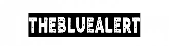
( Fonts by Woodcutter )
A bold, textured font with a vintage, distressed appearance.
![The Blue Alert Frei Schriftart Herunterladen]() Herunterladen 101 Downloads@WebFont
Herunterladen 101 Downloads@WebFont -
( Fonts by ingoFonts - Ingo Zimmermann - Personal-use only. For commercial use please contact owner. )
A bold, modern sans-serif font with clean lines and strong presence.
![AugustSansRed-75Bold Frei Schriftart Herunterladen]() Herunterladen 101 Downloads@WebFont
Herunterladen 101 Downloads@WebFont -
( Fonts by Vultype - Candra Hamdani - Personal-use only. For commercial use please contact owner. )
An elegant script font with flowing, interconnected letters and intricate flourishes.
![Dagtton Frei Schriftart Herunterladen]() Herunterladen 101 Downloads@WebFont
Herunterladen 101 Downloads@WebFont -
![Pointer HyperExtended Frei Schriftart Herunterladen]() Herunterladen 101 Downloads@WebFont
Herunterladen 101 Downloads@WebFont -
( Fonts by Typodermic Fonts )
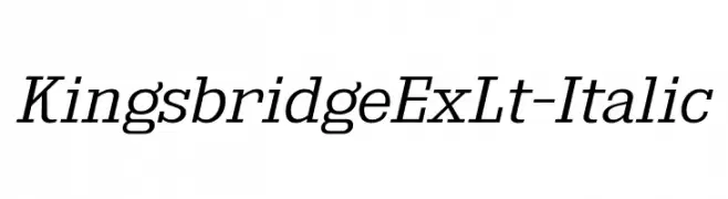
An elegant serif italic font with moderate contrast and refined details.
![KingsbridgeExLt-Italic Frei Schriftart Herunterladen]() Herunterladen 101 Downloads@WebFont
Herunterladen 101 Downloads@WebFont -
( Fonts by Twin Rizki )
A playful, whimsical handwritten font with flowing, interconnected strokes.
![Batley Frei Schriftart Herunterladen]() Herunterladen 101 Downloads@WebFont
Herunterladen 101 Downloads@WebFont


Welche Schriften sind gerade am populärsten?
Poppins, Roboto, Montserrat, Open Sans und Lato sind wegen ihrer klaren Formen und breiten Einsetzbarkeit sehr gefragt – von Markenauftritt über Landingpages bis hin zu Postern.
Welche Fonts eignen sich für Logos?
Geometrische Sans‑Serifs (z. B. Poppins, Familien im Gotham‑Stil) sind ein häufiger Griff für sauberes, skalierbares Branding. Für eine persönlichere Note bleiben Scripts und Handschrift‑Stile beliebt. Kombinieren Sie einen prägnanten Headline‑Font mit einer neutralen Brotschrift für Wiedererkennung und Harmonie.
Wie oft wird die Top‑Liste aktualisiert?
Regelmäßig – basierend auf realen Downloads und Interaktionen. Schauen Sie öfter vorbei, um aufstrebende Favoriten früh zu entdecken.
💡 Tipp: Seite bookmarken – Trends wechseln schnell, und heutige Top‑Schriften inspirieren morgen vielleicht das Rebranding.