Willkommen bei den Top‑Schriften – hier treffen Beliebtheit und Qualität aufeinander. Das sind die in diesem Jahr am häufigsten heruntergeladenen und genutzten Fonts. Wenn Sie sichere Optionen für Logo, Web oder Social suchen, starten Sie hier.
Jeder Top‑Font überzeugt durch Balance, Lesbarkeit und Vielseitigkeit. Sie finden moderne Sans‑Serifs, elegante Scripts, Vintage‑Serifs und minimalistische Displays.
-
( Fonts by Zetafonts - Personal-use only. For commercial use please contact owner. )
A modern, italic, and condensed font with uniform stroke weight.
 Herunterladen 99 Downloads@WebFont
 -
( Fonts by sronstudio - Yusron Billah - Personal-use only. For commercial use please contact owner. )
A modern, elegant handwritten font with medium contrast and fluid strokes.
![Sheridan Frei Schriftart Herunterladen]() Herunterladen 99 Downloads@WebFont
Herunterladen 99 Downloads@WebFont -
( Fonts by a Max Infeld - XEROGRAPHER FONTS - xerographer.blogspot.com . Personal-use only. For commercial use please contact owner. )
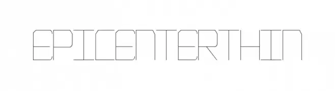
A geometric, minimalist font with thin lines and a modern, technical style.
![EpicenterThin Frei Schriftart Herunterladen]() Herunterladen 99 Downloads@WebFont
Herunterladen 99 Downloads@WebFont -
( Fonts by Benoit Champy - www.vnbc.fr - Personal-use only. For commercial use please contact owner. )
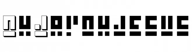
A bold, geometric font with a futuristic, digital aesthetic.
![Oh Jay ohjesus Frei Schriftart Herunterladen]() Herunterladen 99 Downloads@WebFont
Herunterladen 99 Downloads@WebFont -
( Mouser Fonts - www.mouserfonts.com/ )
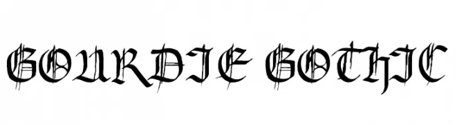
A classic Gothic font with intricate, sharp edges and pointed serifs.
![Gourdie Gothic Frei Schriftart Herunterladen]() Herunterladen 99 Downloads@WebFont
Herunterladen 99 Downloads@WebFont -
( Fonts by Vladimir Nikolic - www.creativefabrica.com/designer/vladimirnikolic/ - Personal-use only. For commercial use please contact owner. )
A modern, geometric font with a hollow, dimensional effect.
![Fritz Regular Frei Schriftart Herunterladen]() Herunterladen 99 Downloads@WebFont
Herunterladen 99 Downloads@WebFont -
( Fonts by www.junkohanhero.com - Personal-use only. For commercial use please contact owner. )
A bold, hand-drawn font with a rough, textured appearance and dynamic style.
![I believe in life before death Frei Schriftart Herunterladen]() Herunterladen 99 Downloads@WebFont
Herunterladen 99 Downloads@WebFont -
( JosefinaTol )
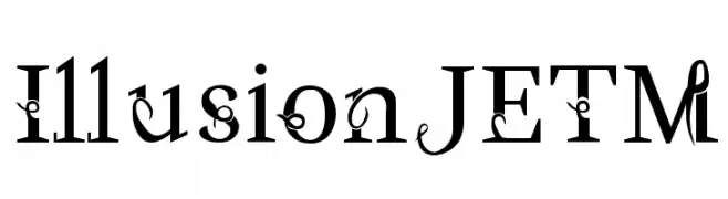
A decorative font with elegant swirls and vintage calligraphic elements.
![IllusionJETM Frei Schriftart Herunterladen]() Herunterladen 99 Downloads@WebFont
Herunterladen 99 Downloads@WebFont -
( Mouser Fonts - www.mouserfonts.com/ )
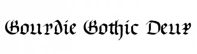
A bold, blackletter font with sharp, angular strokes and high contrast.
![Gourdie Gothic Deux Frei Schriftart Herunterladen]() Herunterladen 99 Downloads@WebFont
Herunterladen 99 Downloads@WebFont -
( Fonts by Dmytro Artamonov - Personal-use only. For commercial use please contact owner. )
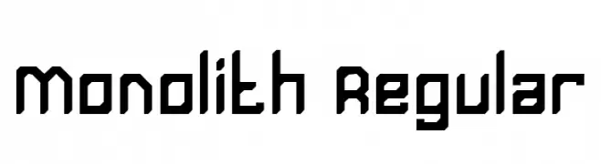
A bold, geometric font with a futuristic, tech-inspired design.
![Monolith Regular Frei Schriftart Herunterladen]() Herunterladen 99 Downloads@WebFont
Herunterladen 99 Downloads@WebFont -
( Holitter Studios - Biffe de Holitter - holitter.wix.com/holitter )
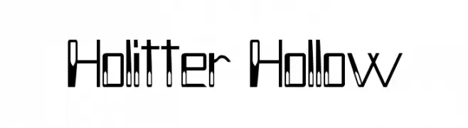
A modern, hollow font with high contrast and geometric design.
![Holitter Hollow Frei Schriftart Herunterladen]() Herunterladen 99 Downloads@WebFont
Herunterladen 99 Downloads@WebFont -
( Fonts by gluk - Grzegorz l - Personal-use only. For commercial use please contact owner. )
An elegant and sophisticated font with flowing lines and a slightly slanted style.
![Garineldo Frei Schriftart Herunterladen]() Herunterladen 99 Downloads@WebFont
Herunterladen 99 Downloads@WebFont -
( Fonts by Daniel Zadorozny - www.iconian.com )
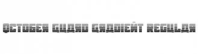
A bold, geometric font with a distinctive horizontal striped pattern.
![October Guard Gradient Regular Frei Schriftart Herunterladen]() Herunterladen 99 Downloads@WebFont
Herunterladen 99 Downloads@WebFont -
( Fonts by NDISCOVER )
A clean, modern font with smooth curves and consistent stroke width, offering elegance and readability.
![Arima Koshi ExtraLight Frei Schriftart Herunterladen]() Herunterladen 99 Downloads@WebFont
Herunterladen 99 Downloads@WebFont -
( Fonts by Rebekka Marleaux - Personal-use only. For commercial use please contact owner. )
A sleek, elegant italic font with smooth, flowing lines and a modern aesthetic.
![Tulia-Italic Frei Schriftart Herunterladen]() Herunterladen 99 Downloads@WebFont
Herunterladen 99 Downloads@WebFont -
( Fonts by www.blambot.com )
A decorative and mystical font with flowing, intricate characters.
![WizardSpeak Frei Schriftart Herunterladen]() Herunterladen 99 Downloads@WebFont
Herunterladen 99 Downloads@WebFont -
( Fonts by Magique Fonts - Personal-use only. For commercial use please contact owner. )
Bold, stencil-like font with a rugged, distressed appearance.
![Top Secret Frei Schriftart Herunterladen]() Herunterladen 99 Downloads@WebFont
Herunterladen 99 Downloads@WebFont -
( Rahmat Hidayat )
An elegant, decorative font with whimsical swirls and cursive elements.
![Scooter Free Frei Schriftart Herunterladen]() Herunterladen 99 Downloads@WebFont
Herunterladen 99 Downloads@WebFont -
( Iconian Fonts - Daniel Zadorozny - www.iconian.com )
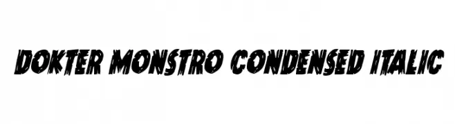
A bold, condensed, and italicized font with a distressed, jagged style.
![Dokter Monstro Condensed Italic Frei Schriftart Herunterladen]() Herunterladen 99 Downloads@WebFont
Herunterladen 99 Downloads@WebFont -
( Personal-use only. For commercial use please contact owner. )
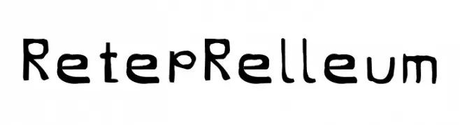
A playful, hand-drawn font with an informal and whimsical style.
![RetepRelleum Frei Schriftart Herunterladen]() Herunterladen 99 Downloads@WebFont
Herunterladen 99 Downloads@WebFont -
( Fonts by a Max Infeld - XEROGRAPHER FONTS - xerographer.blogspot.com . Personal-use only. For commercial use please contact owner. )
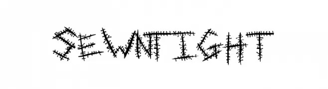
A rugged, stitched-style font with a handcrafted, edgy appearance.
![SewnTight Frei Schriftart Herunterladen]() Herunterladen 99 Downloads@WebFont
Herunterladen 99 Downloads@WebFont -
( Fonts by Font People - Personal-use only. For commercial use please contact owner. )
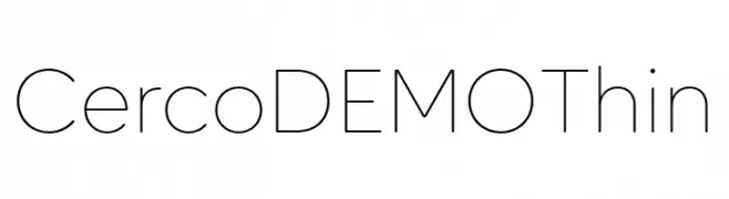
A sleek, modern font with thin lines and a minimalist design.
![Cerco DEMO Thin Frei Schriftart Herunterladen]() Herunterladen 99 Downloads@WebFont
Herunterladen 99 Downloads@WebFont -
( Just Font You - Ian Irwan Wismoyo - justfontyou.com/ )
A sophisticated, elegant cursive script with a modern touch.
![Yellove DEMO Regular Frei Schriftart Herunterladen]() Herunterladen 99 Downloads@WebFont
Herunterladen 99 Downloads@WebFont -
( Fonts by gluk - Grzegorz l - Personal-use only. For commercial use please contact owner. )
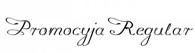
An elegant cursive font with decorative uppercase and streamlined lowercase letters.
![Promocyja Regular Frei Schriftart Herunterladen]() Herunterladen 99 Downloads@WebFont
Herunterladen 99 Downloads@WebFont -
( www.southype.com )
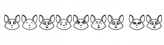
Whimsical animal-face decorative font with unique expressions for each character.
![UnTaRot ST Frei Schriftart Herunterladen]() Herunterladen 99 Downloads@WebFont
Herunterladen 99 Downloads@WebFont -
( Fonts by Vunira Design - Personal-use only. For commercial use please contact owner. )
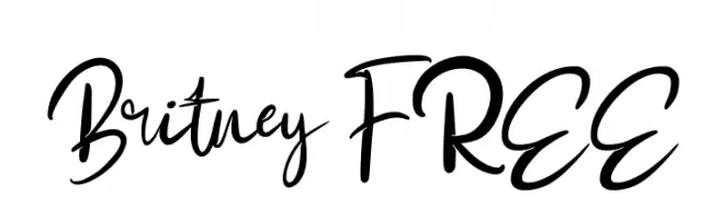
A lively, expressive script font with flowing cursive letters.
![Britney FREE Frei Schriftart Herunterladen]() Herunterladen 99 Downloads@WebFont
Herunterladen 99 Downloads@WebFont -
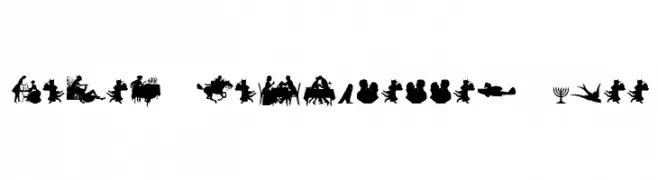
![Mixed Silhouettes Free Frei Schriftart Herunterladen]() Herunterladen 99 Downloads@WebFont
Herunterladen 99 Downloads@WebFont -
( Vladimir Nikolic - www.coroflot.com/vladimirnikolic )
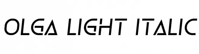
A sleek, modern italic font with geometric precision and subtle contrast.
![Olga Light Italic Frei Schriftart Herunterladen]() Herunterladen 99 Downloads@WebFont
Herunterladen 99 Downloads@WebFont -
( Personal-use only. For commercial use please contact owner. )
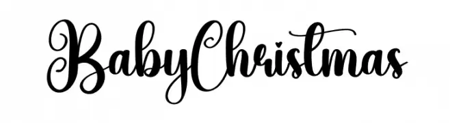
A bold, whimsical script font with decorative swashes and loops.
![Baby Christmas Frei Schriftart Herunterladen]() Herunterladen 99 Downloads@WebFont
Herunterladen 99 Downloads@WebFont -
( Fonts by Leonard Posavec - leosupply.co - Personal-use only. For commercial use please contact owner. )
A bold, distressed serif font with a vintage, rugged appearance.
![Fish Frei Schriftart Herunterladen]() Herunterladen 99 Downloads@WebFont
Herunterladen 99 Downloads@WebFont -
( Fonts by U.S. Web Design System )
A modern, extra light sans-serif font with clean lines and excellent readability.
![Public Sans ExtraLight Frei Schriftart Herunterladen]() Herunterladen 99 Downloads@WebFont
Herunterladen 99 Downloads@WebFont -
( Fonts by Billy Argel - Personal-use only. For commercial use please contact owner. )
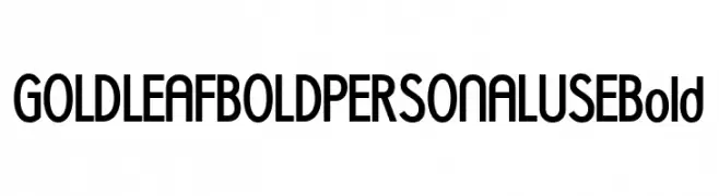
A bold, modern font with geometric lines and a sleek appearance.
![GOLDLEAF BOLD PERSONAL USE Bold Frei Schriftart Herunterladen]() Herunterladen 99 Downloads@WebFont
Herunterladen 99 Downloads@WebFont -
( Fonts by www.junkohanhero.com - Personal-use only. For commercial use please contact owner. )
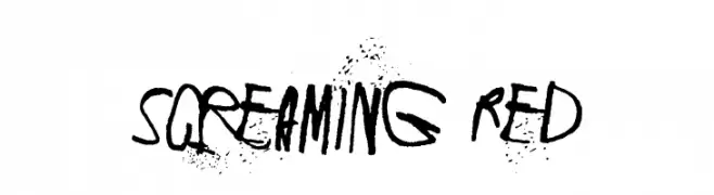
A bold, expressive font with brush-like strokes and a gritty, rebellious aesthetic.
![Screaming Red Frei Schriftart Herunterladen]() Herunterladen 99 Downloads@WebFont
Herunterladen 99 Downloads@WebFont -
( Fonts by ingoFonts - Ingo Zimmermann - Personal-use only. For commercial use please contact owner. )
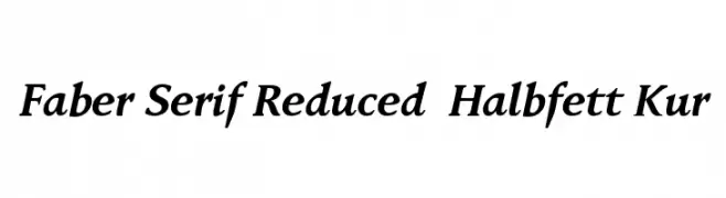
Elegant serif font with italic style and moderate contrast.
![Faber Serif Reduced 76 Halbfett Kur Frei Schriftart Herunterladen]() Herunterladen 99 Downloads@WebFont
Herunterladen 99 Downloads@WebFont -
( Fonts by Khurasan )
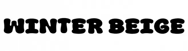
A bold, playful font with rounded, bubbly characters and a retro vibe.
![Winter Beige Frei Schriftart Herunterladen]() Herunterladen 99 Downloads@WebFont
Herunterladen 99 Downloads@WebFont


Welche Schriften sind gerade am populärsten?
Poppins, Roboto, Montserrat, Open Sans und Lato sind wegen ihrer klaren Formen und breiten Einsetzbarkeit sehr gefragt – von Markenauftritt über Landingpages bis hin zu Postern.
Welche Fonts eignen sich für Logos?
Geometrische Sans‑Serifs (z. B. Poppins, Familien im Gotham‑Stil) sind ein häufiger Griff für sauberes, skalierbares Branding. Für eine persönlichere Note bleiben Scripts und Handschrift‑Stile beliebt. Kombinieren Sie einen prägnanten Headline‑Font mit einer neutralen Brotschrift für Wiedererkennung und Harmonie.
Wie oft wird die Top‑Liste aktualisiert?
Regelmäßig – basierend auf realen Downloads und Interaktionen. Schauen Sie öfter vorbei, um aufstrebende Favoriten früh zu entdecken.
💡 Tipp: Seite bookmarken – Trends wechseln schnell, und heutige Top‑Schriften inspirieren morgen vielleicht das Rebranding.