Willkommen bei den Top‑Schriften – hier treffen Beliebtheit und Qualität aufeinander. Das sind die in diesem Jahr am häufigsten heruntergeladenen und genutzten Fonts. Wenn Sie sichere Optionen für Logo, Web oder Social suchen, starten Sie hier.
Jeder Top‑Font überzeugt durch Balance, Lesbarkeit und Vielseitigkeit. Sie finden moderne Sans‑Serifs, elegante Scripts, Vintage‑Serifs und minimalistische Displays.
-
 Herunterladen 551 Downloads@WebFont
 -
( Fonts by Justin Callaghan - Personal-use only. For commercial use please contact owner. )
A futuristic, geometric font with rounded edges and a modern aesthetic.
![SpaceAge Frei Schriftart Herunterladen]() Herunterladen 551 Downloads@WebFont
Herunterladen 551 Downloads@WebFont -
( Fonts by BLKBK - https://blkbk.ink - Personal-use only. For commercial use please contact owner. OFF SITE )
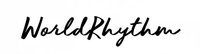
A dynamic script font with fluid, connected letterforms and a casual, sophisticated vibe.
![World Rhythm Frei Schriftart Herunterladen]() Herunterladen 551 Downloads
Herunterladen 551 Downloads -
( Fonts by Khurasan )
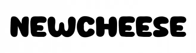
A bold, rounded font with a playful and whimsical style.
![New Cheese Frei Schriftart Herunterladen]() Herunterladen 551 Downloads@WebFont
Herunterladen 551 Downloads@WebFont -
( Fonts by Koch Memorial )
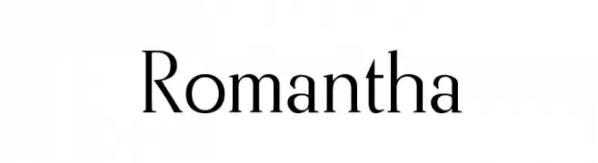
A classic serif font with elegant strokes and sharp serifs, perfect for formal designs.
![Romantha Frei Schriftart Herunterladen]() Herunterladen 551 Downloads@WebFont
Herunterladen 551 Downloads@WebFont -
-
![Keystroke Frei Schriftart Herunterladen]() Herunterladen 551 Downloads@WebFont
Herunterladen 551 Downloads@WebFont -
( Fonts by Jay Hilgert - www.bittbox.com )
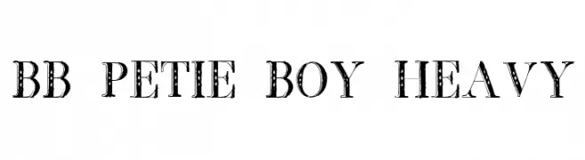
A bold, decorative font with vintage flair and intricate patterns.
![BB Petie Boy Heavy Frei Schriftart Herunterladen]() Herunterladen 551 Downloads@WebFont
Herunterladen 551 Downloads@WebFont -
( Fonts by Graham Meade - GemFonts )
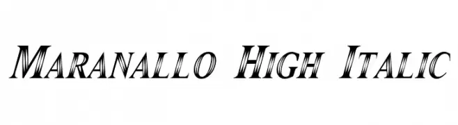
A high-contrast, italic serif font with dynamic and elegant strokes.
![Maranallo High Italic Frei Schriftart Herunterladen]() Herunterladen 551 Downloads@WebFont
Herunterladen 551 Downloads@WebFont -
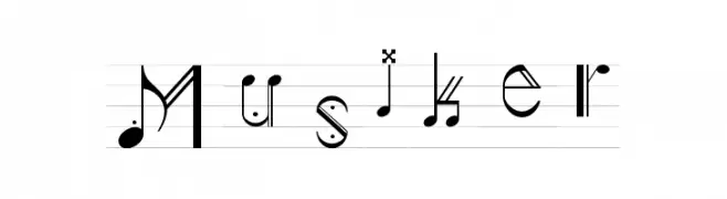
![Musiker Frei Schriftart Herunterladen]() Herunterladen 551 Downloads@WebFont
Herunterladen 551 Downloads@WebFont -
( Fonts by Four Lines )
A playful, bold, and rounded font with a hand-drawn feel.
![Funky Monkey Frei Schriftart Herunterladen]() Herunterladen 551 Downloads@WebFont
Herunterladen 551 Downloads@WebFont


Welche Schriften sind gerade am populärsten?
Poppins, Roboto, Montserrat, Open Sans und Lato sind wegen ihrer klaren Formen und breiten Einsetzbarkeit sehr gefragt – von Markenauftritt über Landingpages bis hin zu Postern.
Welche Fonts eignen sich für Logos?
Geometrische Sans‑Serifs (z. B. Poppins, Familien im Gotham‑Stil) sind ein häufiger Griff für sauberes, skalierbares Branding. Für eine persönlichere Note bleiben Scripts und Handschrift‑Stile beliebt. Kombinieren Sie einen prägnanten Headline‑Font mit einer neutralen Brotschrift für Wiedererkennung und Harmonie.
Wie oft wird die Top‑Liste aktualisiert?
Regelmäßig – basierend auf realen Downloads und Interaktionen. Schauen Sie öfter vorbei, um aufstrebende Favoriten früh zu entdecken.
💡 Tipp: Seite bookmarken – Trends wechseln schnell, und heutige Top‑Schriften inspirieren morgen vielleicht das Rebranding.