Willkommen bei den Top‑Schriften – hier treffen Beliebtheit und Qualität aufeinander. Das sind die in diesem Jahr am häufigsten heruntergeladenen und genutzten Fonts. Wenn Sie sichere Optionen für Logo, Web oder Social suchen, starten Sie hier.
Jeder Top‑Font überzeugt durch Balance, Lesbarkeit und Vielseitigkeit. Sie finden moderne Sans‑Serifs, elegante Scripts, Vintage‑Serifs und minimalistische Displays.
-
( Fonts by MuraKnockout Media + Design - muraknockout.com. Personal-use only. For commercial use please contact owner. )
A bold, high-contrast decorative font with ornate uppercase and streamlined lowercase letters.
 Herunterladen 97 Downloads@WebFont
 -
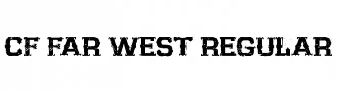
( CloutierFontes - Steve Cloutier - www.cloutierfontes.ca/ )
A rugged, distressed font with a Wild West aesthetic.
![CF Far West Regular Frei Schriftart Herunterladen]() Herunterladen 97 Downloads@WebFont
Herunterladen 97 Downloads@WebFont -
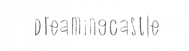
( Xerographer Fonts - Max Infeld - xerographer.blogspot.com )
A whimsical, hand-drawn font with a sketch-like texture and playful style.
![DreamingCastle Frei Schriftart Herunterladen]() Herunterladen 97 Downloads@WebFont
Herunterladen 97 Downloads@WebFont -
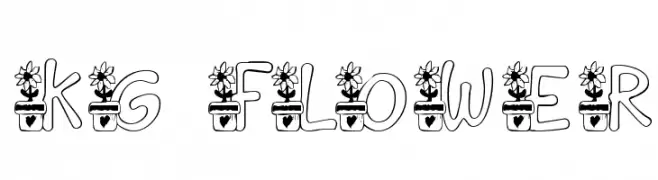
( Katz Fontz - katzfonts.50megs.com/kg.html )
A decorative font with letters growing from flower pots, ideal for playful and nature-themed designs.
![KG FLOWER Frei Schriftart Herunterladen]() Herunterladen 97 Downloads@WebFont
Herunterladen 97 Downloads@WebFont -
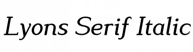
( Fonts by Dan P. Lyons - Personal-use only. For commercial use please contact owner. )
An elegant italic serif font with a classic and sophisticated style.
![Lyons Serif Italic Frei Schriftart Herunterladen]() Herunterladen 97 Downloads@WebFont
Herunterladen 97 Downloads@WebFont -
( LeChefRene - members.aol.com/lcrfonts/ )
A decorative font with characters inside floral motifs, ideal for creative projects.
![LCR Shelbys Flower Frei Schriftart Herunterladen]() Herunterladen 97 Downloads@WebFont
Herunterladen 97 Downloads@WebFont -
( Fonts by PutraCetol Studio - www.putracetol.com - Personal-use only. For commercial use please contact owner. )
A bold, modern font with clean lines and a slightly condensed style.
![Roshmary Frei Schriftart Herunterladen]() Herunterladen 97 Downloads@WebFont
Herunterladen 97 Downloads@WebFont -
( George Williams - web.archive.org/web/20051223080638/bibliofile.mc.duke.edu/gww/fonts/fonts.html )
A decorative uncial script with intricate animal motifs and mythical embellishments.
![Uncial Animals Frei Schriftart Herunterladen]() Herunterladen 97 Downloads@WebFont
Herunterladen 97 Downloads@WebFont -
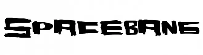
( Fonts by a Max Infeld - XEROGRAPHER FONTS - xerographer.blogspot.com . Personal-use only. For commercial use please contact owner. )
A bold, graffiti-inspired font with a dynamic, hand-drawn style.
![SpaceBang Frei Schriftart Herunterladen]() Herunterladen 97 Downloads@WebFont
Herunterladen 97 Downloads@WebFont -
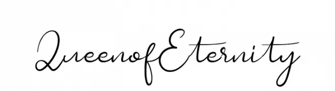
( Fonts by Greentrik6789 - Tri Kuncoro - Personal-use only. For commercial use please contact owner. )
An elegant, flowing script font with a refined and sophisticated style.
![QueenofEternity Frei Schriftart Herunterladen]() Herunterladen 97 Downloads@WebFont
Herunterladen 97 Downloads@WebFont -
![Zounderkite Outline Frei Schriftart Herunterladen]() Herunterladen 97 Downloads@WebFont
Herunterladen 97 Downloads@WebFont -
( Iconian Fonts - Daniel Zadorozny - www.iconian.com )
A bold, italic, futuristic font with a three-dimensional outline.
![Searider Falcon Academy Italic Frei Schriftart Herunterladen]() Herunterladen 97 Downloads@WebFont
Herunterladen 97 Downloads@WebFont -
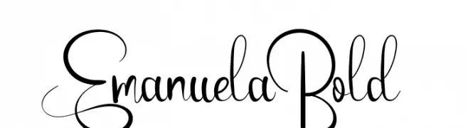
( Vladimir Fedotov )
An elegant and flowing script font with intricate loops and swirls.
![Emanuela Bold Frei Schriftart Herunterladen]() Herunterladen 97 Downloads@WebFont
Herunterladen 97 Downloads@WebFont -
![Chalk Clouds 100%Free Frei Schriftart Herunterladen]() Herunterladen 97 Downloads@WebFont
Herunterladen 97 Downloads@WebFont -
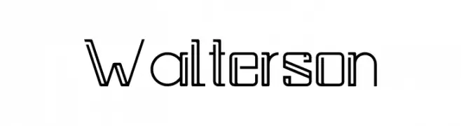
( Fonts by Kong Font - https://fontkong.com/ - Personal-use only. For commercial use please contact owner. )
A modern, geometric font with clean lines and a futuristic style.
![Walterson Frei Schriftart Herunterladen]() Herunterladen 97 Downloads@WebFont
Herunterladen 97 Downloads@WebFont -
( Fonts by Azetype Studio - Muh. Aswar - Personal-use only. For commercial use please contact owner. )
A bold, energetic script font with a dynamic, handwritten style.
![Get Lost! Frei Schriftart Herunterladen]() Herunterladen 97 Downloads@WebFont
Herunterladen 97 Downloads@WebFont -
( گالری فانت فارسی پژوهش آريانا - only compatible with Farsi and Arabic )
A bold, geometric font with a modern and industrial style.
![Heraat Frei Schriftart Herunterladen]() Herunterladen 97 Downloads@WebFont
Herunterladen 97 Downloads@WebFont -
( Catharsis - www.cinga.ch/fonts.html )
An intricate, calligraphic font with bold, angular strokes and decorative flourishes.
![Cirnaja Calligraphy Frei Schriftart Herunterladen]() Herunterladen 97 Downloads@WebFont
Herunterladen 97 Downloads@WebFont -
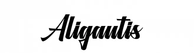
( Fonts by Azetype Studio - Muh. Aswar - Personal-use only. For commercial use please contact owner. )
A bold, cursive font with dynamic, sweeping strokes and elegant slant.
![Aligantis Frei Schriftart Herunterladen]() Herunterladen 97 Downloads@WebFont
Herunterladen 97 Downloads@WebFont -
( Fonts by Iconian Fonts )
A futuristic, expanded italic font with sleek, elongated characters.
![Factor Expanded Italic Frei Schriftart Herunterladen]() Herunterladen 97 Downloads@WebFont
Herunterladen 97 Downloads@WebFont -
( گالری فانت فارسی پژوهش آريانا - only compatible with Farsi and Arabic )
A decorative, edgy font with sharp, angular lines and a graffiti-like style.
![Lab Outline Frei Schriftart Herunterladen]() Herunterladen 97 Downloads@WebFont
Herunterladen 97 Downloads@WebFont -
( Fonts by Situjuh Nazara - 7ntypes.com - Personal-use only. For commercial use please contact owner. )
A modern, italicized font with medium contrast and a sleek, condensed design.
![Tentram Italic Frei Schriftart Herunterladen]() Herunterladen 97 Downloads@WebFont
Herunterladen 97 Downloads@WebFont -
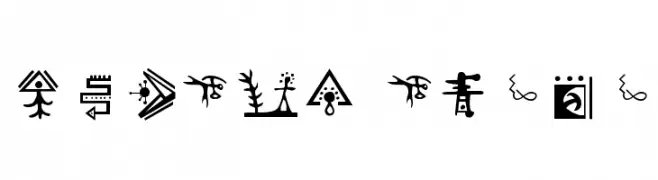
( Giedi Prime )
Highly decorative font with pictographic, symbolic glyphs.
![Golden Disks Frei Schriftart Herunterladen]() Herunterladen 97 Downloads@WebFont
Herunterladen 97 Downloads@WebFont -
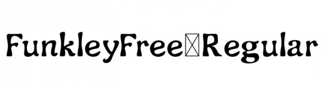
( Fonts by Craft Supply Co. )
A playful, hand-drawn font with bold strokes and a whimsical, artistic style.
![FunkleyFree-Regular Frei Schriftart Herunterladen]() Herunterladen 97 Downloads@WebFont
Herunterladen 97 Downloads@WebFont -
( Fonts by Nick Curtis - Personal-use only. For commercial use please contact owner. )
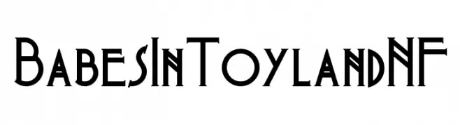
A playful and whimsical font with vintage theatrical flair.
![BabesInToylandNF Frei Schriftart Herunterladen]() Herunterladen 97 Downloads@WebFont
Herunterladen 97 Downloads@WebFont -
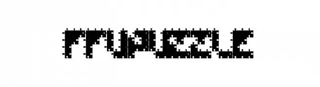
( Fonts by Jovanny Lemonad - typetype.ru - Personal-use only. For commercial use please contact owner. )
A bold, pixelated font with a jigsaw puzzle design.
![FFUPuzzle Frei Schriftart Herunterladen]() Herunterladen 97 Downloads@WebFont
Herunterladen 97 Downloads@WebFont -
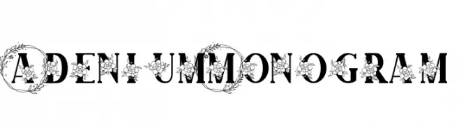
( Fonts by Mozatype )
A decorative font with floral embellishments on each character.
![Adenium Monogram Frei Schriftart Herunterladen]() Herunterladen 97 Downloads@WebFont
Herunterladen 97 Downloads@WebFont -
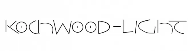
( Fonts by Manfred Klein - manfred-klein.ina-mar.com )
A modern, geometric font with sharp lines and subtle curves.
![Kochwood-Light Frei Schriftart Herunterladen]() Herunterladen 97 Downloads@WebFont
Herunterladen 97 Downloads@WebFont -
![Discover Beauty Frei Schriftart Herunterladen]() Herunterladen 97 Downloads@WebFont
Herunterladen 97 Downloads@WebFont -
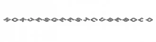
![Hokjesgeestcube Bold Frei Schriftart Herunterladen]() Herunterladen 96 Downloads@WebFont
Herunterladen 96 Downloads@WebFont -
( Fonts by Aaron Amar - Personal-use only. For commercial use please contact owner. )
A bold, italicized, and condensed decorative font with dynamic strokes.
![Kawit Free Cnd Italic Frei Schriftart Herunterladen]() Herunterladen 96 Downloads@WebFont
Herunterladen 96 Downloads@WebFont -
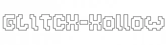
( weknow - Wino S Kadir - www.creativefabrica.com/designer/weknow/ )
A pixelated, hollow font with a glitchy, retro digital style.
![GLITCH-Hollow Frei Schriftart Herunterladen]() Herunterladen 96 Downloads@WebFont
Herunterladen 96 Downloads@WebFont -
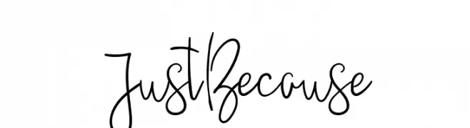
( Vladimir Fedotov )
A playful, whimsical handwritten font with tall, narrow letterforms.
![JustBecause Frei Schriftart Herunterladen]() Herunterladen 96 Downloads@WebFont
Herunterladen 96 Downloads@WebFont -
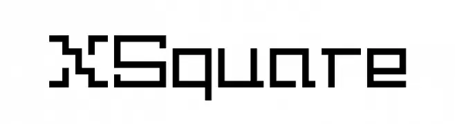
( Addax Designs - www.nt-p.net/adx/index.html )
A geometric, modular font with a square, digital appearance.
![XSquare Frei Schriftart Herunterladen]() Herunterladen 96 Downloads@WebFont
Herunterladen 96 Downloads@WebFont -
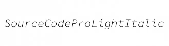
( Fonts by Adobe )
A sleek, monospaced, light italic font ideal for coding and technical applications.
![Source Code Pro Light Italic Frei Schriftart Herunterladen]() Herunterladen 96 Downloads@WebFont
Herunterladen 96 Downloads@WebFont


Welche Schriften sind gerade am populärsten?
Poppins, Roboto, Montserrat, Open Sans und Lato sind wegen ihrer klaren Formen und breiten Einsetzbarkeit sehr gefragt – von Markenauftritt über Landingpages bis hin zu Postern.
Welche Fonts eignen sich für Logos?
Geometrische Sans‑Serifs (z. B. Poppins, Familien im Gotham‑Stil) sind ein häufiger Griff für sauberes, skalierbares Branding. Für eine persönlichere Note bleiben Scripts und Handschrift‑Stile beliebt. Kombinieren Sie einen prägnanten Headline‑Font mit einer neutralen Brotschrift für Wiedererkennung und Harmonie.
Wie oft wird die Top‑Liste aktualisiert?
Regelmäßig – basierend auf realen Downloads und Interaktionen. Schauen Sie öfter vorbei, um aufstrebende Favoriten früh zu entdecken.
💡 Tipp: Seite bookmarken – Trends wechseln schnell, und heutige Top‑Schriften inspirieren morgen vielleicht das Rebranding.