Willkommen bei den Top‑Schriften – hier treffen Beliebtheit und Qualität aufeinander. Das sind die in diesem Jahr am häufigsten heruntergeladenen und genutzten Fonts. Wenn Sie sichere Optionen für Logo, Web oder Social suchen, starten Sie hier.
Jeder Top‑Font überzeugt durch Balance, Lesbarkeit und Vielseitigkeit. Sie finden moderne Sans‑Serifs, elegante Scripts, Vintage‑Serifs und minimalistische Displays.
-
( Fonts by www.junkohanhero.com - Personal-use only. For commercial use please contact owner. )
A playful, bold font with a hand-drawn, whimsical style.
 Herunterladen 546 Downloads@WebFont
 -
![Golden Girdle Frei Schriftart Herunterladen]() Herunterladen 546 Downloads@WebFont
Herunterladen 546 Downloads@WebFont -
( Fonts by Jonathan Paterson )
A casual handwritten font with dynamic strokes and an organic feel.
![JP Hand Straight Frei Schriftart Herunterladen]() Herunterladen 546 Downloads@WebFont
Herunterladen 546 Downloads@WebFont -
( Parker Creative - Alan Parker - fontbundles.net/parker-creative )
A modern, rounded inline font with a clean and contemporary style.
![Provoke Inline-Rounded Frei Schriftart Herunterladen]() Herunterladen 546 Downloads@WebFont
Herunterladen 546 Downloads@WebFont -
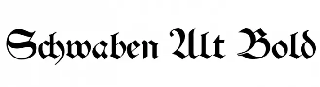
( Fonts by www.peter-wiegel.de. Personal-use only. For commercial use please contact owner. )
A bold, ornate blackletter font with a medieval aesthetic.
![Schwaben Alt Bold Frei Schriftart Herunterladen]() Herunterladen 546 Downloads@WebFont
Herunterladen 546 Downloads@WebFont -
-
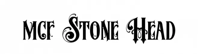
( Fonts by Mister Chek )
A bold, decorative font with intricate flourishes and a vintage feel.
![MCF Stone Head Frei Schriftart Herunterladen]() Herunterladen 546 Downloads@WebFont
Herunterladen 546 Downloads@WebFont -
( Fonts by Burhan Afif - hanscostudio.com - Personal-use only. For commercial use please contact owner. )
A bold, dynamic brush script font with expressive, hand-painted strokes.
![Buchery Frei Schriftart Herunterladen]() Herunterladen 546 Downloads@WebFont
Herunterladen 546 Downloads@WebFont -
( Fonts by Luke Owens - Personal-use only. For commercial use please contact owner. )
A bold, condensed font with strong vertical emphasis and minimal spacing.
![Oregon LDO Condensed Bold Frei Schriftart Herunterladen]() Herunterladen 546 Downloads@WebFont
Herunterladen 546 Downloads@WebFont -
( Fonts by Mocha Frappuccino - Personal-use only. For commercial use please contact owner. )
A bold, geometric font with clean lines and a modern style.
![Akira Jimbo Frei Schriftart Herunterladen]() Herunterladen 546 Downloads@WebFont
Herunterladen 546 Downloads@WebFont -
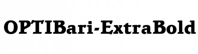
( Fonts by Castcraft Software - opti.netii.net - check the website before use )
A bold, modern serif typeface with strong, thick strokes and pronounced serifs.
![OPTIBari-ExtraBold Frei Schriftart Herunterladen]() Herunterladen 546 Downloads@WebFont
Herunterladen 546 Downloads@WebFont


Welche Schriften sind gerade am populärsten?
Poppins, Roboto, Montserrat, Open Sans und Lato sind wegen ihrer klaren Formen und breiten Einsetzbarkeit sehr gefragt – von Markenauftritt über Landingpages bis hin zu Postern.
Welche Fonts eignen sich für Logos?
Geometrische Sans‑Serifs (z. B. Poppins, Familien im Gotham‑Stil) sind ein häufiger Griff für sauberes, skalierbares Branding. Für eine persönlichere Note bleiben Scripts und Handschrift‑Stile beliebt. Kombinieren Sie einen prägnanten Headline‑Font mit einer neutralen Brotschrift für Wiedererkennung und Harmonie.
Wie oft wird die Top‑Liste aktualisiert?
Regelmäßig – basierend auf realen Downloads und Interaktionen. Schauen Sie öfter vorbei, um aufstrebende Favoriten früh zu entdecken.
💡 Tipp: Seite bookmarken – Trends wechseln schnell, und heutige Top‑Schriften inspirieren morgen vielleicht das Rebranding.