Willkommen bei den Top‑Schriften – hier treffen Beliebtheit und Qualität aufeinander. Das sind die in diesem Jahr am häufigsten heruntergeladenen und genutzten Fonts. Wenn Sie sichere Optionen für Logo, Web oder Social suchen, starten Sie hier.
Jeder Top‑Font überzeugt durch Balance, Lesbarkeit und Vielseitigkeit. Sie finden moderne Sans‑Serifs, elegante Scripts, Vintage‑Serifs und minimalistische Displays.
-
( Fonts by Hanzel Space )
A bold, playful font with rounded strokes and high contrast.
 Herunterladen 96 Downloads@WebFont
 -
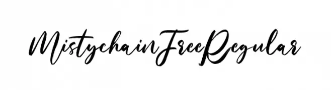
( Fonts by Maulana Creative - Gilang Maulana - Personal-use only. For commercial use please contact owner. )
A flowing, cursive font with elegant, interconnected strokes.
![Mistychain Free Regular Frei Schriftart Herunterladen]() Herunterladen 96 Downloads@WebFont
Herunterladen 96 Downloads@WebFont -
( Fonts by Daniel Zadorozny - www.iconian.com - Personal-use only. For commercial use please contact owner. )
A futuristic, italicized 3D font with a sleek, outlined design.
![Earth Orbiter 3D Italic Frei Schriftart Herunterladen]() Herunterladen 96 Downloads@WebFont
Herunterladen 96 Downloads@WebFont -
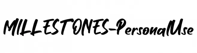
( Fonts by Haksen Studio - Sarwo Edhi Prayitno - Personal-use only. For commercial use please contact owner. )
A bold, handwritten-style font with a dynamic and expressive appearance.
![MILLESTONES - Personal Use Frei Schriftart Herunterladen]() Herunterladen 96 Downloads@WebFont
Herunterladen 96 Downloads@WebFont -
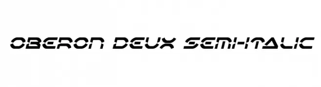
( Fonts by Iconian Fonts )
A futuristic, angular font with a bold, semi-italic style.
![Oberon Deux Semi-Italic Frei Schriftart Herunterladen]() Herunterladen 96 Downloads@WebFont
Herunterladen 96 Downloads@WebFont -
( Fonts by GoldenGraph Design - Personal-use only. For commercial use please contact owner. )
A dynamic, flowing script font with elegant, cursive letterforms.
![Ganbatte Frei Schriftart Herunterladen]() Herunterladen 96 Downloads@WebFont
Herunterladen 96 Downloads@WebFont -
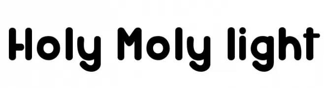
( Fonts by Greg Medina - www.dcoxy.com - Personal-use only. For commercial use please contact owner. )
A playful, rounded font with bold, bubbly characters.
![Holy Moly light Frei Schriftart Herunterladen]() Herunterladen 96 Downloads@WebFont
Herunterladen 96 Downloads@WebFont -
( elharrak - elharrak fonts - el-harrak.blogspot.com/ )
Bold, gear-shaped icon set for brands and apps.
![font 120 icons Frei Schriftart Herunterladen]() Herunterladen 96 Downloads@WebFont
Herunterladen 96 Downloads@WebFont -
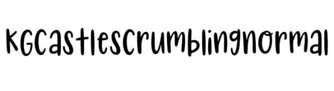
( Fonts by Kimberly Geswein )
A playful, handwritten font with a casual and friendly style.
![KG Castles Crumbling Normal Frei Schriftart Herunterladen]() Herunterladen 96 Downloads@WebFont
Herunterladen 96 Downloads@WebFont -
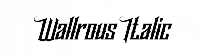
( Fonts by Kong Font - https://fontkong.com/ - Personal-use only. For commercial use please contact owner. )
A bold, italic font with angular, dynamic characters and decorative serifs.
![Wallrous Italic Frei Schriftart Herunterladen]() Herunterladen 96 Downloads@WebFont
Herunterladen 96 Downloads@WebFont -
( Fonts by Ramiro Baldivieso - behance.net/baldivieso. Personal-use only. For commercial use please contact owner. )
A bold, modern font with geometric shapes and dynamic patterned elements.
![Come Callado Regular Frei Schriftart Herunterladen]() Herunterladen 96 Downloads@WebFont
Herunterladen 96 Downloads@WebFont -
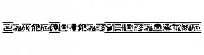
( Fonts by vector.id )
A collection of decorative hieroglyphic symbols inspired by ancient Egyptian writing.
![FontsVectorHIEROGLYPS Frei Schriftart Herunterladen]() Herunterladen 96 Downloads@WebFont
Herunterladen 96 Downloads@WebFont -
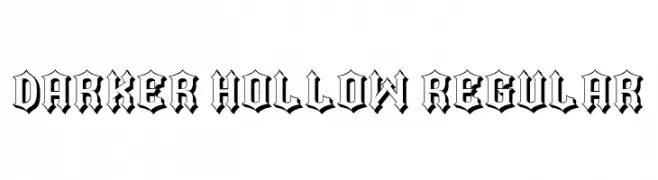
( Fonts by Vladimir Nikolic - www.creativefabrica.com/designer/vladimirnikolic/ - Personal-use only. For commercial use please contact owner. )
A bold, gothic-inspired font with a hollow interior and intricate detailing.
![Darker Hollow Regular Frei Schriftart Herunterladen]() Herunterladen 96 Downloads@WebFont
Herunterladen 96 Downloads@WebFont -
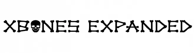
( Iconian Fonts - Daniel Zadorozny - www.iconian.com )
A playful, bone-themed font with a bold and distinctive style.
![xBONES Expanded Frei Schriftart Herunterladen]() Herunterladen 96 Downloads@WebFont
Herunterladen 96 Downloads@WebFont -
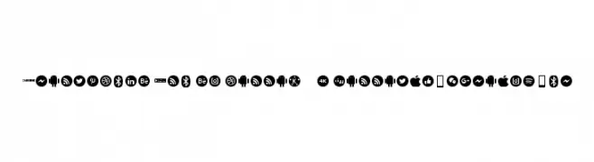
( elharrak - elharrak fonts - el-harrak.blogspot.com/ )
Bold, circular icon set for tech and social media brands.
![Smartphone Pro el harrak © : darrati10@gmail.com Frei Schriftart Herunterladen]() Herunterladen 96 Downloads@WebFont
Herunterladen 96 Downloads@WebFont -
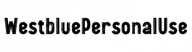
( Fonts by Ditatype )
A bold, distressed font with a vintage, hand-crafted look.
![Westblue Personal Use Frei Schriftart Herunterladen]() Herunterladen 96 Downloads@WebFont
Herunterladen 96 Downloads@WebFont -
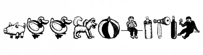
( Fonts by Manfred Klein. Free for private and charity use. Free for commercial with donation to organizations )
A woodcut-style dingbat font with playful, vintage illustrations.
![WoodcutSix Frei Schriftart Herunterladen]() Herunterladen 96 Downloads@WebFont
Herunterladen 96 Downloads@WebFont -
( Fonts by Don Marciano - Personal-use only. For commercial use please contact owner. )
A futuristic, geometric font with sharp angles and a bold, digital aesthetic.
![Galactico Basic Frei Schriftart Herunterladen]() Herunterladen 96 Downloads@WebFont
Herunterladen 96 Downloads@WebFont -
( Fonts by Graphix Line Studio )
A playful, handwritten script font with a casual and energetic style.
![Camping Time Frei Schriftart Herunterladen]() Herunterladen 96 Downloads@WebFont
Herunterladen 96 Downloads@WebFont -
( Fonts by Maulana Creative - Gilang Maulana - Personal-use only. For commercial use please contact owner. )
A flowing, cursive font with elegant, sweeping strokes and a sophisticated appearance.
![Misela Free Regular Frei Schriftart Herunterladen]() Herunterladen 96 Downloads@WebFont
Herunterladen 96 Downloads@WebFont -
( Fonts by Sahirul Iman - Personal-use only. For commercial use please contact owner. )
A bold, decorative font with thick strokes and unique curves.
![ElDurango Frei Schriftart Herunterladen]() Herunterladen 96 Downloads@WebFont
Herunterladen 96 Downloads@WebFont -
( Fonts by Iconian Fonts )
A bold, geometric font with a halftone effect, perfect for futuristic designs.
![Oberon Deux Halftone Frei Schriftart Herunterladen]() Herunterladen 96 Downloads@WebFont
Herunterladen 96 Downloads@WebFont -
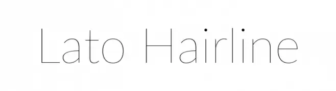
( Fonts by tyPoland Lukasz Dziedzic )
A sleek, minimalistic font with thin strokes and a modern, elegant appearance.
![Lato Hairline Frei Schriftart Herunterladen]() Herunterladen 96 Downloads@WebFont
Herunterladen 96 Downloads@WebFont -
( Savio Bellini - www.bellinistudio.eu )
A clean, modern sans-serif font with balanced spacing and consistent stroke width.
![InprimisFree Frei Schriftart Herunterladen]() Herunterladen 96 Downloads@WebFont
Herunterladen 96 Downloads@WebFont -
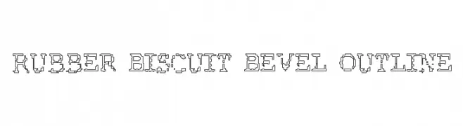
( Fonts by Dibujado )
A playful, pixelated outline font with a retro, three-dimensional look.
![Rubber Biscuit Bevel Outline Frei Schriftart Herunterladen]() Herunterladen 96 Downloads@WebFont
Herunterladen 96 Downloads@WebFont -
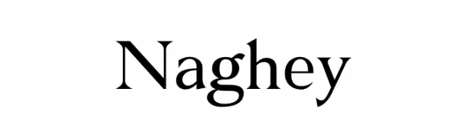
( Fonts by typeformerstudio.com - Personal-use only. For commercial use please contact owner. )
A classic serif font with elegant strokes and pronounced serifs.
![Naghey Frei Schriftart Herunterladen]() Herunterladen 96 Downloads@WebFont
Herunterladen 96 Downloads@WebFont -
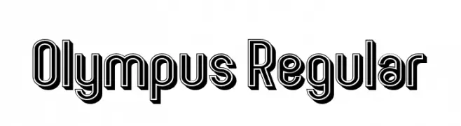
( Fonts by Vladimir Nikolic - www.creativefabrica.com/designer/vladimirnikolic/ - Personal-use only. For commercial use please contact owner. )
A bold, decorative font with a three-dimensional layered outline for a modern, dynamic look.
![Olympus Regular Frei Schriftart Herunterladen]() Herunterladen 96 Downloads@WebFont
Herunterladen 96 Downloads@WebFont -
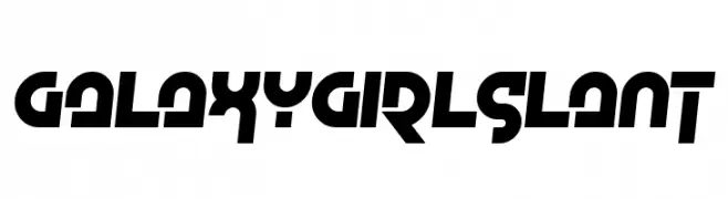
( Fonts by www.chequered.ink - Chequered Ink - Personal-use only. For commercial use please contact owner. )
A bold, futuristic font with a dynamic slant and geometric precision.
![Galaxy Girl Slant Frei Schriftart Herunterladen]() Herunterladen 96 Downloads@WebFont
Herunterladen 96 Downloads@WebFont -
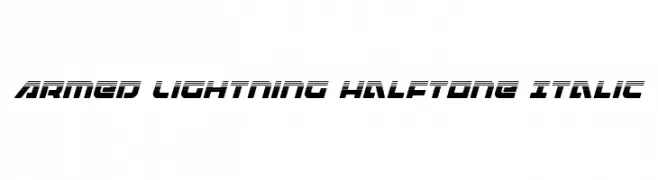
( Fonts by Iconian Fonts )
A dynamic, italicized font with a futuristic halftone and lightning-like design.
![Armed Lightning Halftone Italic Frei Schriftart Herunterladen]() Herunterladen 96 Downloads@WebFont
Herunterladen 96 Downloads@WebFont -
( Fonts by Wahyu Studio - Wahyu Setiyawan - Personal-use only. For commercial use please contact owner. )
A playful, handwritten font with a casual and friendly style.
![Mochi Frei Schriftart Herunterladen]() Herunterladen 96 Downloads@WebFont
Herunterladen 96 Downloads@WebFont -
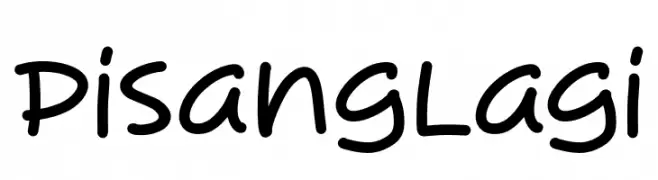
( Fonts by Syaf Rizal - Khurasan - Personal-use only. For commercial use please contact owner. )
A playful, handwritten font with rounded, consistent strokes and a casual vibe.
![Pisang Lagi Frei Schriftart Herunterladen]() Herunterladen 96 Downloads@WebFont
Herunterladen 96 Downloads@WebFont -
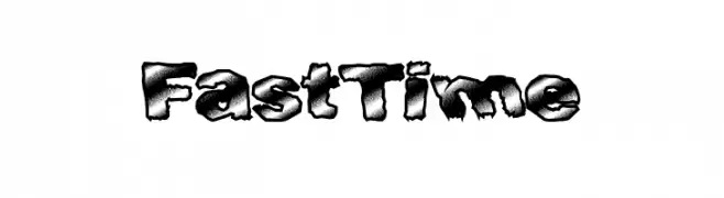
( Fonts by a Max Infeld - XEROGRAPHER FONTS - xerographer.blogspot.com . Personal-use only. For commercial use please contact owner. )
A bold, textured font with a rugged, distressed appearance.
![FastTime Frei Schriftart Herunterladen]() Herunterladen 96 Downloads@WebFont
Herunterladen 96 Downloads@WebFont -
( Iconian Fonts - Daniel Zadorozny - www.iconian.com )
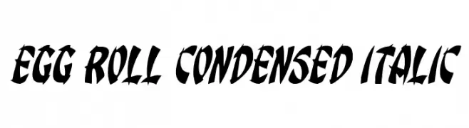
A bold, condensed, and italicized font with dynamic, sharp angles.
![Egg Roll Condensed Italic Frei Schriftart Herunterladen]() Herunterladen 96 Downloads@WebFont
Herunterladen 96 Downloads@WebFont -
( Fonts by Daniel Zadorozny - www.iconian.com - Free for personal use )
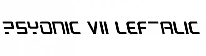
A futuristic, angular font with bold geometric characters.
![PsYonic VII Leftalic Frei Schriftart Herunterladen]() Herunterladen 96 Downloads@WebFont
Herunterladen 96 Downloads@WebFont -
( Fonts by Letterhend Studio )
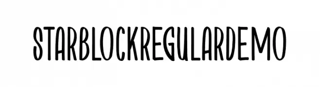
A playful handwritten font with narrow, elongated characters.
![StarblockRegularDemo Frei Schriftart Herunterladen]() Herunterladen 96 Downloads@WebFont
Herunterladen 96 Downloads@WebFont


Welche Schriften sind gerade am populärsten?
Poppins, Roboto, Montserrat, Open Sans und Lato sind wegen ihrer klaren Formen und breiten Einsetzbarkeit sehr gefragt – von Markenauftritt über Landingpages bis hin zu Postern.
Welche Fonts eignen sich für Logos?
Geometrische Sans‑Serifs (z. B. Poppins, Familien im Gotham‑Stil) sind ein häufiger Griff für sauberes, skalierbares Branding. Für eine persönlichere Note bleiben Scripts und Handschrift‑Stile beliebt. Kombinieren Sie einen prägnanten Headline‑Font mit einer neutralen Brotschrift für Wiedererkennung und Harmonie.
Wie oft wird die Top‑Liste aktualisiert?
Regelmäßig – basierend auf realen Downloads und Interaktionen. Schauen Sie öfter vorbei, um aufstrebende Favoriten früh zu entdecken.
💡 Tipp: Seite bookmarken – Trends wechseln schnell, und heutige Top‑Schriften inspirieren morgen vielleicht das Rebranding.