Willkommen bei den Top‑Schriften – hier treffen Beliebtheit und Qualität aufeinander. Das sind die in diesem Jahr am häufigsten heruntergeladenen und genutzten Fonts. Wenn Sie sichere Optionen für Logo, Web oder Social suchen, starten Sie hier.
Jeder Top‑Font überzeugt durch Balance, Lesbarkeit und Vielseitigkeit. Sie finden moderne Sans‑Serifs, elegante Scripts, Vintage‑Serifs und minimalistische Displays.
-
( CheapProFonts - Roger S. Nelsson - www.cheapprofonts.com )
A bold, geometric font with a structured, industrial style.
 Herunterladen 95 Downloads@WebFont
 -
( Fonts by Iconian Fonts )
A bold, 3D geometric font with an italic slant, ideal for dynamic and modern designs.
![Bad Axe 3D Italic Frei Schriftart Herunterladen]() Herunterladen 95 Downloads@WebFont
Herunterladen 95 Downloads@WebFont -
( Iconian Fonts - Daniel Zadorozny - www.iconian.com )
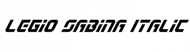
A bold, italicized font with a futuristic and dynamic style.
![Legio Sabina Italic Frei Schriftart Herunterladen]() Herunterladen 95 Downloads@WebFont
Herunterladen 95 Downloads@WebFont -
( Fonts by Tural Alisoy - Personal-use only. For commercial use please contact owner. )
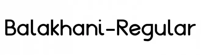
A modern, rounded sans-serif font with excellent readability and a friendly appearance.
![Balakhani-Regular Frei Schriftart Herunterladen]() Herunterladen 95 Downloads@WebFont
Herunterladen 95 Downloads@WebFont -
( Fonts by Raxel Studio - www.behance.net/raxelstudio - Personal-use only. For commercial use please contact owner. )
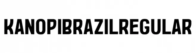
A bold, modern font with clean lines and uniform stroke width.
![Kanopi Brazil Regular Frei Schriftart Herunterladen]() Herunterladen 95 Downloads@WebFont
Herunterladen 95 Downloads@WebFont -
( Fonts by a Neale Davidson - www.pixelsagas.com. Personal-use only. For commercial use please contact owner. )
A bold, futuristic font with geometric and blocky letterforms.
![Betazed Bold Frei Schriftart Herunterladen]() Herunterladen 95 Downloads@WebFont
Herunterladen 95 Downloads@WebFont -
![JobBoofKwast Frei Schriftart Herunterladen]() Herunterladen 95 Downloads@WebFont
Herunterladen 95 Downloads@WebFont -
( Fonts by Daniel Zadorozny - www.iconian.com )
A futuristic, italicized font with bold, angular characters.
![New Mars Laser Italic Frei Schriftart Herunterladen]() Herunterladen 95 Downloads@WebFont
Herunterladen 95 Downloads@WebFont -
( Fonts by a Neale Davidson - www.pixelsagas.com. Personal-use only. For commercial use please contact owner. )
A futuristic italic font with geometric lines and a sleek, modern design.
![Betazed Italic Frei Schriftart Herunterladen]() Herunterladen 95 Downloads@WebFont
Herunterladen 95 Downloads@WebFont -
( Fonts by Ryan Rivaldo Vierra - Personal-use only. For commercial use please contact owner. )
A dynamic and energetic script font with fluid, cursive letterforms.
![Juanita Frei Schriftart Herunterladen]() Herunterladen 95 Downloads@WebFont
Herunterladen 95 Downloads@WebFont -
( Fonts by Iconian Fonts )
A bold, futuristic italic font with a dynamic halftone effect.
![Defcon Zero Halftone Italic Frei Schriftart Herunterladen]() Herunterladen 95 Downloads@WebFont
Herunterladen 95 Downloads@WebFont -
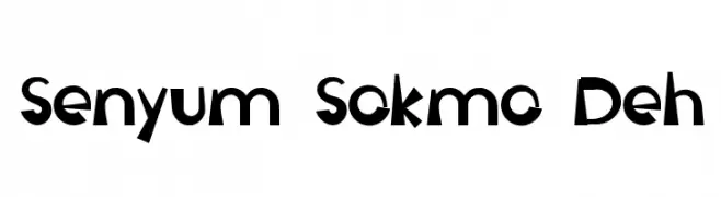
( Haslinda Adnan - Kak Alin - alinscartoon.blogspot.my/ )
A playful and whimsical font with bold, irregular shapes and dynamic strokes.
![Senyum Sokmo Deh Frei Schriftart Herunterladen]() Herunterladen 95 Downloads@WebFont
Herunterladen 95 Downloads@WebFont -
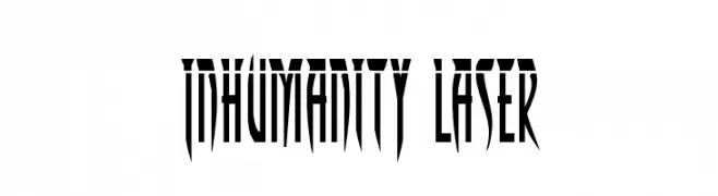
( Fonts by Daniel Zadorozny - www.iconian.com )
A futuristic, angular font with sharp, elongated strokes and a geometric structure.
![Inhumanity Laser Frei Schriftart Herunterladen]() Herunterladen 95 Downloads@WebFont
Herunterladen 95 Downloads@WebFont -
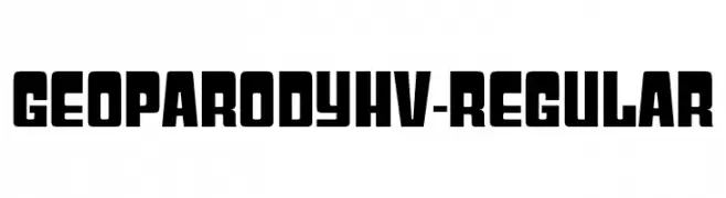
( Fonts by Typodermic Fonts - Raymond Larabie - Personal-use only. For commercial use please contact owner. )
A bold, geometric font with strong lines and modern appeal.
![GeoparodyHv-Regular Frei Schriftart Herunterladen]() Herunterladen 95 Downloads@WebFont
Herunterladen 95 Downloads@WebFont -
( Fonts by a Neale Davidson - www.pixelsagas.com. Personal-use only. For commercial use please contact owner. )
A bold, angular font inspired by ancient runic scripts, ideal for historical or thematic designs.
![Eyvindr Frei Schriftart Herunterladen]() Herunterladen 95 Downloads@WebFont
Herunterladen 95 Downloads@WebFont -
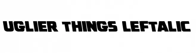
( Iconian Fonts - Daniel Zadorozny - www.iconian.com )
A bold, slanted font with blocky characters and a retro-modern style.
![Uglier Things Leftalic Frei Schriftart Herunterladen]() Herunterladen 95 Downloads@WebFont
Herunterladen 95 Downloads@WebFont -
( Fonts by PutraCetol Studio )
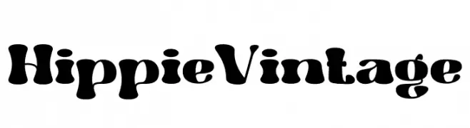
A bold, vintage-inspired font with a playful, retro aesthetic.
![Hippie Vintage Frei Schriftart Herunterladen]() Herunterladen 95 Downloads@WebFont
Herunterladen 95 Downloads@WebFont -
( Fonts by Wino S Kadir - weknow - www.revolge.com/shop/weknow/ - Personal-use only. For commercial use please contact owner. )
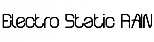
A modern, geometric font with clean lines and a futuristic style.
![Electro Static RAIN Frei Schriftart Herunterladen]() Herunterladen 95 Downloads@WebFont
Herunterladen 95 Downloads@WebFont -
( Fonts by Misti`s Fonts - mistifonts.com - Personal-use only. For commercial use please contact owner. )
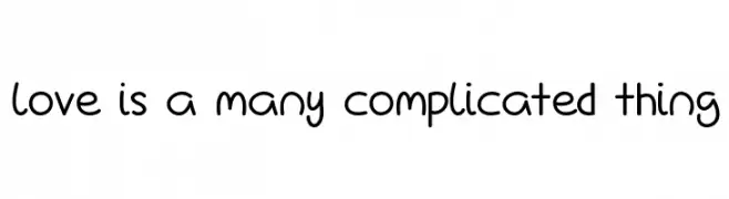
A playful, rounded handwritten font with smooth curves and a friendly appearance.
![Love Is A Many Complicated Thing Frei Schriftart Herunterladen]() Herunterladen 95 Downloads@WebFont
Herunterladen 95 Downloads@WebFont -
( Fonts by Vacatype Co. - Vacatype - Personal-use only. For commercial use please contact owner. )
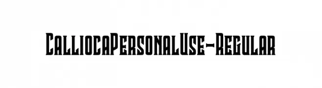
A bold, angular font with a strong, authoritative presence.
![CalliocaPersonalUse-Regular Frei Schriftart Herunterladen]() Herunterladen 95 Downloads@WebFont
Herunterladen 95 Downloads@WebFont -
![toriswriting Frei Schriftart Herunterladen]() Herunterladen 95 Downloads@WebFont
Herunterladen 95 Downloads@WebFont -
( Fonts by Ketikata Studio - Fuad Hasan - Personal-use only. For commercial use please contact owner. )
A dynamic and elegant script font with flowing, handwritten style.
![The Rich Jullietta DEMO Frei Schriftart Herunterladen]() Herunterladen 95 Downloads@WebFont
Herunterladen 95 Downloads@WebFont -
( London's Letters - www.londonsletters.com/ )
A whimsical font featuring beloved children's show characters integrated into bold, sans-serif letters.
![LMS Won't You Be My Neighbor Frei Schriftart Herunterladen]() Herunterladen 95 Downloads@WebFont
Herunterladen 95 Downloads@WebFont -
![TropicanaNF Frei Schriftart Herunterladen]() Herunterladen 95 Downloads@WebFont
Herunterladen 95 Downloads@WebFont -
( Fonts by Igor Kosinsky - Personal-use only. For commercial use please contact owner. )
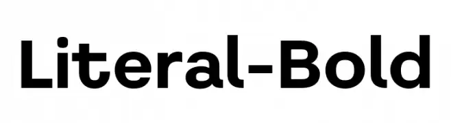
A bold, sans-serif typeface with clean lines and uniform stroke widths.
![Literal-Bold Frei Schriftart Herunterladen]() Herunterladen 95 Downloads@WebFont
Herunterladen 95 Downloads@WebFont -
( Iconian Fonts - Daniel Zadorozny - www.iconian.com )
A bold, geometric font with a futuristic and industrial design.
![New Comic Title Laser Frei Schriftart Herunterladen]() Herunterladen 95 Downloads@WebFont
Herunterladen 95 Downloads@WebFont -
( Nouman )
A circuit-inspired font with intricate line patterns and a futuristic feel.
![Sword of Circuits-Regular Frei Schriftart Herunterladen]() Herunterladen 95 Downloads@WebFont
Herunterladen 95 Downloads@WebFont -
( Fonts by Pentagram / MCKL - Personal-use only. For commercial use please contact owner. )
A modern, medium-weight italic sans-serif font with a clean and dynamic style.
![Rosa Sans Medium Italic Frei Schriftart Herunterladen]() Herunterladen 95 Downloads@WebFont
Herunterladen 95 Downloads@WebFont -
( Fonts by Font People - Personal-use only. For commercial use please contact owner. )
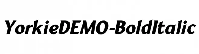
A bold and italicized font with strong, dynamic strokes.
![YorkieDEMO-BoldItalic Frei Schriftart Herunterladen]() Herunterladen 95 Downloads@WebFont
Herunterladen 95 Downloads@WebFont -
( Fonts by Billy Argel Fonts - www.billyargel.com - Personal-use only. For commercial use please contact owner. )
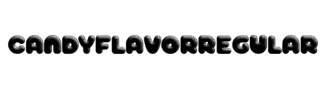
A playful, bold font with a bubble-like, halftone design.
![CANDY FLAVOR Regular Frei Schriftart Herunterladen]() Herunterladen 95 Downloads@WebFont
Herunterladen 95 Downloads@WebFont -
( Endie )
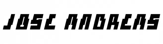
A bold, angular font with a futuristic and geometric design.
![Jose Andreas Frei Schriftart Herunterladen]() Herunterladen 95 Downloads@WebFont
Herunterladen 95 Downloads@WebFont -
( Fonts by Woodcutter )
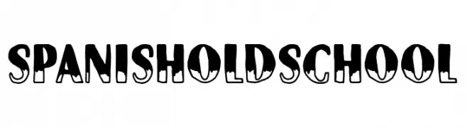
A bold, decorative font with an old-school, hand-drawn style.
![Spanish Old School Frei Schriftart Herunterladen]() Herunterladen 95 Downloads@WebFont
Herunterladen 95 Downloads@WebFont -
( Fonts by Pinisiart )
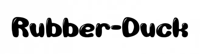
A playful, bold font with rounded, bubble-like characters ideal for fun, decorative projects.
![Rubber-Duck Frei Schriftart Herunterladen]() Herunterladen 95 Downloads@WebFont
Herunterladen 95 Downloads@WebFont -
( Fonts by Etik Fatimah )
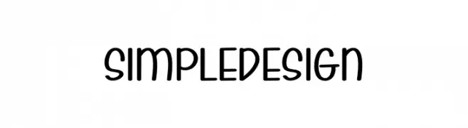
A playful, rounded font with smooth curves and a modern, whimsical style.
![Simple Design Frei Schriftart Herunterladen]() Herunterladen 95 Downloads@WebFont
Herunterladen 95 Downloads@WebFont -
( Fonts by Attype Studio - Fadli Ramadhan Iskandar - Personal-use only. For commercial use please contact owner. )
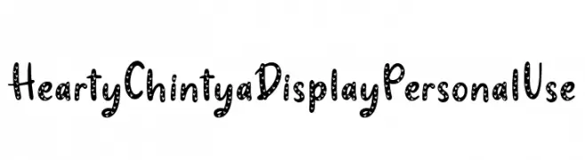
A playful, heart-patterned decorative font with a whimsical and friendly style.
![Hearty Chintya Display Personal Use Frei Schriftart Herunterladen]() Herunterladen 95 Downloads@WebFont
Herunterladen 95 Downloads@WebFont


Welche Schriften sind gerade am populärsten?
Poppins, Roboto, Montserrat, Open Sans und Lato sind wegen ihrer klaren Formen und breiten Einsetzbarkeit sehr gefragt – von Markenauftritt über Landingpages bis hin zu Postern.
Welche Fonts eignen sich für Logos?
Geometrische Sans‑Serifs (z. B. Poppins, Familien im Gotham‑Stil) sind ein häufiger Griff für sauberes, skalierbares Branding. Für eine persönlichere Note bleiben Scripts und Handschrift‑Stile beliebt. Kombinieren Sie einen prägnanten Headline‑Font mit einer neutralen Brotschrift für Wiedererkennung und Harmonie.
Wie oft wird die Top‑Liste aktualisiert?
Regelmäßig – basierend auf realen Downloads und Interaktionen. Schauen Sie öfter vorbei, um aufstrebende Favoriten früh zu entdecken.
💡 Tipp: Seite bookmarken – Trends wechseln schnell, und heutige Top‑Schriften inspirieren morgen vielleicht das Rebranding.