Willkommen bei den Top‑Schriften – hier treffen Beliebtheit und Qualität aufeinander. Das sind die in diesem Jahr am häufigsten heruntergeladenen und genutzten Fonts. Wenn Sie sichere Optionen für Logo, Web oder Social suchen, starten Sie hier.
Jeder Top‑Font überzeugt durch Balance, Lesbarkeit und Vielseitigkeit. Sie finden moderne Sans‑Serifs, elegante Scripts, Vintage‑Serifs und minimalistische Displays.
-
 Herunterladen 539 Downloads@WebFont
 -
![Arcade I Frei Schriftart Herunterladen]() Herunterladen 539 Downloads@WebFont
Herunterladen 539 Downloads@WebFont -
![KR Twinkle Frei Schriftart Herunterladen]() Herunterladen 539 Downloads@WebFont
Herunterladen 539 Downloads@WebFont -
( Fonts by Daniel Zadorozny - www.iconian.com - Personal-use only. For commercial use please contact owner. )
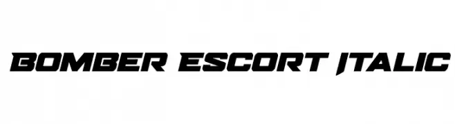
A bold, italicized font with a futuristic and dynamic style.
![Bomber Escort Italic Frei Schriftart Herunterladen]() Herunterladen 538 Downloads@WebFont
Herunterladen 538 Downloads@WebFont -
( Fonts by Alvin Danang - Personal-use only. For commercial use please contact owner. )
A bold, hand-painted font with dynamic, expressive strokes.
![Horets Frei Schriftart Herunterladen]() Herunterladen 538 Downloads@WebFont
Herunterladen 538 Downloads@WebFont -
-
( Fonts by Manfred Klein. Free for private and charity use. Free for commercial with donation to organizations )
A refined serif font with elegant curves and a modern touch.
![Burklein Frei Schriftart Herunterladen]() Herunterladen 538 Downloads@WebFont
Herunterladen 538 Downloads@WebFont -
![Wolf's Bane Bold Outline Frei Schriftart Herunterladen]() Herunterladen 538 Downloads@WebFont
Herunterladen 538 Downloads@WebFont -
![Angelic Regular Frei Schriftart Herunterladen]() Herunterladen 538 Downloads@WebFont
Herunterladen 538 Downloads@WebFont -
( Fonts by Typodermic Fonts )
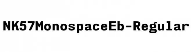
A bold, modern monospaced font with geometric shapes and uniform character width.
![NK57MonospaceEb-Regular Frei Schriftart Herunterladen]() Herunterladen 538 Downloads@WebFont
Herunterladen 538 Downloads@WebFont -
( Fonts by a Emily Spadoni - http://creativemarket.com/emilyspadoni/. Personal-use only. For commercial use please contact owner. )
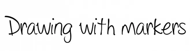
A playful, marker-style handwritten font with smooth, rounded strokes.
![Drawing with markers Frei Schriftart Herunterladen]() Herunterladen 538 Downloads@WebFont
Herunterladen 538 Downloads@WebFont


Welche Schriften sind gerade am populärsten?
Poppins, Roboto, Montserrat, Open Sans und Lato sind wegen ihrer klaren Formen und breiten Einsetzbarkeit sehr gefragt – von Markenauftritt über Landingpages bis hin zu Postern.
Welche Fonts eignen sich für Logos?
Geometrische Sans‑Serifs (z. B. Poppins, Familien im Gotham‑Stil) sind ein häufiger Griff für sauberes, skalierbares Branding. Für eine persönlichere Note bleiben Scripts und Handschrift‑Stile beliebt. Kombinieren Sie einen prägnanten Headline‑Font mit einer neutralen Brotschrift für Wiedererkennung und Harmonie.
Wie oft wird die Top‑Liste aktualisiert?
Regelmäßig – basierend auf realen Downloads und Interaktionen. Schauen Sie öfter vorbei, um aufstrebende Favoriten früh zu entdecken.
💡 Tipp: Seite bookmarken – Trends wechseln schnell, und heutige Top‑Schriften inspirieren morgen vielleicht das Rebranding.