Willkommen bei den Top‑Schriften – hier treffen Beliebtheit und Qualität aufeinander. Das sind die in diesem Jahr am häufigsten heruntergeladenen und genutzten Fonts. Wenn Sie sichere Optionen für Logo, Web oder Social suchen, starten Sie hier.
Jeder Top‑Font überzeugt durch Balance, Lesbarkeit und Vielseitigkeit. Sie finden moderne Sans‑Serifs, elegante Scripts, Vintage‑Serifs und minimalistische Displays.
-
( Copyright (c) 2011, Eduardo Tunni (http://www.tipo.net.ar) )
A bold and elegant font with a classic and sophisticated style.
 Herunterladen 1818 Downloads@WebFont
 -
( Copyright (c) 2014, Indian Type Foundry (info@indiantypefoundry.com). )
A modern and elegant font with clean lines and balanced proportions.
![Laila Frei Schriftart Herunterladen]() Herunterladen 1818 Downloads@WebFont
Herunterladen 1818 Downloads@WebFont -
( Google Web Fonts )
A modern, italic sans-serif font with clean lines and excellent readability.
![Open Sans Italic Frei Schriftart Herunterladen]() Herunterladen 1818 Downloads@WebFont
Herunterladen 1818 Downloads@WebFont -
![Allembert!]() Herunterladen 1818 Downloads@WebFont
Herunterladen 1818 Downloads@WebFont -
( Fonts by Daniel Zadorozny - www.iconian.com - Free for personal use )
A bold, futuristic font with geometric and dynamic design elements.
![Galant Frei Schriftart Herunterladen]() Herunterladen 1818 Downloads@WebFont
Herunterladen 1818 Downloads@WebFont -
-
![NCAA Southern Miss 1 Frei Schriftart Herunterladen]() Herunterladen 1817 Downloads@WebFont
Herunterladen 1817 Downloads@WebFont -
( Copyright (c) 2010, Matt McInerney (matt@pixelspread.com) )
A modern, italic sans-serif font with clean lines and a professional appearance.
![Raleway Italic Frei Schriftart Herunterladen]() Herunterladen 1817 Downloads@WebFont
Herunterladen 1817 Downloads@WebFont -
( Fonts by Manuel Ramos )
A sleek, modern font with rounded edges and a minimalist aesthetic.
![Artesana Frei Schriftart Herunterladen]() Herunterladen 1817 Downloads@WebFont
Herunterladen 1817 Downloads@WebFont -
( Fonts by Geronimo Fonts - Personal-use only. For commercial use please contact owner. )
A playful, handwritten font with tall, narrow letters and a casual style.
![Hammers.and.Strings Frei Schriftart Herunterladen]() Herunterladen 1817 Downloads@WebFont
Herunterladen 1817 Downloads@WebFont -
![Impossible Frei Schriftart Herunterladen]() Herunterladen 1817 Downloads@WebFont
Herunterladen 1817 Downloads@WebFont -
( Copyright (c) 2014, Indian Type Foundry (info@indiantypefoundry.com). )
A classic serif typeface with medium contrast and elegant serifs.
![Karma Medium Frei Schriftart Herunterladen]() Herunterladen 1816 Downloads@WebFont
Herunterladen 1816 Downloads@WebFont -
( Fonts by BLKBK - https://blkbk.ink - Personal-use only. For commercial use please contact owner. Sponsoren Schriftart )
A dynamic script font with a modern, handwritten style.
![High Tide Frei Schriftart Herunterladen]() Herunterladen 1816 Downloads
Herunterladen 1816 Downloads -
![Belfast Frei Schriftart Herunterladen]() Herunterladen 1816 Downloads@WebFont
Herunterladen 1816 Downloads@WebFont -
( Fonts by Cristiano Sobral - Personal-use only. For commercial use please contact owner. )
A bold, high-contrast serif font with a strong, authoritative presence.
![Avrile Serif Black Frei Schriftart Herunterladen]() Herunterladen 1815 Downloads@WebFont
Herunterladen 1815 Downloads@WebFont -
( Fonts by Luke Owens - Personal-use only. For commercial use please contact owner. )
A classic serif font with elegant strokes and refined details.
![Portland LDO Frei Schriftart Herunterladen]() Herunterladen 1815 Downloads@WebFont
Herunterladen 1815 Downloads@WebFont -
Schriftart von fontdationstudio. For commercial use please contact the owner.
( Thank you for downloading this font This font is free for PERSONAL USE ONLY! Commercial license for this font can be purchased at: http://bit.ly/2xZ1K2U )
A graceful script font with flowing cursive letters and decorative swashes.
![Aurella-Script Frei Schriftart Herunterladen]() Herunterladen 1815 Downloads@WebFont
Herunterladen 1815 Downloads@WebFont -
![Meltix Bold Demo Frei Schriftart Herunterladen]() Herunterladen 1815 Downloads@WebFont
Herunterladen 1815 Downloads@WebFont -
( Fonts by Daniel Zadorozny - www.iconian.com )
A sleek, modern, and condensed font with a futuristic aesthetic.
![Grand Sport Condensed Frei Schriftart Herunterladen]() Herunterladen 1815 Downloads@WebFont
Herunterladen 1815 Downloads@WebFont -
![SKOYArwahTuyul Frei Schriftart Herunterladen]() Herunterladen 1815 Downloads@WebFont
Herunterladen 1815 Downloads@WebFont -
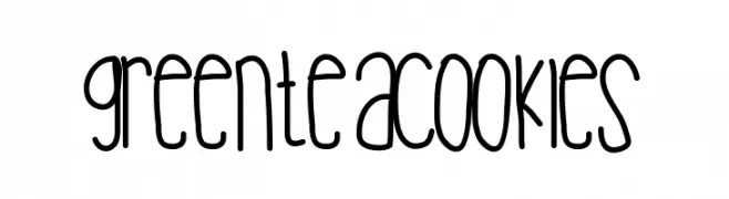
![Greenteacookies Frei Schriftart Herunterladen]() Herunterladen 1815 Downloads@WebFont
Herunterladen 1815 Downloads@WebFont -
( Fonts by Sam Wang )
A casual, handwritten font with dynamic, fluid strokes.
![Handwriting Frei Schriftart Herunterladen]() Herunterladen 1815 Downloads@WebFont
Herunterladen 1815 Downloads@WebFont -
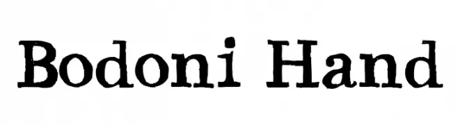
![Bodoni Hand Frei Schriftart Herunterladen]() Herunterladen 1815 Downloads@WebFont
Herunterladen 1815 Downloads@WebFont -
( Fonts by www.fontdiner.com )
A whimsical and bold font with decorative swirls and exaggerated serifs.
![Musicals Frei Schriftart Herunterladen]() Herunterladen 1815 Downloads@WebFont
Herunterladen 1815 Downloads@WebFont -
( Fonts by Digital Graphics Labs - www.digitalgraphiclabs.com )
A bold, angular font with a strong geometric style.
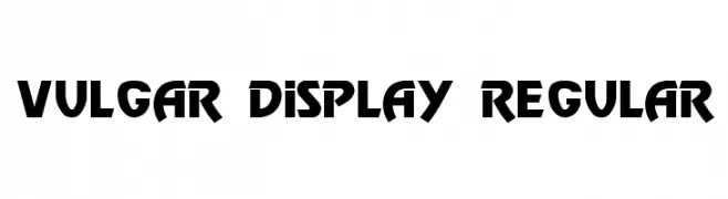
![Vulgar Display Regular Frei Schriftart Herunterladen]() Herunterladen 1815 Downloads@WebFont
Herunterladen 1815 Downloads@WebFont -
( imagex - www.imagex-fonts.com )
A bold, spray paint-inspired font with dynamic, irregular strokes.
![Sister Spray Frei Schriftart Herunterladen]() Herunterladen 1814 Downloads@WebFont
Herunterladen 1814 Downloads@WebFont -
( Copyright 2008 The Sunflower Project Authors )
A modern sans-serif font with geometric shapes and balanced proportions.
![Sunflower Medium Frei Schriftart Herunterladen]() Herunterladen 1814 Downloads@WebFont
Herunterladen 1814 Downloads@WebFont -
( Copyright (c) 2012 by Brian J. Bonislawsky DBA Astigmatic (AOETI) (astigma@astigmatic.com), with Reserved Font Name 'Mouse Memoirs' )
A playful, bold font with a whimsical, cartoon-like style.
![Mouse Memoirs Frei Schriftart Herunterladen]() Herunterladen 1814 Downloads@WebFont
Herunterladen 1814 Downloads@WebFont -
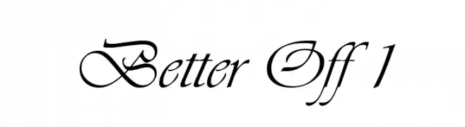
![Better Off 1 Frei Schriftart Herunterladen]() Herunterladen 1814 Downloads@WebFont
Herunterladen 1814 Downloads@WebFont -
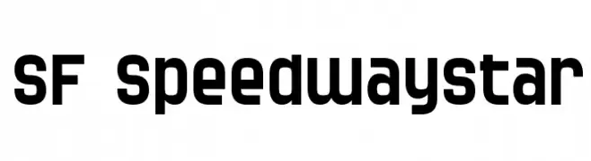
( Fonts by ShyFonts )
A bold, geometric sans-serif font with a modern, sporty aesthetic.
![SF Speedwaystar Frei Schriftart Herunterladen]() Herunterladen 1814 Downloads@WebFont
Herunterladen 1814 Downloads@WebFont -
( Fonts by Cumberland Fontworks - http://www222.pair.com/sjohn/fonts.htm - S. John Ross )
A distressed, textured font with a vintage, grungy aesthetic.
![Nicotine Stains Frei Schriftart Herunterladen]() Herunterladen 1814 Downloads@WebFont
Herunterladen 1814 Downloads@WebFont -
![Malachim Frei Schriftart Herunterladen]() Herunterladen 1814 Downloads@WebFont
Herunterladen 1814 Downloads@WebFont -
( Fonts by Khurasan )
A playful, bold font with rounded, thick strokes and a friendly appearance.
![Take Coffee Frei Schriftart Herunterladen]() Herunterladen 1813 Downloads@WebFont
Herunterladen 1813 Downloads@WebFont -
![Gourmet Hearth Frei Schriftart Herunterladen]() Herunterladen 1813 Downloads@WebFont
Herunterladen 1813 Downloads@WebFont -
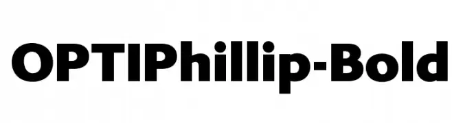
( Fonts by Castcraft Software - OPTI Fonts Archive - opti.netii.net - Personal-use only. For commercial use please contact owner. )
A bold, modern typeface with strong, thick strokes and a clean, contemporary style.
![OPTIPhillip-Bold Frei Schriftart Herunterladen]() Herunterladen 1813 Downloads@WebFont
Herunterladen 1813 Downloads@WebFont -
( Font by Jayvee D. Enaguas - grandchaos9000.deviantart.com )
A bold, modern font with geometric lines and consistent stroke width.
![Monkirta Pursuit NC Frei Schriftart Herunterladen]() Herunterladen 1813 Downloads@WebFont
Herunterladen 1813 Downloads@WebFont


Welche Schriften sind gerade am populärsten?
Poppins, Roboto, Montserrat, Open Sans und Lato sind wegen ihrer klaren Formen und breiten Einsetzbarkeit sehr gefragt – von Markenauftritt über Landingpages bis hin zu Postern.
Welche Fonts eignen sich für Logos?
Geometrische Sans‑Serifs (z. B. Poppins, Familien im Gotham‑Stil) sind ein häufiger Griff für sauberes, skalierbares Branding. Für eine persönlichere Note bleiben Scripts und Handschrift‑Stile beliebt. Kombinieren Sie einen prägnanten Headline‑Font mit einer neutralen Brotschrift für Wiedererkennung und Harmonie.
Wie oft wird die Top‑Liste aktualisiert?
Regelmäßig – basierend auf realen Downloads und Interaktionen. Schauen Sie öfter vorbei, um aufstrebende Favoriten früh zu entdecken.
💡 Tipp: Seite bookmarken – Trends wechseln schnell, und heutige Top‑Schriften inspirieren morgen vielleicht das Rebranding.