Willkommen bei den Top‑Schriften – hier treffen Beliebtheit und Qualität aufeinander. Das sind die in diesem Jahr am häufigsten heruntergeladenen und genutzten Fonts. Wenn Sie sichere Optionen für Logo, Web oder Social suchen, starten Sie hier.
Jeder Top‑Font überzeugt durch Balance, Lesbarkeit und Vielseitigkeit. Sie finden moderne Sans‑Serifs, elegante Scripts, Vintage‑Serifs und minimalistische Displays.
-
( Blahfonts - www.gwydir.demon.co.uk/giles/ )
A modern, geometric font with consistent stroke widths and a clean appearance.
 Herunterladen 91 Downloads@WebFont
 -
( Fonts by Lettersiro Studio - Muhammad Sirojuddin - Personal-use only. For commercial use please contact owner. )
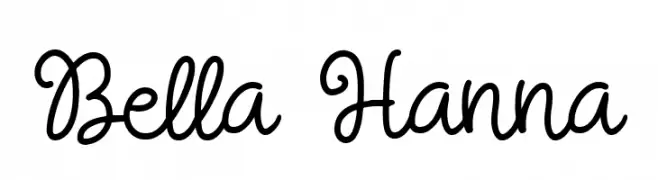
A playful and elegant script font with a handwritten, cursive style.
![Bella Hanna Frei Schriftart Herunterladen]() Herunterladen 91 Downloads@WebFont
Herunterladen 91 Downloads@WebFont -
( Fonts by Maulana Creative - Gilang Maulana - Personal-use only. For commercial use please contact owner. )
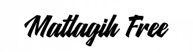
A bold, dynamic script font with a brush lettering style.
![Matlagih Free Frei Schriftart Herunterladen]() Herunterladen 91 Downloads@WebFont
Herunterladen 91 Downloads@WebFont -
![PWChristmastime Frei Schriftart Herunterladen]() Herunterladen 91 Downloads@WebFont
Herunterladen 91 Downloads@WebFont -
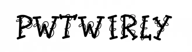
![PWTwirly Frei Schriftart Herunterladen]() Herunterladen 91 Downloads@WebFont
Herunterladen 91 Downloads@WebFont -
( Fonts by Kat`s Fun Fonts - Personal-use only. For commercial use please contact owner. )
A bold, decorative font with fish graphics for a playful aquatic theme.
![KR Angler Frei Schriftart Herunterladen]() Herunterladen 91 Downloads@WebFont
Herunterladen 91 Downloads@WebFont -
( Fonts by Maulana Creative - Gilang Maulana - Personal-use only. For commercial use please contact owner. )
A fluid and elegant script font with interconnected, calligraphic letterforms.
![Purplemonths Free Regular Frei Schriftart Herunterladen]() Herunterladen 91 Downloads@WebFont
Herunterladen 91 Downloads@WebFont -
( Typodermic Fonts - Ray Larabie - www.typodermicfonts.com/ )
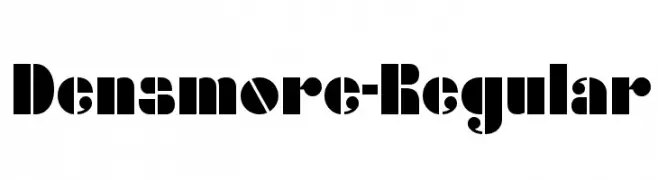
A bold, decorative font with high contrast and unique geometric cutouts.
![Densmore-Regular Frei Schriftart Herunterladen]() Herunterladen 91 Downloads@WebFont
Herunterladen 91 Downloads@WebFont -
( Fonts by Billy Argel )
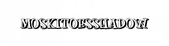
A bold, shadowed font with a three-dimensional, playful style.
![MOSKITOES SHADOW Frei Schriftart Herunterladen]() Herunterladen 91 Downloads@WebFont
Herunterladen 91 Downloads@WebFont -
( Fonts by Behnam - Personal-use only. For commercial use please contact owner. )
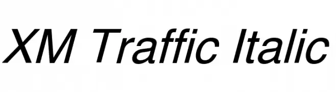
A modern, italic font with clean lines and dynamic slant.
![XM Traffic Italic Frei Schriftart Herunterladen]() Herunterladen 91 Downloads@WebFont
Herunterladen 91 Downloads@WebFont -
( Fonts by Iconian Fonts )
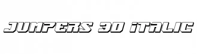
A bold, 3D italic font with a futuristic and dynamic style.
![Jumpers 3D Italic Frei Schriftart Herunterladen]() Herunterladen 91 Downloads@WebFont
Herunterladen 91 Downloads@WebFont -
( Deffeyes Design - www.deffeyes.com/ )
A modern calligraphic font with sharp, angular strokes and elegant flourishes.
![Kells Frei Schriftart Herunterladen]() Herunterladen 91 Downloads@WebFont
Herunterladen 91 Downloads@WebFont -
( Fonts by Daniel Zadorozny - www.iconian.com - Free for personal use )
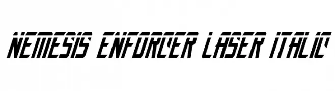
A bold, italic, futuristic font with sharp, angular lines.
![Nemesis Enforcer Laser Italic Frei Schriftart Herunterladen]() Herunterladen 91 Downloads@WebFont
Herunterladen 91 Downloads@WebFont -
( Iconian Fonts - Daniel Zadorozny - www.iconian.com )
A bold, decorative font with a futuristic striped pattern and geometric shapes.
![Lifeforce Chrome Frei Schriftart Herunterladen]() Herunterladen 91 Downloads@WebFont
Herunterladen 91 Downloads@WebFont -
( Fonts by Dharmas Studio )
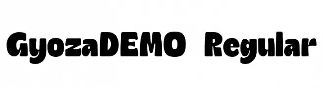
A bold, playful font with rounded, chunky characters and a retro-modern vibe.
![GyozaDEMO-Regular Frei Schriftart Herunterladen]() Herunterladen 91 Downloads@WebFont
Herunterladen 91 Downloads@WebFont -
( Fonts by Iconian Fonts )
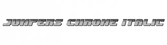
A bold, futuristic font with a 3D effect and italicized slant.
![Jumpers Chrome Italic Frei Schriftart Herunterladen]() Herunterladen 91 Downloads@WebFont
Herunterladen 91 Downloads@WebFont -
( Fonts by Kreative Korporation - www.kreativekorp.com )
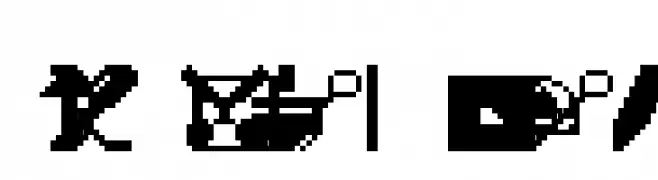
Pixel-based icon set inspired by early computer UI graphics.
![Engelbart Raw Frei Schriftart Herunterladen]() Herunterladen 91 Downloads@WebFont
Herunterladen 91 Downloads@WebFont -
( Fonts by David Espinosa [Type Sailor] - www.facebook.com/typesailor - Personal-use only. For commercial use please contact owner. )
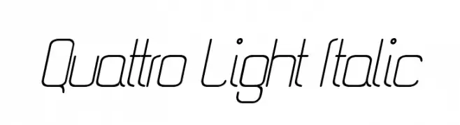
A sleek, modern italic font with thin, elongated letterforms and a geometric style.
![Quattro Light Italic Frei Schriftart Herunterladen]() Herunterladen 91 Downloads@WebFont
Herunterladen 91 Downloads@WebFont -
( Fonts by www.junkohanhero.com - Personal-use only. For commercial use please contact owner. )
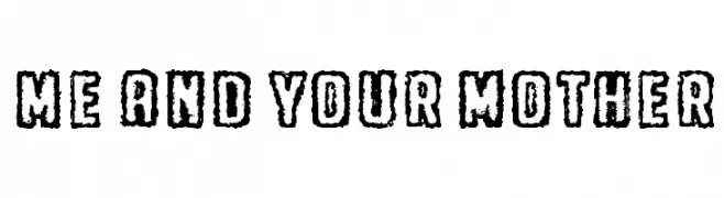
A bold, textured font with a distressed, hand-drawn appearance.
![Me and your mother Frei Schriftart Herunterladen]() Herunterladen 91 Downloads@WebFont
Herunterladen 91 Downloads@WebFont -
( Fonts by Michelle Pha - Personal-use only. For commercial use please contact owner. )
A casual, handwritten font with a playful and informal style.
![My_handwriting Frei Schriftart Herunterladen]() Herunterladen 91 Downloads@WebFont
Herunterladen 91 Downloads@WebFont -
( Fonts by Pizzadude )
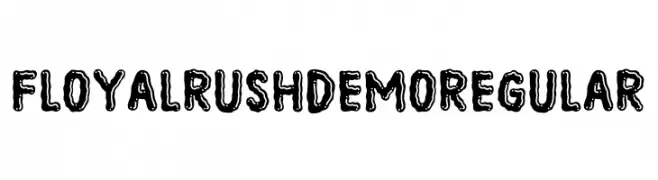
A bold, decorative font with a hand-drawn, textured style.
![Floyal Rush DEMO Regular Frei Schriftart Herunterladen]() Herunterladen 91 Downloads@WebFont
Herunterladen 91 Downloads@WebFont -
( Personal-use only. For commercial use please contact owner. )
Bold, geometric icon set with high legibility and uniform style.
![UniCons Frei Schriftart Herunterladen]() Herunterladen 91 Downloads@WebFont
Herunterladen 91 Downloads@WebFont -
( Fonts by Daniel Zadorozny - www.iconian.com )
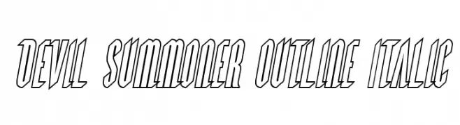
Bold, italicized outline font with a dynamic and edgy style.
![Devil Summoner Outline Italic Frei Schriftart Herunterladen]() Herunterladen 91 Downloads@WebFont
Herunterladen 91 Downloads@WebFont -
( Fonts by Daniel Zadorozny - www.iconian.com )
A bold, Western-style font with thick serifs and a rugged aesthetic.
![Western Rail Frei Schriftart Herunterladen]() Herunterladen 91 Downloads@WebFont
Herunterladen 91 Downloads@WebFont -
( Fonts by Balev - Balevgraph Studio - Personal-use only. For commercial use please contact owner. )
A stylish and elegant script font with fluid, cursive letterforms.
![Ceverland Frei Schriftart Herunterladen]() Herunterladen 91 Downloads@WebFont
Herunterladen 91 Downloads@WebFont -
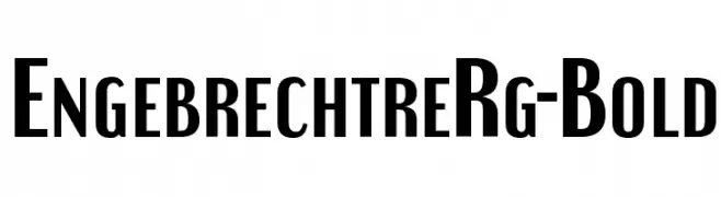
( Typodermic Fonts - Ray Larabie - www.typodermicfonts.com/ )
A bold, modern font with tall, narrow letterforms.
![EngebrechtreRg-Bold Frei Schriftart Herunterladen]() Herunterladen 91 Downloads@WebFont
Herunterladen 91 Downloads@WebFont -
( Fonts by IHD )
A bold, decorative font with swirling embellishments and a strong visual impact.
![Makari Bold Frei Schriftart Herunterladen]() Herunterladen 91 Downloads@WebFont
Herunterladen 91 Downloads@WebFont -
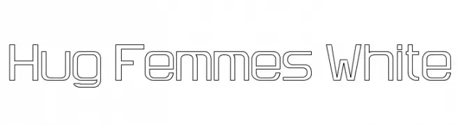
( Fonts by David Espinosa [Type Sailor] - www.facebook.com/typesailor - Personal-use only. For commercial use please contact owner. )
A geometric, outlined font with a modern, technical style.
![Hug Femmes White Frei Schriftart Herunterladen]() Herunterladen 91 Downloads@WebFont
Herunterladen 91 Downloads@WebFont -
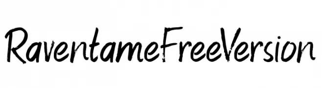
( Fonts by ViactionType - Lukman Hidayat - Personal-use only. For commercial use please contact owner. )
A bold, expressive handwritten font with brush-like strokes.
![RaventameFreeVersion Frei Schriftart Herunterladen]() Herunterladen 91 Downloads@WebFont
Herunterladen 91 Downloads@WebFont -
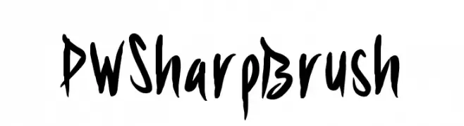
( Fonts by Peax Webdesign )
A bold, expressive brush-style font with a dynamic, hand-painted look.
![PWSharpBrush Frei Schriftart Herunterladen]() Herunterladen 91 Downloads@WebFont
Herunterladen 91 Downloads@WebFont -
( imagex - www.imagex-fonts.com )
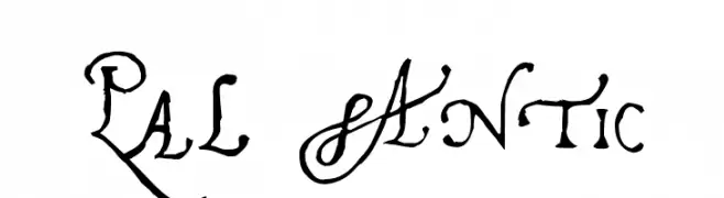
A vintage, decorative font with ornate, calligraphic letterforms and high contrast.
![Pal Antic Frei Schriftart Herunterladen]() Herunterladen 91 Downloads@WebFont
Herunterladen 91 Downloads@WebFont -
( Fonts by CannotIntoSpaceFonts - KineticPlasma Fonts - Personal-use only. For commercial use please contact owner. )
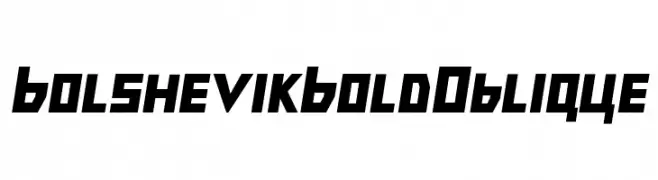
Bold, oblique font with geometric shapes and angular lines.
![Bolshevik Bold Oblique Frei Schriftart Herunterladen]() Herunterladen 91 Downloads@WebFont
Herunterladen 91 Downloads@WebFont -
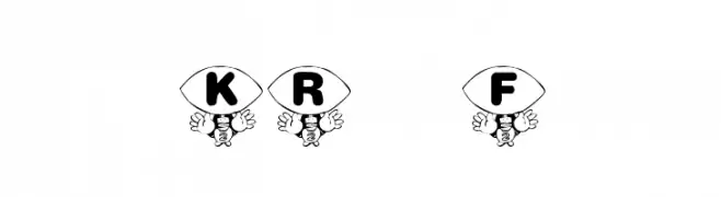
( Fonts by Kat`s Fun Fonts - Personal-use only. For commercial use please contact owner. )
A playful, football-themed font with bold characters enclosed in football shapes, ideal for sports projects.
![KR Foo'ball Frei Schriftart Herunterladen]() Herunterladen 91 Downloads@WebFont
Herunterladen 91 Downloads@WebFont -
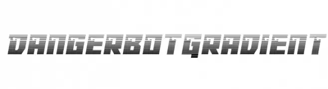
( Fonts by Iconian Fonts )
A bold, futuristic font with a gradient effect and dynamic horizontal lines.
![Dangerbot Gradient Frei Schriftart Herunterladen]() Herunterladen 91 Downloads@WebFont
Herunterladen 91 Downloads@WebFont -
( Fonts by Manfred Klein. Free for private and charity use. Free for commercial with donation to organizations )
A decorative font with abstract, whimsical face designs in circular shapes.
![DiskOBats Frei Schriftart Herunterladen]() Herunterladen 91 Downloads@WebFont
Herunterladen 91 Downloads@WebFont


Welche Schriften sind gerade am populärsten?
Poppins, Roboto, Montserrat, Open Sans und Lato sind wegen ihrer klaren Formen und breiten Einsetzbarkeit sehr gefragt – von Markenauftritt über Landingpages bis hin zu Postern.
Welche Fonts eignen sich für Logos?
Geometrische Sans‑Serifs (z. B. Poppins, Familien im Gotham‑Stil) sind ein häufiger Griff für sauberes, skalierbares Branding. Für eine persönlichere Note bleiben Scripts und Handschrift‑Stile beliebt. Kombinieren Sie einen prägnanten Headline‑Font mit einer neutralen Brotschrift für Wiedererkennung und Harmonie.
Wie oft wird die Top‑Liste aktualisiert?
Regelmäßig – basierend auf realen Downloads und Interaktionen. Schauen Sie öfter vorbei, um aufstrebende Favoriten früh zu entdecken.
💡 Tipp: Seite bookmarken – Trends wechseln schnell, und heutige Top‑Schriften inspirieren morgen vielleicht das Rebranding.