Willkommen bei den Top‑Schriften – hier treffen Beliebtheit und Qualität aufeinander. Das sind die in diesem Jahr am häufigsten heruntergeladenen und genutzten Fonts. Wenn Sie sichere Optionen für Logo, Web oder Social suchen, starten Sie hier.
Jeder Top‑Font überzeugt durch Balance, Lesbarkeit und Vielseitigkeit. Sie finden moderne Sans‑Serifs, elegante Scripts, Vintage‑Serifs und minimalistische Displays.
-
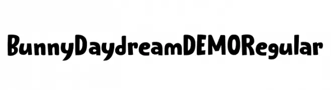
( Fonts by Hanoded )
A playful, bold font with rounded characters and whimsical bunny-themed glyphs.
 Herunterladen 525 Downloads@WebFont
 -
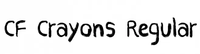
( www.cloutierfontes.ca/ )
A playful, hand-drawn font with a crayon-like texture.
![CF Crayons Regular Frei Schriftart Herunterladen]() Herunterladen 525 Downloads@WebFont
Herunterladen 525 Downloads@WebFont -
Schriftart von twinletter. For commercial use please contact the owner.
( THIS FONT IS DEMO ONLY Free for personal used any donations are very appreciated. PayPal account for donation: https://paypal.me/abahrozi -------------------------------------------------------- ENGLISH: Be very careful and take the time to read any a )
A bold, flowing script font with a modern, playful style.
![Maybe Personal Use Frei Schriftart Herunterladen]() Herunterladen 525 Downloads@WebFont
Herunterladen 525 Downloads@WebFont -
Schriftart von RCgraphics. For commercial use please contact the owner.
( You can use this font for free for Non-Commercial (Personal) use, but if you want to use it for Commercial use you will need to purchase a license here : https://rcgraphics.fr/shop/ The personnal and/or non-commercial uses of this font are FREE. )
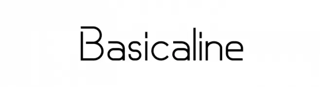
A clean, modern sans-serif font with geometric uniformity.
![Basicaline Frei Schriftart Herunterladen]() Herunterladen 525 Downloads@WebFont
Herunterladen 525 Downloads@WebFont -
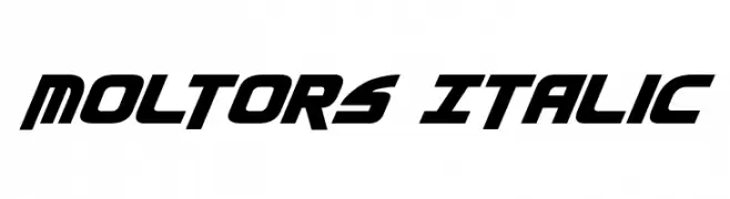
( Fonts by Daniel Zadorozny - www.iconian.com )
A bold, italicized font with a futuristic and dynamic style.
![Moltors Italic Frei Schriftart Herunterladen]() Herunterladen 525 Downloads@WebFont
Herunterladen 525 Downloads@WebFont -
-
( These fonts are free to use in any private, recreational manner.For commercial go to www.flopdesign.com/fordesign/font.html )
A modern serif font with elegant curves and a classic touch.
![ParismatchRegular Frei Schriftart Herunterladen]() Herunterladen 525 Downloads@WebFont
Herunterladen 525 Downloads@WebFont -
![Kohicle25 Frei Schriftart Herunterladen]() Herunterladen 525 Downloads@WebFont
Herunterladen 525 Downloads@WebFont -
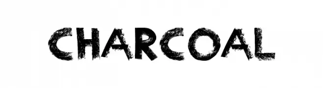
( Fonts by Jonathan S. Harris - www.tattoowoo.com. Personal-use only. For commercial use please contact owner. )
A rugged, textured font with a hand-drawn, charcoal-like appearance.
![Charcoal Frei Schriftart Herunterladen]() Herunterladen 525 Downloads@WebFont
Herunterladen 525 Downloads@WebFont -
( Fonts by Arkandis Digital Foundry )
A modern sans-serif font with geometric shapes and uniform strokes.
![IkariusADFNo2Std-Regular Frei Schriftart Herunterladen]() Herunterladen 525 Downloads@WebFont
Herunterladen 525 Downloads@WebFont -
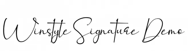
( Fonts by RaffaSyad Studio - www.creativefabrica.com/designer/r-studio/ - Personal-use only. For commercial use please contact owner. )
An elegant, cursive font with flowing lines and graceful curves.
![Winstyle Signature Demo Frei Schriftart Herunterladen]() Herunterladen 525 Downloads@WebFont
Herunterladen 525 Downloads@WebFont


Welche Schriften sind gerade am populärsten?
Poppins, Roboto, Montserrat, Open Sans und Lato sind wegen ihrer klaren Formen und breiten Einsetzbarkeit sehr gefragt – von Markenauftritt über Landingpages bis hin zu Postern.
Welche Fonts eignen sich für Logos?
Geometrische Sans‑Serifs (z. B. Poppins, Familien im Gotham‑Stil) sind ein häufiger Griff für sauberes, skalierbares Branding. Für eine persönlichere Note bleiben Scripts und Handschrift‑Stile beliebt. Kombinieren Sie einen prägnanten Headline‑Font mit einer neutralen Brotschrift für Wiedererkennung und Harmonie.
Wie oft wird die Top‑Liste aktualisiert?
Regelmäßig – basierend auf realen Downloads und Interaktionen. Schauen Sie öfter vorbei, um aufstrebende Favoriten früh zu entdecken.
💡 Tipp: Seite bookmarken – Trends wechseln schnell, und heutige Top‑Schriften inspirieren morgen vielleicht das Rebranding.