Willkommen bei den Top‑Schriften – hier treffen Beliebtheit und Qualität aufeinander. Das sind die in diesem Jahr am häufigsten heruntergeladenen und genutzten Fonts. Wenn Sie sichere Optionen für Logo, Web oder Social suchen, starten Sie hier.
Jeder Top‑Font überzeugt durch Balance, Lesbarkeit und Vielseitigkeit. Sie finden moderne Sans‑Serifs, elegante Scripts, Vintage‑Serifs und minimalistische Displays.
-
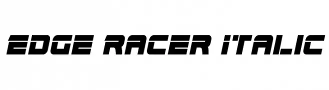
( Fonts by www.iconian.com - Personal-use only. For commercial use please contact owner. )
A bold, italicized font with a futuristic and dynamic style.
 Herunterladen 525 Downloads@WebFont
 -
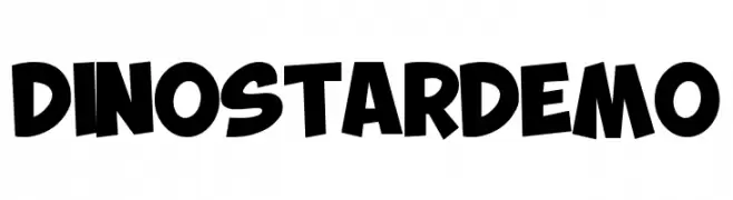
( Fonts by Fachranheit )
A bold, playful font with chunky, hand-drawn letters.
![DINO STAR DEMO Frei Schriftart Herunterladen]() Herunterladen 525 Downloads@WebFont
Herunterladen 525 Downloads@WebFont -
![Club Fluffy Frei Schriftart Herunterladen]() Herunterladen 525 Downloads@WebFont
Herunterladen 525 Downloads@WebFont -
![moi Frei Schriftart Herunterladen]() Herunterladen 525 Downloads@WebFont
Herunterladen 525 Downloads@WebFont -
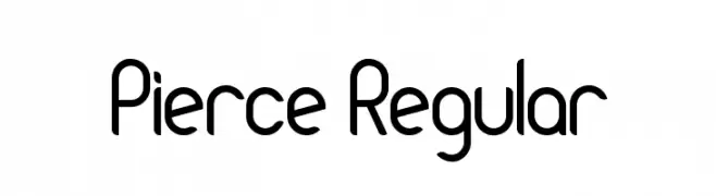
![Pierce Regular Frei Schriftart Herunterladen]() Herunterladen 525 Downloads@WebFont
Herunterladen 525 Downloads@WebFont -
-
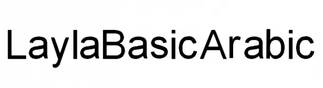
( Personal-use only. For commercial use please contact owner. )
A clean, modern sans-serif font with consistent stroke width and excellent readability.
![LaylaBasicArabic Frei Schriftart Herunterladen]() Herunterladen 525 Downloads@WebFont
Herunterladen 525 Downloads@WebFont -
( Google Web Fonts )
A modern, clean sans-serif font with excellent legibility and balance.
![Nokora Frei Schriftart Herunterladen]() Herunterladen 524 Downloads@WebFont
Herunterladen 524 Downloads@WebFont -
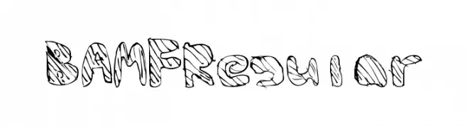
![BAMFRegular Frei Schriftart Herunterladen]() Herunterladen 524 Downloads@WebFont
Herunterladen 524 Downloads@WebFont -
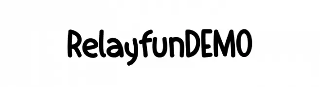
( Fonts by Yebhu )
A playful, hand-drawn font with rounded edges and a friendly feel.
![RelayfunDEMO Frei Schriftart Herunterladen]() Herunterladen 524 Downloads@WebFont
Herunterladen 524 Downloads@WebFont -
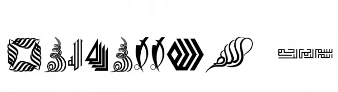
![Besmellah 5 Frei Schriftart Herunterladen]() Herunterladen 524 Downloads@WebFont
Herunterladen 524 Downloads@WebFont


Welche Schriften sind gerade am populärsten?
Poppins, Roboto, Montserrat, Open Sans und Lato sind wegen ihrer klaren Formen und breiten Einsetzbarkeit sehr gefragt – von Markenauftritt über Landingpages bis hin zu Postern.
Welche Fonts eignen sich für Logos?
Geometrische Sans‑Serifs (z. B. Poppins, Familien im Gotham‑Stil) sind ein häufiger Griff für sauberes, skalierbares Branding. Für eine persönlichere Note bleiben Scripts und Handschrift‑Stile beliebt. Kombinieren Sie einen prägnanten Headline‑Font mit einer neutralen Brotschrift für Wiedererkennung und Harmonie.
Wie oft wird die Top‑Liste aktualisiert?
Regelmäßig – basierend auf realen Downloads und Interaktionen. Schauen Sie öfter vorbei, um aufstrebende Favoriten früh zu entdecken.
💡 Tipp: Seite bookmarken – Trends wechseln schnell, und heutige Top‑Schriften inspirieren morgen vielleicht das Rebranding.