Willkommen bei den Top‑Schriften – hier treffen Beliebtheit und Qualität aufeinander. Das sind die in diesem Jahr am häufigsten heruntergeladenen und genutzten Fonts. Wenn Sie sichere Optionen für Logo, Web oder Social suchen, starten Sie hier.
Jeder Top‑Font überzeugt durch Balance, Lesbarkeit und Vielseitigkeit. Sie finden moderne Sans‑Serifs, elegante Scripts, Vintage‑Serifs und minimalistische Displays.
-
 Herunterladen 90 Downloads@WebFont
 -
( Anke-Art - www.anke-art.de/ )
A playful, dotted outline font perfect for whimsical designs.
![Happy Snail Mail DEMO Regular Frei Schriftart Herunterladen]() Herunterladen 90 Downloads@WebFont
Herunterladen 90 Downloads@WebFont -
( Fonts by GemFonts - Typotheticals - Graham Meade - Personal-use only. For commercial use please contact owner. )
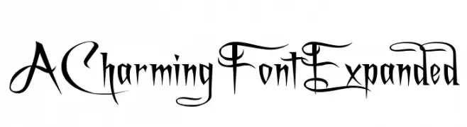
A decorative and artistic font with intricate swirls and flourishes.
![A Charming Font Expanded Frei Schriftart Herunterladen]() Herunterladen 90 Downloads@WebFont
Herunterladen 90 Downloads@WebFont -
( Fonts by Ryan Brotherston - Personal-use only. For commercial use please contact owner. )
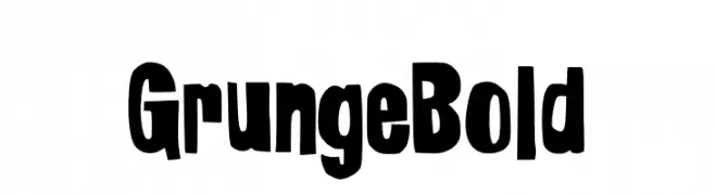
A bold, grunge-inspired font with irregular, distressed edges.
![Grunge Bold Frei Schriftart Herunterladen]() Herunterladen 90 Downloads@WebFont
Herunterladen 90 Downloads@WebFont -
( Zetafonts - www.zetafonts.com )
A bold, rounded font with smooth curves and consistent weight.
![KabrioAbarth-ExtraBold Frei Schriftart Herunterladen]() Herunterladen 90 Downloads@WebFont
Herunterladen 90 Downloads@WebFont -
( Sabrina Schleiger - www.sabrinaschleiger.com )
A playful and whimsical handwritten font with smooth, flowing strokes.
![justbeautifulsimplicity Frei Schriftart Herunterladen]() Herunterladen 90 Downloads@WebFont
Herunterladen 90 Downloads@WebFont -
( Fonts by Vultype - Candra Hamdani - Personal-use only. For commercial use please contact owner. )
A bold, expressive handwritten font with fluid strokes and a playful style.
![Balming Frei Schriftart Herunterladen]() Herunterladen 90 Downloads@WebFont
Herunterladen 90 Downloads@WebFont -
( Personal-use only. For commercial use please contact owner. )
A bold, angular font with Gothic influences and high contrast strokes.
![Babacar Frei Schriftart Herunterladen]() Herunterladen 90 Downloads@WebFont
Herunterladen 90 Downloads@WebFont -
![Navy Cadet Leftalic Frei Schriftart Herunterladen]() Herunterladen 90 Downloads@WebFont
Herunterladen 90 Downloads@WebFont -
( Fonts by Ibnu Nur Rahman )
Elegant handwritten script font.
![Kingdoms Frei Schriftart Herunterladen]() Herunterladen 90 Downloads@WebFont
Herunterladen 90 Downloads@WebFont -
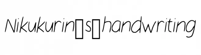
![Nikukurin_s_handwriting Frei Schriftart Herunterladen]() Herunterladen 90 Downloads@WebFont
Herunterladen 90 Downloads@WebFont -
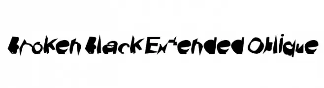
![Broken Black Extended Oblique Frei Schriftart Herunterladen]() Herunterladen 90 Downloads@WebFont
Herunterladen 90 Downloads@WebFont -
( weknow - Wino S Kadir - www.creativefabrica.com/designer/weknow/ )
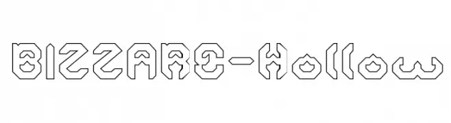
A futuristic, hollow font with geometric and angular shapes.
![BIZZARE-Hollow Frei Schriftart Herunterladen]() Herunterladen 90 Downloads@WebFont
Herunterladen 90 Downloads@WebFont -
( LJ Design Studios - www.ljdesignstudios.com )
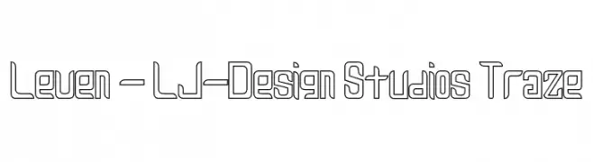
A modern, geometric font with a hollow, outlined style and consistent stroke widths.
![Leven - LJ-Design Studios Traze Frei Schriftart Herunterladen]() Herunterladen 90 Downloads@WebFont
Herunterladen 90 Downloads@WebFont -
( Fonts by Vigilante Typeface Corporation Larry Yerkes. Personal-use only. For commercial use please contact owner. )
A playful, italicized handwritten font with bold, rounded strokes.
![VTCKomixationCapsItalic Frei Schriftart Herunterladen]() Herunterladen 90 Downloads@WebFont
Herunterladen 90 Downloads@WebFont -
( Fonts by Typodermic Fonts - Raymond Larabie - Personal-use only. For commercial use please contact owner. )
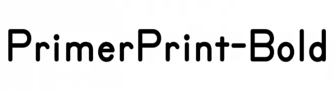
A modern, rounded font with excellent readability and a friendly appearance.
![PrimerPrint-Bold Frei Schriftart Herunterladen]() Herunterladen 90 Downloads@WebFont
Herunterladen 90 Downloads@WebFont -
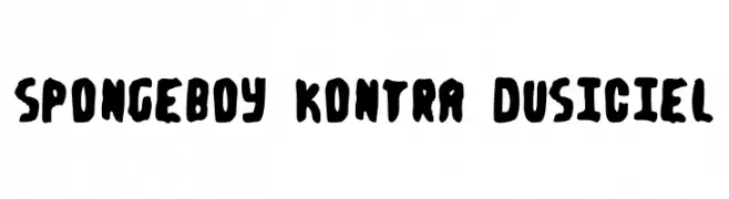
![Spongeboy kontra Dusiciel Frei Schriftart Herunterladen]() Herunterladen 90 Downloads@WebFont
Herunterladen 90 Downloads@WebFont -
( Fonts by YOFonts - Yasuhiro Yamaoka - yoworks.com - Personal-use only. For commercial use please contact owner. )
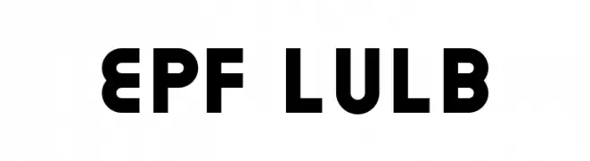
A bold, geometric font with a modern and robust design.
![EPF LULB Frei Schriftart Herunterladen]() Herunterladen 90 Downloads@WebFont
Herunterladen 90 Downloads@WebFont -
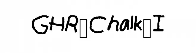
![GHR_Chalk_I Frei Schriftart Herunterladen]() Herunterladen 90 Downloads@WebFont
Herunterladen 90 Downloads@WebFont -
( Fonts by Benoit Champy - www.vnbc.fr - Personal-use only. For commercial use please contact owner. )
A modern, continuous line font with elegant, interconnected characters.
![Bellefine Frei Schriftart Herunterladen]() Herunterladen 90 Downloads@WebFont
Herunterladen 90 Downloads@WebFont -
( Fonts by Manfred Klein. Free for private and charity use. Free for commercial with donation to organizations )
An abstract, maze-like font with high contrast and intricate patterns.
![VasarelyWasHere Frei Schriftart Herunterladen]() Herunterladen 90 Downloads@WebFont
Herunterladen 90 Downloads@WebFont -
( Måns Grebäck - www.mansgreback.com )
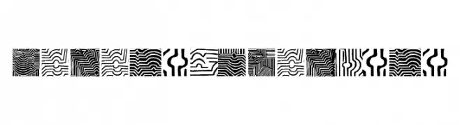
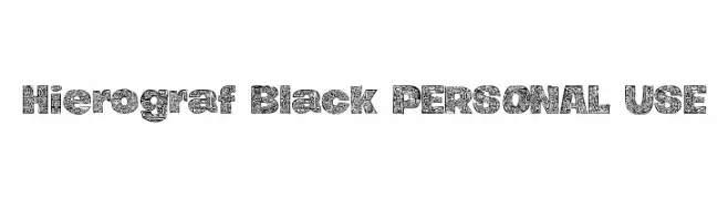
A decorative font with intricate pattern-filled characters.
![Hierograf Black PERSONAL USE Frei Schriftart Herunterladen]() Herunterladen 90 Downloads@WebFont
Herunterladen 90 Downloads@WebFont -
( Fonts by EdricStd - Personal-use only. For commercial use please contact owner. )
An elegant, flowing script font with interconnected cursive strokes.
![Sild regular Frei Schriftart Herunterladen]() Herunterladen 90 Downloads@WebFont
Herunterladen 90 Downloads@WebFont -
( Fonts by Benoit Champy - www.vnbc.fr - Personal-use only. For commercial use please contact owner. )
A bold, geometric stencil font with an industrial feel.
![Game Plan game plan Frei Schriftart Herunterladen]() Herunterladen 90 Downloads@WebFont
Herunterladen 90 Downloads@WebFont -
( Fonts by a cenz qobbal - www.facebook.com/cenzqobbalfonts. Personal-use only. For commercial use please contact owner. )
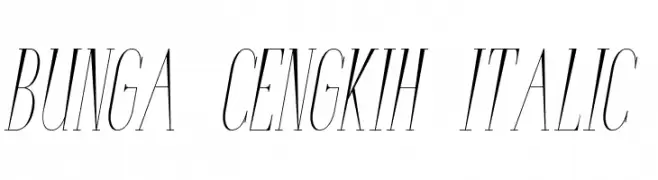
An elegant italic font with high contrast and refined serifs.
![Bunga Cengkih Italic Frei Schriftart Herunterladen]() Herunterladen 90 Downloads@WebFont
Herunterladen 90 Downloads@WebFont -
( Fonts by Vigilante Typeface Corporation Larry Yerkes. Personal-use only. For commercial use please contact owner. )
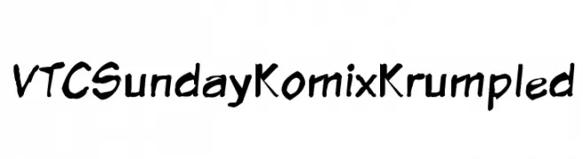
A playful, hand-drawn style with a krumpled, comic-like appearance.
![VTCSundayKomixKrumpled Frei Schriftart Herunterladen]() Herunterladen 90 Downloads@WebFont
Herunterladen 90 Downloads@WebFont -
( Iconian Fonts - Daniel Zadorozny - www.iconian.com )
A modern, geometric font with a thin outline and italic style, perfect for futuristic designs.
![Drone Tracker Thin Outline Italic Frei Schriftart Herunterladen]() Herunterladen 90 Downloads@WebFont
Herunterladen 90 Downloads@WebFont -
( Fonts by Vladimir Nikolic )
A bold, futuristic font with a 3D effect and dynamic inner detailing.
![Speed of Light Bright Regular Frei Schriftart Herunterladen]() Herunterladen 90 Downloads@WebFont
Herunterladen 90 Downloads@WebFont -
( Iconian Fonts - Daniel Zadorozny - www.iconian.com )
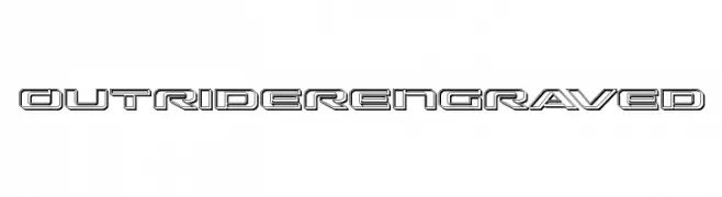
A bold, futuristic font with an engraved, three-dimensional effect.
![Outrider Engraved Frei Schriftart Herunterladen]() Herunterladen 90 Downloads@WebFont
Herunterladen 90 Downloads@WebFont -
( weknow - Wino S Kadir - www.creativefabrica.com/designer/weknow/ )
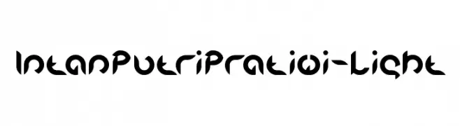
A bold, geometric font with a futuristic and modern design.
![Intan Putri Pratiwi-Light Frei Schriftart Herunterladen]() Herunterladen 90 Downloads@WebFont
Herunterladen 90 Downloads@WebFont -
( Fonts by Wino S Kadir - weknow - www.revolge.com/shop/weknow/ - Personal-use only. For commercial use please contact owner. )
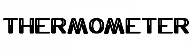
A bold, geometric font with a modern and impactful design.
![THERMOMETER Frei Schriftart Herunterladen]() Herunterladen 90 Downloads@WebFont
Herunterladen 90 Downloads@WebFont -
( Fonts by pOPdOG fONTS - Dimitris Kolyris - Personal-use only. For commercial use please contact owner. )
A bold, distressed font with a rugged, textured appearance.
![VIPER NORA Frei Schriftart Herunterladen]() Herunterladen 90 Downloads@WebFont
Herunterladen 90 Downloads@WebFont -
( Fonts by Wahyu Eka Prasetya - wepfont.com - Personal-use only. For commercial use please contact owner. )
A bold, playful handwritten font with thick strokes and a dynamic flow.
![Gule Frei Schriftart Herunterladen]() Herunterladen 90 Downloads@WebFont
Herunterladen 90 Downloads@WebFont -
( Fonts by Syaf Rizal - Khurasan - Personal-use only. For commercial use please contact owner. )
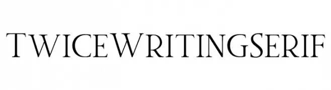
A classic serif font with elegant strokes and refined serifs.
![Twice Writing Serif Frei Schriftart Herunterladen]() Herunterladen 90 Downloads@WebFont
Herunterladen 90 Downloads@WebFont -
( Iconian Fonts - Daniel Zadorozny - www.iconian.com )
A bold, geometric font with a futuristic and industrial design.
![Drone Tracker Title Frei Schriftart Herunterladen]() Herunterladen 90 Downloads@WebFont
Herunterladen 90 Downloads@WebFont


Welche Schriften sind gerade am populärsten?
Poppins, Roboto, Montserrat, Open Sans und Lato sind wegen ihrer klaren Formen und breiten Einsetzbarkeit sehr gefragt – von Markenauftritt über Landingpages bis hin zu Postern.
Welche Fonts eignen sich für Logos?
Geometrische Sans‑Serifs (z. B. Poppins, Familien im Gotham‑Stil) sind ein häufiger Griff für sauberes, skalierbares Branding. Für eine persönlichere Note bleiben Scripts und Handschrift‑Stile beliebt. Kombinieren Sie einen prägnanten Headline‑Font mit einer neutralen Brotschrift für Wiedererkennung und Harmonie.
Wie oft wird die Top‑Liste aktualisiert?
Regelmäßig – basierend auf realen Downloads und Interaktionen. Schauen Sie öfter vorbei, um aufstrebende Favoriten früh zu entdecken.
💡 Tipp: Seite bookmarken – Trends wechseln schnell, und heutige Top‑Schriften inspirieren morgen vielleicht das Rebranding.