Willkommen bei den Top‑Schriften – hier treffen Beliebtheit und Qualität aufeinander. Das sind die in diesem Jahr am häufigsten heruntergeladenen und genutzten Fonts. Wenn Sie sichere Optionen für Logo, Web oder Social suchen, starten Sie hier.
Jeder Top‑Font überzeugt durch Balance, Lesbarkeit und Vielseitigkeit. Sie finden moderne Sans‑Serifs, elegante Scripts, Vintage‑Serifs und minimalistische Displays.
-
 Herunterladen 1800 Downloads@WebFont
 -
Schriftart von alifinart. For commercial use please contact the owner.
( Handil Pro Medium Font )
A modern, sans-serif font with clean lines and excellent readability.
![HandilPro-Medium Frei Schriftart Herunterladen]() Herunterladen 1799 Downloads@WebFont
Herunterladen 1799 Downloads@WebFont -
( Fonts by Fernando Haro - Personal-use only. For commercial use please contact owner. )
A bold and impactful typeface with a modern, clean design.
![Secuela-ExtraBold Frei Schriftart Herunterladen]() Herunterladen 1799 Downloads@WebFont
Herunterladen 1799 Downloads@WebFont -
![Sofye Demo Frei Schriftart Herunterladen]() Herunterladen 1799 Downloads@WebFont
Herunterladen 1799 Downloads@WebFont -
( Fonts by Jens R. Ziehn - www.filmhimmel.com )
A whimsical, bold serif font with playful, decorative elements.
![Chocolate-Factory Frei Schriftart Herunterladen]() Herunterladen 1799 Downloads@WebFont
Herunterladen 1799 Downloads@WebFont -
( Fonts by Vanessa Bays - bythebutterfly.com )
A playful, dotted, handwritten-style font with a whimsical flair.
![Wednesday Frei Schriftart Herunterladen]() Herunterladen 1799 Downloads@WebFont
Herunterladen 1799 Downloads@WebFont -
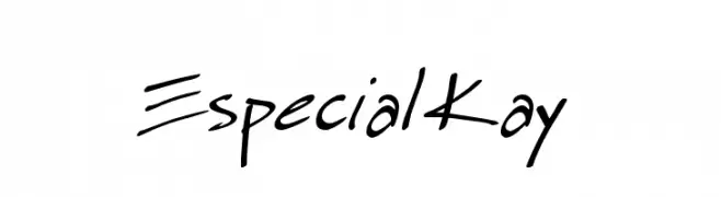
![Especial Kay Frei Schriftart Herunterladen]() Herunterladen 1799 Downloads@WebFont
Herunterladen 1799 Downloads@WebFont -
![Roomfer Frei Schriftart Herunterladen]() Herunterladen 1798 Downloads@WebFont
Herunterladen 1798 Downloads@WebFont -
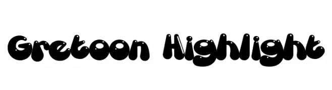
( Fonts by Mans Greback - www.mawns.com )
A playful, bold font with rounded, cartoonish characters and a three-dimensional effect.
![Gretoon Highlight Frei Schriftart Herunterladen]() Herunterladen 1798 Downloads@WebFont
Herunterladen 1798 Downloads@WebFont -
![21 Frei Schriftart Herunterladen]() Herunterladen 1798 Downloads@WebFont
Herunterladen 1798 Downloads@WebFont -
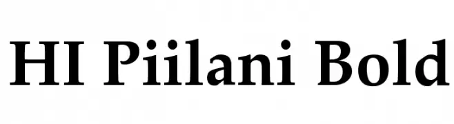
![HI Piilani Bold Frei Schriftart Herunterladen]() Herunterladen 1798 Downloads@WebFont
Herunterladen 1798 Downloads@WebFont -
![My World[sk8er_punkd@hotmail.co Frei Schriftart Herunterladen]() Herunterladen 1798 Downloads@WebFont
Herunterladen 1798 Downloads@WebFont -
![loserboi grunge Frei Schriftart Herunterladen]() Herunterladen 1798 Downloads@WebFont
Herunterladen 1798 Downloads@WebFont -
![Attract more women Frei Schriftart Herunterladen]() Herunterladen 1798 Downloads@WebFont
Herunterladen 1798 Downloads@WebFont -
( Iconian Fonts - Daniel Zadorozny - www.iconian.com )
A bold, italicized font with a modern, dynamic style.
![Concielian Classic Bold Frei Schriftart Herunterladen]() Herunterladen 1797 Downloads@WebFont
Herunterladen 1797 Downloads@WebFont -
( Graphicfresh - graphicfresh.com/ )
A bold, geometric font with a modern, monospaced appearance.
![Edmund-Free Frei Schriftart Herunterladen]() Herunterladen 1797 Downloads@WebFont
Herunterladen 1797 Downloads@WebFont -
( Adam Ericsson )
A clean, geometric font with thin strokes and a modern aesthetic.
![Adam Frei Schriftart Herunterladen]() Herunterladen 1797 Downloads@WebFont
Herunterladen 1797 Downloads@WebFont -
( Fonts by uatype.faithweb.com - UnAuthorized Type )
A playful, hand-drawn font with irregular, sketch-like letterforms.
![Sketchbook Frei Schriftart Herunterladen]() Herunterladen 1797 Downloads@WebFont
Herunterladen 1797 Downloads@WebFont -
![Moto Frei Schriftart Herunterladen]() Herunterladen 1797 Downloads@WebFont
Herunterladen 1797 Downloads@WebFont -
( Fonts by www.fontalicious.com )
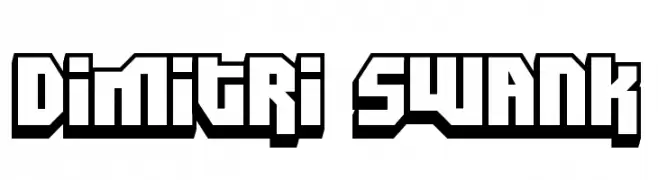
A bold, geometric font with a 3D effect and strong visual impact.
![Dimitri Swank Frei Schriftart Herunterladen]() Herunterladen 1797 Downloads@WebFont
Herunterladen 1797 Downloads@WebFont -
( Fonts by Fontfabric - Svetoslav Simov - Personal-use only. For commercial use please contact owner. )
A modern, semi-bold sans-serif font with clean lines and excellent legibility.
![Mont Blanc-Trial SemiBold Frei Schriftart Herunterladen]() Herunterladen 1796 Downloads@WebFont
Herunterladen 1796 Downloads@WebFont -
( Fonts by Vladimir Nikolic - www.creativefabrica.com/designer/vladimirnikolic/ - Personal-use only. For commercial use please contact owner. )
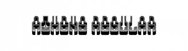
A bold, three-dimensional font with an industrial and futuristic design.
![Athens Regular Frei Schriftart Herunterladen]() Herunterladen 1796 Downloads@WebFont
Herunterladen 1796 Downloads@WebFont -
![BOSTON CAPS Frei Schriftart Herunterladen]() Herunterladen 1796 Downloads@WebFont
Herunterladen 1796 Downloads@WebFont -
( www.junkohanhero.com )
A bold, distressed font with a grunge texture and strong, impactful characters.
![Nirhauma Frei Schriftart Herunterladen]() Herunterladen 1796 Downloads@WebFont
Herunterladen 1796 Downloads@WebFont -
![Gears of Peace Frei Schriftart Herunterladen]() Herunterladen 1796 Downloads@WebFont
Herunterladen 1796 Downloads@WebFont -
( Fonts by Dieter Steffmann )
A bold blackletter font with sharp, angular strokes and ornate detailing.
![Fenwick Woodtype Frei Schriftart Herunterladen]() Herunterladen 1796 Downloads@WebFont
Herunterladen 1796 Downloads@WebFont -
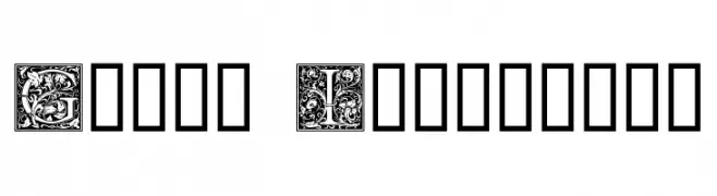
( Fonts by Dieter Steffmann )
An ornate, decorative font with intricate floral patterns in each letter.
![Goudy Initialen Frei Schriftart Herunterladen]() Herunterladen 1796 Downloads@WebFont
Herunterladen 1796 Downloads@WebFont -
( Fonts by Rory Minchin-King - Personal-use only. For commercial use please contact owner. )
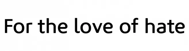
A modern, geometric sans-serif font with clean lines and uniform strokes.
![For the love of hate Frei Schriftart Herunterladen]() Herunterladen 1795 Downloads@WebFont
Herunterladen 1795 Downloads@WebFont -
( Fonts by Krysten Tom )
A bold, handwritten font with a playful and casual style.
![SwaggerBold Frei Schriftart Herunterladen]() Herunterladen 1795 Downloads@WebFont
Herunterladen 1795 Downloads@WebFont -
( Fonts by Manfred Klein - manfred-klein.ina-mar.com )
A bold, condensed font ideal for impactful headlines.
![Santana-BlackCondensed Frei Schriftart Herunterladen]() Herunterladen 1795 Downloads@WebFont
Herunterladen 1795 Downloads@WebFont -
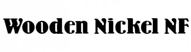
( Fonts by Nick Curtis - www.nicksfonts.com )
A bold, vintage-style serif font with decorative elements and strong presence.
![Wooden Nickel NF Frei Schriftart Herunterladen]() Herunterladen 1795 Downloads@WebFont
Herunterladen 1795 Downloads@WebFont -
![I Ching Frei Schriftart Herunterladen]() Herunterladen 1795 Downloads@WebFont
Herunterladen 1795 Downloads@WebFont -
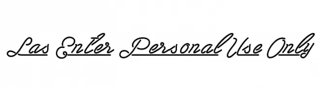
![Las Enter Personal Use Only Frei Schriftart Herunterladen]() Herunterladen 1794 Downloads@WebFont
Herunterladen 1794 Downloads@WebFont -
![Volstead Frei Schriftart Herunterladen]() Herunterladen 1794 Downloads@WebFont
Herunterladen 1794 Downloads@WebFont -
![1980 Portable Frei Schriftart Herunterladen]() Herunterladen 1794 Downloads@WebFont
Herunterladen 1794 Downloads@WebFont


Welche Schriften sind gerade am populärsten?
Poppins, Roboto, Montserrat, Open Sans und Lato sind wegen ihrer klaren Formen und breiten Einsetzbarkeit sehr gefragt – von Markenauftritt über Landingpages bis hin zu Postern.
Welche Fonts eignen sich für Logos?
Geometrische Sans‑Serifs (z. B. Poppins, Familien im Gotham‑Stil) sind ein häufiger Griff für sauberes, skalierbares Branding. Für eine persönlichere Note bleiben Scripts und Handschrift‑Stile beliebt. Kombinieren Sie einen prägnanten Headline‑Font mit einer neutralen Brotschrift für Wiedererkennung und Harmonie.
Wie oft wird die Top‑Liste aktualisiert?
Regelmäßig – basierend auf realen Downloads und Interaktionen. Schauen Sie öfter vorbei, um aufstrebende Favoriten früh zu entdecken.
💡 Tipp: Seite bookmarken – Trends wechseln schnell, und heutige Top‑Schriften inspirieren morgen vielleicht das Rebranding.