Willkommen bei den Top‑Schriften – hier treffen Beliebtheit und Qualität aufeinander. Das sind die in diesem Jahr am häufigsten heruntergeladenen und genutzten Fonts. Wenn Sie sichere Optionen für Logo, Web oder Social suchen, starten Sie hier.
Jeder Top‑Font überzeugt durch Balance, Lesbarkeit und Vielseitigkeit. Sie finden moderne Sans‑Serifs, elegante Scripts, Vintage‑Serifs und minimalistische Displays.
-
 Herunterladen 520 Downloads@WebFont
 -
( Fonts by www.studiotypo.com - Personal-use only. For commercial use please contact owner. )
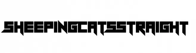
A bold, rounded font with a modern and friendly style.
![Wida Round Demo Bold Frei Schriftart Herunterladen]() Herunterladen 520 Downloads@WebFont
Herunterladen 520 Downloads@WebFont -
( Fonts by Daniel Zadorozny - www.iconian.com - Free for personal use )
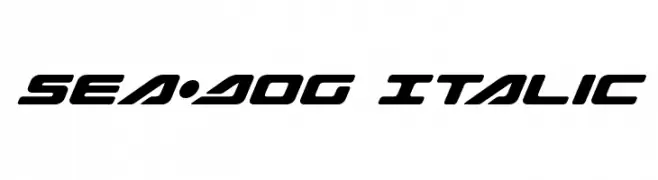
A bold, italicized font with a futuristic and dynamic style.
![Sea-Dog Italic Frei Schriftart Herunterladen]() Herunterladen 520 Downloads@WebFont
Herunterladen 520 Downloads@WebFont -
( Fonts by Khurasan )
A bold, playful handwritten font with rounded, energetic characters.
![Socake Frei Schriftart Herunterladen]() Herunterladen 520 Downloads@WebFont
Herunterladen 520 Downloads@WebFont -
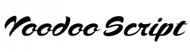
![Voodoo Script Frei Schriftart Herunterladen]() Herunterladen 520 Downloads@WebFont
Herunterladen 520 Downloads@WebFont -
-
( Fonts by Rizky Andyno Ramadhan - Dichi. Personal-use only. For commercial use please contact owner. )
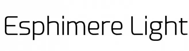
A modern, light sans-serif font with a clean and minimalist design.
![Esphimere Light Frei Schriftart Herunterladen]() Herunterladen 520 Downloads@WebFont
Herunterladen 520 Downloads@WebFont -
( Fonts by Dieter Schumacher )
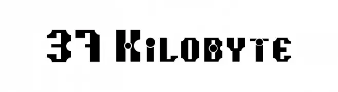
A bold, geometric font with an industrial and futuristic design.
![37 Kilobyte Frei Schriftart Herunterladen]() Herunterladen 520 Downloads@WebFont
Herunterladen 520 Downloads@WebFont -
( imagex - www.imagex-fonts.com )
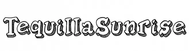
A bold, playful font with a 3D shadow effect and dotted texture.
![Tequilla Sunrise Frei Schriftart Herunterladen]() Herunterladen 520 Downloads@WebFont
Herunterladen 520 Downloads@WebFont -
![PT Lullaby Frei Schriftart Herunterladen]() Herunterladen 520 Downloads@WebFont
Herunterladen 520 Downloads@WebFont -
( behance.net/baldivieso )
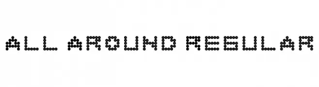
A modern, dot-based font with a playful and digital aesthetic.
![All Around Regular Frei Schriftart Herunterladen]() Herunterladen 520 Downloads@WebFont
Herunterladen 520 Downloads@WebFont


Welche Schriften sind gerade am populärsten?
Poppins, Roboto, Montserrat, Open Sans und Lato sind wegen ihrer klaren Formen und breiten Einsetzbarkeit sehr gefragt – von Markenauftritt über Landingpages bis hin zu Postern.
Welche Fonts eignen sich für Logos?
Geometrische Sans‑Serifs (z. B. Poppins, Familien im Gotham‑Stil) sind ein häufiger Griff für sauberes, skalierbares Branding. Für eine persönlichere Note bleiben Scripts und Handschrift‑Stile beliebt. Kombinieren Sie einen prägnanten Headline‑Font mit einer neutralen Brotschrift für Wiedererkennung und Harmonie.
Wie oft wird die Top‑Liste aktualisiert?
Regelmäßig – basierend auf realen Downloads und Interaktionen. Schauen Sie öfter vorbei, um aufstrebende Favoriten früh zu entdecken.
💡 Tipp: Seite bookmarken – Trends wechseln schnell, und heutige Top‑Schriften inspirieren morgen vielleicht das Rebranding.