Willkommen bei den Top‑Schriften – hier treffen Beliebtheit und Qualität aufeinander. Das sind die in diesem Jahr am häufigsten heruntergeladenen und genutzten Fonts. Wenn Sie sichere Optionen für Logo, Web oder Social suchen, starten Sie hier.
Jeder Top‑Font überzeugt durch Balance, Lesbarkeit und Vielseitigkeit. Sie finden moderne Sans‑Serifs, elegante Scripts, Vintage‑Serifs und minimalistische Displays.
-
( Fonts by or from www.graffitifonts.net )
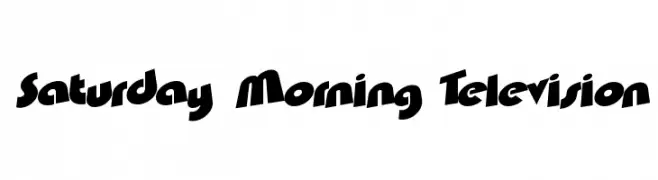
A bold, cartoonish font with dynamic, slanted characters and a playful style.
 Herunterladen 516 Downloads@WebFont
 -
Schriftart von gatype. For commercial use please contact the owner.
( Free for personal use )
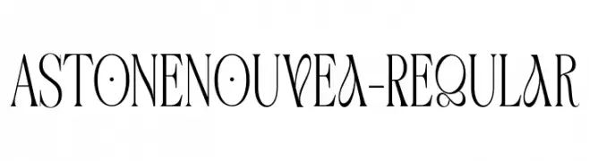
An elegant serif typeface with high contrast and Art Nouveau influences.
![AstoneNouvea-Regular Frei Schriftart Herunterladen]() Herunterladen 516 Downloads@WebFont
Herunterladen 516 Downloads@WebFont -
( Fonts by Daniel Gauthier )
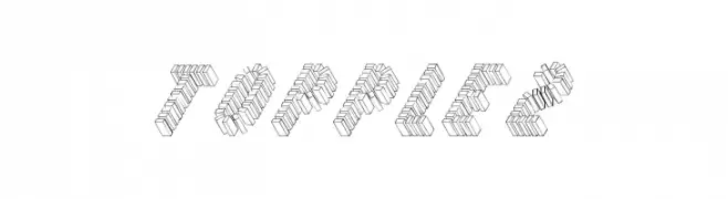
A 3D block-style font with intricate line work and a bold, playful appearance.
![Topple2 Frei Schriftart Herunterladen]() Herunterladen 516 Downloads@WebFont
Herunterladen 516 Downloads@WebFont -
![If only life was simple Frei Schriftart Herunterladen]() Herunterladen 516 Downloads@WebFont
Herunterladen 516 Downloads@WebFont -
( Fonts by Mans Greback - www.mawns.com )
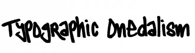
A bold, graffiti-inspired font with dynamic, hand-drawn strokes.
![Typographic Onedalism Frei Schriftart Herunterladen]() Herunterladen 516 Downloads@WebFont
Herunterladen 516 Downloads@WebFont -
-
![Clubz Frei Schriftart Herunterladen]() Herunterladen 516 Downloads@WebFont
Herunterladen 516 Downloads@WebFont -
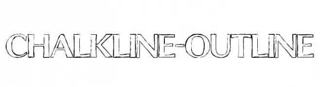
![ChalkLine-Outline Frei Schriftart Herunterladen]() Herunterladen 516 Downloads@WebFont
Herunterladen 516 Downloads@WebFont -
( Fonts by Jérémie Dupuis )
A modern serif font with clean lines and elegant style.
![Ghostlight-Light Frei Schriftart Herunterladen]() Herunterladen 516 Downloads@WebFont
Herunterladen 516 Downloads@WebFont -
( Fonts by Geronimo Fonts - Personal-use only. For commercial use please contact owner. )
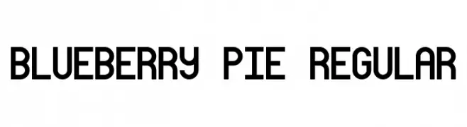
A bold, geometric font with a modern and balanced design.
![Blueberry Pie Regular Frei Schriftart Herunterladen]() Herunterladen 515 Downloads@WebFont
Herunterladen 515 Downloads@WebFont -
( Fonts by Måns Grebäck )
A bold serif font with strong vertical lines and thick serifs, exuding authority and tradition.
![Vacer Serif Personal Bold Frei Schriftart Herunterladen]() Herunterladen 515 Downloads@WebFont
Herunterladen 515 Downloads@WebFont


Welche Schriften sind gerade am populärsten?
Poppins, Roboto, Montserrat, Open Sans und Lato sind wegen ihrer klaren Formen und breiten Einsetzbarkeit sehr gefragt – von Markenauftritt über Landingpages bis hin zu Postern.
Welche Fonts eignen sich für Logos?
Geometrische Sans‑Serifs (z. B. Poppins, Familien im Gotham‑Stil) sind ein häufiger Griff für sauberes, skalierbares Branding. Für eine persönlichere Note bleiben Scripts und Handschrift‑Stile beliebt. Kombinieren Sie einen prägnanten Headline‑Font mit einer neutralen Brotschrift für Wiedererkennung und Harmonie.
Wie oft wird die Top‑Liste aktualisiert?
Regelmäßig – basierend auf realen Downloads und Interaktionen. Schauen Sie öfter vorbei, um aufstrebende Favoriten früh zu entdecken.
💡 Tipp: Seite bookmarken – Trends wechseln schnell, und heutige Top‑Schriften inspirieren morgen vielleicht das Rebranding.