Willkommen bei den Top‑Schriften – hier treffen Beliebtheit und Qualität aufeinander. Das sind die in diesem Jahr am häufigsten heruntergeladenen und genutzten Fonts. Wenn Sie sichere Optionen für Logo, Web oder Social suchen, starten Sie hier.
Jeder Top‑Font überzeugt durch Balance, Lesbarkeit und Vielseitigkeit. Sie finden moderne Sans‑Serifs, elegante Scripts, Vintage‑Serifs und minimalistische Displays.
-
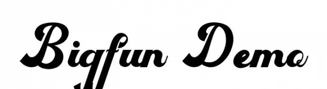
( Fonts by PutraCetol Studio - www.putracetol.com - Personal-use only. For commercial use please contact owner. )
A bold, dynamic script font with high contrast and flowing cursive style.
 Herunterladen 88 Downloads@WebFont
 -
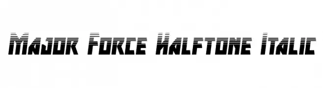
( Fonts by Iconian Fonts )
A bold, geometric font with a halftone effect and italic style, perfect for dynamic designs.
![Major Force Halftone Italic Frei Schriftart Herunterladen]() Herunterladen 88 Downloads@WebFont
Herunterladen 88 Downloads@WebFont -
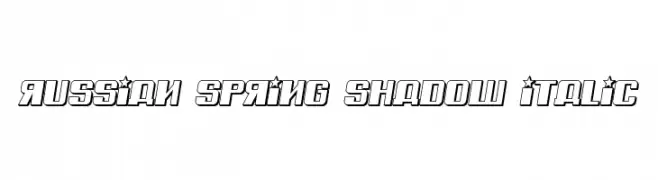
( Vladimir Nikolic - www.coroflot.com/vladimirnikolic )
Bold, shadowed, italic font with decorative elements and a dynamic style.
![Russian Spring Shadow Italic Frei Schriftart Herunterladen]() Herunterladen 88 Downloads@WebFont
Herunterladen 88 Downloads@WebFont -
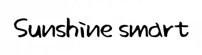
( Colorful Typhoon - www.geocities.jp/kitschlabo/ )
A playful, hand-drawn font with an informal and approachable style.
![Sunshine smart Frei Schriftart Herunterladen]() Herunterladen 88 Downloads@WebFont
Herunterladen 88 Downloads@WebFont -
( Fonts by Inermedia Studio - Personal-use only. For commercial use please contact owner. )
A whimsical script font with flowing, interconnected letterforms and dynamic contrast.
![Genius Frei Schriftart Herunterladen]() Herunterladen 88 Downloads@WebFont
Herunterladen 88 Downloads@WebFont -
( Fonts by nendi emelia - pratiwi emelia - Personal-use only. For commercial use please contact owner. )
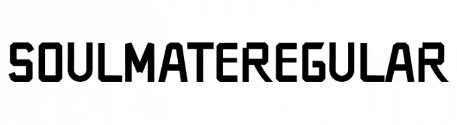
A bold, geometric font with sharp angles and a modern style.
![SOULMATERegular Frei Schriftart Herunterladen]() Herunterladen 88 Downloads@WebFont
Herunterladen 88 Downloads@WebFont -
( Iconian Fonts - Daniel Zadorozny - www.iconian.com )
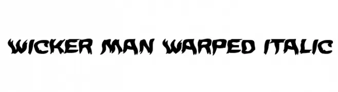
A bold, warped, and italicized font with a rugged, dynamic style.
![Wicker Man Warped Italic Frei Schriftart Herunterladen]() Herunterladen 88 Downloads@WebFont
Herunterladen 88 Downloads@WebFont -
( Studio Dot by dot - Sjoerd Kulsdom - www.dotbydot.nl/fonts )
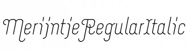
A modern, elegant font with slender, italicized characters and smooth strokes.
![Merijntje Regular Italic Frei Schriftart Herunterladen]() Herunterladen 88 Downloads@WebFont
Herunterladen 88 Downloads@WebFont -
( Fonts by Shradha Katiyar - Personal-use only. For commercial use please contact owner. )
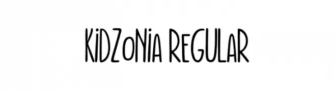
A playful, handwritten font with tall, narrow letters and rounded edges.
![Kidzonia Regular Frei Schriftart Herunterladen]() Herunterladen 88 Downloads@WebFont
Herunterladen 88 Downloads@WebFont -
( Fonts by a Max Infeld - XEROGRAPHER FONTS - xerographer.blogspot.com . Personal-use only. For commercial use please contact owner. )
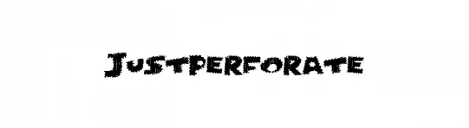
A bold, perforated font with a textured, edgy style.
![JustPerforate Frei Schriftart Herunterladen]() Herunterladen 88 Downloads@WebFont
Herunterladen 88 Downloads@WebFont -
( Levi Szekeres - www.loremipsum.ro )
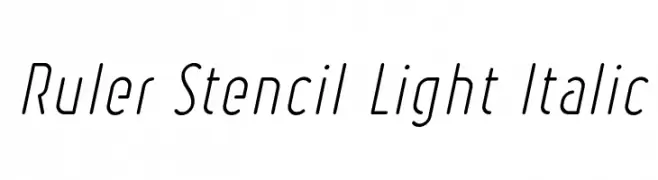
A modern, stencil-style font with thin, italicized characters.
![Ruler Stencil Light Italic Frei Schriftart Herunterladen]() Herunterladen 88 Downloads@WebFont
Herunterladen 88 Downloads@WebFont -
( Fonts by AGUS ALFIAN - ghielz.com - Personal-use only. For commercial use please contact owner. )
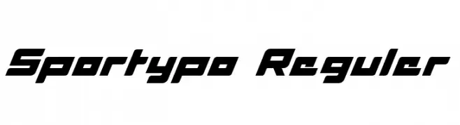
A bold, dynamic font with a sporty, futuristic style and uniform thick strokes.
![Sportypo Reguler Frei Schriftart Herunterladen]() Herunterladen 88 Downloads@WebFont
Herunterladen 88 Downloads@WebFont -
( Fonts by JOEBOB graphics - Joe vanderHam - Personal-use only. For commercial use please contact owner. )
A bold, expressive handwritten font with fluid, connected strokes.
![Epistula Medium TRIAL Frei Schriftart Herunterladen]() Herunterladen 88 Downloads@WebFont
Herunterladen 88 Downloads@WebFont -
( Fonts by Brian Zick - Personal-use only. For commercial use please contact owner. )
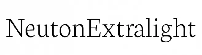
A clean and elegant serif font with a light weight and classic design.
![Neuton Extralight Frei Schriftart Herunterladen]() Herunterladen 88 Downloads@WebFont
Herunterladen 88 Downloads@WebFont -
( Fonts by Germán Ventriglia - Personal-use only. For commercial use please contact owner. )
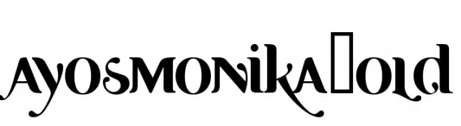
A bold, high-contrast font with dramatic serifs and elegant flourishes.
![Ayosmonika Bold Frei Schriftart Herunterladen]() Herunterladen 88 Downloads@WebFont
Herunterladen 88 Downloads@WebFont -
( Fonts by Wino S Kadir - weknow - www.revolge.com/shop/weknow/ - Personal-use only. For commercial use please contact owner. )
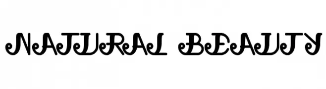
An ornate and decorative font with elegant swirls and medium contrast.
![natural beauty Frei Schriftart Herunterladen]() Herunterladen 88 Downloads@WebFont
Herunterladen 88 Downloads@WebFont -
( Fonts by Edric Studio - Personal-use only. For commercial use please contact owner. )
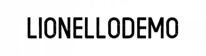
A bold, distressed industrial font with a vintage feel.
![LIONELLO DEMO Frei Schriftart Herunterladen]() Herunterladen 88 Downloads@WebFont
Herunterladen 88 Downloads@WebFont -
( Fonts by a Neale Davidson - www.pixelsagas.com. Personal-use only. For commercial use please contact owner. )
A bold, geometric font with playful heart motifs and strong visual impact.
![Utonium Bold Frei Schriftart Herunterladen]() Herunterladen 88 Downloads@WebFont
Herunterladen 88 Downloads@WebFont -
( Fonts by Wino S Kadir - weknow - www.revolge.com/shop/weknow/ - Personal-use only. For commercial use please contact owner. )
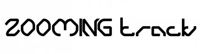
A futuristic, geometric font with sharp angles and a bold style.
![ZOOMING track Frei Schriftart Herunterladen]() Herunterladen 88 Downloads@WebFont
Herunterladen 88 Downloads@WebFont -
( Fonts by Mega Type - M Akmal - Personal-use only. For commercial use please contact owner. )
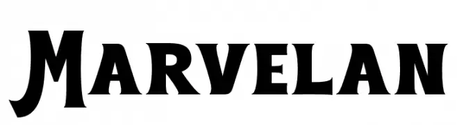
A bold, dynamic font with thick strokes and unique serifs, perfect for impactful designs.
![Marvelan Frei Schriftart Herunterladen]() Herunterladen 88 Downloads@WebFont
Herunterladen 88 Downloads@WebFont -
( Fonts by Woodcutter Manero - http://www.woodcutter.es - Personal-use only. For commercial use please contact owner. )
A bold, distressed font with a rugged, vintage appearance.
![The King of Wall Frei Schriftart Herunterladen]() Herunterladen 88 Downloads@WebFont
Herunterladen 88 Downloads@WebFont -
( Fonts by a Max Infeld - XEROGRAPHER FONTS - xerographer.blogspot.com . Personal-use only. For commercial use please contact owner. )
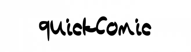
A playful, handwritten-style font with bold, irregular strokes.
![QuickComic Frei Schriftart Herunterladen]() Herunterladen 88 Downloads@WebFont
Herunterladen 88 Downloads@WebFont -
( Evad - Dave Huizing )
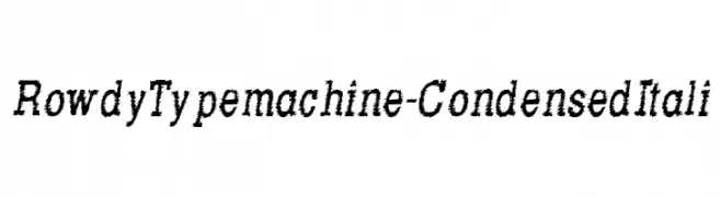
A textured, condensed italic font with a dynamic, hand-drawn appearance.
![RowdyTypemachine-CondensedItali Frei Schriftart Herunterladen]() Herunterladen 88 Downloads@WebFont
Herunterladen 88 Downloads@WebFont -
( Fonts by DumadiStyle - Toni Dzulham - Personal-use only. For commercial use please contact owner. )
A playful, bold font with rounded, whimsical characters.
![Kero kero Frei Schriftart Herunterladen]() Herunterladen 88 Downloads@WebFont
Herunterladen 88 Downloads@WebFont -
( Fonts by Daniel Zadorozny - www.iconian.com - Personal-use only. For commercial use please contact owner. )
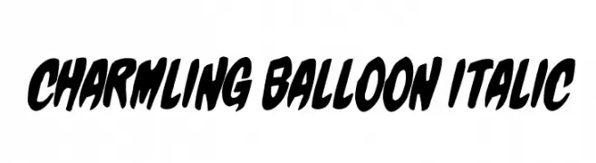
A bold, balloon-like italic font with playful, rounded letterforms.
![Charmling Balloon Italic Frei Schriftart Herunterladen]() Herunterladen 88 Downloads@WebFont
Herunterladen 88 Downloads@WebFont -
( Cosmic Graphics - formerly at www.ne.jp/asahi/cosmicgraphics/homepage/contents.html )
The image contains abstract geometric shapes, not a valid font.
![Pow-waw Frei Schriftart Herunterladen]() Herunterladen 88 Downloads
Herunterladen 88 Downloads -
( Fonts by Wahyu Eka Prasetya - wepfont.com - Personal-use only. For commercial use please contact owner. )
A bold, textured font with a rugged, hand-painted appearance.
![Easy Oatmeal Frei Schriftart Herunterladen]() Herunterladen 88 Downloads@WebFont
Herunterladen 88 Downloads@WebFont -
( Fonts by wirbelkinddesign - Personal-use only. For commercial use please contact owner. )
A bold, artistic font with sharp curves and dynamic flow.
![Wirbelkind Frei Schriftart Herunterladen]() Herunterladen 88 Downloads@WebFont
Herunterladen 88 Downloads@WebFont -
( Fonts by sRB-Powers - Personal-use only. For commercial use please contact owner. )
A bold, angular serif font with striking, edgy characteristics.
![week [sRB] Frei Schriftart Herunterladen]() Herunterladen 88 Downloads@WebFont
Herunterladen 88 Downloads@WebFont -
( Fonts by Peter Wiegel - www.peter-wiegel.de - Personal-use only. For commercial use please contact owner. )
A bold, traditional blackletter font with intricate and ornate letterforms.
![CATProfessorKrauseFraktur-Bold Frei Schriftart Herunterladen]() Herunterladen 88 Downloads@WebFont
Herunterladen 88 Downloads@WebFont -
( Fonts by Darrell Flood )
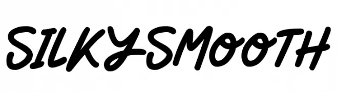
A bold, handwritten font with smooth, flowing curves and a casual, energetic style.
![Silky Smooth Frei Schriftart Herunterladen]() Herunterladen 88 Downloads@WebFont
Herunterladen 88 Downloads@WebFont -
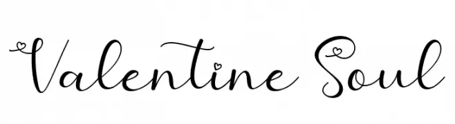
( Fonts by AEN Creative Studio - Agung Eko Nugroho - Personal-use only. For commercial use please contact owner. )
A romantic, whimsical script font with heart motifs and elegant curves.
![Valentine Soul Frei Schriftart Herunterladen]() Herunterladen 88 Downloads@WebFont
Herunterladen 88 Downloads@WebFont -
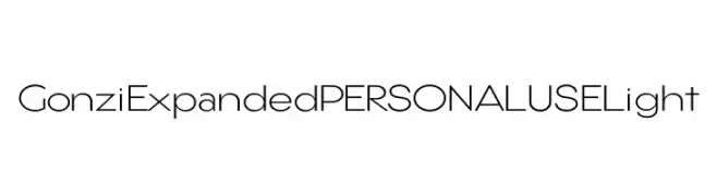
( Fonts by Mans Greback - Personal-use only. For commercial use please contact owner. )
A modern, expanded, and geometric font with a light weight.
![Gonzi Expanded PERSONAL USE Light Frei Schriftart Herunterladen]() Herunterladen 88 Downloads@WebFont
Herunterladen 88 Downloads@WebFont -
( Fonts by niyos - Nur Huda - Personal-use only. For commercial use please contact owner. )
A bold, flowing script font with interconnected letters and decorative swirls.
![Salidea Frei Schriftart Herunterladen]() Herunterladen 88 Downloads@WebFont
Herunterladen 88 Downloads@WebFont -
( Iconian Fonts - Daniel Zadorozny - www.iconian.com )
A bold, italicized, and compact font with a modern, dynamic style.
![Phantacon Compact Bold Italic Frei Schriftart Herunterladen]() Herunterladen 88 Downloads@WebFont
Herunterladen 88 Downloads@WebFont


![week [sRB] Frei Schriftart Herunterladen](https://d144mzi0q5mijx.cloudfront.net/img/W/E/week-sRB.webp)


Welche Schriften sind gerade am populärsten?
Poppins, Roboto, Montserrat, Open Sans und Lato sind wegen ihrer klaren Formen und breiten Einsetzbarkeit sehr gefragt – von Markenauftritt über Landingpages bis hin zu Postern.
Welche Fonts eignen sich für Logos?
Geometrische Sans‑Serifs (z. B. Poppins, Familien im Gotham‑Stil) sind ein häufiger Griff für sauberes, skalierbares Branding. Für eine persönlichere Note bleiben Scripts und Handschrift‑Stile beliebt. Kombinieren Sie einen prägnanten Headline‑Font mit einer neutralen Brotschrift für Wiedererkennung und Harmonie.
Wie oft wird die Top‑Liste aktualisiert?
Regelmäßig – basierend auf realen Downloads und Interaktionen. Schauen Sie öfter vorbei, um aufstrebende Favoriten früh zu entdecken.
💡 Tipp: Seite bookmarken – Trends wechseln schnell, und heutige Top‑Schriften inspirieren morgen vielleicht das Rebranding.