Willkommen bei den Top‑Schriften – hier treffen Beliebtheit und Qualität aufeinander. Das sind die in diesem Jahr am häufigsten heruntergeladenen und genutzten Fonts. Wenn Sie sichere Optionen für Logo, Web oder Social suchen, starten Sie hier.
Jeder Top‑Font überzeugt durch Balance, Lesbarkeit und Vielseitigkeit. Sie finden moderne Sans‑Serifs, elegante Scripts, Vintage‑Serifs und minimalistische Displays.
-
( Fonts by Denne - Denise Bentulan - Personal-use only. For commercial use please contact owner. )
A playful, handwritten font with tall, narrow letters and a whimsical style.
 Herunterladen 87 Downloads@WebFont
 -
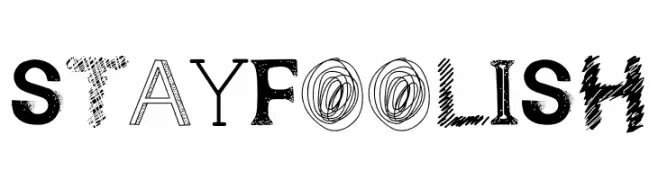
( Fonts by Excellent Ritma Florendia )
A playful and eclectic font with varied artistic styles for each character.
![Stay Foolish Frei Schriftart Herunterladen]() Herunterladen 87 Downloads@WebFont
Herunterladen 87 Downloads@WebFont -
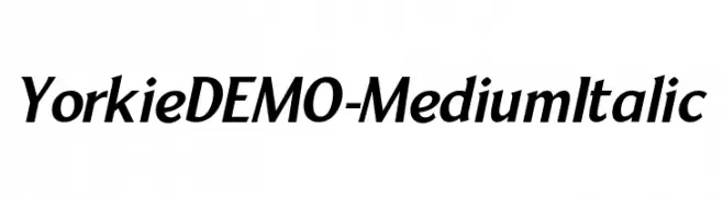
( Fonts by Font People - Personal-use only. For commercial use please contact owner. )
A modern italic font with smooth curves and balanced contrast.
![YorkieDEMO-MediumItalic Frei Schriftart Herunterladen]() Herunterladen 87 Downloads@WebFont
Herunterladen 87 Downloads@WebFont -
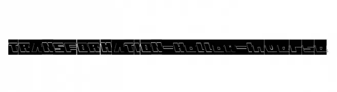
( weknow - Wino S Kadir - www.creativefabrica.com/designer/weknow/ )
A bold, hollow, inverse font with a modern, geometric style.
![TRANSFORMATION-Hollow-Inverse Frei Schriftart Herunterladen]() Herunterladen 87 Downloads@WebFont
Herunterladen 87 Downloads@WebFont -
( Fonts by Daniel Zadorozny - www.iconian.com - Personal-use only. For commercial use please contact owner. )
A bold, italicized font with high contrast and dynamic slant.
![Falzon Italic Frei Schriftart Herunterladen]() Herunterladen 87 Downloads@WebFont
Herunterladen 87 Downloads@WebFont -
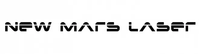
( Fonts by Daniel Zadorozny - www.iconian.com )
A futuristic, geometric font with bold, angular letterforms and a modern aesthetic.
![New Mars Laser Frei Schriftart Herunterladen]() Herunterladen 87 Downloads@WebFont
Herunterladen 87 Downloads@WebFont -
( Fonts by Graph Arts - Yanuar Lutfi - Personal-use only. For commercial use please contact owner. )
A playful, casual handwritten font with fluid, irregular strokes.
![Moments Frei Schriftart Herunterladen]() Herunterladen 87 Downloads@WebFont
Herunterladen 87 Downloads@WebFont -
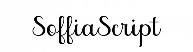
( Fonts by Zane Studio - Personal-use only. For commercial use please contact owner. )
A graceful and elegant script font with fluid, cursive strokes.
![SoffiaScript Frei Schriftart Herunterladen]() Herunterladen 87 Downloads@WebFont
Herunterladen 87 Downloads@WebFont -
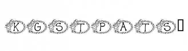
( Katz Fontz - katzfonts.50megs.com/kg.html )
A decorative font with letters inside shamrock shapes, perfect for festive themes.
![KG ST PATS 3 Frei Schriftart Herunterladen]() Herunterladen 87 Downloads@WebFont
Herunterladen 87 Downloads@WebFont -
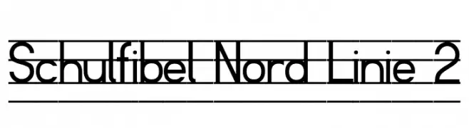
( Fonts by Peter Wiegel - www.peter-wiegel.de - Personal-use only. For commercial use please contact owner. )
A geometric, modern font with consistent stroke widths and balanced proportions.
![Schulfibel Nord Linie 2 Frei Schriftart Herunterladen]() Herunterladen 87 Downloads@WebFont
Herunterladen 87 Downloads@WebFont -
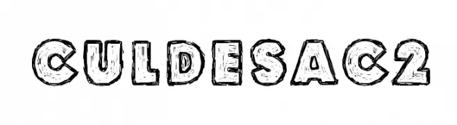
( Fonts by www.junkohanhero.com - Personal-use only. For commercial use please contact owner. )
A bold, textured, hand-drawn font with a playful and artistic style.
![Culdesac2 Frei Schriftart Herunterladen]() Herunterladen 87 Downloads@WebFont
Herunterladen 87 Downloads@WebFont -
( Fonts by Matias Romero - Personal-use only. For commercial use please contact owner. )
A bold, modern font with geometric influences and strong visual impact.
![Lizard Frei Schriftart Herunterladen]() Herunterladen 87 Downloads@WebFont
Herunterladen 87 Downloads@WebFont -
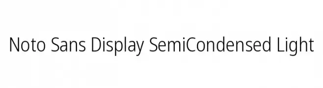
( Noto is a trademark of Google Inc. Noto fonts are open source. All Noto fonts are published under the SIL Open Font License, Version 1.1 )
A modern, light, semi-condensed sans-serif font with clean, geometric lines.
![Noto Sans Display SemiCondensed Light Frei Schriftart Herunterladen]() Herunterladen 87 Downloads@WebFont
Herunterladen 87 Downloads@WebFont -
( Fonts by Ryul Davidson - Personal-use only. For commercial use please contact owner. )
A modern, geometric sans-serif font with an extra light weight.
![Along Sans s2 ExtraLight Frei Schriftart Herunterladen]() Herunterladen 87 Downloads@WebFont
Herunterladen 87 Downloads@WebFont -
( Fonts by Seno Aji - Personal-use only. For commercial use please contact owner. )
A dynamic and elegant script font with a modern touch.
![Austhin Frei Schriftart Herunterladen]() Herunterladen 87 Downloads@WebFont
Herunterladen 87 Downloads@WebFont -
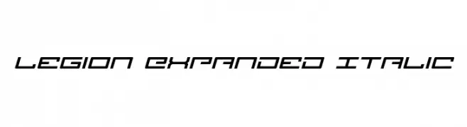
( Iconian Fonts - Daniel Zadorozny - www.iconian.com )
A futuristic, expanded italic font with angular, geometric shapes.
![Legion Expanded Italic Frei Schriftart Herunterladen]() Herunterladen 87 Downloads@WebFont
Herunterladen 87 Downloads@WebFont -
( Fonts by Vladimir Nikolic )
A bold, geometric font with a modern and dynamic style.
![Reverse Regular Frei Schriftart Herunterladen]() Herunterladen 87 Downloads@WebFont
Herunterladen 87 Downloads@WebFont -
![Siberia UltraOblique Outline Frei Schriftart Herunterladen]() Herunterladen 87 Downloads@WebFont
Herunterladen 87 Downloads@WebFont -
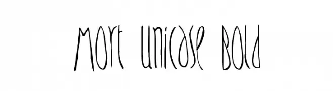
( Daniel Plant - www.fontmonster.org )
A unique, artistic font with elongated, narrow characters and a hand-drawn quality.
![Mort Unicase Bold Frei Schriftart Herunterladen]() Herunterladen 87 Downloads@WebFont
Herunterladen 87 Downloads@WebFont -
( Fonts by productype.com )
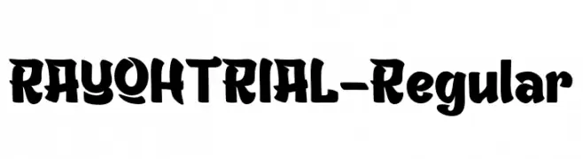
A bold, playful font with rounded characters and exaggerated serifs.
![RAYOHTRIAL-Regular Frei Schriftart Herunterladen]() Herunterladen 87 Downloads@WebFont
Herunterladen 87 Downloads@WebFont -
( Fonts by Zetafonts - Personal-use only. For commercial use please contact owner. )
A sleek, modern, light italic sans-serif font with a clean and professional look.
![Altair Light Italic Frei Schriftart Herunterladen]() Herunterladen 87 Downloads@WebFont
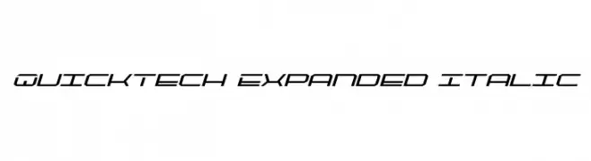
Herunterladen 87 Downloads@WebFont -
![QuickTech Expanded Italic Frei Schriftart Herunterladen]() Herunterladen 87 Downloads@WebFont
Herunterladen 87 Downloads@WebFont -
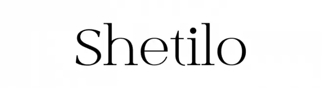
( Fonts by typeformerstudio.com - Personal-use only. For commercial use please contact owner. )
A classic serif font with elegant, refined characters and thin serifs.
![Shetilo Frei Schriftart Herunterladen]() Herunterladen 87 Downloads@WebFont
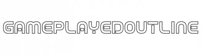
Herunterladen 87 Downloads@WebFont -
![Game Played Outline Frei Schriftart Herunterladen]() Herunterladen 87 Downloads@WebFont
Herunterladen 87 Downloads@WebFont -
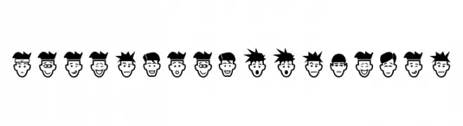
( Fonts by Ideas and Apps )
A whimsical, bold icon set of diverse cartoon faces.
![IdeasAndApps Faces Frei Schriftart Herunterladen]() Herunterladen 87 Downloads@WebFont
Herunterladen 87 Downloads@WebFont -
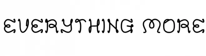
( Fonts by Wino S Kadir - weknow - www.revolge.com/shop/weknow/ - Personal-use only. For commercial use please contact owner. )
A playful, handwritten font with rounded, whimsical characters.
![EVERYTHING MORE Frei Schriftart Herunterladen]() Herunterladen 87 Downloads@WebFont
Herunterladen 87 Downloads@WebFont -
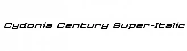
( Iconian Fonts - Daniel Zadorozny - www.iconian.com )
A dynamic, italicized font with a futuristic and sleek design.
![Cydonia Century Super-Italic Frei Schriftart Herunterladen]() Herunterladen 87 Downloads@WebFont
Herunterladen 87 Downloads@WebFont -
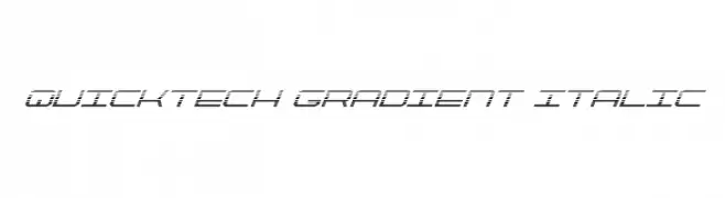
![QuickTech Gradient Italic Frei Schriftart Herunterladen]() Herunterladen 87 Downloads@WebFont
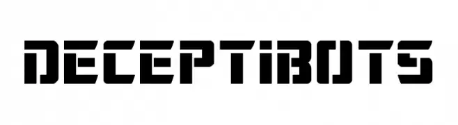
Herunterladen 87 Downloads@WebFont -
![Deceptibots Frei Schriftart Herunterladen]() Herunterladen 87 Downloads@WebFont
Herunterladen 87 Downloads@WebFont -
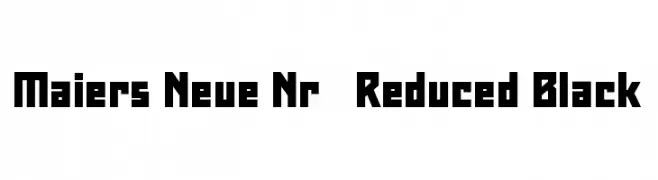
( Fonts by ingoFonts - Ingo Zimmermann - Personal-use only. For commercial use please contact owner. )
A bold, geometric font with blocky, angular letterforms and a modern, assertive style.
![Maiers Neue Nr.8 Reduced Black Frei Schriftart Herunterladen]() Herunterladen 87 Downloads@WebFont
Herunterladen 87 Downloads@WebFont -
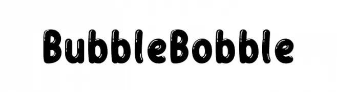
( Fonts by Almarkhatype - Abdul Malik Wisnu - Personal-use only. For commercial use please contact owner. )
A playful, bold typeface with rounded, bubbly characters.
![Bubble Bobble Frei Schriftart Herunterladen]() Herunterladen 87 Downloads@WebFont
Herunterladen 87 Downloads@WebFont -
( Fonts by a Neale Davidson - www.pixelsagas.com. Personal-use only. For commercial use please contact owner. )
A bold, italicized font with angular, dynamic letterforms.
![Cardosan Italic Frei Schriftart Herunterladen]() Herunterladen 87 Downloads@WebFont
Herunterladen 87 Downloads@WebFont -
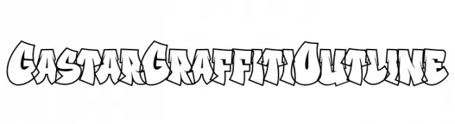
( Fonts by Fitrah Type )
A bold, graffiti-style font with dynamic, angular letterforms and thick outlines.
![Gastar Graffiti Outline Frei Schriftart Herunterladen]() Herunterladen 87 Downloads@WebFont
Herunterladen 87 Downloads@WebFont -
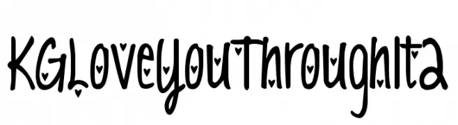
![KG Love You Through It 2 Frei Schriftart Herunterladen]() Herunterladen 87 Downloads@WebFont
Herunterladen 87 Downloads@WebFont -
( Iconian Fonts - Daniel Zadorozny - www.iconian.com )
Superhero silhouette font with each glyph as a character pose.
![Legionnaires Regular Frei Schriftart Herunterladen]() Herunterladen 87 Downloads@WebFont
Herunterladen 87 Downloads@WebFont


Welche Schriften sind gerade am populärsten?
Poppins, Roboto, Montserrat, Open Sans und Lato sind wegen ihrer klaren Formen und breiten Einsetzbarkeit sehr gefragt – von Markenauftritt über Landingpages bis hin zu Postern.
Welche Fonts eignen sich für Logos?
Geometrische Sans‑Serifs (z. B. Poppins, Familien im Gotham‑Stil) sind ein häufiger Griff für sauberes, skalierbares Branding. Für eine persönlichere Note bleiben Scripts und Handschrift‑Stile beliebt. Kombinieren Sie einen prägnanten Headline‑Font mit einer neutralen Brotschrift für Wiedererkennung und Harmonie.
Wie oft wird die Top‑Liste aktualisiert?
Regelmäßig – basierend auf realen Downloads und Interaktionen. Schauen Sie öfter vorbei, um aufstrebende Favoriten früh zu entdecken.
💡 Tipp: Seite bookmarken – Trends wechseln schnell, und heutige Top‑Schriften inspirieren morgen vielleicht das Rebranding.