Willkommen bei den Top‑Schriften – hier treffen Beliebtheit und Qualität aufeinander. Das sind die in diesem Jahr am häufigsten heruntergeladenen und genutzten Fonts. Wenn Sie sichere Optionen für Logo, Web oder Social suchen, starten Sie hier.
Jeder Top‑Font überzeugt durch Balance, Lesbarkeit und Vielseitigkeit. Sie finden moderne Sans‑Serifs, elegante Scripts, Vintage‑Serifs und minimalistische Displays.
-
( Fonts by Mike Wolf )
A bold, 3D retro-futuristic font with geometric and angular design.
 Herunterladen 507 Downloads@WebFont
 -
( Font by Jayvee D. Enaguas - grandchaos9000.deviantart.com )
A pixelated, retro-style font with a blocky, geometric design.
![RetroVille NC Frei Schriftart Herunterladen]() Herunterladen 507 Downloads@WebFont
Herunterladen 507 Downloads@WebFont -
![Discus Frei Schriftart Herunterladen]() Herunterladen 507 Downloads@WebFont
Herunterladen 507 Downloads@WebFont -
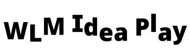
![WLM Idea Play Frei Schriftart Herunterladen]() Herunterladen 507 Downloads@WebFont
Herunterladen 507 Downloads@WebFont -
( Fonts by Farul Arjianto - creativemarket.com/typefar - Personal-use only. For commercial use please contact owner. )
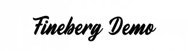
A bold, cursive font with smooth, flowing lines and elegant flourishes.
![Fineberg Demo Frei Schriftart Herunterladen]() Herunterladen 507 Downloads@WebFont
Herunterladen 507 Downloads@WebFont -
-
( Fonts by Luedecke Design Font Co. - ldfonts.weebly.com )
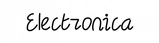
A playful, handwritten font with fluid strokes and a casual style.
![Electronica Frei Schriftart Herunterladen]() Herunterladen 507 Downloads@WebFont
Herunterladen 507 Downloads@WebFont -
( Fonts by Lindsay Tatman )
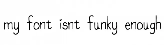
A playful, hand-drawn font with a whimsical and casual style.
![my font isnt funky enough Frei Schriftart Herunterladen]() Herunterladen 507 Downloads@WebFont
Herunterladen 507 Downloads@WebFont -
( Fonts by Ingo Zimmermann - www.ingofonts.com. Personal-use only. For commercial use please contact owner. )
A bold, modern sans-serif font with excellent readability and a clean design.
![WendelinReduced-Halbfett Frei Schriftart Herunterladen]() Herunterladen 507 Downloads@WebFont
Herunterladen 507 Downloads@WebFont -
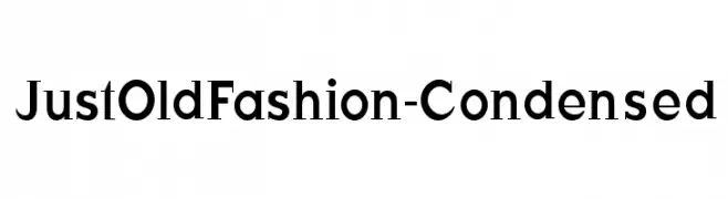
( Fonts by Manfred Klein - manfred-klein.ina-mar.com )
A classic serif font with a condensed width and medium contrast, offering elegance and readability.
![JustOldFashion-Condensed Frei Schriftart Herunterladen]() Herunterladen 507 Downloads@WebFont
Herunterladen 507 Downloads@WebFont -
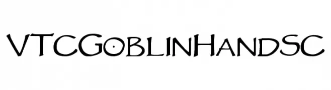
![VTCGoblinHandSC Frei Schriftart Herunterladen]() Herunterladen 507 Downloads@WebFont
Herunterladen 507 Downloads@WebFont


Welche Schriften sind gerade am populärsten?
Poppins, Roboto, Montserrat, Open Sans und Lato sind wegen ihrer klaren Formen und breiten Einsetzbarkeit sehr gefragt – von Markenauftritt über Landingpages bis hin zu Postern.
Welche Fonts eignen sich für Logos?
Geometrische Sans‑Serifs (z. B. Poppins, Familien im Gotham‑Stil) sind ein häufiger Griff für sauberes, skalierbares Branding. Für eine persönlichere Note bleiben Scripts und Handschrift‑Stile beliebt. Kombinieren Sie einen prägnanten Headline‑Font mit einer neutralen Brotschrift für Wiedererkennung und Harmonie.
Wie oft wird die Top‑Liste aktualisiert?
Regelmäßig – basierend auf realen Downloads und Interaktionen. Schauen Sie öfter vorbei, um aufstrebende Favoriten früh zu entdecken.
💡 Tipp: Seite bookmarken – Trends wechseln schnell, und heutige Top‑Schriften inspirieren morgen vielleicht das Rebranding.