Willkommen bei den Top‑Schriften – hier treffen Beliebtheit und Qualität aufeinander. Das sind die in diesem Jahr am häufigsten heruntergeladenen und genutzten Fonts. Wenn Sie sichere Optionen für Logo, Web oder Social suchen, starten Sie hier.
Jeder Top‑Font überzeugt durch Balance, Lesbarkeit und Vielseitigkeit. Sie finden moderne Sans‑Serifs, elegante Scripts, Vintage‑Serifs und minimalistische Displays.
-
( Fonts by Alpaprana - Personal-use only. For commercial use please contact owner. )
A playful, hand-drawn font with elongated, whimsical letterforms.
 Herunterladen 86 Downloads@WebFont
 -
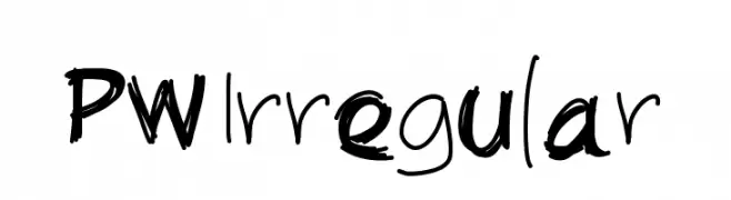
( Fonts by Peax Webdesign - www.peax-webdesign.com. Personal-use only. For commercial use please contact owner. )
A playful, hand-drawn font with irregular, dynamic strokes.
![PWIrregular Frei Schriftart Herunterladen]() Herunterladen 86 Downloads@WebFont
Herunterladen 86 Downloads@WebFont -
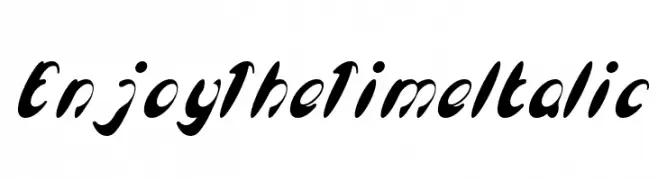
( weknow - Wino S Kadir - www.creativefabrica.com/designer/weknow/ )
A bold, italic script font with dynamic and fluid strokes.
![Enjoy The Time Italic Frei Schriftart Herunterladen]() Herunterladen 86 Downloads@WebFont
Herunterladen 86 Downloads@WebFont -
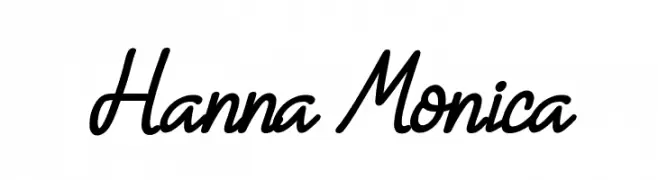
( Fonts by Subectype & Orenari - Rangga Subekti & Ari - Personal-use only. For commercial use please contact owner. )
A lively script font with fluid, connected strokes and elegant loops.
![Hanna Monica Frei Schriftart Herunterladen]() Herunterladen 86 Downloads@WebFont
Herunterladen 86 Downloads@WebFont -
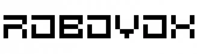
( Splintered - www.splintered.co.uk )
A futuristic, pixelated font with a digital, geometric style.
![Robovox Frei Schriftart Herunterladen]() Herunterladen 86 Downloads@WebFont
Herunterladen 86 Downloads@WebFont -
( Typodermic Fonts - Ray Larabie - www.typodermicfonts.com/ )
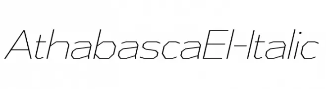
A geometric, angular italic font with a modern, dynamic style.
![AthabascaEl-Italic Frei Schriftart Herunterladen]() Herunterladen 86 Downloads@WebFont
Herunterladen 86 Downloads@WebFont -
( Fonts by Vladimir Nikolic )
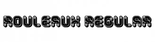
A bold, playful font with a mechanical, gear-like design and high contrast.
![Rouleaux Regular Frei Schriftart Herunterladen]() Herunterladen 86 Downloads@WebFont
Herunterladen 86 Downloads@WebFont -
( Fonts by Craft Supply Co - Personal-use only. For commercial use please contact owner. )
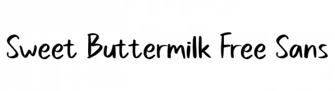
A playful, casual handwritten font with smooth, flowing lines.
![Sweet Buttermilk Free Sans Frei Schriftart Herunterladen]() Herunterladen 86 Downloads@WebFont
Herunterladen 86 Downloads@WebFont -
( Fonts by Yissus Letters --- Drawings - Jesus Galiana - Personal-use only. For commercial use please contact owner. )
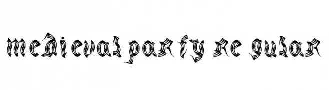
An ornate, medieval-style font with intricate, flowing strokes.
![medievalparty-Regular Frei Schriftart Herunterladen]() Herunterladen 86 Downloads@WebFont
Herunterladen 86 Downloads@WebFont -
( Fonts by Bearytype - Dian Hadi - Personal-use only. For commercial use please contact owner. )
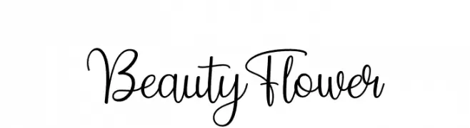
An elegant and flowing script font with graceful, cursive letterforms.
![Beauty Flower Frei Schriftart Herunterladen]() Herunterladen 86 Downloads@WebFont
Herunterladen 86 Downloads@WebFont -
( Fonts by Manfred Klein. Free for private and charity use. Free for commercial with donation to organizations )
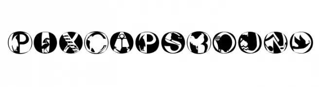
A modern, artistic font with characters enclosed in circles, featuring bold graphic elements.
![PixCapsRound Frei Schriftart Herunterladen]() Herunterladen 86 Downloads@WebFont
Herunterladen 86 Downloads@WebFont -
( Fonts by Abo Daniel Studio - Panggah Laksono - Personal-use only. For commercial use please contact owner. )
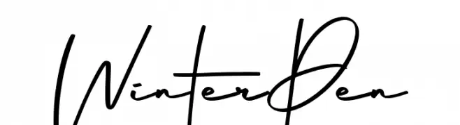
A modern, handwritten font with fluid, dynamic strokes.
![Winter Pen Frei Schriftart Herunterladen]() Herunterladen 86 Downloads@WebFont
Herunterladen 86 Downloads@WebFont -
( Fonts by ingoFonts - Ingo Zimmermann - Personal-use only. For commercial use please contact owner. )
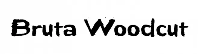
A bold, hand-carved font with a rustic, woodcut appearance.
![Bruta Woodcut Frei Schriftart Herunterladen]() Herunterladen 86 Downloads@WebFont
Herunterladen 86 Downloads@WebFont -
( Fonts by Moch Zaenal Abidin )
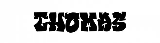
A bold, graffiti-inspired font with dynamic, exaggerated forms.
![THOMAS Frei Schriftart Herunterladen]() Herunterladen 86 Downloads@WebFont
Herunterladen 86 Downloads@WebFont -
( Fonts by Vladimir Nikolic - https://www.creativefabrica.com/product/educated-deers/ref/144265/ - Personal-use only. For commercial use please contact owner. )
A bold, geometric font with a retro-futuristic style.
![Retrosonic Regular Frei Schriftart Herunterladen]() Herunterladen 86 Downloads@WebFont
Herunterladen 86 Downloads@WebFont -
( Fonts by Iconian Fonts - Daniel Zadorozny - Personal-use only. For commercial use please contact owner. )
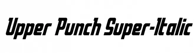
A bold, italicized font with a dynamic and modern style.
![Upper Punch Super-Italic Frei Schriftart Herunterladen]() Herunterladen 86 Downloads@WebFont
Herunterladen 86 Downloads@WebFont -
( Fonts by Vunira Design - Personal-use only. For commercial use please contact owner. )
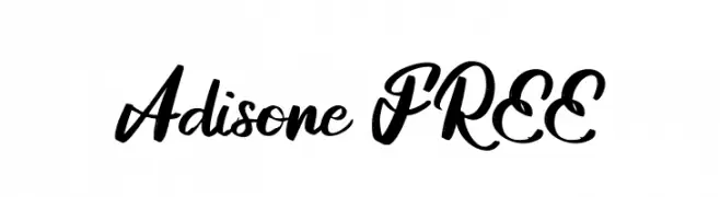
A dynamic and elegant script font with bold, flowing letterforms.
![Adisone FREE Frei Schriftart Herunterladen]() Herunterladen 86 Downloads@WebFont
Herunterladen 86 Downloads@WebFont -
( Fonts by a Max Infeld - XEROGRAPHER FONTS - xerographer.blogspot.com . Personal-use only. For commercial use please contact owner. )
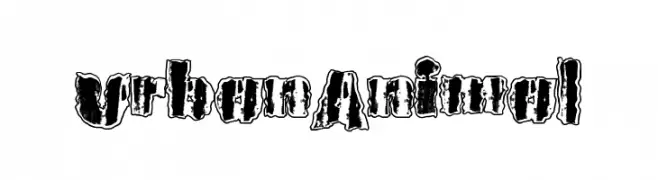
A rugged, distressed font with a bold, grunge aesthetic.
![UrbanAnimal Frei Schriftart Herunterladen]() Herunterladen 86 Downloads@WebFont
Herunterladen 86 Downloads@WebFont -
( Fonts by Voy Vivika - Personal-use only. For commercial use please contact owner. )
A pixelated, blocky font with a retro digital aesthetic.
![OpenMine Frei Schriftart Herunterladen]() Herunterladen 86 Downloads@WebFont
Herunterladen 86 Downloads@WebFont -
( Fonts by ingoFonts - Ingo Zimmermann - Personal-use only. For commercial use please contact owner. )
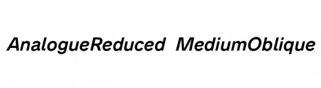
A modern, oblique font with medium weight and clean lines.
![Analogue Reduced 66 Medium Oblique Frei Schriftart Herunterladen]() Herunterladen 86 Downloads@WebFont
Herunterladen 86 Downloads@WebFont -
( Fonts by Vladimir Nikolic - https://www.creativefabrica.com/product/educated-deers/ref/144265/ - Personal-use only. For commercial use please contact owner. )
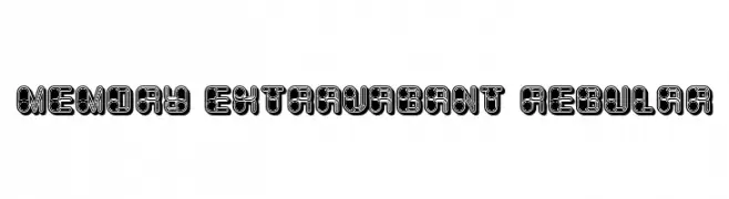
A bold, decorative font with intricate geometric patterns and thick outlines.
![Memory Extravagant Regular Frei Schriftart Herunterladen]() Herunterladen 86 Downloads@WebFont
Herunterladen 86 Downloads@WebFont -
( Jaime Rangel Castro )
A dynamic and elegant script font with smooth curves and a slight slant.
![Patty Frei Schriftart Herunterladen]() Herunterladen 86 Downloads@WebFont
Herunterladen 86 Downloads@WebFont -
( Fonts by a Max Infeld - XEROGRAPHER FONTS - xerographer.blogspot.com . Personal-use only. For commercial use please contact owner. )
A hand-drawn, textured font with a raw, organic appearance.
![RawDiet Frei Schriftart Herunterladen]() Herunterladen 86 Downloads@WebFont
Herunterladen 86 Downloads@WebFont -
( Fonts by Si Panji )
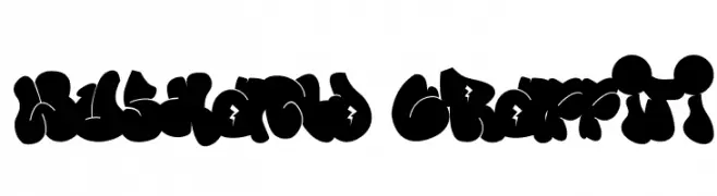
A bold, graffiti-style font with dynamic, rounded shapes and high contrast.
![Wushand Graffiti Frei Schriftart Herunterladen]() Herunterladen 86 Downloads@WebFont
Herunterladen 86 Downloads@WebFont -
( Fonts by StringLabs - stringlabscreative.com - Personal-use only. For commercial use please contact owner. )
A bold, decorative font with a vintage, gothic style.
![Chivel Mind Frei Schriftart Herunterladen]() Herunterladen 86 Downloads@WebFont
Herunterladen 86 Downloads@WebFont -
( Fonts by Vladimir Nikolic - www.creativefabrica.com/designer/vladimirnikolic/ - Personal-use only. For commercial use please contact owner. )
A bold, medieval-inspired font with sharp, angular edges and a strong presence.
![Waster Extract Book Frei Schriftart Herunterladen]() Herunterladen 86 Downloads@WebFont
Herunterladen 86 Downloads@WebFont -
( Fonts by Hefar Cantillana - Personal-use only. For commercial use please contact owner. )
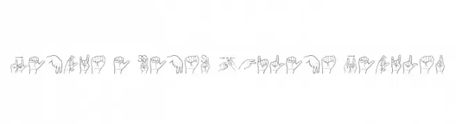
Hand-drawn, instructional sign language illustrations with clean lines.
![Lengua De Senas Chilena Regular Frei Schriftart Herunterladen]() Herunterladen 86 Downloads@WebFont
Herunterladen 86 Downloads@WebFont -
( Fonts by ingoFonts - Ingo Zimmermann - Personal-use only. For commercial use please contact owner. )
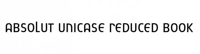
A modern, geometric unicase font with clean, rounded characters.
![Absolut Unicase Reduced Book Frei Schriftart Herunterladen]() Herunterladen 86 Downloads@WebFont
Herunterladen 86 Downloads@WebFont -
( Fonts by nailetter - Sun Art - Personal-use only. For commercial use please contact owner. )
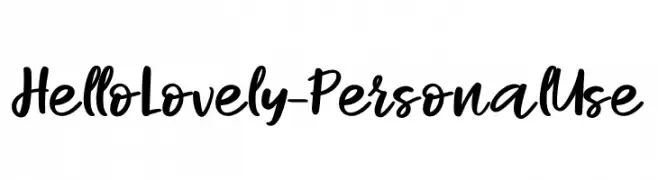
A playful, handwritten font with bold, smooth strokes and a casual, cursive style.
![Hello Lovely - Personal Use Frei Schriftart Herunterladen]() Herunterladen 86 Downloads@WebFont
Herunterladen 86 Downloads@WebFont -
( Andreas Johansson - hem.passagen.se/anjo77/font/ )
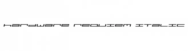
A futuristic, geometric italic font with a digital and tech-inspired style.
![hardware requiem italic Frei Schriftart Herunterladen]() Herunterladen 86 Downloads@WebFont
Herunterladen 86 Downloads@WebFont -
( Fonts by Peter Wiegel - www.peter-wiegel.de - Personal-use only. For commercial use please contact owner. )
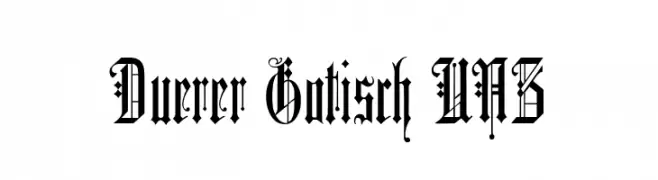
An ornate Blackletter font with intricate flourishes and a gothic style.
![Duerer Gotisch UNZ Frei Schriftart Herunterladen]() Herunterladen 86 Downloads@WebFont
Herunterladen 86 Downloads@WebFont -
( Fonts by Daniel Zadorozny - www.iconian.com )
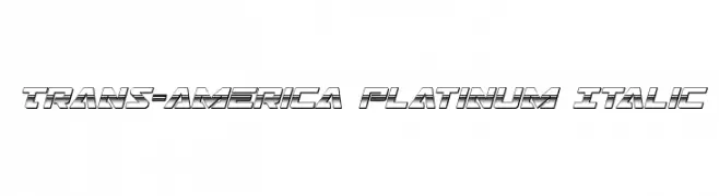
A bold, futuristic italic font with a three-dimensional effect and geometric structure.
![Trans-America Platinum Italic Frei Schriftart Herunterladen]() Herunterladen 86 Downloads@WebFont
Herunterladen 86 Downloads@WebFont -
( Fonts by inst.ink-type - Galih S Aji - Personal-use only. For commercial use please contact owner. )
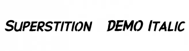
A bold, italic font with textured, brush-like strokes and a dynamic, handcrafted appearance.
![Superstition - DEMO Italic Frei Schriftart Herunterladen]() Herunterladen 86 Downloads@WebFont
Herunterladen 86 Downloads@WebFont -
( Jaime Rangel Castro )
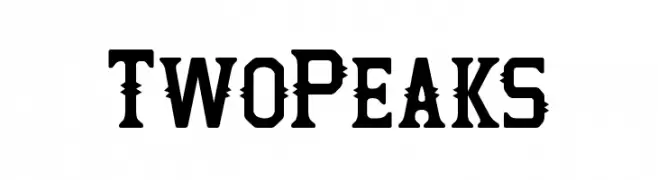
A bold, angular font with sharp, peak-like cut-out details.
![Two Peaks Frei Schriftart Herunterladen]() Herunterladen 86 Downloads@WebFont
Herunterladen 86 Downloads@WebFont -
( Fonts by Aestherica Studio )
A playful, casual handwritten font with fluid, slightly irregular strokes.
![Peach Cakes Frei Schriftart Herunterladen]() Herunterladen 86 Downloads@WebFont
Herunterladen 86 Downloads@WebFont


Welche Schriften sind gerade am populärsten?
Poppins, Roboto, Montserrat, Open Sans und Lato sind wegen ihrer klaren Formen und breiten Einsetzbarkeit sehr gefragt – von Markenauftritt über Landingpages bis hin zu Postern.
Welche Fonts eignen sich für Logos?
Geometrische Sans‑Serifs (z. B. Poppins, Familien im Gotham‑Stil) sind ein häufiger Griff für sauberes, skalierbares Branding. Für eine persönlichere Note bleiben Scripts und Handschrift‑Stile beliebt. Kombinieren Sie einen prägnanten Headline‑Font mit einer neutralen Brotschrift für Wiedererkennung und Harmonie.
Wie oft wird die Top‑Liste aktualisiert?
Regelmäßig – basierend auf realen Downloads und Interaktionen. Schauen Sie öfter vorbei, um aufstrebende Favoriten früh zu entdecken.
💡 Tipp: Seite bookmarken – Trends wechseln schnell, und heutige Top‑Schriften inspirieren morgen vielleicht das Rebranding.