Willkommen bei den Top‑Schriften – hier treffen Beliebtheit und Qualität aufeinander. Das sind die in diesem Jahr am häufigsten heruntergeladenen und genutzten Fonts. Wenn Sie sichere Optionen für Logo, Web oder Social suchen, starten Sie hier.
Jeder Top‑Font überzeugt durch Balance, Lesbarkeit und Vielseitigkeit. Sie finden moderne Sans‑Serifs, elegante Scripts, Vintage‑Serifs und minimalistische Displays.
-
 Herunterladen 505 Downloads
 -
( desobeissance-graphique.blogspot.com )
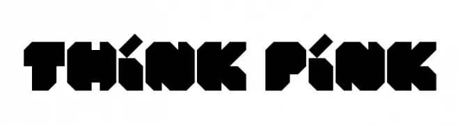
A bold, geometric font with sharp angles and block-like shapes.
![Think Pink Frei Schriftart Herunterladen]() Herunterladen 505 Downloads@WebFont
Herunterladen 505 Downloads@WebFont -
( Pizzadude - Jakob Fischer - www.pizzadude.dk/ )
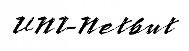
A tall, narrow font with a hand-drawn, artistic style.
![PorceleinaDEMO Frei Schriftart Herunterladen]() Herunterladen 505 Downloads@WebFont
Herunterladen 505 Downloads@WebFont -
( Fonts by Octotype - www.foundmyfont.com - Personal-use only. For commercial use please contact owner. )
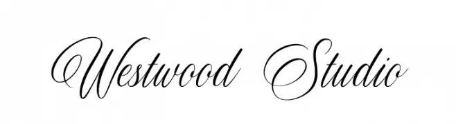
An elegant script font with flowing, interconnected letters and high contrast strokes.
![Westwood Studio Frei Schriftart Herunterladen]() Herunterladen 505 Downloads@WebFont
Herunterladen 505 Downloads@WebFont -
( Fonts by www.houseoflime.com )
Ornamental heart-shaped decorative glyphs.
![Hearts of Lime Frei Schriftart Herunterladen]() Herunterladen 505 Downloads@WebFont
Herunterladen 505 Downloads@WebFont -
-
( Fonts by Steve Gardner - www.explogos.com. Personal-use only. For commercial use please contact owner. )
A bold, modern sans-serif font with clean lines and strong geometric shapes.
![Sans Statement Regular Frei Schriftart Herunterladen]() Herunterladen 505 Downloads@WebFont
Herunterladen 505 Downloads@WebFont -
( Fonts by Octotype - www.foundmyfont.com - Personal-use only. For commercial use please contact owner. )
A classic, elegant script font with flowing cursive letters and intricate flourishes.
![Delightful Frei Schriftart Herunterladen]() Herunterladen 505 Downloads@WebFont
Herunterladen 505 Downloads@WebFont -
( Fonts by MJType )
A bold, playful handwritten font with rounded edges and a dynamic style.
![TIKTAK Frei Schriftart Herunterladen]() Herunterladen 505 Downloads@WebFont
Herunterladen 505 Downloads@WebFont -
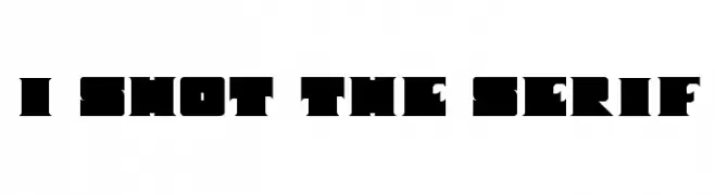
![I Shot The Serif Frei Schriftart Herunterladen]() Herunterladen 504 Downloads@WebFont
Herunterladen 504 Downloads@WebFont -
![Aaron SansRegular Frei Schriftart Herunterladen]() Herunterladen 504 Downloads@WebFont
Herunterladen 504 Downloads@WebFont


Welche Schriften sind gerade am populärsten?
Poppins, Roboto, Montserrat, Open Sans und Lato sind wegen ihrer klaren Formen und breiten Einsetzbarkeit sehr gefragt – von Markenauftritt über Landingpages bis hin zu Postern.
Welche Fonts eignen sich für Logos?
Geometrische Sans‑Serifs (z. B. Poppins, Familien im Gotham‑Stil) sind ein häufiger Griff für sauberes, skalierbares Branding. Für eine persönlichere Note bleiben Scripts und Handschrift‑Stile beliebt. Kombinieren Sie einen prägnanten Headline‑Font mit einer neutralen Brotschrift für Wiedererkennung und Harmonie.
Wie oft wird die Top‑Liste aktualisiert?
Regelmäßig – basierend auf realen Downloads und Interaktionen. Schauen Sie öfter vorbei, um aufstrebende Favoriten früh zu entdecken.
💡 Tipp: Seite bookmarken – Trends wechseln schnell, und heutige Top‑Schriften inspirieren morgen vielleicht das Rebranding.