Willkommen bei den Top‑Schriften – hier treffen Beliebtheit und Qualität aufeinander. Das sind die in diesem Jahr am häufigsten heruntergeladenen und genutzten Fonts. Wenn Sie sichere Optionen für Logo, Web oder Social suchen, starten Sie hier.
Jeder Top‑Font überzeugt durch Balance, Lesbarkeit und Vielseitigkeit. Sie finden moderne Sans‑Serifs, elegante Scripts, Vintage‑Serifs und minimalistische Displays.
-
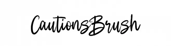
( Fonts by Fargun Studio - Fajar Gunawan - Personal-use only. For commercial use please contact owner. )
A lively, brush-style font with a handwritten appearance.
 Herunterladen 86 Downloads@WebFont
 -
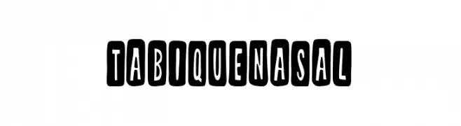
( Fonts by Woodcutter )
A bold, playful font with characters enclosed in rounded rectangles, offering a quirky and dynamic style.
![Tabique Nasal Frei Schriftart Herunterladen]() Herunterladen 86 Downloads@WebFont
Herunterladen 86 Downloads@WebFont -
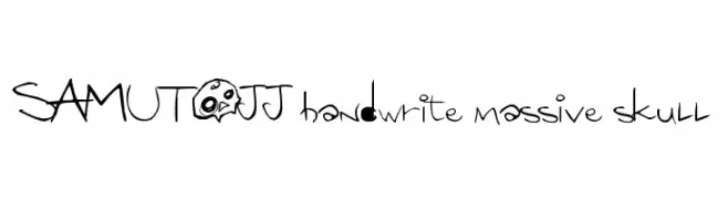
( SAMUTOJJ - www.samutojj.com )
A playful, edgy font with hand-drawn strokes and whimsical skull motifs.
![SAMUTOJJ handwrite massive skull Frei Schriftart Herunterladen]() Herunterladen 86 Downloads@WebFont
Herunterladen 86 Downloads@WebFont -
![Barcade 3D Italic Frei Schriftart Herunterladen]() Herunterladen 86 Downloads@WebFont
Herunterladen 86 Downloads@WebFont -
( Fonts by Kat`s Fun Fonts - Personal-use only. For commercial use please contact owner. )
A decorative font with whimsical square illustrations, perfect for playful designs.
![KR Scrappin Squares Frei Schriftart Herunterladen]() Herunterladen 86 Downloads@WebFont
Herunterladen 86 Downloads@WebFont -
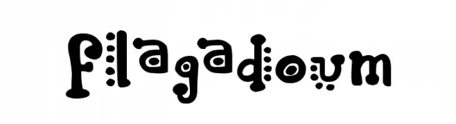
( imagex - www.imagex-fonts.com )
A playful, whimsical font with bold, rounded characters and decorative dot embellishments.
![Flagadoum Frei Schriftart Herunterladen]() Herunterladen 86 Downloads@WebFont
Herunterladen 86 Downloads@WebFont -
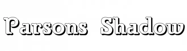
( Fonts by Typographer Mediengestaltung - Personal-use only. For commercial use please contact owner. )
A bold, shadowed font with a three-dimensional effect, perfect for standout designs.
![Parsons Shadow Frei Schriftart Herunterladen]() Herunterladen 86 Downloads@WebFont
Herunterladen 86 Downloads@WebFont -
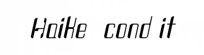
( Otto Maurer Design - Otto Maurer - www.myfonts.com/foundry/Otto_Maurer/ )
A modern, condensed font with a sleek, slanted design.
![Haike cond it Frei Schriftart Herunterladen]() Herunterladen 86 Downloads@WebFont
Herunterladen 86 Downloads@WebFont -
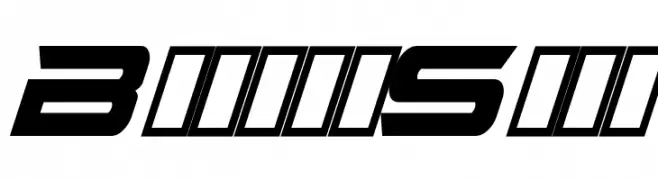
( Fonts by imagex - Personal-use only. For commercial use please contact owner. )
A bold, angular font with a futuristic and dynamic design.
![Bright Star Frei Schriftart Herunterladen]() Herunterladen 86 Downloads@WebFont
Herunterladen 86 Downloads@WebFont -
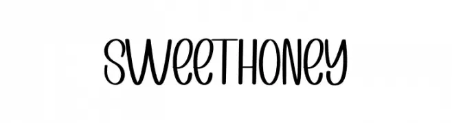
( Fonts by PiPi Creative )
Playful handwritten-style font with smooth curves.
![Sweet Honey Frei Schriftart Herunterladen]() Herunterladen 86 Downloads@WebFont
Herunterladen 86 Downloads@WebFont -
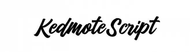
( Fonts by Tebaltipis Studio )
Bold, flowing script with a handwritten style.
![KedmoteScript Frei Schriftart Herunterladen]() Herunterladen 86 Downloads@WebFont
Herunterladen 86 Downloads@WebFont -
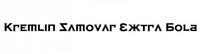
( Fonts by Bolt Cutter - www.boltcutterdesign.com - Personal-use only. For commercial use please contact owner. )
A bold, geometric font with sharp, angular strokes and a modern-retro aesthetic.
![Kremlin Samovar Extra Bold Frei Schriftart Herunterladen]() Herunterladen 86 Downloads@WebFont
Herunterladen 86 Downloads@WebFont -
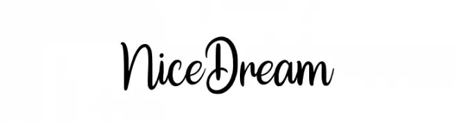
( Fonts by ToniStudio - Fatoni Nurman - Personal-use only. For commercial use please contact owner. )
A playful and elegant script font with a handwritten style.
![Nice Dream Frei Schriftart Herunterladen]() Herunterladen 86 Downloads@WebFont
Herunterladen 86 Downloads@WebFont -
( Fonts by Nick Curtis - Personal-use only. For commercial use please contact owner. )
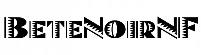
A bold, decorative font with sharp, angular elements and geometric patterns.
![BeteNoirNF Frei Schriftart Herunterladen]() Herunterladen 86 Downloads@WebFont
Herunterladen 86 Downloads@WebFont -
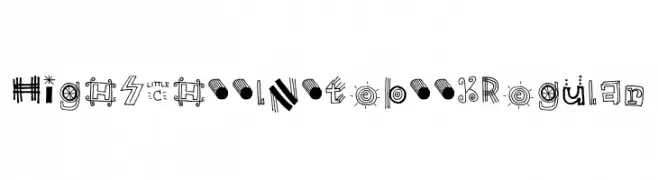
![High School Notebook Regular Frei Schriftart Herunterladen]() Herunterladen 86 Downloads@WebFont
Herunterladen 86 Downloads@WebFont -
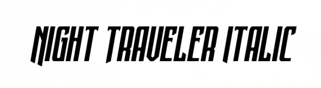
( Fonts by Daniel Zadorozny - www.iconian.com - Personal-use only. For commercial use please contact owner. )
A bold, italic font with sharp angles and high contrast.
![Night Traveler Italic Frei Schriftart Herunterladen]() Herunterladen 86 Downloads@WebFont
Herunterladen 86 Downloads@WebFont -
( Typodermic Fonts - Ray Larabie - www.typodermicfonts.com/ )
A modern, bold sans-serif font with a geometric style and excellent readability.
![MesmerizeExSb-Regular Frei Schriftart Herunterladen]() Herunterladen 86 Downloads@WebFont
Herunterladen 86 Downloads@WebFont -
( Fonts by AminMario - Amin Mario - Personal-use only. For commercial use please contact owner. )
A modern, elegant handwritten font with fluid, cursive letterforms.
![Athena River Frei Schriftart Herunterladen]() Herunterladen 86 Downloads@WebFont
Herunterladen 86 Downloads@WebFont -
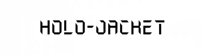
( Fonts by Iconian Fonts )
A futuristic, angular font with bold lines and a modern aesthetic.
![Holo-Jacket Frei Schriftart Herunterladen]() Herunterladen 86 Downloads@WebFont
Herunterladen 86 Downloads@WebFont -
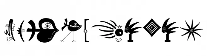
( Fonts by Manfred Klein. Free for private and charity use. Free for commercial with donation to organizations )
Abstract pictogram font with whimsical, surreal illustrations.
![TypoPieces Frei Schriftart Herunterladen]() Herunterladen 86 Downloads@WebFont
Herunterladen 86 Downloads@WebFont -
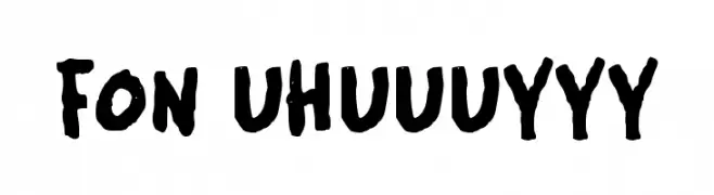
( Fonts by Wahyu Eka Prasetya - wepfont.com - Personal-use only. For commercial use please contact owner. )
A bold, hand-drawn font with an expressive and artistic style.
![FON UHUUUYYY Frei Schriftart Herunterladen]() Herunterladen 86 Downloads@WebFont
Herunterladen 86 Downloads@WebFont -
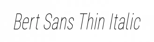
( Fonts by Christian Robertson, Adam Twardoch, & Cristiano Sobral - Personal-use only. For commercial use please contact owner. )
A thin, italicized sans-serif font with a modern and elegant design.
![Bert Sans Thin Italic Frei Schriftart Herunterladen]() Herunterladen 86 Downloads@WebFont
Herunterladen 86 Downloads@WebFont -
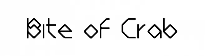
( Ezzazebra - Adhreza Brahma - www.behance.net/adhreza )
A geometric, angular font with a modern and futuristic style.
![Bite of Crab Frei Schriftart Herunterladen]() Herunterladen 86 Downloads@WebFont
Herunterladen 86 Downloads@WebFont -
![Gumtuckey-Regular Frei Schriftart Herunterladen]() Herunterladen 86 Downloads@WebFont
Herunterladen 86 Downloads@WebFont -
( Fonts by CannotIntoSpaceFonts - KineticPlasma Fonts - Personal-use only. For commercial use please contact owner. )
A bold, italic font with a modern and dynamic style.
![Electronic UltraHeavy Italic Frei Schriftart Herunterladen]() Herunterladen 86 Downloads@WebFont
Herunterladen 86 Downloads@WebFont -
( Fonts by Anomali Creative - Krisna Teja - Personal-use only. For commercial use please contact owner. )
A bold, expressive script font with a dynamic, cursive style.
![Magnolia Frei Schriftart Herunterladen]() Herunterladen 86 Downloads@WebFont
Herunterladen 86 Downloads@WebFont -
( Carly Fisher )
A sleek, minimalist font with thin, elongated letterforms.
![Slim PickinsRegular Frei Schriftart Herunterladen]() Herunterladen 86 Downloads@WebFont
Herunterladen 86 Downloads@WebFont -
( Iconian Fonts - Daniel Zadorozny - www.iconian.com )
A bold, jagged, italic font with a distressed, dynamic appearance.
![Colossus Jagged Italic Frei Schriftart Herunterladen]() Herunterladen 86 Downloads@WebFont
Herunterladen 86 Downloads@WebFont -
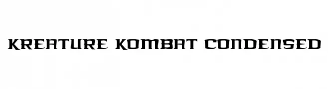
( Iconian Fonts - Daniel Zadorozny - www.iconian.com )
A bold, condensed font with sharp, angular edges and a modern, aggressive style.
![Kreature Kombat Condensed Frei Schriftart Herunterladen]() Herunterladen 86 Downloads@WebFont
Herunterladen 86 Downloads@WebFont -
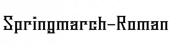
( Fonts by feorag - Personal-use only. For commercial use please contact owner. )
A bold, geometric font with a modern and industrial feel.
![Springmarch-Roman Frei Schriftart Herunterladen]() Herunterladen 86 Downloads@WebFont
Herunterladen 86 Downloads@WebFont -
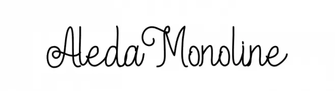
( Fonts by Edric Studio www.creativefabrica.com/designer/edricstudio/ - Personal-use only. For commercial use please contact owner. )
A playful monoline font with a hand-drawn, whimsical style.
![Aleda Monoline Frei Schriftart Herunterladen]() Herunterladen 86 Downloads@WebFont
Herunterladen 86 Downloads@WebFont -
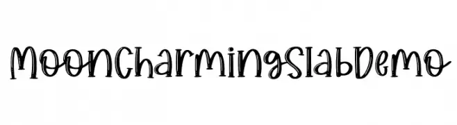
( Fonts by Allouse Studio - Personal-use only. For commercial use please contact owner. )
A playful, hand-drawn font with bold strokes and subtle serifs.
![Moon Charming Slab Demo Frei Schriftart Herunterladen]() Herunterladen 86 Downloads@WebFont
Herunterladen 86 Downloads@WebFont -
( Fonts by Joseph Dawson - Personal-use only. For commercial use please contact owner. )
A playful, bold font with rounded edges and a hand-drawn feel.
![Certainly Frei Schriftart Herunterladen]() Herunterladen 86 Downloads@WebFont
Herunterladen 86 Downloads@WebFont -
![PWCoolFont Frei Schriftart Herunterladen]() Herunterladen 86 Downloads@WebFont
Herunterladen 86 Downloads@WebFont -
( Fonts by Behnam - Personal-use only. For commercial use please contact owner. )
A modern italic font with smooth curves and clean lines.
![XM Vahid Italic Frei Schriftart Herunterladen]() Herunterladen 86 Downloads@WebFont
Herunterladen 86 Downloads@WebFont


Welche Schriften sind gerade am populärsten?
Poppins, Roboto, Montserrat, Open Sans und Lato sind wegen ihrer klaren Formen und breiten Einsetzbarkeit sehr gefragt – von Markenauftritt über Landingpages bis hin zu Postern.
Welche Fonts eignen sich für Logos?
Geometrische Sans‑Serifs (z. B. Poppins, Familien im Gotham‑Stil) sind ein häufiger Griff für sauberes, skalierbares Branding. Für eine persönlichere Note bleiben Scripts und Handschrift‑Stile beliebt. Kombinieren Sie einen prägnanten Headline‑Font mit einer neutralen Brotschrift für Wiedererkennung und Harmonie.
Wie oft wird die Top‑Liste aktualisiert?
Regelmäßig – basierend auf realen Downloads und Interaktionen. Schauen Sie öfter vorbei, um aufstrebende Favoriten früh zu entdecken.
💡 Tipp: Seite bookmarken – Trends wechseln schnell, und heutige Top‑Schriften inspirieren morgen vielleicht das Rebranding.