Willkommen bei den Top‑Schriften – hier treffen Beliebtheit und Qualität aufeinander. Das sind die in diesem Jahr am häufigsten heruntergeladenen und genutzten Fonts. Wenn Sie sichere Optionen für Logo, Web oder Social suchen, starten Sie hier.
Jeder Top‑Font überzeugt durch Balance, Lesbarkeit und Vielseitigkeit. Sie finden moderne Sans‑Serifs, elegante Scripts, Vintage‑Serifs und minimalistische Displays.
-
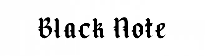
( Fonts by Kong Font - Personal-use only. For commercial use please contact owner. )
A bold, ornate blackletter font with a medieval aesthetic.
 Herunterladen 85 Downloads@WebFont
 -
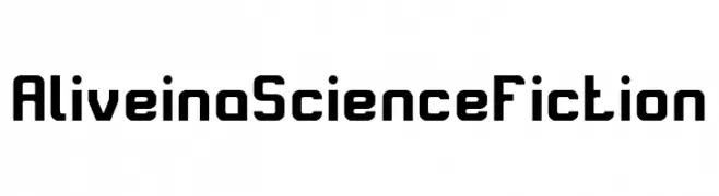
( Fonts by weknow - Wino S Kadir - Personal-use only. For commercial use please contact owner. )
A bold, futuristic font with geometric and angular letterforms.
![Alive in a Science Fiction Frei Schriftart Herunterladen]() Herunterladen 85 Downloads@WebFont
Herunterladen 85 Downloads@WebFont -
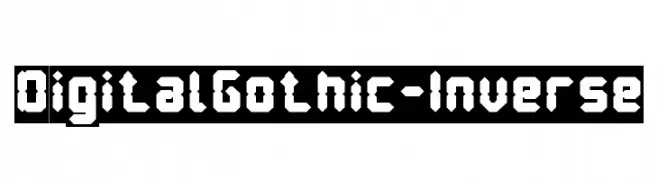
( weknow - Wino S Kadir - www.creativefabrica.com/designer/weknow/ )
A bold, geometric font with a digital gothic style.
![Digital Gothic-Inverse Frei Schriftart Herunterladen]() Herunterladen 85 Downloads@WebFont
Herunterladen 85 Downloads@WebFont -
( Eberth Vera Graphics - www.eberthvera.com/ )
A bold, geometric font with angular, arrow-like elements for a dynamic look.
![Lost Link Frei Schriftart Herunterladen]() Herunterladen 85 Downloads@WebFont
Herunterladen 85 Downloads@WebFont -
( Fonts by Vladimir Nikolic - https://www.creativefabrica.com/product/educated-deers/ref/144265/ - Personal-use only. For commercial use please contact owner. )
A bold, decorative font with a gradient effect and thick outlines.
![Dressed Gradient Regular Frei Schriftart Herunterladen]() Herunterladen 85 Downloads@WebFont
Herunterladen 85 Downloads@WebFont -
( Fonts by New Typography - Vernon Adams. Personal-use only. For commercial use please contact owner. )
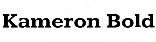
A bold serif font with strong strokes and pronounced serifs, offering a classic yet modern look.
![Kameron Bold Frei Schriftart Herunterladen]() Herunterladen 85 Downloads@WebFont
Herunterladen 85 Downloads@WebFont -
( Paragraph - Jan Schmoeger - www.paragraph.com.au )
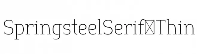
A refined serif font with thin strokes and a modern, elegant style.
![SpringsteelSerif-Thin Frei Schriftart Herunterladen]() Herunterladen 85 Downloads@WebFont
Herunterladen 85 Downloads@WebFont -
( Fonts by Andi - Personal-use only. For commercial use please contact owner. )
A bold, decorative font with floral motifs encasing each uppercase letter.
![PickledPansies Frei Schriftart Herunterladen]() Herunterladen 85 Downloads@WebFont
Herunterladen 85 Downloads@WebFont -
( Fonts by Daniel Zadorozny - www.iconian.com - Free for personal use )
A bold, geometric, and italic font with a futuristic and angular design.
![Trigger Man Pro Italic Frei Schriftart Herunterladen]() Herunterladen 85 Downloads@WebFont
Herunterladen 85 Downloads@WebFont -
( Fonts by Creatype Studio - Rian Rahardi - Personal-use only. For commercial use please contact owner. )
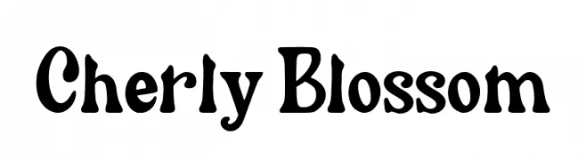
A playful and whimsical decorative font with bold, curvy characters.
![Cherly Blossom Frei Schriftart Herunterladen]() Herunterladen 85 Downloads@WebFont
Herunterladen 85 Downloads@WebFont -
( Fonts by FatmaStudio - Fatmawati - Personal-use only. For commercial use please contact owner. )
A lively and elegant script font with flowing, cursive letters and dramatic flourishes.
![Heylena Frei Schriftart Herunterladen]() Herunterladen 85 Downloads@WebFont
Herunterladen 85 Downloads@WebFont -
( Fonts by Jadatype - Jada Akbal - Personal-use only. For commercial use please contact owner. )
A bold, playful font with rounded, hand-drawn characters.
![The Me Frei Schriftart Herunterladen]() Herunterladen 85 Downloads@WebFont
Herunterladen 85 Downloads@WebFont -
( Fonts by Zetafonts - Personal-use only. For commercial use please contact owner. )
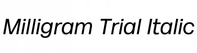
A modern, italic sans-serif font with a clean and dynamic style.
![Milligram Trial Italic Frei Schriftart Herunterladen]() Herunterladen 85 Downloads@WebFont
Herunterladen 85 Downloads@WebFont -
( Fonts by Syaf Rizal - Khurasan - Personal-use only. For commercial use please contact owner. )
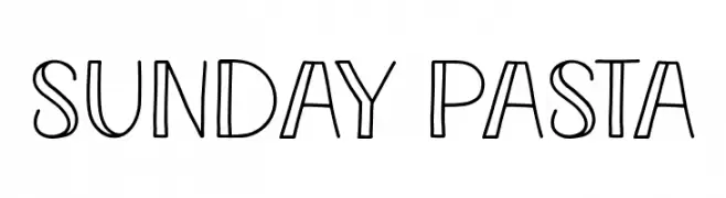
A playful, hand-drawn font with a whimsical, outlined style.
![Sunday Pasta Frei Schriftart Herunterladen]() Herunterladen 85 Downloads@WebFont
Herunterladen 85 Downloads@WebFont -
( Fonts by Supersemar Letter - Arief Tri Sulistiyono - Personal-use only. For commercial use please contact owner. )
A playful, hand-drawn font with tall, narrow letters and a whimsical style.
![Magical History Frei Schriftart Herunterladen]() Herunterladen 85 Downloads@WebFont
Herunterladen 85 Downloads@WebFont -
( Fonts by Nick Curtis - Personal-use only. For commercial use please contact owner. )
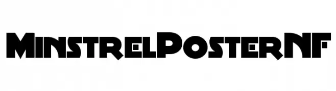
A bold, geometric font with angular forms and Art Deco influences.
![MinstrelPosterNF Frei Schriftart Herunterladen]() Herunterladen 85 Downloads@WebFont
Herunterladen 85 Downloads@WebFont -
( Andrus Peegel )
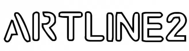
A bold, outlined font with geometric shapes and clean lines.
![artline2 Frei Schriftart Herunterladen]() Herunterladen 85 Downloads@WebFont
Herunterladen 85 Downloads@WebFont -
( Diana Stivelberg )
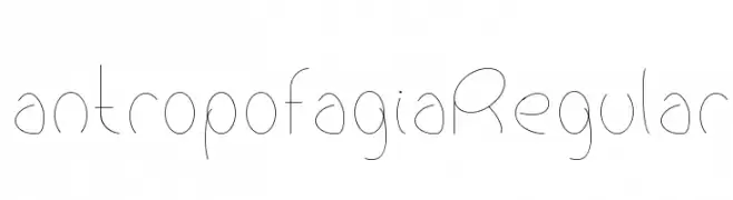
A minimalist, modern font with thin strokes and a fluid, airy design.
![antropofagiaRegular Frei Schriftart Herunterladen]() Herunterladen 85 Downloads@WebFont
Herunterladen 85 Downloads@WebFont -
( Fonts by CalligraphyFonts - Personal-use only. For commercial use please contact owner. )
A dynamic and flowing script font with elegant, cursive letterforms.
![Journey Begins Demo Frei Schriftart Herunterladen]() Herunterladen 85 Downloads@WebFont
Herunterladen 85 Downloads@WebFont -
( Fonts by Adrian Candela - Personal-use only. For commercial use please contact owner. )
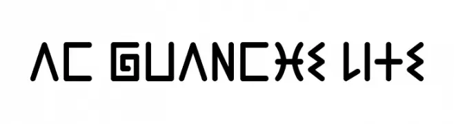
A bold, geometric font with angular and curved elements for a modern look.
![AC Guanche Lite Frei Schriftart Herunterladen]() Herunterladen 85 Downloads@WebFont
Herunterladen 85 Downloads@WebFont -
( Fonts by Jimtype Studio - Personal-use only. For commercial use please contact owner. )
A modern, elegant script font with fluid, handwritten strokes.
![FallenJones Frei Schriftart Herunterladen]() Herunterladen 85 Downloads@WebFont
Herunterladen 85 Downloads@WebFont -
( Fonts by Mans Greback - Personal-use only. For commercial use please contact owner. )
An elegant italic font with thin strokes and a modern, dynamic style.
![Airium Italic PERSONAL USE ONLY Regular Frei Schriftart Herunterladen]() Herunterladen 85 Downloads@WebFont
Herunterladen 85 Downloads@WebFont -
( Fonts by Neogrey Creative - Ivan Filipov - Personal-use only. For commercial use please contact owner. )
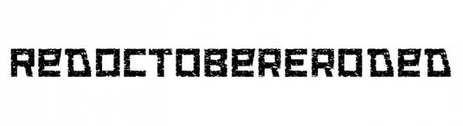
A rugged, distressed font with a bold, eroded texture.
![Red October Eroded Frei Schriftart Herunterladen]() Herunterladen 85 Downloads@WebFont
Herunterladen 85 Downloads@WebFont -
( Fonts by Thor Christopher Arisland - Personal-use only. For commercial use please contact owner. )
A classic blackletter font with ornate, angular letterforms and a traditional gothic style.
![Taylor Gothic Frei Schriftart Herunterladen]() Herunterladen 85 Downloads@WebFont
Herunterladen 85 Downloads@WebFont -
( Iconian Fonts - Daniel Zadorozny - www.iconian.com )
A bold, expanded, and italicized font with a futuristic and angular design.
![Thunder Trooper Expanded Italic Frei Schriftart Herunterladen]() Herunterladen 85 Downloads@WebFont
Herunterladen 85 Downloads@WebFont -
( Fonts by Syaf Rizal - Khurasan - Personal-use only. For commercial use please contact owner. )
A playful, bold font with rounded, thick strokes and a whimsical, modern style.
![Lost Paper Frei Schriftart Herunterladen]() Herunterladen 85 Downloads@WebFont
Herunterladen 85 Downloads@WebFont -
( LeChefRene - members.aol.com/lcrfonts/ )
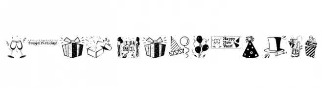
A festive dingbat font with party-themed icons and celebratory text.
![LCR Party Dings Frei Schriftart Herunterladen]() Herunterladen 85 Downloads@WebFont
Herunterladen 85 Downloads@WebFont -
( Fonts by douglas vitkauskas - Personal-use only. For commercial use please contact owner. )
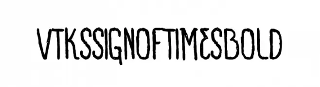
A hand-drawn, distressed font with a vintage, rustic appearance.
![VTKS SIGN OF TIMES bold Frei Schriftart Herunterladen]() Herunterladen 85 Downloads@WebFont
Herunterladen 85 Downloads@WebFont -
![Tramix Frei Schriftart Herunterladen]() Herunterladen 85 Downloads@WebFont
Herunterladen 85 Downloads@WebFont -
( Fonts by a Max Infeld - XEROGRAPHER FONTS - xerographer.blogspot.com . Personal-use only. For commercial use please contact owner. )
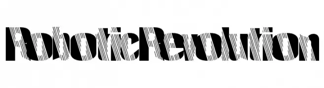
A bold, striped decorative font with high contrast and a modern, edgy style.
![RoboticRevolution Frei Schriftart Herunterladen]() Herunterladen 85 Downloads@WebFont
Herunterladen 85 Downloads@WebFont -
( Fonts by Basni.std - Bery Arisandi - Personal-use only. For commercial use please contact owner. )
A bold, elegant script font with high contrast and fluid strokes.
![Rinjani Frei Schriftart Herunterladen]() Herunterladen 85 Downloads@WebFont
Herunterladen 85 Downloads@WebFont -
( Fonts by Kat`s Fun Fonts - Personal-use only. For commercial use please contact owner. )
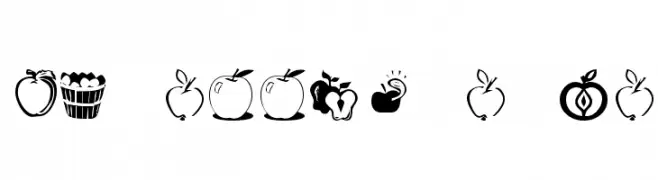
A playful collection of apple-themed icons in black and white.
![KR Apple A Day Frei Schriftart Herunterladen]() Herunterladen 85 Downloads@WebFont
Herunterladen 85 Downloads@WebFont -
![Pulp Dance Frei Schriftart Herunterladen]() Herunterladen 85 Downloads@WebFont
Herunterladen 85 Downloads@WebFont -
( Fonts by Letterara - Thomas Aradea - Personal-use only. For commercial use please contact owner. )
A playful, handwritten font with bold strokes and a dynamic, informal style.
![Mileadila Frei Schriftart Herunterladen]() Herunterladen 85 Downloads@WebFont
Herunterladen 85 Downloads@WebFont -
( Iconian Fonts - Daniel Zadorozny - www.iconian.com )
A bold, italicized, futuristic font with angular, geometric shapes.
![Command Override Super-Italic Frei Schriftart Herunterladen]() Herunterladen 85 Downloads@WebFont
Herunterladen 85 Downloads@WebFont


Welche Schriften sind gerade am populärsten?
Poppins, Roboto, Montserrat, Open Sans und Lato sind wegen ihrer klaren Formen und breiten Einsetzbarkeit sehr gefragt – von Markenauftritt über Landingpages bis hin zu Postern.
Welche Fonts eignen sich für Logos?
Geometrische Sans‑Serifs (z. B. Poppins, Familien im Gotham‑Stil) sind ein häufiger Griff für sauberes, skalierbares Branding. Für eine persönlichere Note bleiben Scripts und Handschrift‑Stile beliebt. Kombinieren Sie einen prägnanten Headline‑Font mit einer neutralen Brotschrift für Wiedererkennung und Harmonie.
Wie oft wird die Top‑Liste aktualisiert?
Regelmäßig – basierend auf realen Downloads und Interaktionen. Schauen Sie öfter vorbei, um aufstrebende Favoriten früh zu entdecken.
💡 Tipp: Seite bookmarken – Trends wechseln schnell, und heutige Top‑Schriften inspirieren morgen vielleicht das Rebranding.