Willkommen bei den Top‑Schriften – hier treffen Beliebtheit und Qualität aufeinander. Das sind die in diesem Jahr am häufigsten heruntergeladenen und genutzten Fonts. Wenn Sie sichere Optionen für Logo, Web oder Social suchen, starten Sie hier.
Jeder Top‑Font überzeugt durch Balance, Lesbarkeit und Vielseitigkeit. Sie finden moderne Sans‑Serifs, elegante Scripts, Vintage‑Serifs und minimalistische Displays.
-
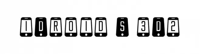
( Fonts by Daniel Zadorozny - www.iconian.com - Personal-use only. For commercial use please contact owner. )
A tech-inspired font with characters enclosed in smartphone shapes.
 Herunterladen 84 Downloads@WebFont
 -
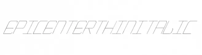
( Fonts by a Max Infeld - XEROGRAPHER FONTS - xerographer.blogspot.com . Personal-use only. For commercial use please contact owner. )
A thin, italicized font with a modern, technical style.
![EpicenterThinItalic Frei Schriftart Herunterladen]() Herunterladen 84 Downloads@WebFont
Herunterladen 84 Downloads@WebFont -
( Fonts by Haksen Studio - Sarwo Edhi Prayitno - Personal-use only. For commercial use please contact owner. )
A lively and dynamic script font with playful loops and cursive strokes.
![Mostly Bonny Frei Schriftart Herunterladen]() Herunterladen 84 Downloads@WebFont
Herunterladen 84 Downloads@WebFont -
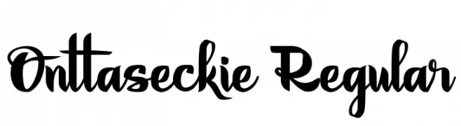
( Fonts by Bido Std - Personal-use only. For commercial use please contact owner. )
A bold, expressive script font with flowing, interconnected strokes and a modern flair.
![Onttaseckie Regular Frei Schriftart Herunterladen]() Herunterladen 84 Downloads@WebFont
Herunterladen 84 Downloads@WebFont -
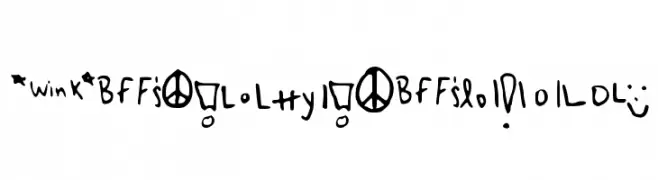
( Miranda Matthews )
A whimsical collection of hand-drawn symbols and doodles with a playful, informal style.
![MyRandaSymbols Frei Schriftart Herunterladen]() Herunterladen 84 Downloads@WebFont
Herunterladen 84 Downloads@WebFont -
( Fonts by Kong Font - fontkong.com - Personal-use only. For commercial use please contact owner. )
A modern, geometric font with rounded edges and uniform stroke width.
![Stikco Frei Schriftart Herunterladen]() Herunterladen 84 Downloads@WebFont
Herunterladen 84 Downloads@WebFont -
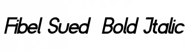
( Fonts by Peter Wiegel - www.peter-wiegel.de - Personal-use only. For commercial use please contact owner. )
A bold, italicized font with a modern and dynamic style.
![Fibel Sued Bold Italic Frei Schriftart Herunterladen]() Herunterladen 84 Downloads@WebFont
Herunterladen 84 Downloads@WebFont -
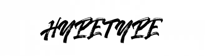
( Fonts by Motokiwo - Anton Cahyono - Personal-use only. For commercial use please contact owner. )
A bold, brush-style font with dynamic and expressive strokes.
![Hypetype Frei Schriftart Herunterladen]() Herunterladen 84 Downloads@WebFont
Herunterladen 84 Downloads@WebFont -
( madeDeduk )
A versatile font combining vintage decorative script with bold, distressed uppercase letters.
![Draconian Frei Schriftart Herunterladen]() Herunterladen 84 Downloads@WebFont
Herunterladen 84 Downloads@WebFont -
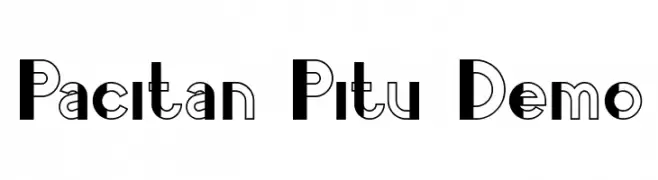
( Fonts by nariswari_creative - Taufik Dwi Purnomo - Personal-use only. For commercial use please contact owner. )
A bold, modern font with dual-tone geometric design.
![Pacitan Pitu Demo Frei Schriftart Herunterladen]() Herunterladen 84 Downloads@WebFont
Herunterladen 84 Downloads@WebFont -
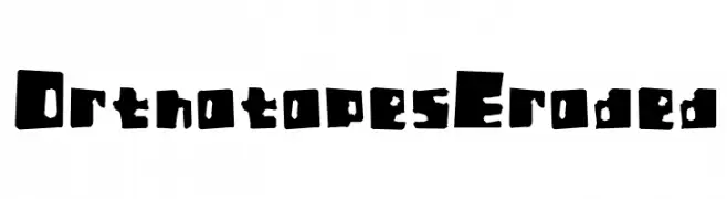
( Incstone Design, by Megami Studios - Rob Barba - www.incstonedesign.com/ )
A bold, distressed font with an eroded, industrial look.
![Orthotopes Eroded Frei Schriftart Herunterladen]() Herunterladen 84 Downloads@WebFont
Herunterladen 84 Downloads@WebFont -
( Fonts by StringLabs - stringlabscreative.com - Personal-use only. For commercial use please contact owner. )
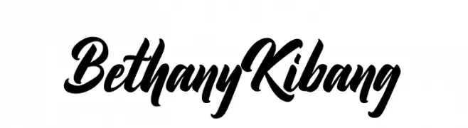
A bold, flowing script font with elegant, interconnected characters.
![Bethany Kibang Frei Schriftart Herunterladen]() Herunterladen 84 Downloads@WebFont
Herunterladen 84 Downloads@WebFont -
( Fonts by Vladimir Nikolic - https://www.creativefabrica.com/product/educated-deers/ref/144265/ - Personal-use only. For commercial use please contact owner. )
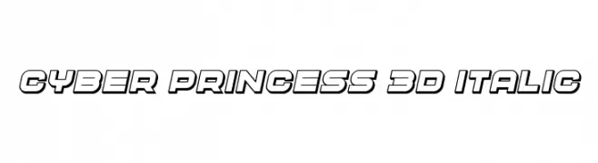
A bold, 3D italic font with a futuristic and dynamic design.
![Cyber Princess 3D Italic Frei Schriftart Herunterladen]() Herunterladen 84 Downloads@WebFont
Herunterladen 84 Downloads@WebFont -
( Iconian Fonts - Daniel Zadorozny - www.iconian.com )
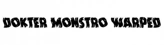
A bold, distorted font with jagged edges and a monstrous appearance.
![Dokter Monstro Warped Frei Schriftart Herunterladen]() Herunterladen 84 Downloads@WebFont
Herunterladen 84 Downloads@WebFont -
( Fonts by YOFonts - Yasuhiro Yamaoka - yoworks.com - Personal-use only. For commercial use please contact owner. )
A bold, geometric font with a modern and industrial style.
![EPF LCB Frei Schriftart Herunterladen]() Herunterladen 84 Downloads@WebFont
Herunterladen 84 Downloads@WebFont -
( Fonts by sronstudio - Yusron Billah - Personal-use only. For commercial use please contact owner. )
A lively, handwritten script font with a playful and dynamic style.
![Candy Chicks Frei Schriftart Herunterladen]() Herunterladen 84 Downloads@WebFont
Herunterladen 84 Downloads@WebFont -
( Copyright 2018 the Niramit Project Authors (https://github.com/cadsondemak/Niramit) )
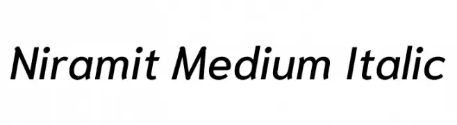
A modern, italic sans-serif font with medium weight and smooth curves.
![Niramit Medium Italic Frei Schriftart Herunterladen]() Herunterladen 84 Downloads@WebFont
Herunterladen 84 Downloads@WebFont -
( Fonts by Beautypes )
A whimsical and elegant handwritten script font with playful loops and curves.
![WankaryScript Frei Schriftart Herunterladen]() Herunterladen 84 Downloads@WebFont
Herunterladen 84 Downloads@WebFont -
![GlazKrak-Regular Frei Schriftart Herunterladen]() Herunterladen 84 Downloads@WebFont
Herunterladen 84 Downloads@WebFont -
( Noto is a trademark of Google Inc. Noto fonts are open source. All Noto fonts are published under the SIL Open Font License, Version 1.1 )
A bold, semi-condensed font with strong strokes and high legibility.
![Noto Serif Tamil SemiCondensed Black Frei Schriftart Herunterladen]() Herunterladen 84 Downloads@WebFont
Herunterladen 84 Downloads@WebFont -
( Fonts by Mans Greback - Personal-use only. For commercial use please contact owner. )
A cursive, handwritten-style font with elegant, flowing strokes.
![SunnySamPERSONAL-Medium Frei Schriftart Herunterladen]() Herunterladen 84 Downloads@WebFont
Herunterladen 84 Downloads@WebFont -
( Fonts by Peter Wiegel - www.peter-wiegel.de - Personal-use only. For commercial use please contact owner. )
A classic cursive font with elegant, flowing lines and a sophisticated style.
![DeutscheNormalschriftOT Frei Schriftart Herunterladen]() Herunterladen 84 Downloads@WebFont
Herunterladen 84 Downloads@WebFont -
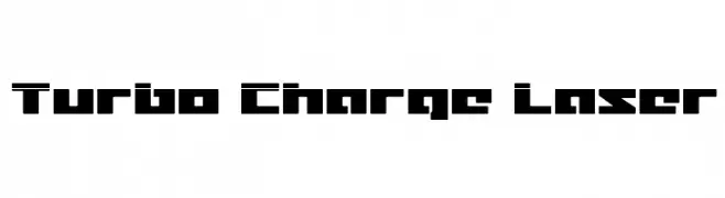
( Fonts by Iconian Fonts )
A bold, futuristic font with a geometric and angular design.
![Turbo Charge Laser Frei Schriftart Herunterladen]() Herunterladen 84 Downloads@WebFont
Herunterladen 84 Downloads@WebFont -
( Fonts by Wahyu Eka Prasetya - wepfont.com - Personal-use only. For commercial use please contact owner. )
A bold, brush-style font with dynamic, hand-painted characteristics.
![Gerbang Frei Schriftart Herunterladen]() Herunterladen 84 Downloads@WebFont
Herunterladen 84 Downloads@WebFont -
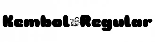
( Fonts by twinletter )
A bold, rounded font with a playful and modern style.
![Kembol-Regular Frei Schriftart Herunterladen]() Herunterladen 84 Downloads@WebFont
Herunterladen 84 Downloads@WebFont -
( Fonts by Yasuko )
A bold, decorative font with characters enclosed in patterned circles.
![Hedhead Regular Frei Schriftart Herunterladen]() Herunterladen 84 Downloads@WebFont
Herunterladen 84 Downloads@WebFont -
( Fonts by a Neale Davidson - www.pixelsagas.com. Personal-use only. For commercial use please contact owner. )
A futuristic, angular italic font with a cybernetic aesthetic.
![Modern Cybertronic Italic Frei Schriftart Herunterladen]() Herunterladen 84 Downloads@WebFont
Herunterladen 84 Downloads@WebFont -
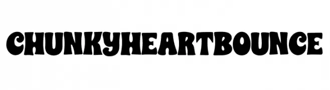
( Fonts by AM Designs )
A bold, playful font with rounded, bouncy characters.
![CHUNKY HEART BOUNCE Frei Schriftart Herunterladen]() Herunterladen 84 Downloads@WebFont
Herunterladen 84 Downloads@WebFont -
( Fonts by Press Gang Studios - Personal-use only. For commercial use please contact owner. )
A dynamic, italicized handwritten font with medium contrast and a casual style.
![life signals Italic Frei Schriftart Herunterladen]() Herunterladen 84 Downloads@WebFont
Herunterladen 84 Downloads@WebFont -
( Fonts by Daniel Zadorozny - www.iconian.com - Personal-use only. For commercial use please contact owner. )
A bold, italicized stencil-style font with a futuristic and dynamic design.
![Force Commander Italic Frei Schriftart Herunterladen]() Herunterladen 84 Downloads@WebFont
Herunterladen 84 Downloads@WebFont -
( Fonts by Wino S Kadir - weknow - www.revolge.com/shop/weknow/ - Personal-use only. For commercial use please contact owner. )
A bold, playful font with decorative curls and a retro-modern style.
![BREATH Frei Schriftart Herunterladen]() Herunterladen 84 Downloads@WebFont
Herunterladen 84 Downloads@WebFont -
( Fonts by Iconian Fonts )
A modern, semi-bold, expanded italic font with a sleek and dynamic style.
![Elite Danger Semi-Bold Expanded Italic Frei Schriftart Herunterladen]() Herunterladen 84 Downloads@WebFont
Herunterladen 84 Downloads@WebFont -
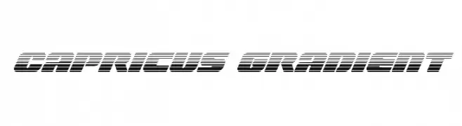
( Iconian Fonts - Daniel Zadorozny - www.iconian.com )
A bold, futuristic font with horizontal gradient lines and a slanted, dynamic style.
![Capricus Gradient Frei Schriftart Herunterladen]() Herunterladen 84 Downloads@WebFont
Herunterladen 84 Downloads@WebFont -
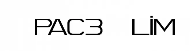
![Spac3 Slim Frei Schriftart Herunterladen]() Herunterladen 84 Downloads@WebFont
Herunterladen 84 Downloads@WebFont -
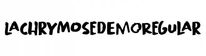
( Fonts by Hanoded - David Kerkhoff - Personal-use only. For commercial use please contact owner. )
A bold, hand-painted style font with an expressive and artistic look.
![Lachrymose DEMO Regular Frei Schriftart Herunterladen]() Herunterladen 84 Downloads@WebFont
Herunterladen 84 Downloads@WebFont


Welche Schriften sind gerade am populärsten?
Poppins, Roboto, Montserrat, Open Sans und Lato sind wegen ihrer klaren Formen und breiten Einsetzbarkeit sehr gefragt – von Markenauftritt über Landingpages bis hin zu Postern.
Welche Fonts eignen sich für Logos?
Geometrische Sans‑Serifs (z. B. Poppins, Familien im Gotham‑Stil) sind ein häufiger Griff für sauberes, skalierbares Branding. Für eine persönlichere Note bleiben Scripts und Handschrift‑Stile beliebt. Kombinieren Sie einen prägnanten Headline‑Font mit einer neutralen Brotschrift für Wiedererkennung und Harmonie.
Wie oft wird die Top‑Liste aktualisiert?
Regelmäßig – basierend auf realen Downloads und Interaktionen. Schauen Sie öfter vorbei, um aufstrebende Favoriten früh zu entdecken.
💡 Tipp: Seite bookmarken – Trends wechseln schnell, und heutige Top‑Schriften inspirieren morgen vielleicht das Rebranding.