Willkommen bei den Top‑Schriften – hier treffen Beliebtheit und Qualität aufeinander. Das sind die in diesem Jahr am häufigsten heruntergeladenen und genutzten Fonts. Wenn Sie sichere Optionen für Logo, Web oder Social suchen, starten Sie hier.
Jeder Top‑Font überzeugt durch Balance, Lesbarkeit und Vielseitigkeit. Sie finden moderne Sans‑Serifs, elegante Scripts, Vintage‑Serifs und minimalistische Displays.
-
( Fonts by Jovanny Lemonad - typetype.ru - Personal-use only. For commercial use please contact owner. )
A bold, condensed sans-serif font with a modern and clean design.
 Herunterladen 1750 Downloads@WebFont
 -
( Fonts by Billy Argel - www.billyargel.com - Personal-use only. For commercial use please contact owner. )
A modern, geometric sans-serif font with a clean and balanced design.
![RioGlamour Frei Schriftart Herunterladen]() Herunterladen 1750 Downloads@WebFont
Herunterladen 1750 Downloads@WebFont -
![Lovecraft-s-Diary Frei Schriftart Herunterladen]() Herunterladen 1750 Downloads@WebFont
Herunterladen 1750 Downloads@WebFont -
![Zero Threes Frei Schriftart Herunterladen]() Herunterladen 1750 Downloads@WebFont
Herunterladen 1750 Downloads@WebFont -
Schriftart von glyphstyle. For commercial use please contact the owner.
( NOTE: This demo font is for PERSONAL USE ONLY! But any donation are very appreciated. Paypal account for donation : https://www.paypal.me/dimasardhi full version: https://www.glyphstyle.net/tropical-taste/ contact us at styleglyph@gmail.com And follo )
A bold, dynamic font with thick strokes and a modern-vintage flair.
![Tropical Taste Demo Frei Schriftart Herunterladen]() Herunterladen 1749 Downloads@WebFont
Herunterladen 1749 Downloads@WebFont -
( Fonts by Dominique Demetz - ddemetz.com - Personal-use only. For commercial use please contact owner. )
A flowing, elegant script font with a handwritten style.
![Gina Ann Frei Schriftart Herunterladen]() Herunterladen 1749 Downloads@WebFont
Herunterladen 1749 Downloads@WebFont -
( Free for a personal use. For a commercial use please visit www.kevinandamanda.com )
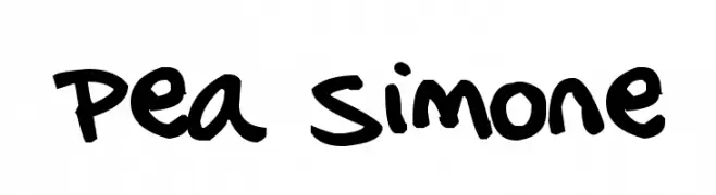
A playful, handwritten font with bold, irregular strokes and a casual style.
![Pea Simone Frei Schriftart Herunterladen]() Herunterladen 1749 Downloads@WebFont
Herunterladen 1749 Downloads@WebFont -
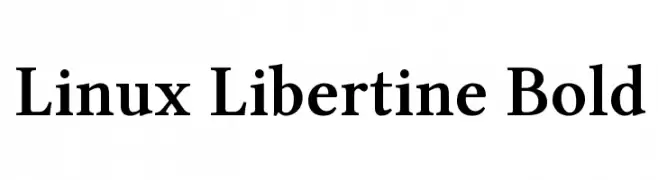
![Linux Libertine Bold Frei Schriftart Herunterladen]() Herunterladen 1749 Downloads@WebFont
Herunterladen 1749 Downloads@WebFont -
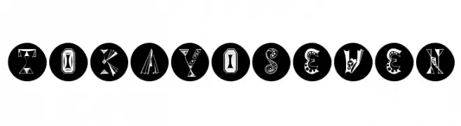
( Fonts by Manfred Klein. Free for private and charity use. Free for commercial with donation to organizations )
A playful, decorative font with unique, whimsical designs in each character.
![TokayOSeven Frei Schriftart Herunterladen]() Herunterladen 1749 Downloads@WebFont
Herunterladen 1749 Downloads@WebFont -
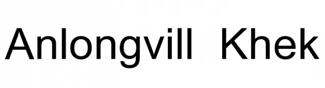
![Anlongvill Khek Frei Schriftart Herunterladen]() Herunterladen 1749 Downloads@WebFont
Herunterladen 1749 Downloads@WebFont -
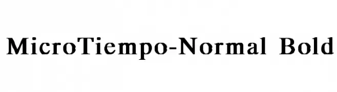
![MicroTiempo-Normal Bold Frei Schriftart Herunterladen]() Herunterladen 1749 Downloads@WebFont
Herunterladen 1749 Downloads@WebFont -
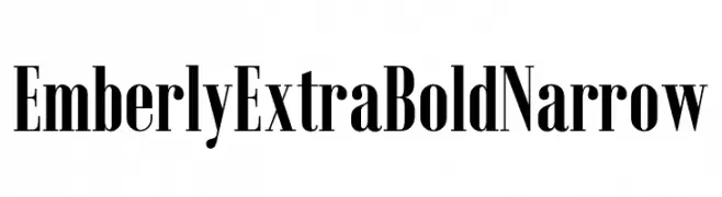
( Fonts by Rajesh Rajput - gumroad.com/rajputrajesh_448 - Personal-use only. For commercial use please contact owner. )
A bold, narrow font with high contrast and elegant, slender letterforms.
![Emberly Extra Bold Narrow Frei Schriftart Herunterladen]() Herunterladen 1748 Downloads@WebFont
Herunterladen 1748 Downloads@WebFont -
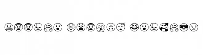
( Fonts by Tomoharu )
Expressive, outlined emoji icons with bold lines and varied emotions.
![Google Emojis Regular Frei Schriftart Herunterladen]() Herunterladen 1748 Downloads@WebFont
Herunterladen 1748 Downloads@WebFont -
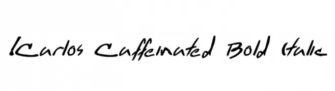
( !Exclamachine Type Foundry - exclamachine.com/ )
A bold, italic, handwritten font with dynamic and energetic strokes.
![!Carlos Caffeinated Bold Italic Frei Schriftart Herunterladen]() Herunterladen 1748 Downloads@WebFont
Herunterladen 1748 Downloads@WebFont -
( Fonts by Fernando Haro - defharo.com )
A bold, outlined font with a modern and impactful style.
![I am Hueca Frei Schriftart Herunterladen]() Herunterladen 1748 Downloads@WebFont
Herunterladen 1748 Downloads@WebFont -
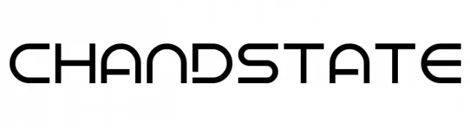
( Fonts by Andrew McCluskey - nalgames.com. Personal-use only. For commercial use please contact owner. )
A modern, geometric font with clean lines and a futuristic style.
![Chandstate Frei Schriftart Herunterladen]() Herunterladen 1748 Downloads@WebFont
Herunterladen 1748 Downloads@WebFont -
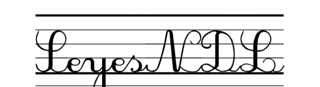
![SeyesNDL Frei Schriftart Herunterladen]() Herunterladen 1748 Downloads@WebFont
Herunterladen 1748 Downloads@WebFont -
![Gaps Frei Schriftart Herunterladen]() Herunterladen 1748 Downloads@WebFont
Herunterladen 1748 Downloads@WebFont -
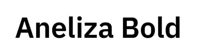
( Fonts by Mike Abbink, Paul van der Laan, Pieter van Rosmalen - Personal-use only. For commercial use please contact owner. )
A bold, modern sans-serif font with clean lines and balanced proportions.
![Aneliza Bold Frei Schriftart Herunterladen]() Herunterladen 1747 Downloads@WebFont
Herunterladen 1747 Downloads@WebFont -
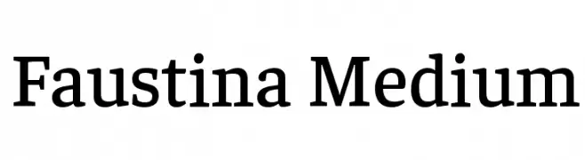
( Copyright 2016 The Faustina Project Authors (omnibus.type@gmail.com) )
A classic serif font with medium weight, offering elegance and readability.
![Faustina Medium Frei Schriftart Herunterladen]() Herunterladen 1747 Downloads@WebFont
Herunterladen 1747 Downloads@WebFont -
![Freak Frei Schriftart Herunterladen]() Herunterladen 1747 Downloads@WebFont
Herunterladen 1747 Downloads@WebFont -
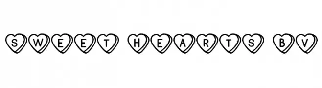
( Fonts by Blue Vinyl - Jess Latham - www.bvfonts.com )
A decorative font with characters enclosed in heart shapes, perfect for romantic or playful designs.
![Sweet Hearts BV Frei Schriftart Herunterladen]() Herunterladen 1747 Downloads@WebFont
Herunterladen 1747 Downloads@WebFont -
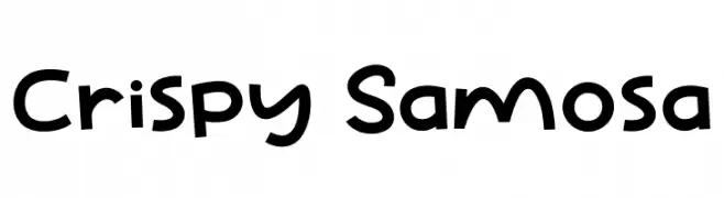
( Fonts by Khurasan )
A playful, hand-drawn font with bold, irregular letterforms.
![Crispy Samosa Frei Schriftart Herunterladen]() Herunterladen 1746 Downloads@WebFont
Herunterladen 1746 Downloads@WebFont -
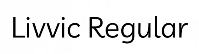
( Copyright 2019 The Livvic Project Authors (https://github.com/Fonthausen/Livvic) )
A modern, geometric sans-serif font with balanced proportions and a clean appearance.
![Livvic Regular Frei Schriftart Herunterladen]() Herunterladen 1746 Downloads@WebFont
Herunterladen 1746 Downloads@WebFont -
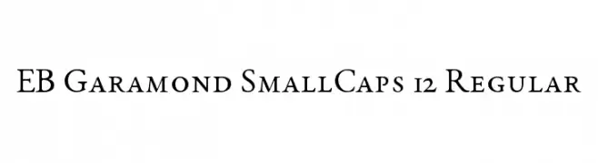
( Fonts by Georg Duffner - Personal-use only. For commercial use please contact owner. )
A classic serif font with elegant, traditional letterforms and balanced design.
![EB Garamond SmallCaps 12 Regular Frei Schriftart Herunterladen]() Herunterladen 1746 Downloads@WebFont
Herunterladen 1746 Downloads@WebFont -
![aKa Frei Schriftart Herunterladen]() Herunterladen 1746 Downloads@WebFont
Herunterladen 1746 Downloads@WebFont -
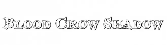
( Fonts by Daniel Zadorozny - www.iconian.com )
A rugged, distressed font with bold outlines and shadow effects.
![Blood Crow Shadow Frei Schriftart Herunterladen]() Herunterladen 1746 Downloads@WebFont
Herunterladen 1746 Downloads@WebFont -
( Fonts by Fikryal studio )
A bold, playful handwritten font with rounded edges and dynamic style.
![CHERRY LIME Frei Schriftart Herunterladen]() Herunterladen 1745 Downloads@WebFont
Herunterladen 1745 Downloads@WebFont -
( Fonts by Des Gomez )
A playful, handwritten font with a casual and dynamic style.
![Hypebeast Frei Schriftart Herunterladen]() Herunterladen 1745 Downloads@WebFont
Herunterladen 1745 Downloads@WebFont -
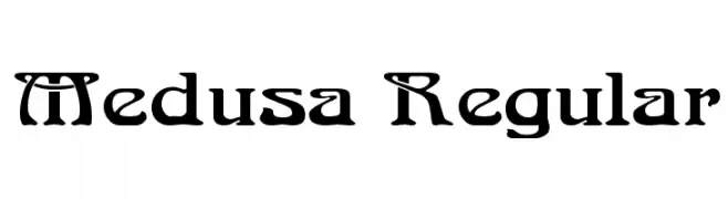
![Medusa Regular Frei Schriftart Herunterladen]() Herunterladen 1745 Downloads@WebFont
Herunterladen 1745 Downloads@WebFont -
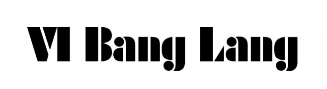
![VI Bang Lang Frei Schriftart Herunterladen]() Herunterladen 1745 Downloads@WebFont
Herunterladen 1745 Downloads@WebFont -
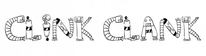
![Clink Clank Frei Schriftart Herunterladen]() Herunterladen 1745 Downloads@WebFont
Herunterladen 1745 Downloads@WebFont -
( Fonts by ParaType - Personal-use only. For commercial use please contact owner. )
A bold, modern sans-serif font with geometric shapes and consistent stroke width.
![PT Root UI Bold Frei Schriftart Herunterladen]() Herunterladen 1744 Downloads@WebFont
Herunterladen 1744 Downloads@WebFont -
![This Is The Future Frei Schriftart Herunterladen]() Herunterladen 1744 Downloads@WebFont
Herunterladen 1744 Downloads@WebFont -
( Lianne Elliott )
A modern, striped font with a bold, geometric design.
![Labour Frei Schriftart Herunterladen]() Herunterladen 1744 Downloads@WebFont
Herunterladen 1744 Downloads@WebFont


Welche Schriften sind gerade am populärsten?
Poppins, Roboto, Montserrat, Open Sans und Lato sind wegen ihrer klaren Formen und breiten Einsetzbarkeit sehr gefragt – von Markenauftritt über Landingpages bis hin zu Postern.
Welche Fonts eignen sich für Logos?
Geometrische Sans‑Serifs (z. B. Poppins, Familien im Gotham‑Stil) sind ein häufiger Griff für sauberes, skalierbares Branding. Für eine persönlichere Note bleiben Scripts und Handschrift‑Stile beliebt. Kombinieren Sie einen prägnanten Headline‑Font mit einer neutralen Brotschrift für Wiedererkennung und Harmonie.
Wie oft wird die Top‑Liste aktualisiert?
Regelmäßig – basierend auf realen Downloads und Interaktionen. Schauen Sie öfter vorbei, um aufstrebende Favoriten früh zu entdecken.
💡 Tipp: Seite bookmarken – Trends wechseln schnell, und heutige Top‑Schriften inspirieren morgen vielleicht das Rebranding.