Willkommen bei den Top‑Schriften – hier treffen Beliebtheit und Qualität aufeinander. Das sind die in diesem Jahr am häufigsten heruntergeladenen und genutzten Fonts. Wenn Sie sichere Optionen für Logo, Web oder Social suchen, starten Sie hier.
Jeder Top‑Font überzeugt durch Balance, Lesbarkeit und Vielseitigkeit. Sie finden moderne Sans‑Serifs, elegante Scripts, Vintage‑Serifs und minimalistische Displays.
-
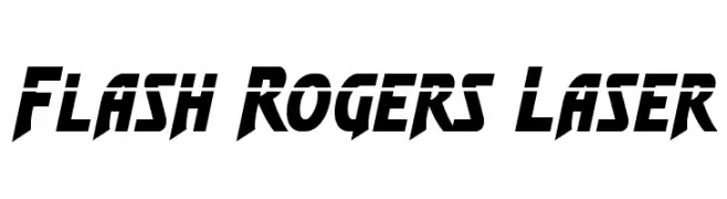
( Iconian Fonts - Daniel Zadorozny - www.iconian.com )
A bold, angular typeface with a futuristic and dynamic style.
 Herunterladen 84 Downloads@WebFont
 -
( Fonts by Getypes Studio - Muhammad Rizaldi - Personal-use only. For commercial use please contact owner. )
A graceful and elegant script font with a handwritten style.
![salwascript Frei Schriftart Herunterladen]() Herunterladen 84 Downloads@WebFont
Herunterladen 84 Downloads@WebFont -
( Fonts by alphArtype - Agung Rohmat - Personal-use only. For commercial use please contact owner. )
A lively, handwritten font with fluid, elegant strokes and a personal touch.
![Styled Bright Regular Frei Schriftart Herunterladen]() Herunterladen 84 Downloads@WebFont
Herunterladen 84 Downloads@WebFont -
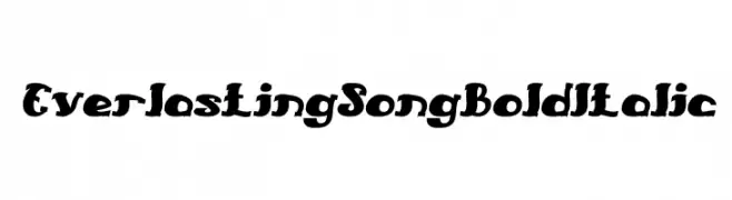
( weknow - Wino S Kadir - www.creativefabrica.com/designer/weknow/ )
A bold, italic script font with high contrast and decorative flair.
![Everlasting Song Bold Italic Frei Schriftart Herunterladen]() Herunterladen 84 Downloads@WebFont
Herunterladen 84 Downloads@WebFont -
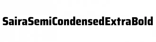
( Fonts by Omnibus Type )
A bold, semi-condensed typeface with a modern and impactful style.
![Saira SemiCondensed ExtraBold Frei Schriftart Herunterladen]() Herunterladen 84 Downloads@WebFont
Herunterladen 84 Downloads@WebFont -
( Fonts by Lars Manenschijn - Personal-use only. For commercial use please contact owner. )
Hand-drawn cartoon male characters representing letters and symbols.
![Create a Cartoon! [Male basic] Frei Schriftart Herunterladen]() Herunterladen 84 Downloads@WebFont
Herunterladen 84 Downloads@WebFont -
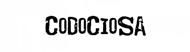
( Fonts by www.woodcutter.es - woodcutter Manero - Personal-use only. For commercial use please contact owner. )
A bold, distressed font with a vintage, grunge aesthetic.
![Codociosa Frei Schriftart Herunterladen]() Herunterladen 84 Downloads@WebFont
Herunterladen 84 Downloads@WebFont -
( Perdana Kurniawan Arta - creativemarket.com/perdanakun )
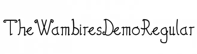
A whimsical, decorative serif font with playful curls and loops.
![TheWambiresDemoRegular Frei Schriftart Herunterladen]() Herunterladen 84 Downloads@WebFont
Herunterladen 84 Downloads@WebFont -
( Fonts by Hendrick Rolandez - Personal-use only. For commercial use please contact owner. )
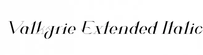
An elegant, high-contrast italic font with elongated letterforms and an extended width.
![Valkyrie Extended Italic Frei Schriftart Herunterladen]() Herunterladen 84 Downloads@WebFont
Herunterladen 84 Downloads@WebFont -
( Fonts by HandletterYean - Yean Aguste - Personal-use only. For commercial use please contact owner. )
A lively handwritten font with fluid, dynamic strokes and a casual feel.
![StarTrack Frei Schriftart Herunterladen]() Herunterladen 84 Downloads@WebFont
Herunterladen 84 Downloads@WebFont -
( Fonts by David Espinosa [Type Sailor] - www.facebook.com/typesailor - Personal-use only. For commercial use please contact owner. )
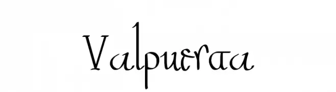
An artistic, medieval-inspired font with decorative and intricate letterforms.
![Valpuesta Frei Schriftart Herunterladen]() Herunterladen 84 Downloads@WebFont
Herunterladen 84 Downloads@WebFont -
( Iconian Fonts - Daniel Zadorozny - www.iconian.com )
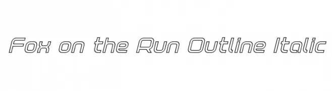
A modern, italic outline font with geometric shapes and dynamic style.
![Fox on the Run Outline Italic Frei Schriftart Herunterladen]() Herunterladen 84 Downloads@WebFont
Herunterladen 84 Downloads@WebFont -
( Fonts by Misti Hammers - mistifonts.com - Personal-use only. For commercial use please contact owner. )
An elegant cursive script font with flowing, connected characters.
![HalloweeninAutumn Frei Schriftart Herunterladen]() Herunterladen 84 Downloads@WebFont
Herunterladen 84 Downloads@WebFont -
( Fonts by Zain Mustafa - Personal-use only. For commercial use please contact owner. )
A modern, thin, and minimalist font with clean lines and a sleek appearance.
![Mehrajan-Thin Frei Schriftart Herunterladen]() Herunterladen 84 Downloads@WebFont
Herunterladen 84 Downloads@WebFont -
( Noto is a trademark of Google Inc. Noto fonts are open source. All Noto fonts are published under the SIL Open Font License, Version 1.1 )
A clean, minimalistic font with smooth curves and uniform stroke width.
![Noto Sans Arabic ExtraLight Frei Schriftart Herunterladen]() Herunterladen 84 Downloads@WebFont
Herunterladen 84 Downloads@WebFont -
( Fonts by Vigilante Typeface Corporation Larry Yerkes. Personal-use only. For commercial use please contact owner. )
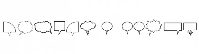
Outlined comic speech and thought bubbles in diverse shapes.
![Komika Bubbles Frei Schriftart Herunterladen]() Herunterladen 84 Downloads@WebFont
Herunterladen 84 Downloads@WebFont -
( Fonts by Lettersiro Studio - Muhammad Sirojuddin - Personal-use only. For commercial use please contact owner. )
A clean, modern font with tall, narrow characters and consistent stroke width.
![Today Easter Frei Schriftart Herunterladen]() Herunterladen 84 Downloads@WebFont
Herunterladen 84 Downloads@WebFont -
( Craft Supply Co. - creativemarket.com/craftsupplyco )
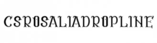
A decorative font with dropline shadows and elegant serifs.
![CS Rosalia Dropline Frei Schriftart Herunterladen]() Herunterladen 84 Downloads@WebFont
Herunterladen 84 Downloads@WebFont -
( Iconian Fonts - Daniel Zadorozny - www.iconian.com )
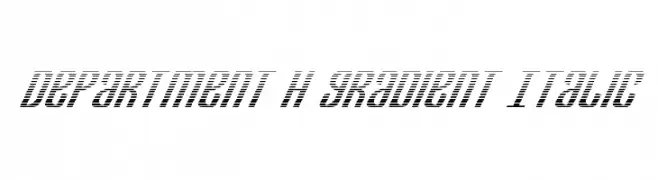
A modern, italic font with a gradient line effect, conveying speed and dynamism.
![Department H Gradient Italic Frei Schriftart Herunterladen]() Herunterladen 84 Downloads@WebFont
Herunterladen 84 Downloads@WebFont -
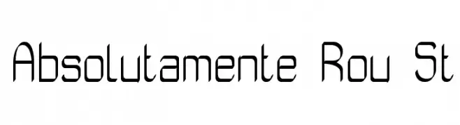
( Southype - Rodrigo Gonzalez - www.southype.com )
A modern, geometric font with sleek lines and a sophisticated appearance.
![Absolutamente Rou St Frei Schriftart Herunterladen]() Herunterladen 84 Downloads@WebFont
Herunterladen 84 Downloads@WebFont -
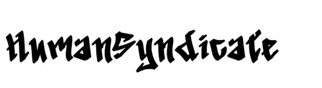
( Fonts by Yoga Letter )
A bold blackletter font with sharp, angular lines and a gothic aesthetic.
![Human Syndicate - 1 Frei Schriftart Herunterladen]() Herunterladen 84 Downloads@WebFont
Herunterladen 84 Downloads@WebFont -
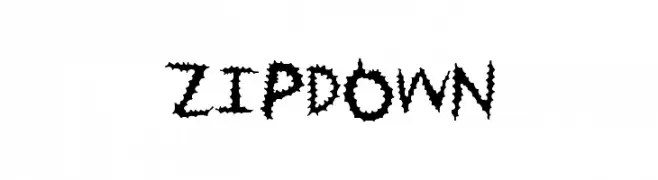
( Fonts by a Max Infeld - XEROGRAPHER FONTS - xerographer.blogspot.com . Personal-use only. For commercial use please contact owner. )
A jagged, edgy font with sharp, irregular edges for a dynamic look.
![ZipDown Frei Schriftart Herunterladen]() Herunterladen 84 Downloads@WebFont
Herunterladen 84 Downloads@WebFont -
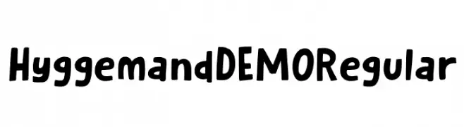
( Fonts by Hanoded )
A playful, hand-drawn font with bold, rounded characters and whimsical elements.
![Hyggemand DEMO Regular Frei Schriftart Herunterladen]() Herunterladen 84 Downloads@WebFont
Herunterladen 84 Downloads@WebFont -
( Noto is a trademark of Google Inc. Noto fonts are open source. All Noto fonts are published under the SIL Open Font License, Version 1.1 )
A bold, semi-condensed sans-serif font with a modern and robust design.
![Noto Sans Display SemiCondensed Black Frei Schriftart Herunterladen]() Herunterladen 84 Downloads@WebFont
Herunterladen 84 Downloads@WebFont -
( Fonts by StringLabs - stringlabscreative.com - Personal-use only. For commercial use please contact owner. )
A bold, gothic-style font with sharp angles and decorative serifs.
![Rademos Regular Frei Schriftart Herunterladen]() Herunterladen 84 Downloads@WebFont
Herunterladen 84 Downloads@WebFont -
( Fonts by Khurasan - Syaf Rizal - Personal-use only. For commercial use please contact owner. )
A playful, handwritten font with bold, rounded strokes and a casual style.
![Tourism Days Frei Schriftart Herunterladen]() Herunterladen 84 Downloads@WebFont
Herunterladen 84 Downloads@WebFont -
( Fonts by Variatype - Mukhlis Muhammad - Personal-use only. For commercial use please contact owner. )
A playful, bold handwritten font with a casual and energetic style.
![CHASINGBLUEBERRYRegular Frei Schriftart Herunterladen]() Herunterladen 84 Downloads@WebFont
Herunterladen 84 Downloads@WebFont -
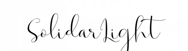
( Fonts by Solidtype - Personal-use only. For commercial use please contact owner. )
An elegant, flowing script font with graceful loops and cursive strokes.
![Solidar Light Frei Schriftart Herunterladen]() Herunterladen 84 Downloads@WebFont
Herunterladen 84 Downloads@WebFont -
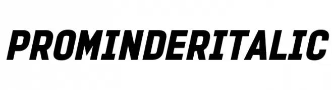
( Fonts by 7NTypes - Personal-use only. For commercial use please contact owner. )
A bold, italicized font with a modern, angular design.
![PROMINDER Italic Frei Schriftart Herunterladen]() Herunterladen 84 Downloads@WebFont
Herunterladen 84 Downloads@WebFont -
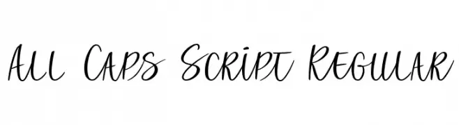
( Fonts by Roland Huse Design )
A flowing, elegant script font with interconnected characters and a handwritten feel.
![All Caps Script Regular Frei Schriftart Herunterladen]() Herunterladen 84 Downloads@WebFont
Herunterladen 84 Downloads@WebFont -
![GilliusADFNo2-BoldCondItalic Frei Schriftart Herunterladen]() Herunterladen 84 Downloads@WebFont
Herunterladen 84 Downloads@WebFont -
( Fonts by Iconian Fonts - Daniel Zadorozny - Personal-use only. For commercial use please contact owner. )
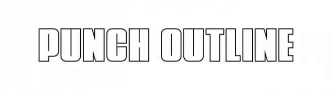
A bold, outlined font with geometric structure and clean lines.
![Punch Outline Frei Schriftart Herunterladen]() Herunterladen 84 Downloads@WebFont
Herunterladen 84 Downloads@WebFont -
( Fonts by nariswari_creative - Taufik Dwi Purnomo - Personal-use only. For commercial use please contact owner. )
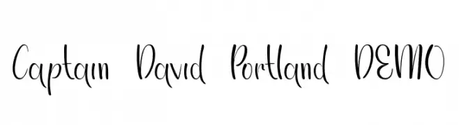
A playful, energetic script font with a hand-drawn appearance.
![Captain David Portland DEMO Frei Schriftart Herunterladen]() Herunterladen 84 Downloads@WebFont
Herunterladen 84 Downloads@WebFont -
( Robert Allgeyer - www.icogitate.com/~ergosum/fonts/music-fonts2.htm )
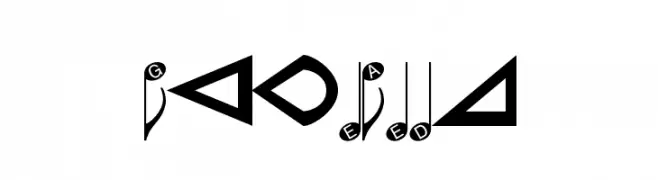
A playful font combining musical notes with geometric shapes for a unique, artistic style.
![NoteHedz Frei Schriftart Herunterladen]() Herunterladen 84 Downloads@WebFont
Herunterladen 84 Downloads@WebFont -
( dcoxy - Greg Medina - www.dcoxy.com/ )
A playful, handwritten script font with smooth, rounded strokes.
![Burglar Frei Schriftart Herunterladen]() Herunterladen 84 Downloads@WebFont
Herunterladen 84 Downloads@WebFont


![Create a Cartoon! [Male basic] Frei Schriftart Herunterladen](https://d144mzi0q5mijx.cloudfront.net/img/C/R/Create-a-Cartoon-Male-basic.webp)


Welche Schriften sind gerade am populärsten?
Poppins, Roboto, Montserrat, Open Sans und Lato sind wegen ihrer klaren Formen und breiten Einsetzbarkeit sehr gefragt – von Markenauftritt über Landingpages bis hin zu Postern.
Welche Fonts eignen sich für Logos?
Geometrische Sans‑Serifs (z. B. Poppins, Familien im Gotham‑Stil) sind ein häufiger Griff für sauberes, skalierbares Branding. Für eine persönlichere Note bleiben Scripts und Handschrift‑Stile beliebt. Kombinieren Sie einen prägnanten Headline‑Font mit einer neutralen Brotschrift für Wiedererkennung und Harmonie.
Wie oft wird die Top‑Liste aktualisiert?
Regelmäßig – basierend auf realen Downloads und Interaktionen. Schauen Sie öfter vorbei, um aufstrebende Favoriten früh zu entdecken.
💡 Tipp: Seite bookmarken – Trends wechseln schnell, und heutige Top‑Schriften inspirieren morgen vielleicht das Rebranding.