Willkommen bei den Top‑Schriften – hier treffen Beliebtheit und Qualität aufeinander. Das sind die in diesem Jahr am häufigsten heruntergeladenen und genutzten Fonts. Wenn Sie sichere Optionen für Logo, Web oder Social suchen, starten Sie hier.
Jeder Top‑Font überzeugt durch Balance, Lesbarkeit und Vielseitigkeit. Sie finden moderne Sans‑Serifs, elegante Scripts, Vintage‑Serifs und minimalistische Displays.
-
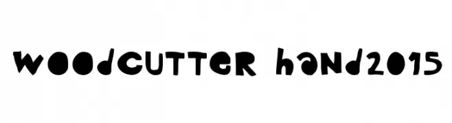
( Fonts by www.woodcutter.es - woodcutter Manero - Personal-use only. For commercial use please contact owner. )
A playful, bold, hand-drawn font with irregular, organic shapes and a whimsical style.
 Herunterladen 84 Downloads@WebFont
 -
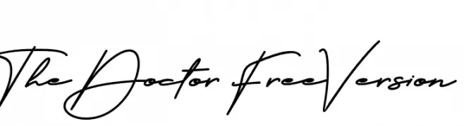
( Fonts by PutraCetol Studio - www.putracetol.com - Personal-use only. For commercial use please contact owner. )
A dynamic and elegant script font with fluid, connected strokes.
![The Doctor FreeVersion Frei Schriftart Herunterladen]() Herunterladen 84 Downloads@WebFont
Herunterladen 84 Downloads@WebFont -
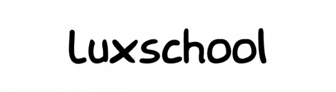
( Fonts by Sahl Studio - Personal-use only. For commercial use please contact owner. )
A playful, handwritten font with bold, rounded characters.
![Luxschool Frei Schriftart Herunterladen]() Herunterladen 84 Downloads@WebFont
Herunterladen 84 Downloads@WebFont -
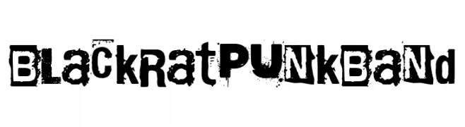
( Fonts by Woodcutter )
A gritty, distressed font with a rebellious punk rock aesthetic.
![Black Rat Punk Band Frei Schriftart Herunterladen]() Herunterladen 84 Downloads@WebFont
Herunterladen 84 Downloads@WebFont -
( Fonts by Alit Suarnegara - Alit Design - www.alitdesign.net - Personal-use only. For commercial use please contact owner. )
A bold, high-contrast serif font with elegant curves and dramatic strokes.
![BlackQuality Frei Schriftart Herunterladen]() Herunterladen 84 Downloads@WebFont
Herunterladen 84 Downloads@WebFont -
( Fonts by Daniel Zadorozny - www.iconian.com )
A bold, industrial font with a laser-cut, mechanical appearance.
![Iron Forge Laser Regular Frei Schriftart Herunterladen]() Herunterladen 84 Downloads@WebFont
Herunterladen 84 Downloads@WebFont -
( Iconian Fonts - Daniel Zadorozny - www.iconian.com )
A modern, geometric font with characters enclosed in hexagons.
![HEX:gon Staggered Frei Schriftart Herunterladen]() Herunterladen 84 Downloads@WebFont
Herunterladen 84 Downloads@WebFont -
( Iconian Fonts - Daniel Zadorozny - www.iconian.com )
A futuristic, geometric font with bold, rounded letterforms and unique dot accents.
![Planet X Compact Frei Schriftart Herunterladen]() Herunterladen 84 Downloads@WebFont
Herunterladen 84 Downloads@WebFont -
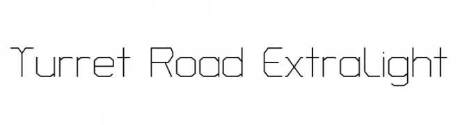
( Copyright 2018 The Turret Road Project Authors (https://github.com/noponies/turret-road) )
A geometric, angular font with consistent stroke width and a modern, minimalistic design.
![Turret Road ExtraLight Frei Schriftart Herunterladen]() Herunterladen 84 Downloads@WebFont
Herunterladen 84 Downloads@WebFont -
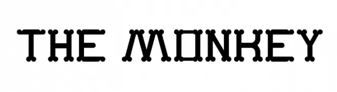
( Fonts by Wino S Kadir - weknow - www.revolge.com/shop/weknow/ - Personal-use only. For commercial use please contact owner. )
A playful, modular font with rounded terminals and a digital-inspired design.
![The Monkey Frei Schriftart Herunterladen]() Herunterladen 84 Downloads@WebFont
Herunterladen 84 Downloads@WebFont -
![Zounderkite Expanded Frei Schriftart Herunterladen]() Herunterladen 84 Downloads@WebFont
Herunterladen 84 Downloads@WebFont -
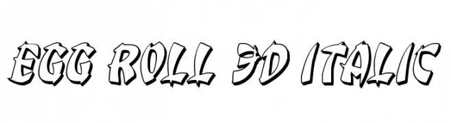
( Iconian Fonts - Daniel Zadorozny - www.iconian.com )
A bold, 3D italic font with a playful, dynamic style and thick outlines.
![Egg Roll 3D Italic Frei Schriftart Herunterladen]() Herunterladen 84 Downloads@WebFont
Herunterladen 84 Downloads@WebFont -
( Iconian Fonts - Daniel Zadorozny - www.iconian.com )
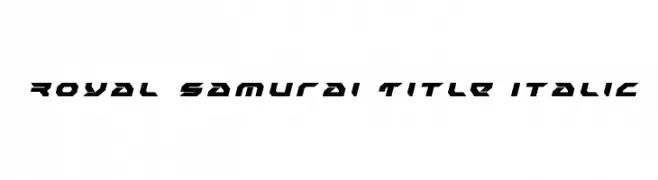
A bold, angular, and italic font with a futuristic and dynamic style.
![Royal Samurai Title Italic Frei Schriftart Herunterladen]() Herunterladen 84 Downloads@WebFont
Herunterladen 84 Downloads@WebFont -
( Fonts by Will Albin-Clark - willalbinclark.com - Personal-use only. For commercial use please contact owner. )
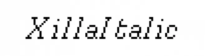
A pixelated, italic font with a retro digital aesthetic.
![Xilla Italic Frei Schriftart Herunterladen]() Herunterladen 84 Downloads@WebFont
Herunterladen 84 Downloads@WebFont -
( Xerographer Fonts - Max Infeld - xerographer.blogspot.com )
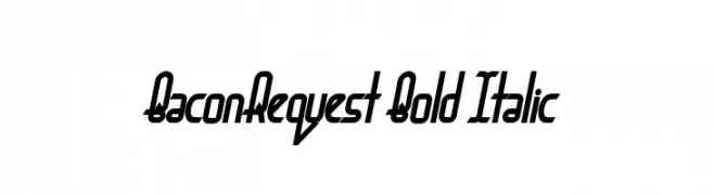
A bold, italicized font with a modern and dynamic style.
![BaconRequest Bold Italic Frei Schriftart Herunterladen]() Herunterladen 84 Downloads@WebFont
Herunterladen 84 Downloads@WebFont -
( Fonts by Dmitry Astakhov - www.behance.net/adonis-abe1e - Personal-use only. For commercial use please contact owner. )
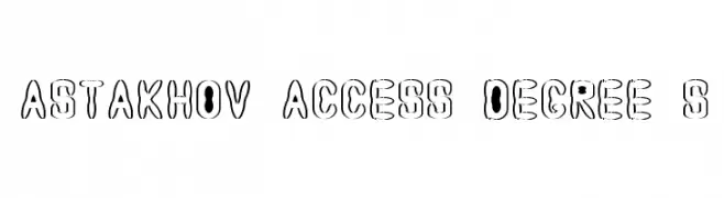
A bold, outlined font with a playful, hollow design ideal for creative projects.
![Astakhov Access Degree S Frei Schriftart Herunterladen]() Herunterladen 84 Downloads@WebFont
Herunterladen 84 Downloads@WebFont -
( Iconian Fonts - Daniel Zadorozny - www.iconian.com )
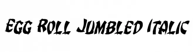
A bold, italic font with a dynamic, graffiti-inspired style.
![Egg Roll Jumbled Italic Frei Schriftart Herunterladen]() Herunterladen 84 Downloads@WebFont
Herunterladen 84 Downloads@WebFont -
( Font Nook - www.geocities.com/weakestlink11/ )
A festive, candy cane-inspired font with bold, striped characters.
![Cane Pillars Frei Schriftart Herunterladen]() Herunterladen 84 Downloads@WebFont
Herunterladen 84 Downloads@WebFont -
( Fonts by Steve Gardner - www.explogos.com. Personal-use only. For commercial use please contact owner. )
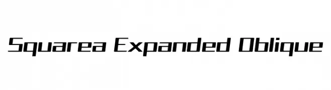
A modern, oblique, and expanded font with a futuristic and dynamic design.
![Squarea Expanded Oblique Frei Schriftart Herunterladen]() Herunterladen 84 Downloads@WebFont
Herunterladen 84 Downloads@WebFont -
( Fonts by Kat`s Fun Fonts - Personal-use only. For commercial use please contact owner. )
A decorative font with New Year-themed illustrations for festive designs.
![KR Welcome 2002 Pt 2 Frei Schriftart Herunterladen]() Herunterladen 84 Downloads@WebFont
Herunterladen 84 Downloads@WebFont -
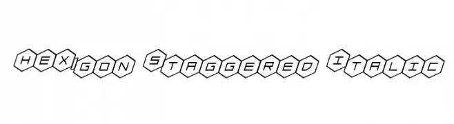
( Iconian Fonts - Daniel Zadorozny - www.iconian.com )
A hexagon-enclosed, staggered italic font with a modern geometric style.
![HEX:gon Staggered Italic Frei Schriftart Herunterladen]() Herunterladen 84 Downloads@WebFont
Herunterladen 84 Downloads@WebFont -
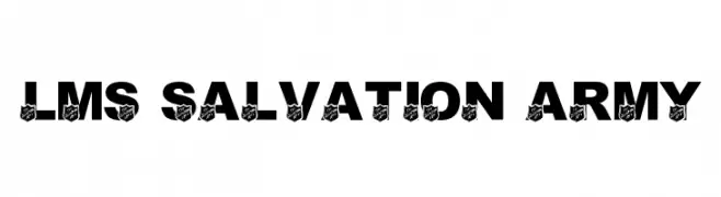
( London's Letters - www.londonsletters.com/ )
A bold, uppercase font with decorative shield emblems, ideal for impactful designs.
![LMS Salvation Army Frei Schriftart Herunterladen]() Herunterladen 84 Downloads@WebFont
Herunterladen 84 Downloads@WebFont -
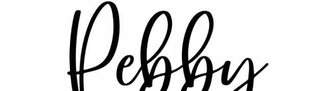
( Fonts by NJ Studio - Personal-use only. For commercial use please contact owner. )
A lively and flowing script font with elegant, cursive letterforms.
![Pebby Frei Schriftart Herunterladen]() Herunterladen 84 Downloads@WebFont
Herunterladen 84 Downloads@WebFont -
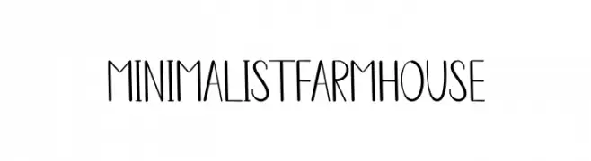
( Fonts by Scratchones )
A minimalist, hand-drawn font with a rustic farmhouse charm.
![Minimalist Farmhouse Frei Schriftart Herunterladen]() Herunterladen 84 Downloads@WebFont
Herunterladen 84 Downloads@WebFont -
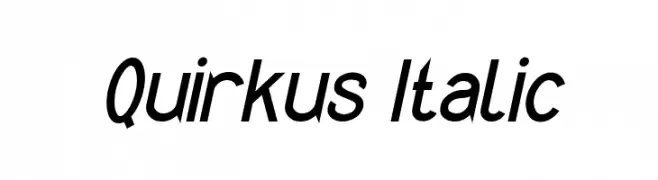
( Fonts by Peter Wiegel - www.peter-wiegel.de - Personal-use only. For commercial use please contact owner. )
A modern, italic font with sleek, condensed characters and a dynamic style.
![Quirkus Italic Frei Schriftart Herunterladen]() Herunterladen 84 Downloads@WebFont
Herunterladen 84 Downloads@WebFont -
( Fonts by Wino S Kadir - weknow - www.revolge.com/shop/weknow/ - Personal-use only. For commercial use please contact owner. )
A bold, geometric font with a modern and impactful design.
![salute Frei Schriftart Herunterladen]() Herunterladen 84 Downloads@WebFont
Herunterladen 84 Downloads@WebFont -
( Fonts by Fontfabric - Svetoslav Simov - Personal-use only. For commercial use please contact owner. )
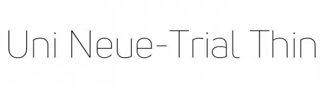
A modern, thin sans-serif font with a clean and minimalist style.
![Uni Neue-Trial Thin Frei Schriftart Herunterladen]() Herunterladen 84 Downloads@WebFont
Herunterladen 84 Downloads@WebFont -
( Vladimir Nikolic - www.coroflot.com/vladimirnikolic )
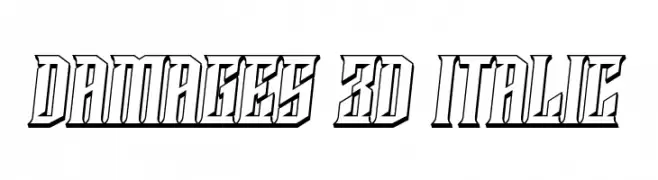
A bold, 3D italic font with sharp angles and a dynamic style.
![Damages 3D Italic Frei Schriftart Herunterladen]() Herunterladen 84 Downloads@WebFont
Herunterladen 84 Downloads@WebFont -
( Noto is a trademark of Google Inc. Noto fonts are open source. All Noto fonts are published under the SIL Open Font License, Version 1.1 )
A bold, semi-condensed font with strong, clear characters.
![Noto Sans Arabic SemiCondensed ExtraBold Frei Schriftart Herunterladen]() Herunterladen 84 Downloads@WebFont
Herunterladen 84 Downloads@WebFont -
( Fonts by Wino S Kadir - weknow - www.revolge.com/shop/weknow/ - Personal-use only. For commercial use please contact owner. )
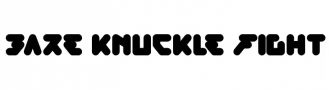
A bold, geometric font with angular shapes and thick strokes, ideal for headlines.
![bare knuckle fight Frei Schriftart Herunterladen]() Herunterladen 84 Downloads@WebFont
Herunterladen 84 Downloads@WebFont -
( Iconian Fonts - Daniel Zadorozny - www.iconian.com )
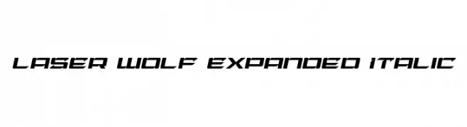
A bold, italic, and futuristic font with sharp, angular edges.
![Laser Wolf Expanded Italic Frei Schriftart Herunterladen]() Herunterladen 84 Downloads@WebFont
Herunterladen 84 Downloads@WebFont -
( Noto is a trademark of Google Inc. Noto fonts are open source. All Noto fonts are published under the SIL Open Font License, Version 1.1 )
A semi-bold serif font with a classic and versatile design.
![Noto Serif Sinhala SemiBold Frei Schriftart Herunterladen]() Herunterladen 84 Downloads@WebFont
Herunterladen 84 Downloads@WebFont -
( Fonts by CannotIntoSpaceFonts - KineticPlasma Fonts - Personal-use only. For commercial use please contact owner. )
A bold, decorative font with jagged, fragmented edges for a dynamic look.
![Hussar Lance ExtraBold Frei Schriftart Herunterladen]() Herunterladen 84 Downloads@WebFont
Herunterladen 84 Downloads@WebFont -
( Fonts by ingoFonts - Ingo Zimmermann - Personal-use only. For commercial use please contact owner. )
A clean, modern sans-serif typeface with uniform stroke width and balanced spacing.
![FaberSansStd-45Leicht Frei Schriftart Herunterladen]() Herunterladen 84 Downloads@WebFont
Herunterladen 84 Downloads@WebFont -
( ATRAX - antraxja-fonts.iweb.pl/en/ )
A modern, elegant font with tall, narrow uppercase letters and distinctive lowercase features.
![Orchidee Frei Schriftart Herunterladen]() Herunterladen 84 Downloads@WebFont
Herunterladen 84 Downloads@WebFont


Welche Schriften sind gerade am populärsten?
Poppins, Roboto, Montserrat, Open Sans und Lato sind wegen ihrer klaren Formen und breiten Einsetzbarkeit sehr gefragt – von Markenauftritt über Landingpages bis hin zu Postern.
Welche Fonts eignen sich für Logos?
Geometrische Sans‑Serifs (z. B. Poppins, Familien im Gotham‑Stil) sind ein häufiger Griff für sauberes, skalierbares Branding. Für eine persönlichere Note bleiben Scripts und Handschrift‑Stile beliebt. Kombinieren Sie einen prägnanten Headline‑Font mit einer neutralen Brotschrift für Wiedererkennung und Harmonie.
Wie oft wird die Top‑Liste aktualisiert?
Regelmäßig – basierend auf realen Downloads und Interaktionen. Schauen Sie öfter vorbei, um aufstrebende Favoriten früh zu entdecken.
💡 Tipp: Seite bookmarken – Trends wechseln schnell, und heutige Top‑Schriften inspirieren morgen vielleicht das Rebranding.