Willkommen bei den Top‑Schriften – hier treffen Beliebtheit und Qualität aufeinander. Das sind die in diesem Jahr am häufigsten heruntergeladenen und genutzten Fonts. Wenn Sie sichere Optionen für Logo, Web oder Social suchen, starten Sie hier.
Jeder Top‑Font überzeugt durch Balance, Lesbarkeit und Vielseitigkeit. Sie finden moderne Sans‑Serifs, elegante Scripts, Vintage‑Serifs und minimalistische Displays.
-
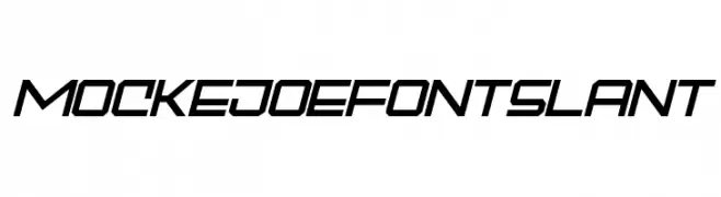
( Fonts by Tebaltipis Studio )
A bold, angular, and slanted font with a futuristic and dynamic style.
 Herunterladen 84 Downloads@WebFont
 -
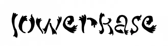
( Fonts by a Max Infeld - XEROGRAPHER FONTS - xerographer.blogspot.com . Personal-use only. For commercial use please contact owner. )
A decorative font with organic, flowing shapes and intricate details.
![lowerkase Frei Schriftart Herunterladen]() Herunterladen 84 Downloads@WebFont
Herunterladen 84 Downloads@WebFont -
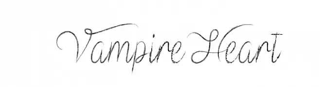
( Fonts by Misti's Fonts - Personal-use only. For commercial use please contact owner. )
An elegant and flowing script font with intricate letterforms and graceful swirls.
![VampireHeart Frei Schriftart Herunterladen]() Herunterladen 84 Downloads@WebFont
Herunterladen 84 Downloads@WebFont -
( Fonts by Wino S Kadir - weknow - www.revolge.com/shop/weknow/ - Personal-use only. For commercial use please contact owner. )
A modern, geometric font with a futuristic and dynamic style.
![THE SCIENCE ARCHAEOLOGIST Frei Schriftart Herunterladen]() Herunterladen 84 Downloads@WebFont
Herunterladen 84 Downloads@WebFont -
( Fonts by benoitsjoholm.blogspot.com - Benoit Sjoholm - Personal-use only. For commercial use please contact owner. )
A modern, flowing font with connected, elongated characters and rounded edges.
![Kamalo Frei Schriftart Herunterladen]() Herunterladen 84 Downloads@WebFont
Herunterladen 84 Downloads@WebFont -
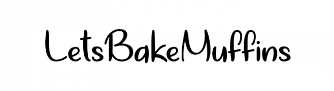
( Misti's Fonts - mistifonts.com/ )
A playful handwritten font with a casual and friendly style.
![LetsBakeMuffins Frei Schriftart Herunterladen]() Herunterladen 84 Downloads@WebFont
Herunterladen 84 Downloads@WebFont -
( Fonts by Daniel Zadorozny - www.iconian.com - Free for personal use )
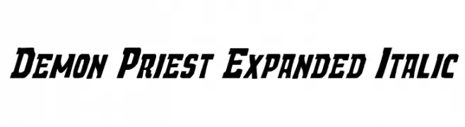
A bold, expanded, and italicized font with dynamic and angular characters.
![Demon Priest Expanded Italic Frei Schriftart Herunterladen]() Herunterladen 84 Downloads@WebFont
Herunterladen 84 Downloads@WebFont -
( Fonts by Greg Medina - www.dcoxy.com - Personal-use only. For commercial use please contact owner. )
Cartoon face illustrations form each character in a playful, decorative style.
![teubé3 Frei Schriftart Herunterladen]() Herunterladen 84 Downloads@WebFont
Herunterladen 84 Downloads@WebFont -
( Fonts by www.chequered.ink - Chequered Ink - Personal-use only. For commercial use please contact owner. )
A pixelated, ghost-themed font with a retro arcade style.
![Spoopy Ghost Pixels Frei Schriftart Herunterladen]() Herunterladen 84 Downloads@WebFont
Herunterladen 84 Downloads@WebFont -
![Siberia Narrow Frei Schriftart Herunterladen]() Herunterladen 84 Downloads@WebFont
Herunterladen 84 Downloads@WebFont -
( Fonts by Miffies - mfs.jp.org - Personal-use only. For commercial use please contact owner. )
A pixelated, retro-style font with a blocky, geometric appearance.
![M33_FLOPPY Frei Schriftart Herunterladen]() Herunterladen 84 Downloads@WebFont
Herunterladen 84 Downloads@WebFont -
( Fonts by Denny Subagja - Personal-use only. For commercial use please contact owner. )
A flowing, elegant script font with a modern calligraphic style.
![Himalaya Frei Schriftart Herunterladen]() Herunterladen 84 Downloads@WebFont
Herunterladen 84 Downloads@WebFont -
( Xerographer Fonts - Max Infeld - xerographer.blogspot.com )
A decorative vintage font with intricate, hand-drawn details and a textured appearance.
![OldeBarnsby Frei Schriftart Herunterladen]() Herunterladen 84 Downloads@WebFont
Herunterladen 84 Downloads@WebFont -
( Walter Paggioro - www.raptuscreativi.com/site/fields/type-design/ )
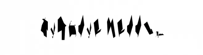
A hand-drawn, irregular font with bold, jagged strokes and a quirky, organic feel.
![ASILUM Frei Schriftart Herunterladen]() Herunterladen 84 Downloads@WebFont
Herunterladen 84 Downloads@WebFont -
( Jaime Rangel Castro )
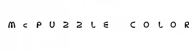
A playful, bold font with rounded, whimsical characters.
![McPuzzle Color Frei Schriftart Herunterladen]() Herunterladen 84 Downloads@WebFont
Herunterladen 84 Downloads@WebFont -
( Noto is a trademark of Google Inc. Noto fonts are open source. All Noto fonts are published under the SIL Open Font License, Version 1.1 )
A semi-condensed, medium weight serif font with a balanced and professional appearance.
![Noto Serif Georgian SemiCondensed Medium Frei Schriftart Herunterladen]() Herunterladen 84 Downloads@WebFont
Herunterladen 84 Downloads@WebFont -
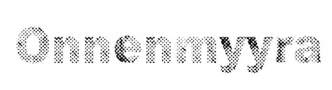
( Fonts by www.junkohanhero.com - Personal-use only. For commercial use please contact owner. )
A bold, halftone-patterned font with a textured, dotted appearance.
![Onnenmyyra Frei Schriftart Herunterladen]() Herunterladen 84 Downloads@WebFont
Herunterladen 84 Downloads@WebFont -
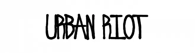
( Beraka Design - José Beraka Lobos - about.me/beraka )
A bold, graffiti-inspired font with a hand-drawn, urban style.
![Urban Riot Frei Schriftart Herunterladen]() Herunterladen 84 Downloads@WebFont
Herunterladen 84 Downloads@WebFont -
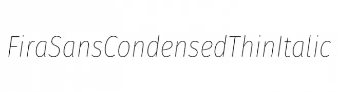
( Fonts by Mozilla )
A sleek, modern, condensed thin italic font with a minimalist aesthetic.
![Fira Sans Condensed Thin Italic Frei Schriftart Herunterladen]() Herunterladen 84 Downloads@WebFont
Herunterladen 84 Downloads@WebFont -
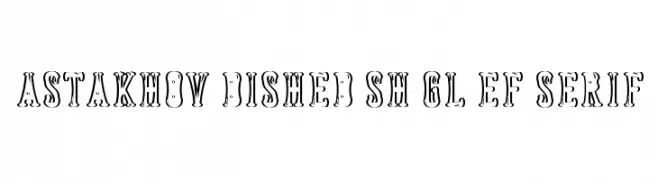
( Fonts by Dmitry Astakhov - www.behance.net/adonis-abe1e - Personal-use only. For commercial use please contact owner. )
A bold, decorative font with a playful, three-dimensional style.
![Astakhov Dished Sh Gl EF Serif Frei Schriftart Herunterladen]() Herunterladen 84 Downloads@WebFont
Herunterladen 84 Downloads@WebFont -
( Fonts by Ryul Davidson - Personal-use only. For commercial use please contact owner. )
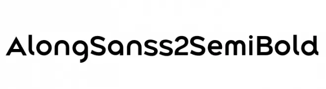
A modern, semi-bold sans-serif font with clean lines and balanced proportions.
![Along Sans s2 SemiBold Frei Schriftart Herunterladen]() Herunterladen 84 Downloads@WebFont
Herunterladen 84 Downloads@WebFont -
( Fonts by alphArtype - Agung Rohmat - Personal-use only. For commercial use please contact owner. )
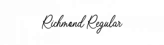
An elegant, cursive handwritten font with fluid, connected letters.
![Richmond Regular Frei Schriftart Herunterladen]() Herunterladen 84 Downloads@WebFont
Herunterladen 84 Downloads@WebFont -
( Fonts by Nanda Muhammad Rifai - Personal-use only. For commercial use please contact owner. )
A bold, industrial font with a distressed texture and strong geometric forms.
![rusher Frei Schriftart Herunterladen]() Herunterladen 84 Downloads@WebFont
Herunterladen 84 Downloads@WebFont -
![Siberia Reversed Frei Schriftart Herunterladen]() Herunterladen 84 Downloads@WebFont
Herunterladen 84 Downloads@WebFont -
( Fonts by benoitsjoholm.blogspot.com - Benoit Sjoholm - Personal-use only. For commercial use please contact owner. )
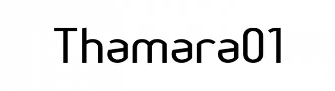
A modern, rounded sans-serif font with a clean and approachable style.
![Thamara01 Frei Schriftart Herunterladen]() Herunterladen 84 Downloads@WebFont
Herunterladen 84 Downloads@WebFont -
( wiccked stepmother fonts - Melanie Cook - wiccked.etsy.com/ )
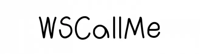
A playful, handwritten font with rounded edges and consistent stroke width.
![WSCallMe Frei Schriftart Herunterladen]() Herunterladen 84 Downloads@WebFont
Herunterladen 84 Downloads@WebFont -
( Fedency Creations )
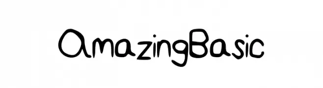
A playful, handwritten font with a casual and friendly style.
![AmazingBasic Frei Schriftart Herunterladen]() Herunterladen 84 Downloads@WebFont
Herunterladen 84 Downloads@WebFont -
( Fonts by Kong Font - fontkong.com - Personal-use only. For commercial use please contact owner. )
A bold, playful script font with a handwritten, artistic flair.
![AsifaCarol Frei Schriftart Herunterladen]() Herunterladen 84 Downloads@WebFont
Herunterladen 84 Downloads@WebFont -
( Iconian Fonts - Daniel Zadorozny - www.iconian.com )
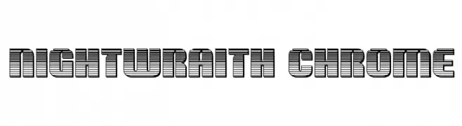
A bold, futuristic font with a striped, monospaced design.
![Nightwraith Chrome Frei Schriftart Herunterladen]() Herunterladen 84 Downloads@WebFont
Herunterladen 84 Downloads@WebFont -
( Fonts by Natalia Arencibia - Personal-use only. For commercial use please contact owner. )
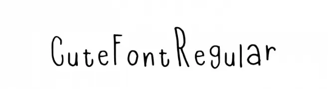
A playful, hand-drawn font with a whimsical and informal style.
![Cute Font Regular Frei Schriftart Herunterladen]() Herunterladen 84 Downloads@WebFont
Herunterladen 84 Downloads@WebFont -
( Fonts by Gunawan - Personal-use only. For commercial use please contact owner. )
A bold, rounded, and playful font with a hand-drawn look.
![Big Mango Frei Schriftart Herunterladen]() Herunterladen 84 Downloads@WebFont
Herunterladen 84 Downloads@WebFont -
( Fonts by Iconian Fonts - Daniel Zadorozny - Personal-use only. For commercial use please contact owner. )
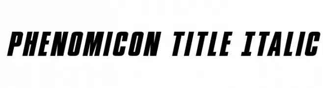
A bold, italic font with a dynamic and modern style.
![Phenomicon Title Italic Frei Schriftart Herunterladen]() Herunterladen 84 Downloads@WebFont
Herunterladen 84 Downloads@WebFont -
( Fonts by GorillaBlu - Personal-use only. For commercial use please contact owner. )
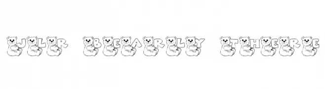
A whimsical font with letters inside bear outlines, perfect for playful designs.
![JLR Bearly There Frei Schriftart Herunterladen]() Herunterladen 84 Downloads@WebFont
Herunterladen 84 Downloads@WebFont -
( Fonts by Darrell Flood - Personal-use only. For commercial use please contact owner. )
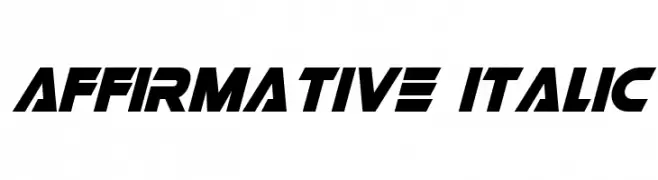
A bold, italicized font with a modern, dynamic style.
![Affirmative Italic Frei Schriftart Herunterladen]() Herunterladen 84 Downloads@WebFont
Herunterladen 84 Downloads@WebFont -
( Iconian Fonts - Daniel Zadorozny - www.iconian.com )
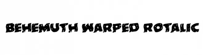
A bold, warped, and dynamic font with a playful, chaotic aesthetic.
![Behemuth Warped Rotalic Frei Schriftart Herunterladen]() Herunterladen 84 Downloads@WebFont
Herunterladen 84 Downloads@WebFont


Welche Schriften sind gerade am populärsten?
Poppins, Roboto, Montserrat, Open Sans und Lato sind wegen ihrer klaren Formen und breiten Einsetzbarkeit sehr gefragt – von Markenauftritt über Landingpages bis hin zu Postern.
Welche Fonts eignen sich für Logos?
Geometrische Sans‑Serifs (z. B. Poppins, Familien im Gotham‑Stil) sind ein häufiger Griff für sauberes, skalierbares Branding. Für eine persönlichere Note bleiben Scripts und Handschrift‑Stile beliebt. Kombinieren Sie einen prägnanten Headline‑Font mit einer neutralen Brotschrift für Wiedererkennung und Harmonie.
Wie oft wird die Top‑Liste aktualisiert?
Regelmäßig – basierend auf realen Downloads und Interaktionen. Schauen Sie öfter vorbei, um aufstrebende Favoriten früh zu entdecken.
💡 Tipp: Seite bookmarken – Trends wechseln schnell, und heutige Top‑Schriften inspirieren morgen vielleicht das Rebranding.