Willkommen bei den Top‑Schriften – hier treffen Beliebtheit und Qualität aufeinander. Das sind die in diesem Jahr am häufigsten heruntergeladenen und genutzten Fonts. Wenn Sie sichere Optionen für Logo, Web oder Social suchen, starten Sie hier.
Jeder Top‑Font überzeugt durch Balance, Lesbarkeit und Vielseitigkeit. Sie finden moderne Sans‑Serifs, elegante Scripts, Vintage‑Serifs und minimalistische Displays.
-
( Fonts by Greentrik6789 - Tri Kuncoro - Personal-use only. For commercial use please contact owner. )
A modern, elegant typeface with clean lines and balanced proportions.
 Herunterladen 84 Downloads@WebFont
 -
( Fonts by Kat`s Fun Fonts - Personal-use only. For commercial use please contact owner. )
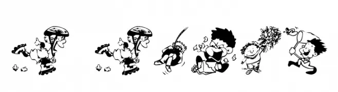
A whimsical collection of cartoon-style illustrations of children in various playful activities.
![KR Kidlets Frei Schriftart Herunterladen]() Herunterladen 84 Downloads@WebFont
Herunterladen 84 Downloads@WebFont -
( Iconian Fonts - Daniel Zadorozny - www.iconian.com )
A bold, geometric font with outlined, block-like letters for a modern, industrial look.
![Tigershark Pro Frei Schriftart Herunterladen]() Herunterladen 84 Downloads@WebFont
Herunterladen 84 Downloads@WebFont -
( Fonts by Roland Huse Design - Roland Huse - Personal-use only. For commercial use please contact owner. )
A bold, brush-style font with a dynamic and artistic appearance.
![RElapse Regular Frei Schriftart Herunterladen]() Herunterladen 84 Downloads@WebFont
Herunterladen 84 Downloads@WebFont -
( Fonts by Vladimir Nikolic )
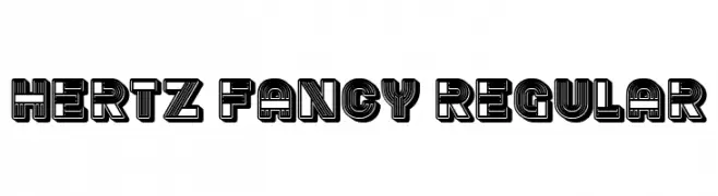
A bold, decorative font with layered, parallel lines creating a modern and retro look.
![Hertz Fancy Regular Frei Schriftart Herunterladen]() Herunterladen 84 Downloads@WebFont
Herunterladen 84 Downloads@WebFont -
( Fonts by Greentrik6789 - Tri Kuncoro - Personal-use only. For commercial use please contact owner. )
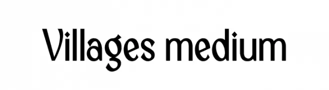
A modern, elegant font with clean lines and a slightly condensed style.
![Villages Frei Schriftart Herunterladen]() Herunterladen 84 Downloads@WebFont
Herunterladen 84 Downloads@WebFont -
( Fonts by Scratch Design - Studio 41 - Personal-use only. For commercial use please contact owner. )
A bold, dynamic script font with fluid, cursive strokes and artistic flair.
![Karmany Regular Frei Schriftart Herunterladen]() Herunterladen 84 Downloads@WebFont
Herunterladen 84 Downloads@WebFont -
( London's Letters - www.londonsletters.com/ )
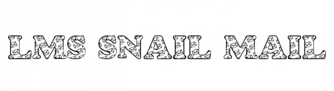
A decorative font with intricate star and swirl patterns inside bold, outlined characters.
![LMS Snail Mail Frei Schriftart Herunterladen]() Herunterladen 84 Downloads@WebFont
Herunterladen 84 Downloads@WebFont -
( Fonts by www.freesvgdesigns.com )
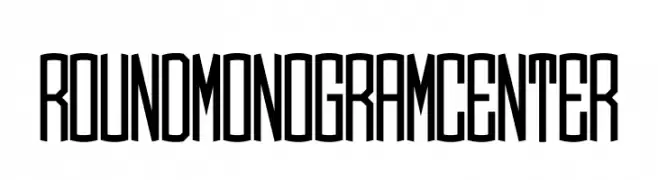
A tall, narrow, and geometric font with a modern aesthetic.
![Round_Monogram_Center Frei Schriftart Herunterladen]() Herunterladen 84 Downloads@WebFont
Herunterladen 84 Downloads@WebFont -
( Fonts by Maulana Creative )
A dynamic and elegant handwritten font with fluid, cursive strokes.
![Cellarets Frei Schriftart Herunterladen]() Herunterladen 84 Downloads@WebFont
Herunterladen 84 Downloads@WebFont -
( Fonts by Kat`s Fun Fonts - Personal-use only. For commercial use please contact owner. )
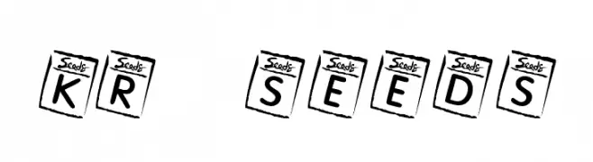
A playful, decorative font with characters inside stylized seed packets.
![KR Seeds Frei Schriftart Herunterladen]() Herunterladen 84 Downloads@WebFont
Herunterladen 84 Downloads@WebFont -
( Ace of Space - www.aceofspace.com )
A decorative set of symbols inspired by ancient Greek art and mythology.
![greek1 Frei Schriftart Herunterladen]() Herunterladen 84 Downloads@WebFont
Herunterladen 84 Downloads@WebFont -
( Fonts by Juha Korhonen )
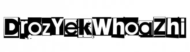
A bold, blocky font with a unique cut-out effect and high contrast.
![Droz Yek Whoa Zhi Frei Schriftart Herunterladen]() Herunterladen 84 Downloads@WebFont
Herunterladen 84 Downloads@WebFont -
( Fonts by Iconian Fonts )
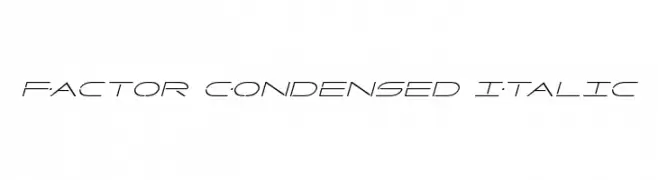
A sleek, futuristic, condensed italic font with geometric forms.
![Factor Condensed Italic Frei Schriftart Herunterladen]() Herunterladen 84 Downloads@WebFont
Herunterladen 84 Downloads@WebFont -
( Noto is a trademark of Google Inc. Noto fonts are open source. All Noto fonts are published under the SIL Open Font License, Version 1.1 )
A minimalist, geometric sans-serif with extra-light weight and high legibility.
![Noto Sans Myanmar UI ExtraLight Frei Schriftart Herunterladen]() Herunterladen 84 Downloads@WebFont
Herunterladen 84 Downloads@WebFont -
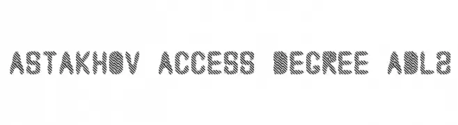
( Fonts by Dmitry Astakhov - www.behance.net/adonis-abe1e - Personal-use only. For commercial use please contact owner. )
A bold, decorative font with diagonal striped patterns for a modern, edgy look.
![Astakhov Access Degree ADL2 Frei Schriftart Herunterladen]() Herunterladen 84 Downloads@WebFont
Herunterladen 84 Downloads@WebFont -
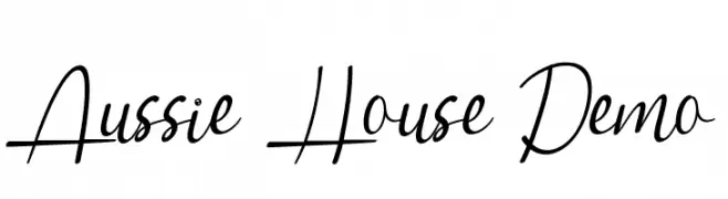
( Fonts by Noah Type - noahtype.com - Personal-use only. For commercial use please contact owner. )
A dynamic script font with elegant curves and medium contrast.
![Aussie House Demo Frei Schriftart Herunterladen]() Herunterladen 84 Downloads@WebFont
Herunterladen 84 Downloads@WebFont -
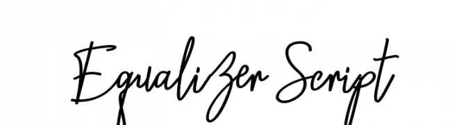
( Fonts by Ridha Furqan Ananda Nasution - Personal-use only. For commercial use please contact owner. )
A lively, cursive script font with fluid, connected strokes and a handwritten feel.
![Equalizer Script Frei Schriftart Herunterladen]() Herunterladen 84 Downloads@WebFont
Herunterladen 84 Downloads@WebFont -
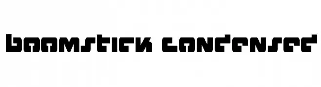
( Fonts by Iconian Fonts )
A bold, geometric, and condensed font with a futuristic and industrial style.
![Boomstick Condensed Frei Schriftart Herunterladen]() Herunterladen 84 Downloads@WebFont
Herunterladen 84 Downloads@WebFont -
( Fonts by CannotIntoSpaceFonts - KineticPlasma Fonts - Personal-use only. For commercial use please contact owner. )
An abstract, stencil-like font with bold, irregular shapes resembling camouflage patterns.
![CISF Camouflage Kit Stencil Frei Schriftart Herunterladen]() Herunterladen 84 Downloads@WebFont
Herunterladen 84 Downloads@WebFont -
( Iconian Fonts - Daniel Zadorozny - www.iconian.com )
A bold, angular font with a modern, geometric style.
![Hitchblock Frei Schriftart Herunterladen]() Herunterladen 84 Downloads@WebFont
Herunterladen 84 Downloads@WebFont -
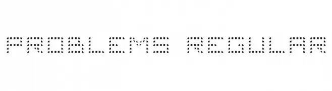
( Jeronimo - Jeroen Kant )
A modern, dotted font with a digital, pixelated style.
![Problems 4 Regular Frei Schriftart Herunterladen]() Herunterladen 84 Downloads@WebFont
Herunterladen 84 Downloads@WebFont -
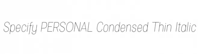
( Måns Grebäck - www.mansgreback.com )
A sleek, thin, and italic font with a modern, condensed style.
![Specify PERSONAL Condensed Thin Italic Frei Schriftart Herunterladen]() Herunterladen 84 Downloads@WebFont
Herunterladen 84 Downloads@WebFont -
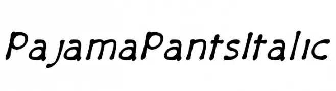
( Shara Weber - sharasfonts.com )
A playful, handwritten font with smooth curves and a casual slant.
![PajamaPantsItalic Frei Schriftart Herunterladen]() Herunterladen 84 Downloads@WebFont
Herunterladen 84 Downloads@WebFont -
( Fonts by Octotype - www.foundmyfont.com - Personal-use only. For commercial use please contact owner. )
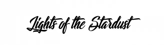
A dynamic and flowing script font with elegant, cursive letterforms.
![Lights of the Stardust Frei Schriftart Herunterladen]() Herunterladen 84 Downloads@WebFont
Herunterladen 84 Downloads@WebFont -
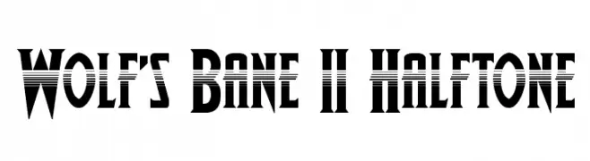
( Donationware )
A bold, halftone-effect font with a dynamic and modern style.
![Wolf's Bane II Halftone Frei Schriftart Herunterladen]() Herunterladen 84 Downloads@WebFont
Herunterladen 84 Downloads@WebFont -
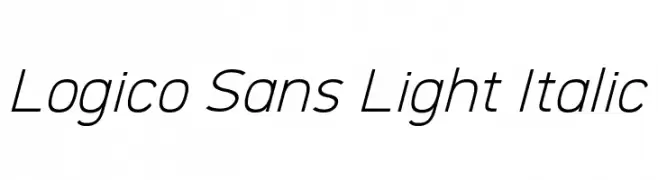
( Parker Creative - Alan Parker - fontbundles.net/parker-creative )
A modern, light, italic sans-serif font with clean lines and low contrast.
![Logico Sans Light Italic Frei Schriftart Herunterladen]() Herunterladen 84 Downloads@WebFont
Herunterladen 84 Downloads@WebFont -
( Noto is a trademark of Google Inc. Noto fonts are open source. All Noto fonts are published under the SIL Open Font License, Version 1.1 )
A bold, condensed font with a modern and robust style.
![Noto Sans Sinhala Condensed Black Frei Schriftart Herunterladen]() Herunterladen 84 Downloads@WebFont
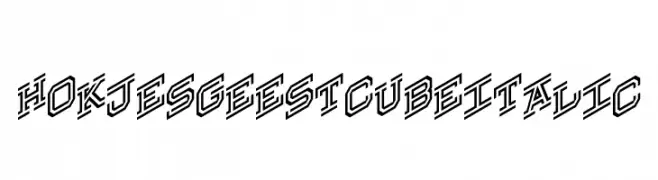
Herunterladen 84 Downloads@WebFont -
![Hokjesgeestcube Italic Frei Schriftart Herunterladen]() Herunterladen 84 Downloads@WebFont
Herunterladen 84 Downloads@WebFont -
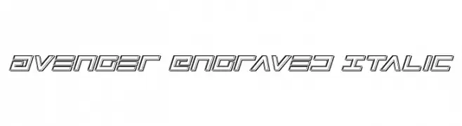
( Iconian Fonts - Daniel Zadorozny - www.iconian.com )
A bold, futuristic, engraved italic font with a three-dimensional appearance.
![Avenger Engraved Italic Frei Schriftart Herunterladen]() Herunterladen 84 Downloads@WebFont
Herunterladen 84 Downloads@WebFont -
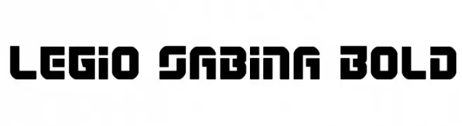
( Iconian Fonts - Daniel Zadorozny - www.iconian.com )
A bold, geometric typeface with strong, angular lines and a modern aesthetic.
![Legio Sabina Bold Frei Schriftart Herunterladen]() Herunterladen 84 Downloads@WebFont
Herunterladen 84 Downloads@WebFont -
( Fonts by Theinkpot - Personal-use only. For commercial use please contact owner. )
A playful, hand-drawn font with a whimsical and informal style.
![Goedemorgen, Luc[as] Frei Schriftart Herunterladen]() Herunterladen 84 Downloads
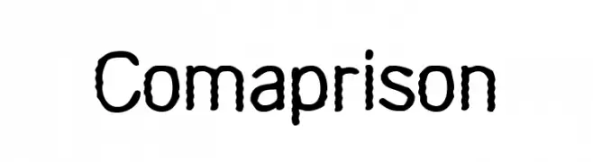
Herunterladen 84 Downloads -
![Comaprison Frei Schriftart Herunterladen]() Herunterladen 84 Downloads@WebFont
Herunterladen 84 Downloads@WebFont -
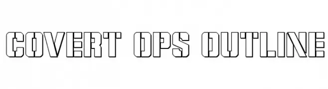
( Iconian Fonts - Daniel Zadorozny - www.iconian.com )
A bold, geometric outline font with sharp angles and a modern aesthetic.
![Covert Ops Outline Frei Schriftart Herunterladen]() Herunterladen 84 Downloads@WebFont
Herunterladen 84 Downloads@WebFont -
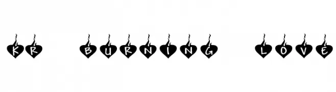
( Fonts by Kat`s Fun Fonts - Personal-use only. For commercial use please contact owner. )
A playful, heart-themed font with bold, rounded letters and decorative flame accents.
![KR Burning Love Frei Schriftart Herunterladen]() Herunterladen 83 Downloads@WebFont
Herunterladen 83 Downloads@WebFont


![Goedemorgen, Luc[as] Frei Schriftart Herunterladen](https://d144mzi0q5mijx.cloudfront.net/img/G/O/Goedemorgen-Luc-as.webp)
Welche Schriften sind gerade am populärsten?
Poppins, Roboto, Montserrat, Open Sans und Lato sind wegen ihrer klaren Formen und breiten Einsetzbarkeit sehr gefragt – von Markenauftritt über Landingpages bis hin zu Postern.
Welche Fonts eignen sich für Logos?
Geometrische Sans‑Serifs (z. B. Poppins, Familien im Gotham‑Stil) sind ein häufiger Griff für sauberes, skalierbares Branding. Für eine persönlichere Note bleiben Scripts und Handschrift‑Stile beliebt. Kombinieren Sie einen prägnanten Headline‑Font mit einer neutralen Brotschrift für Wiedererkennung und Harmonie.
Wie oft wird die Top‑Liste aktualisiert?
Regelmäßig – basierend auf realen Downloads und Interaktionen. Schauen Sie öfter vorbei, um aufstrebende Favoriten früh zu entdecken.
💡 Tipp: Seite bookmarken – Trends wechseln schnell, und heutige Top‑Schriften inspirieren morgen vielleicht das Rebranding.