Willkommen bei den Top‑Schriften – hier treffen Beliebtheit und Qualität aufeinander. Das sind die in diesem Jahr am häufigsten heruntergeladenen und genutzten Fonts. Wenn Sie sichere Optionen für Logo, Web oder Social suchen, starten Sie hier.
Jeder Top‑Font überzeugt durch Balance, Lesbarkeit und Vielseitigkeit. Sie finden moderne Sans‑Serifs, elegante Scripts, Vintage‑Serifs und minimalistische Displays.
-
( Fonts by Vladimir Nikolic - https://www.creativefabrica.com/product/educated-deers/ref/144265/ - Personal-use only. For commercial use please contact owner. )
A bold, geometric font with a filled, textured design and angular shapes.
 Herunterladen 84 Downloads@WebFont
 -
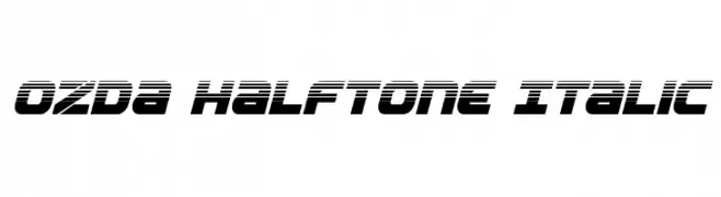
( Iconian Fonts - Daniel Zadorozny - www.iconian.com )
A bold, italicized font with a futuristic halftone effect.
![Ozda Halftone Italic Frei Schriftart Herunterladen]() Herunterladen 84 Downloads@WebFont
Herunterladen 84 Downloads@WebFont -
( Katario - Rioniga Zandy - fontbundles.net/katario )
A modern, playful typeface with tall, narrow letterforms and rounded edges.
![Pevitta Typeface Demo Frei Schriftart Herunterladen]() Herunterladen 84 Downloads@WebFont
Herunterladen 84 Downloads@WebFont -
( Fonts by Nick Curtis - Personal-use only. For commercial use please contact owner. )
A bold, angular font with geometric shapes and dynamic style.
![BlitzkriegNF Frei Schriftart Herunterladen]() Herunterladen 84 Downloads@WebFont
Herunterladen 84 Downloads@WebFont -
( Fonts by Arfi Ardian )
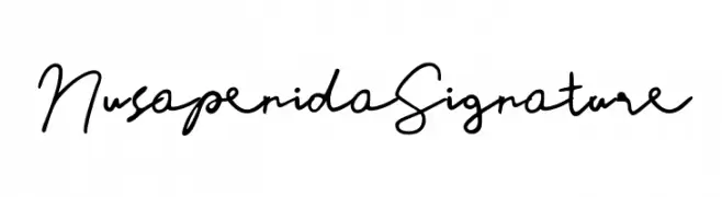
Handwritten cursive script font.
![Nusapenida Signature Frei Schriftart Herunterladen]() Herunterladen 84 Downloads@WebFont
Herunterladen 84 Downloads@WebFont -
( Fonts by Ramli Setiadi - Personal-use only. For commercial use please contact owner. )
A playful, handwritten font with a casual and whimsical style.
![sad boy Frei Schriftart Herunterladen]() Herunterladen 84 Downloads@WebFont
Herunterladen 84 Downloads@WebFont -
( Typodermic Fonts - Ray Larabie - www.typodermicfonts.com/ )
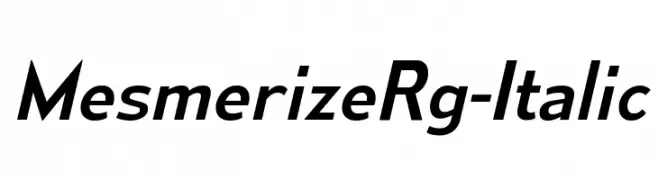
A sleek, modern italic font with consistent stroke width and dynamic style.
![MesmerizeRg-Italic Frei Schriftart Herunterladen]() Herunterladen 84 Downloads@WebFont
Herunterladen 84 Downloads@WebFont -
( memesbruh03 - Aaron D. Chand )
A pixelated, retro-style font with a digital, blocky appearance.
![Codina Frei Schriftart Herunterladen]() Herunterladen 84 Downloads@WebFont
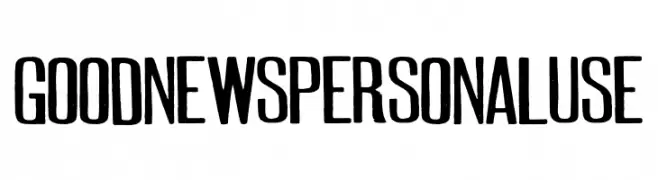
Herunterladen 84 Downloads@WebFont -
![GOODNEWSPERSONALUSE Frei Schriftart Herunterladen]() Herunterladen 84 Downloads@WebFont
Herunterladen 84 Downloads@WebFont -
( Fonts by a Max Infeld - XEROGRAPHER FONTS - xerographer.blogspot.com . Personal-use only. For commercial use please contact owner. )
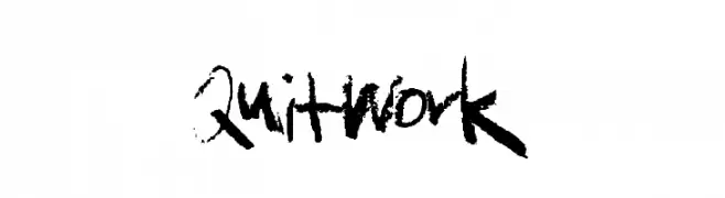
A bold, expressive, hand-drawn font with a brush-like, graffiti-inspired style.
![QuitWork Frei Schriftart Herunterladen]() Herunterladen 84 Downloads@WebFont
Herunterladen 84 Downloads@WebFont -
( Iconian Fonts - Daniel Zadorozny - www.iconian.com )
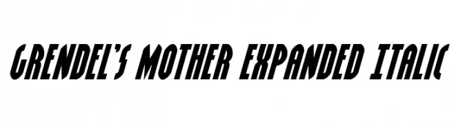
A bold, expanded italic font with a dynamic and modern style.
![Grendel's Mother Expanded Italic Frei Schriftart Herunterladen]() Herunterladen 84 Downloads@WebFont
Herunterladen 84 Downloads@WebFont -
( Fonts by Vladimir Nikolic - www.creativefabrica.com/designer/vladimirnikolic/ - Personal-use only. For commercial use please contact owner. )
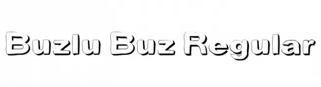
A bold, playful font with a three-dimensional shadow effect.
![Buzlu Buz Regular Frei Schriftart Herunterladen]() Herunterladen 84 Downloads@WebFont
Herunterladen 84 Downloads@WebFont -
( Fonts by Michael Muranaka - muraknockout.com - Personal-use only. For commercial use please contact owner. )
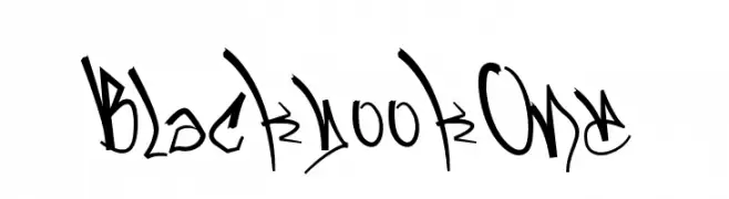
A graffiti-inspired, artistic font with dynamic and expressive characters.
![BlackbookOne Frei Schriftart Herunterladen]() Herunterladen 84 Downloads@WebFont
Herunterladen 84 Downloads@WebFont -
( Fonts by The Docallisme - Amry Al Mursalaat - Personal-use only. For commercial use please contact owner. )
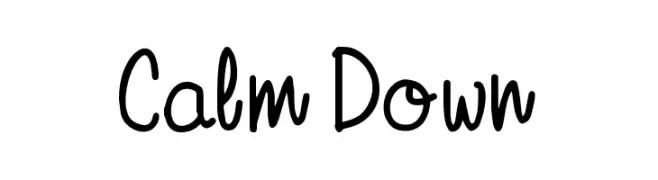
A playful, handwritten font with a casual and approachable style.
![Calm Down Frei Schriftart Herunterladen]() Herunterladen 84 Downloads@WebFont
Herunterladen 84 Downloads@WebFont -
( Fonts by StringLabs - stringlabscreative.com - Personal-use only. For commercial use please contact owner. )
A playful, hand-drawn font with a textured, artistic style.
![Andovine Frei Schriftart Herunterladen]() Herunterladen 84 Downloads@WebFont
Herunterladen 84 Downloads@WebFont -
( Fonts by Anita Jürgeleit - Personal-use only. For commercial use please contact owner. )
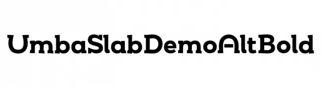
A bold slab serif font with a modern yet classic appeal.
![Umba Slab Demo Alt Bold Frei Schriftart Herunterladen]() Herunterladen 84 Downloads@WebFont
Herunterladen 84 Downloads@WebFont -
( Fonts by Geronimo Fonts - Personal-use only. For commercial use please contact owner. )
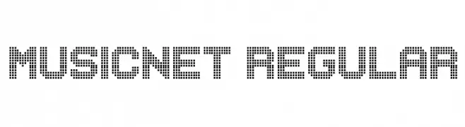
A dot matrix-inspired font with a digital, retro aesthetic.
![MUSICNET Regular Frei Schriftart Herunterladen]() Herunterladen 84 Downloads@WebFont
Herunterladen 84 Downloads@WebFont -
( Måns Grebäck - www.mansgreback.com )
An ornate and decorative font with intricate swirls and flourishes.
![Medish Deco PERSONAL USE ONLY Frei Schriftart Herunterladen]() Herunterladen 84 Downloads@WebFont
Herunterladen 84 Downloads@WebFont -
( Studio Dot by dot - Sjoerd Kulsdom - www.dotbydot.nl/fonts )
A modern, geometric font with a monolinear and interconnected style.
![Merijntje Frei Schriftart Herunterladen]() Herunterladen 84 Downloads@WebFont
Herunterladen 84 Downloads@WebFont -
( London's Letters - www.londonsletters.com/ )
A decorative font inspired by cinema, featuring intricate designs with a film theme.
![LMS Lights, Camera, Action Frei Schriftart Herunterladen]() Herunterladen 84 Downloads@WebFont
Herunterladen 84 Downloads@WebFont -
( Fonts by antipixel - Personal-use only. For commercial use please contact owner. )
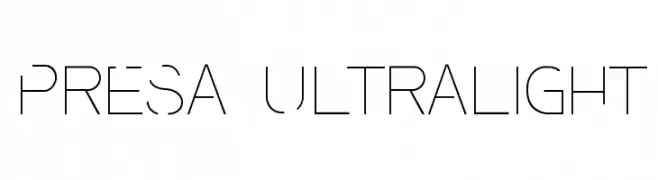
A sleek, ultra-light font with geometric precision and modern elegance.
![Presa Ultralight Frei Schriftart Herunterladen]() Herunterladen 84 Downloads@WebFont
Herunterladen 84 Downloads@WebFont -
( Noto is a trademark of Google Inc. Noto fonts are open source. All Noto fonts are published under the SIL Open Font License, Version 1.1 )
A modern, condensed font with a clean and readable design.
![Noto Sans Devanagari Condensed SemiBold Frei Schriftart Herunterladen]() Herunterladen 84 Downloads@WebFont
Herunterladen 84 Downloads@WebFont -
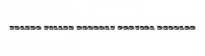
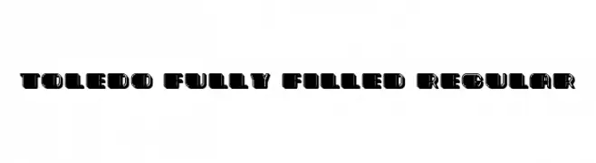
( Fonts by Vladimir Nikolic - https://www.creativefabrica.com/product/educated-deers/ref/144265/ - Personal-use only. For commercial use please contact owner. )
A bold, geometric font with rounded edges and high contrast.
![Toledo Fully Filled Regular Frei Schriftart Herunterladen]() Herunterladen 84 Downloads@WebFont
Herunterladen 84 Downloads@WebFont -
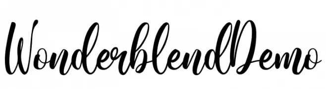
( Fonts by Sabrcreative - Personal-use only. For commercial use please contact owner. )
A bold, fluid script font with expressive strokes and elegant flow.
![Wonderblend Demo Frei Schriftart Herunterladen]() Herunterladen 84 Downloads@WebFont
Herunterladen 84 Downloads@WebFont -
( Fonts by Geneva - Genesis Vargas - Personal-use only. For commercial use please contact owner. )
A bold, decorative serif font with high contrast and vintage-modern appeal.
![Fabula Frei Schriftart Herunterladen]() Herunterladen 84 Downloads@WebFont
Herunterladen 84 Downloads@WebFont -
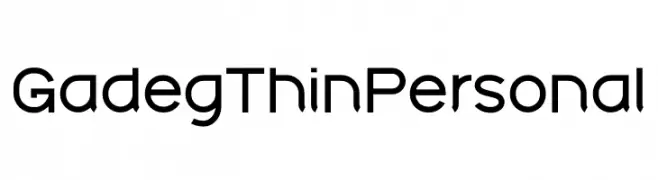
( Fonts by twinletter - Rozikan - Personal-use only. For commercial use please contact owner. )
A clean, modern font with uniform stroke width and minimalist design.
![Gadeg Thin Personal Frei Schriftart Herunterladen]() Herunterladen 84 Downloads@WebFont
Herunterladen 84 Downloads@WebFont -
( Attype Studio - Fadli Ramadhan Iskandar - thehungryjpeg.com/attype-studio/ )
A modern, rounded font with a friendly and balanced design.
![MOONKNIGHTRegular Frei Schriftart Herunterladen]() Herunterladen 84 Downloads@WebFont
Herunterladen 84 Downloads@WebFont -
( Fonts by Cz Liu )
A bold, rounded font with a playful and modern aesthetic.
![Seen Vision 7th Regular Frei Schriftart Herunterladen]() Herunterladen 84 Downloads@WebFont
Herunterladen 84 Downloads@WebFont -
( Fonts by Mans Greback - Personal-use only. For commercial use please contact owner. )
A sleek, modern, thin italic font with expanded letterforms and minimal contrast.
![Gonzi Expanded PERSONAL USE Thin Italic Frei Schriftart Herunterladen]() Herunterladen 84 Downloads@WebFont
Herunterladen 84 Downloads@WebFont -
( Fonts by Zetafonts - Personal-use only. For commercial use please contact owner. )
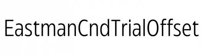
A modern, condensed sans-serif font with uniform stroke width.
![Eastman Cnd Trial Offset Frei Schriftart Herunterladen]() Herunterladen 84 Downloads@WebFont
Herunterladen 84 Downloads@WebFont -
( Fonts by pOPdOG fONTS - Dimitris Kolyris - popdog_fonts.tripod.com Sponsoren Schriftart )
A bold, decorative font with a retro, three-dimensional style.
![Glasnost Frei Schriftart Herunterladen]() Herunterladen 84 Downloads
Herunterladen 84 Downloads -
( Fonts by Iconian Fonts )
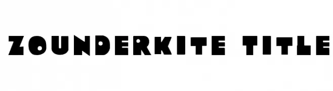
Bold, geometric font with playful, chunky characters.
![Zounderkite Title Frei Schriftart Herunterladen]() Herunterladen 84 Downloads@WebFont
Herunterladen 84 Downloads@WebFont -
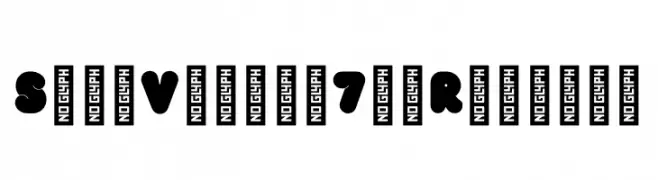
( Fonts by JSH creates )
![Silent Respect Frei Schriftart Herunterladen]() Herunterladen 84 Downloads@WebFont
Herunterladen 84 Downloads@WebFont -
( iainbudgen.gdnm.org )
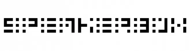
A futuristic, dot-and-line font with a digital display aesthetic.
![Speakerbox Frei Schriftart Herunterladen]() Herunterladen 84 Downloads@WebFont
Herunterladen 84 Downloads@WebFont -
( Fonts by AminMario - Amin Mario - Personal-use only. For commercial use please contact owner. )
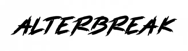
A bold, dynamic brush script with expressive strokes and a hand-painted look.
![ALTERBREAK Frei Schriftart Herunterladen]() Herunterladen 84 Downloads@WebFont
Herunterladen 84 Downloads@WebFont


Welche Schriften sind gerade am populärsten?
Poppins, Roboto, Montserrat, Open Sans und Lato sind wegen ihrer klaren Formen und breiten Einsetzbarkeit sehr gefragt – von Markenauftritt über Landingpages bis hin zu Postern.
Welche Fonts eignen sich für Logos?
Geometrische Sans‑Serifs (z. B. Poppins, Familien im Gotham‑Stil) sind ein häufiger Griff für sauberes, skalierbares Branding. Für eine persönlichere Note bleiben Scripts und Handschrift‑Stile beliebt. Kombinieren Sie einen prägnanten Headline‑Font mit einer neutralen Brotschrift für Wiedererkennung und Harmonie.
Wie oft wird die Top‑Liste aktualisiert?
Regelmäßig – basierend auf realen Downloads und Interaktionen. Schauen Sie öfter vorbei, um aufstrebende Favoriten früh zu entdecken.
💡 Tipp: Seite bookmarken – Trends wechseln schnell, und heutige Top‑Schriften inspirieren morgen vielleicht das Rebranding.