Willkommen bei den Top‑Schriften – hier treffen Beliebtheit und Qualität aufeinander. Das sind die in diesem Jahr am häufigsten heruntergeladenen und genutzten Fonts. Wenn Sie sichere Optionen für Logo, Web oder Social suchen, starten Sie hier.
Jeder Top‑Font überzeugt durch Balance, Lesbarkeit und Vielseitigkeit. Sie finden moderne Sans‑Serifs, elegante Scripts, Vintage‑Serifs und minimalistische Displays.
-
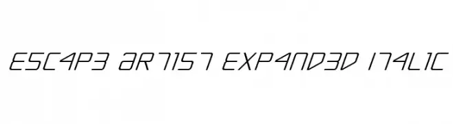
( Fonts by Daniel Zadorozny - www.iconian.com )
A futuristic, expanded italic font with geometric and dynamic letterforms.
 Herunterladen 83 Downloads@WebFont
 -
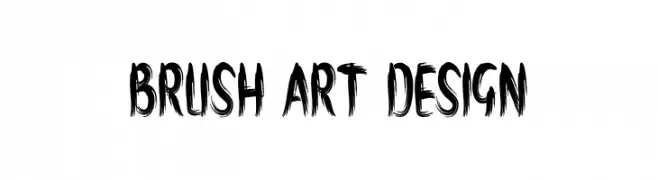
( Fonts by Marwah Store - Alexe Crisna - Personal-use only. For commercial use please contact owner. )
A dynamic brushstroke-inspired font with an artistic and textured appearance.
![brush art design Frei Schriftart Herunterladen]() Herunterladen 83 Downloads@WebFont
Herunterladen 83 Downloads@WebFont -
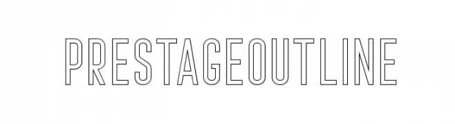
( Craft Supply Co. - creativemarket.com/craftsupplyco )
A modern, geometric outline font with clean lines and balanced spacing.
![Prestage Outline Frei Schriftart Herunterladen]() Herunterladen 83 Downloads@WebFont
Herunterladen 83 Downloads@WebFont -
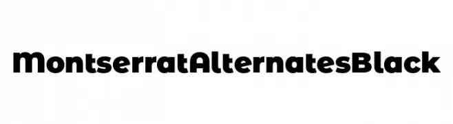
( Fonts by Julieta Ulanovsky )
A bold, modern font with a geometric and impactful design.
![Montserrat Alternates Black Frei Schriftart Herunterladen]() Herunterladen 83 Downloads@WebFont
Herunterladen 83 Downloads@WebFont -
( Fonts by Zanatlija - Personal-use only. For commercial use please contact owner. )
Ornate, illustrative skull icons with a bold, tattoo-style appearance.
![only skulls Frei Schriftart Herunterladen]() Herunterladen 83 Downloads@WebFont
Herunterladen 83 Downloads@WebFont -
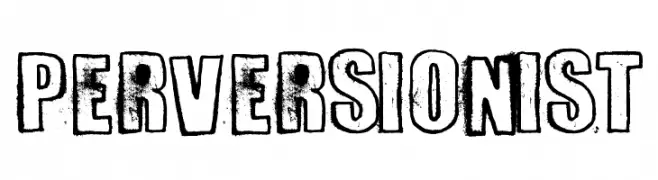
( imagex - www.imagex-fonts.com )
A bold, distressed font with a vintage, grunge aesthetic.
![Perversionist Frei Schriftart Herunterladen]() Herunterladen 83 Downloads@WebFont
Herunterladen 83 Downloads@WebFont -
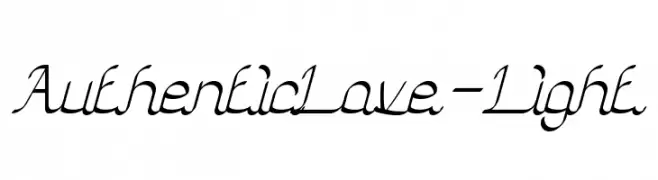
( weknow - Wino S Kadir - www.creativefabrica.com/designer/weknow/ )
A cursive script font with elegant, interconnected letters and smooth strokes.
![Authentic Love-Light Frei Schriftart Herunterladen]() Herunterladen 83 Downloads@WebFont
Herunterladen 83 Downloads@WebFont -
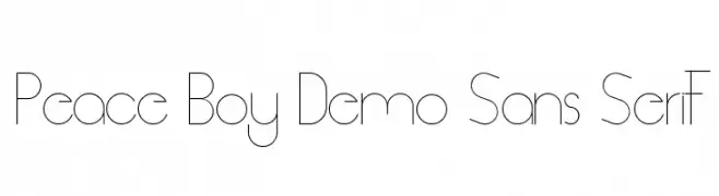
( Fonts by Edric Studio - Personal-use only. For commercial use please contact owner. )
A sleek, modern sans-serif font with geometric precision and minimalist design.
![Peace Boy Demo Sans Serif Frei Schriftart Herunterladen]() Herunterladen 83 Downloads@WebFont
Herunterladen 83 Downloads@WebFont -
( Fonts by I Shofyan - Personal-use only. For commercial use please contact owner. )
A bold, geometric font with sharp angles and a modern aesthetic.
![REBA Frei Schriftart Herunterladen]() Herunterladen 83 Downloads@WebFont
Herunterladen 83 Downloads@WebFont -
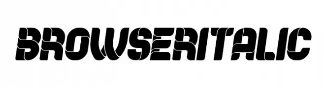
( Fonts by Vladimir Nikolic - Personal-use only. For commercial use please contact owner. )
A bold, dynamic font with a modern, futuristic style and high contrast.
![Browser Italic Frei Schriftart Herunterladen]() Herunterladen 83 Downloads@WebFont
Herunterladen 83 Downloads@WebFont -
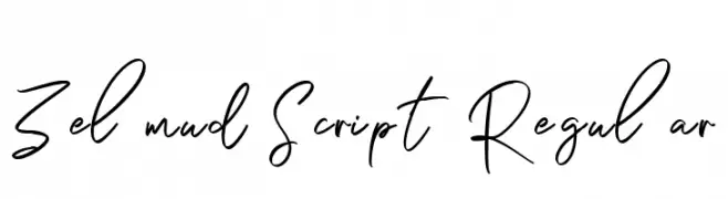
( Fonts by Maulana Creative )
Handwritten cursive script font.
![Zelmud Script Regular Frei Schriftart Herunterladen]() Herunterladen 83 Downloads@WebFont
Herunterladen 83 Downloads@WebFont -
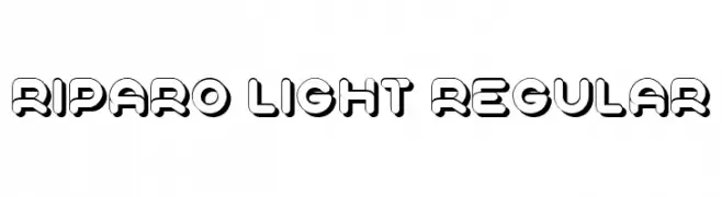
( Fonts by Vladimir Nikolic - www.creativefabrica.com/designer/vladimirnikolic/ - Personal-use only. For commercial use please contact owner. )
A bold, three-dimensional font with a shadow effect, ideal for impactful designs.
![Riparo Light Regular Frei Schriftart Herunterladen]() Herunterladen 83 Downloads@WebFont
Herunterladen 83 Downloads@WebFont -
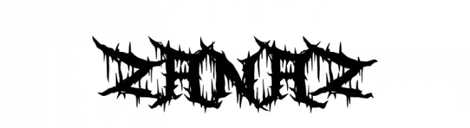
( Fonts by Garisman Studio - Risman Ginarwan - Personal-use only. For commercial use please contact owner. )
A thorny, decorative font with sharp, edgy details.
![Zanaz Frei Schriftart Herunterladen]() Herunterladen 83 Downloads@WebFont
Herunterladen 83 Downloads@WebFont -
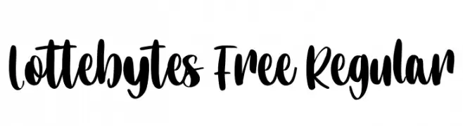
( Fonts by Maulana Creative - Gilang Maulana - Personal-use only. For commercial use please contact owner. )
A bold, expressive handwritten font with high contrast and playful curves.
![Lottebytes Free Regular Frei Schriftart Herunterladen]() Herunterladen 83 Downloads@WebFont
Herunterladen 83 Downloads@WebFont -
( 010Bus )
A pixelated, retro-style font with a bold, blocky appearance.
![7px3bus Frei Schriftart Herunterladen]() Herunterladen 83 Downloads@WebFont
Herunterladen 83 Downloads@WebFont -
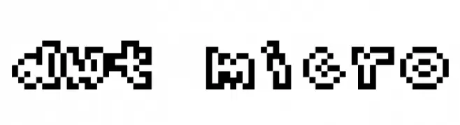
( Fonts by Kreative Korporation - www.kreativekorp.com )
A pixelated, retro-style font with a blocky, 8-bit design.
![dwt Micro Frei Schriftart Herunterladen]() Herunterladen 83 Downloads@WebFont
Herunterladen 83 Downloads@WebFont -
( Fonts by Balpirick Studio - https://www.creativefabrica.com/designer/balpirick/ref/308299/ - Personal-use only. For commercial use please contact owner. )
A graceful and flowing script font with a handwritten style.
![Baldive Frei Schriftart Herunterladen]() Herunterladen 83 Downloads@WebFont
Herunterladen 83 Downloads@WebFont -
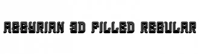
( Vladimir Nikolic - www.coroflot.com/vladimirnikolic )
A bold, 3D-filled font with a vintage yet modern geometric style.
![Assyrian 3D Filled Regular Frei Schriftart Herunterladen]() Herunterladen 83 Downloads@WebFont
Herunterladen 83 Downloads@WebFont -
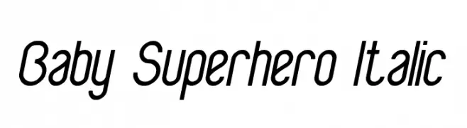
( weknow - Wino S Kadir - www.creativefabrica.com/designer/weknow/ )
A playful, italicized font with rounded, dynamic letterforms.
![Baby Superhero Italic Frei Schriftart Herunterladen]() Herunterladen 83 Downloads@WebFont
Herunterladen 83 Downloads@WebFont -
( Fonts by Muhammad Yafinuha )
A bold, playful font with thick, rounded strokes and a whimsical design.
![NightKinds Frei Schriftart Herunterladen]() Herunterladen 83 Downloads@WebFont
Herunterladen 83 Downloads@WebFont -
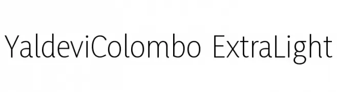
( Fonts by Mooniak - Personal-use only. For commercial use please contact owner. )
A modern, light sans-serif font with clean lines and excellent readability.
![YaldeviColombo ExtraLight Frei Schriftart Herunterladen]() Herunterladen 83 Downloads@WebFont
Herunterladen 83 Downloads@WebFont -
( Noto is a trademark of Google Inc. Noto fonts are open source. All Noto fonts are published under the SIL Open Font License, Version 1.1 )
A modern, geometric font with characters enclosed in boxes, offering clarity and structure.
![Noto Serif Georgian Condensed Medium Frei Schriftart Herunterladen]() Herunterladen 83 Downloads@WebFont
Herunterladen 83 Downloads@WebFont -
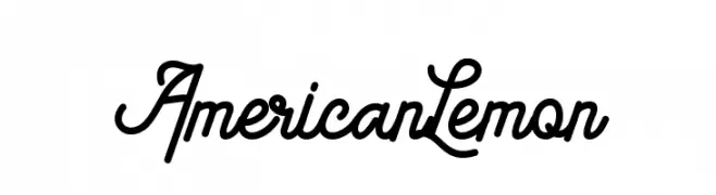
( Fonts by Riyadh Rahman - Personal-use only. For commercial use please contact owner. )
A bold, cursive script font with interconnected letters and decorative flourishes.
![American Lemon Frei Schriftart Herunterladen]() Herunterladen 83 Downloads@WebFont
Herunterladen 83 Downloads@WebFont -
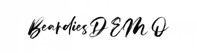
( Fonts by Vz Type - Personal-use only. For commercial use please contact owner. )
A bold, brush-style font with dynamic and expressive strokes.
![Beardies DEMO Frei Schriftart Herunterladen]() Herunterladen 83 Downloads@WebFont
Herunterladen 83 Downloads@WebFont -
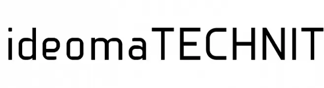
( Ideoma - ideoma design - www.logotipo.pt )
A modern, geometric sans-serif font with consistent stroke width and clear readability.
![ideomaTECHNIT Frei Schriftart Herunterladen]() Herunterladen 83 Downloads@WebFont
Herunterladen 83 Downloads@WebFont -
( Anigma New Media - www.anigma.fsnet.co.uk/an/anigma-fonts.html )
A playful, bold font with a bubbly, cartoonish design.
![BunnyBaby Frei Schriftart Herunterladen]() Herunterladen 83 Downloads@WebFont
Herunterladen 83 Downloads@WebFont -
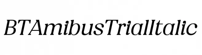
( Fonts by BeauType Studio - beautique.vn - Personal-use only. For commercial use please contact owner. )
A refined italic typeface with smooth curves and moderate contrast.
![BT Amibus Trial Italic Frei Schriftart Herunterladen]() Herunterladen 83 Downloads@WebFont
Herunterladen 83 Downloads@WebFont -
( Noto is a trademark of Google Inc. Noto fonts are open source. All Noto fonts are published under the SIL Open Font License, Version 1.1 )
No valid font glyphs are displayed; only placeholder boxes are present.
![Noto Sans Tai Tham Frei Schriftart Herunterladen]() Herunterladen 83 Downloads@WebFont
Herunterladen 83 Downloads@WebFont -
( Noto is a trademark of Google Inc. Noto fonts are open source. All Noto fonts are published under the SIL Open Font License, Version 1.1 )
Condensed semi-bold sans-serif font for Ethiopic script.
![Noto Sans Ethiopic Condensed SemiBold Frei Schriftart Herunterladen]() Herunterladen 83 Downloads@WebFont
Herunterladen 83 Downloads@WebFont -
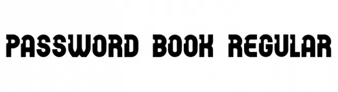
( Fonts by Vladimir Nikolic - https://www.creativefabrica.com/product/educated-deers/ref/144265/ - Personal-use only. For commercial use please contact owner. )
A bold, blocky font with rounded edges and a vintage-modern appeal.
![Password Book Regular Frei Schriftart Herunterladen]() Herunterladen 83 Downloads@WebFont
Herunterladen 83 Downloads@WebFont -
( Fonts by sronstudio - Yusron Billah - Personal-use only. For commercial use please contact owner. )
A playful, hand-drawn font with rounded, bold characters and a friendly vibe.
![Reach Story Frei Schriftart Herunterladen]() Herunterladen 83 Downloads@WebFont
Herunterladen 83 Downloads@WebFont -
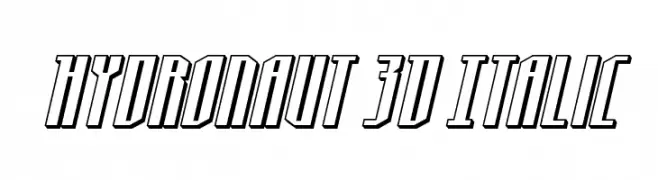
( Fonts by Daniel Zadorozny - www.iconian.com - Personal-use only. For commercial use please contact owner. )
A bold, 3D italic font with a futuristic and dynamic style.
![Hydronaut 3D Italic Frei Schriftart Herunterladen]() Herunterladen 83 Downloads@WebFont
Herunterladen 83 Downloads@WebFont -
( Chris Pirillo - www.lockergnome.com/ )
Cartoon dingbat font with character illustrations.
![Griffinbats Frei Schriftart Herunterladen]() Herunterladen 83 Downloads@WebFont
Herunterladen 83 Downloads@WebFont -
( Elementype - www.facebook.com/elementype )
A bold, dynamic script font with elegant flourishes and strong presence.
![Antebras Frei Schriftart Herunterladen]() Herunterladen 83 Downloads@WebFont
Herunterladen 83 Downloads@WebFont -
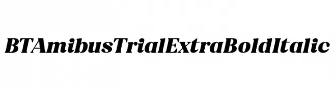
( Fonts by BeauType Studio - beautique.vn - Personal-use only. For commercial use please contact owner. )
A bold, italic typeface with strong strokes and dynamic presence.
![BT Amibus Trial ExtraBold Italic Frei Schriftart Herunterladen]() Herunterladen 83 Downloads@WebFont
Herunterladen 83 Downloads@WebFont


Welche Schriften sind gerade am populärsten?
Poppins, Roboto, Montserrat, Open Sans und Lato sind wegen ihrer klaren Formen und breiten Einsetzbarkeit sehr gefragt – von Markenauftritt über Landingpages bis hin zu Postern.
Welche Fonts eignen sich für Logos?
Geometrische Sans‑Serifs (z. B. Poppins, Familien im Gotham‑Stil) sind ein häufiger Griff für sauberes, skalierbares Branding. Für eine persönlichere Note bleiben Scripts und Handschrift‑Stile beliebt. Kombinieren Sie einen prägnanten Headline‑Font mit einer neutralen Brotschrift für Wiedererkennung und Harmonie.
Wie oft wird die Top‑Liste aktualisiert?
Regelmäßig – basierend auf realen Downloads und Interaktionen. Schauen Sie öfter vorbei, um aufstrebende Favoriten früh zu entdecken.
💡 Tipp: Seite bookmarken – Trends wechseln schnell, und heutige Top‑Schriften inspirieren morgen vielleicht das Rebranding.