Willkommen bei den Top‑Schriften – hier treffen Beliebtheit und Qualität aufeinander. Das sind die in diesem Jahr am häufigsten heruntergeladenen und genutzten Fonts. Wenn Sie sichere Optionen für Logo, Web oder Social suchen, starten Sie hier.
Jeder Top‑Font überzeugt durch Balance, Lesbarkeit und Vielseitigkeit. Sie finden moderne Sans‑Serifs, elegante Scripts, Vintage‑Serifs und minimalistische Displays.
-
( Fonts by www.woodcutter.es - woodcutter Manero - Personal-use only. For commercial use please contact owner. )
A bold, split-style font with high contrast and uniform width.
 Herunterladen 84 Downloads@WebFont
 -
( Fonts by Iconian Fonts )
A bold, italicized font with a futuristic, angular design.
![Armed Lightning Laser Italic Frei Schriftart Herunterladen]() Herunterladen 84 Downloads@WebFont
Herunterladen 84 Downloads@WebFont -
( weknow - Wino S Kadir - www.creativefabrica.com/designer/weknow/ )
A bold, futuristic italic font with geometric shapes and rounded edges.
![GAME ROBOT Italic Frei Schriftart Herunterladen]() Herunterladen 84 Downloads@WebFont
Herunterladen 84 Downloads@WebFont -
( LeChefRene - members.aol.com/lcrfonts/ )
A whimsical, decorative font with characters encased in crowned frog illustrations.
![LCR Croaker King Frei Schriftart Herunterladen]() Herunterladen 84 Downloads@WebFont
Herunterladen 84 Downloads@WebFont -
( Fonts by Alit Design )
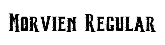
A bold, distressed font with sharp serifs and a rugged, edgy style.
![Morvien Regular Frei Schriftart Herunterladen]() Herunterladen 84 Downloads@WebFont
Herunterladen 84 Downloads@WebFont -
( Fonts by Vladimir Nikolic - www.creativefabrica.com/designer/vladimirnikolic/ - Personal-use only. For commercial use please contact owner. )
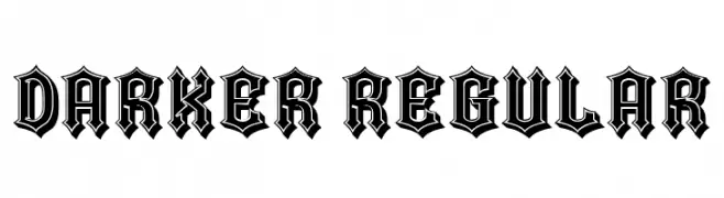
A bold, gothic-style font with sharp, angular edges and intricate detailing.
![Darker Regular Frei Schriftart Herunterladen]() Herunterladen 84 Downloads@WebFont
Herunterladen 84 Downloads@WebFont -
( Fonts by Edric Studio - Personal-use only. For commercial use please contact owner. )
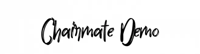
A bold, expressive handwritten font with a lively, energetic style.
![Chairmate Demo Frei Schriftart Herunterladen]() Herunterladen 84 Downloads@WebFont
Herunterladen 84 Downloads@WebFont -
( Fonts by Nick Curtis - Personal-use only. For commercial use please contact owner. )
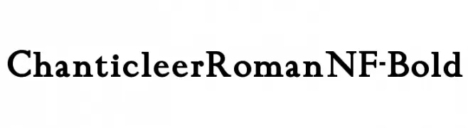
A bold, classic serif font with strong, elegant strokes.
![ChanticleerRomanNF-Bold Frei Schriftart Herunterladen]() Herunterladen 84 Downloads@WebFont
Herunterladen 84 Downloads@WebFont -
( Fonts by Octotype - www.foundmyfont.com - Personal-use only. For commercial use please contact owner. )
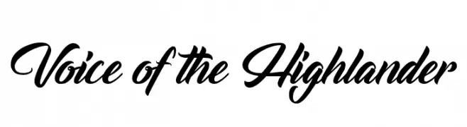
A dynamic and flowing script font with elegant cursive letterforms.
![Voice of the Highlander Frei Schriftart Herunterladen]() Herunterladen 84 Downloads@WebFont
Herunterladen 84 Downloads@WebFont -
( Fonts by Iconian Fonts )
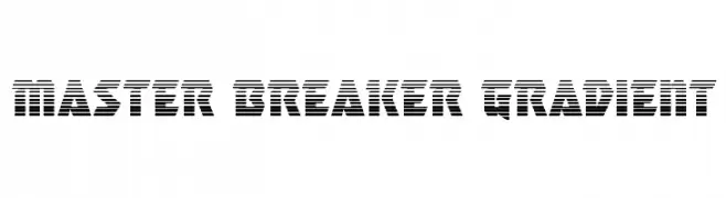
A bold, geometric font with a distinctive striped pattern, ideal for dynamic and futuristic designs.
![Master Breaker Gradient Frei Schriftart Herunterladen]() Herunterladen 84 Downloads@WebFont
Herunterladen 84 Downloads@WebFont -
( Fonts by CalligraphyFonts - Personal-use only. For commercial use please contact owner. )
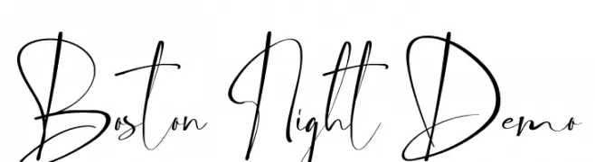
An elegant, flowing script font with intricate strokes and high contrast, perfect for refined projects.
![Boston Night Demo Frei Schriftart Herunterladen]() Herunterladen 84 Downloads@WebFont
Herunterladen 84 Downloads@WebFont -
( Fonts by Akrtype Studio - Ak Mal - Personal-use only. For commercial use please contact owner. )
An elegant, flowing script font with whimsical loops and swirls.
![Honeymoon Frei Schriftart Herunterladen]() Herunterladen 84 Downloads@WebFont
Herunterladen 84 Downloads@WebFont -
( Fonts by ingoFonts - Ingo Zimmermann - Personal-use only. For commercial use please contact owner. )
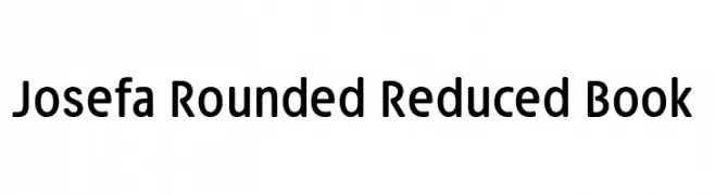
A modern, rounded typeface with excellent readability and a friendly appearance.
![Josefa Rounded Reduced Book Frei Schriftart Herunterladen]() Herunterladen 84 Downloads@WebFont
Herunterladen 84 Downloads@WebFont -
( BBco. - www.etsy.com/shop/ClairDeLunePixelArt )
A playful, hand-drawn font with irregular strokes and a whimsical style.
![Scrawny Norah Frei Schriftart Herunterladen]() Herunterladen 84 Downloads@WebFont
Herunterladen 84 Downloads@WebFont -
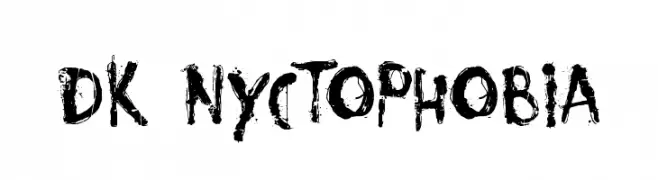
( Hanoded - David Kerkhoff - www.hanodedfonts.com )
A grungy, distressed font with a hand-painted, chaotic style.
![DK Nyctophobia Frei Schriftart Herunterladen]() Herunterladen 84 Downloads@WebFont
Herunterladen 84 Downloads@WebFont -
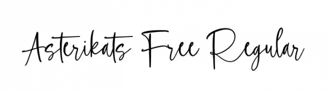
( Fonts by Maulana Creative - Gilang Maulana - Personal-use only. For commercial use please contact owner. )
A playful, artistic handwritten font with fluid, connected letterforms.
![Asterikats Free Regular Frei Schriftart Herunterladen]() Herunterladen 84 Downloads@WebFont
Herunterladen 84 Downloads@WebFont -
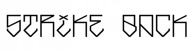
( Out of Step Font Company - Dan Steinbok - outofstepfontco.com )
A geometric, angular font with a futuristic and bold design.
![Strike Back Frei Schriftart Herunterladen]() Herunterladen 84 Downloads@WebFont
Herunterladen 84 Downloads@WebFont -
( Vladimir Nikolic - www.coroflot.com/vladimirnikolic )
A bold, italic font with sharp angles and dynamic strokes.
![Theatrical Italic Frei Schriftart Herunterladen]() Herunterladen 84 Downloads@WebFont
Herunterladen 84 Downloads@WebFont -
( D.Frohwein - www.aleatoric.de )
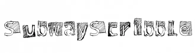
A playful, hand-drawn scribble font with a bold, artistic style.
![Subway Scribble Frei Schriftart Herunterladen]() Herunterladen 84 Downloads@WebFont
Herunterladen 84 Downloads@WebFont -
( Cat Neligan )
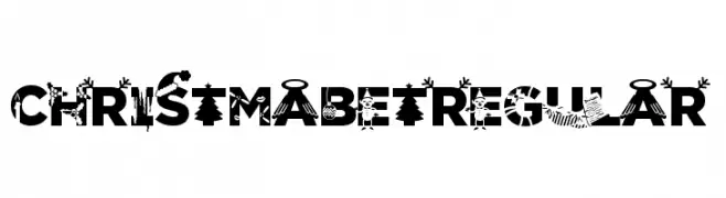
A festive, decorative font featuring Christmas-themed elements within each character.
![ChristmabetRegular Frei Schriftart Herunterladen]() Herunterladen 84 Downloads@WebFont
Herunterladen 84 Downloads@WebFont -
( Vladimir Nikolic - www.coroflot.com/vladimirnikolic )
A bold, italicized font with a shadow effect for dramatic impact.
![Theatrical Shadow Bold Italic Frei Schriftart Herunterladen]() Herunterladen 84 Downloads@WebFont
Herunterladen 84 Downloads@WebFont -
( Fonts by Ezeray Ciel )
A bold, angular font with a futuristic and abstract design.
![Andarion Regular Frei Schriftart Herunterladen]() Herunterladen 84 Downloads@WebFont
Herunterladen 84 Downloads@WebFont -
( Fonts by Dharmas Studio )
A bold, playful font with rounded, bubble-like characters.
![Swipe DEMO Frei Schriftart Herunterladen]() Herunterladen 84 Downloads@WebFont
Herunterladen 84 Downloads@WebFont -
( Fonts by Anthony Robinson )
A geometric, digital-style font resembling a 14-segment LED display.
![14 SegmentLED Frei Schriftart Herunterladen]() Herunterladen 84 Downloads@WebFont
Herunterladen 84 Downloads@WebFont -
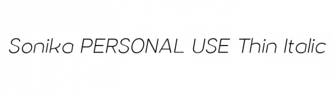
( Måns Grebäck - www.mansgreback.com )
A sleek, modern thin italic font with elegant, elongated letterforms.
![Sonika PERSONAL USE Thin Italic Frei Schriftart Herunterladen]() Herunterladen 84 Downloads@WebFont
Herunterladen 84 Downloads@WebFont -
( George Williams - web.archive.org/web/20051223080638/bibliofile.mc.duke.edu/gww/fonts/fonts.html )
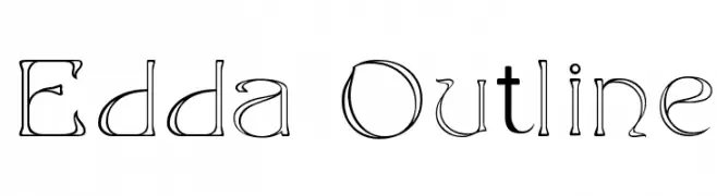
A decorative outline font with a blend of geometric and organic shapes.
![Edda Outline Frei Schriftart Herunterladen]() Herunterladen 84 Downloads@WebFont
Herunterladen 84 Downloads@WebFont -
( Fonts by Woodcutter )
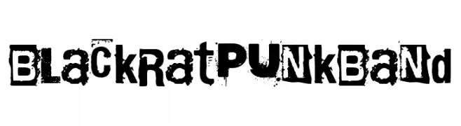
A gritty, distressed font with a rebellious punk rock aesthetic.
![Black Rat Punk Band Frei Schriftart Herunterladen]() Herunterladen 84 Downloads@WebFont
Herunterladen 84 Downloads@WebFont -
( Fonts by Daniel Zadorozny - www.iconian.com )
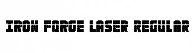
A bold, industrial font with a laser-cut, mechanical appearance.
![Iron Forge Laser Regular Frei Schriftart Herunterladen]() Herunterladen 84 Downloads@WebFont
Herunterladen 84 Downloads@WebFont -
( Iconian Fonts - Daniel Zadorozny - www.iconian.com )
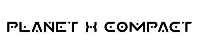
A futuristic, geometric font with bold, rounded letterforms and unique dot accents.
![Planet X Compact Frei Schriftart Herunterladen]() Herunterladen 84 Downloads@WebFont
Herunterladen 84 Downloads@WebFont -
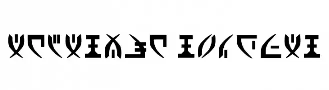
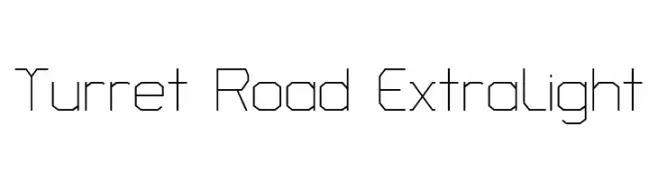
( Copyright 2018 The Turret Road Project Authors (https://github.com/noponies/turret-road) )
A geometric, angular font with consistent stroke width and a modern, minimalistic design.
![Turret Road ExtraLight Frei Schriftart Herunterladen]() Herunterladen 84 Downloads@WebFont
Herunterladen 84 Downloads@WebFont -
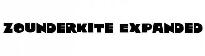
![Zounderkite Expanded Frei Schriftart Herunterladen]() Herunterladen 84 Downloads@WebFont
Herunterladen 84 Downloads@WebFont -
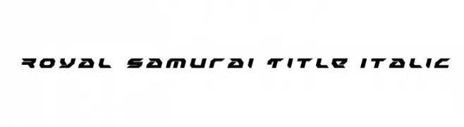
( Iconian Fonts - Daniel Zadorozny - www.iconian.com )
A bold, angular, and italic font with a futuristic and dynamic style.
![Royal Samurai Title Italic Frei Schriftart Herunterladen]() Herunterladen 84 Downloads@WebFont
Herunterladen 84 Downloads@WebFont -
( Fonts by hvnter.net - Personal-use only. For commercial use please contact owner. )
A bold, decorative font with playful, abstract shapes and rounded strokes.
![Kilo Frei Schriftart Herunterladen]() Herunterladen 84 Downloads@WebFont
Herunterladen 84 Downloads@WebFont -
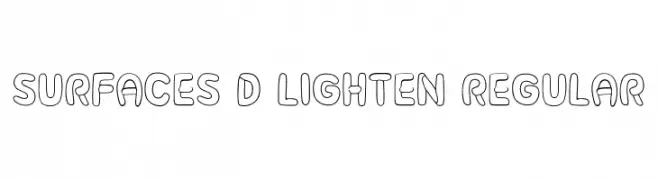
( Fonts by Vladimir Nikolic )
A playful, rounded 3D outline font with smooth curves and consistent thickness.
![Surfaces 3D Lighten Regular Frei Schriftart Herunterladen]() Herunterladen 84 Downloads@WebFont
Herunterladen 84 Downloads@WebFont -
![Quick End Jerk Frei Schriftart Herunterladen]() Herunterladen 84 Downloads@WebFont
Herunterladen 84 Downloads@WebFont


Welche Schriften sind gerade am populärsten?
Poppins, Roboto, Montserrat, Open Sans und Lato sind wegen ihrer klaren Formen und breiten Einsetzbarkeit sehr gefragt – von Markenauftritt über Landingpages bis hin zu Postern.
Welche Fonts eignen sich für Logos?
Geometrische Sans‑Serifs (z. B. Poppins, Familien im Gotham‑Stil) sind ein häufiger Griff für sauberes, skalierbares Branding. Für eine persönlichere Note bleiben Scripts und Handschrift‑Stile beliebt. Kombinieren Sie einen prägnanten Headline‑Font mit einer neutralen Brotschrift für Wiedererkennung und Harmonie.
Wie oft wird die Top‑Liste aktualisiert?
Regelmäßig – basierend auf realen Downloads und Interaktionen. Schauen Sie öfter vorbei, um aufstrebende Favoriten früh zu entdecken.
💡 Tipp: Seite bookmarken – Trends wechseln schnell, und heutige Top‑Schriften inspirieren morgen vielleicht das Rebranding.