Willkommen bei den Top‑Schriften – hier treffen Beliebtheit und Qualität aufeinander. Das sind die in diesem Jahr am häufigsten heruntergeladenen und genutzten Fonts. Wenn Sie sichere Optionen für Logo, Web oder Social suchen, starten Sie hier.
Jeder Top‑Font überzeugt durch Balance, Lesbarkeit und Vielseitigkeit. Sie finden moderne Sans‑Serifs, elegante Scripts, Vintage‑Serifs und minimalistische Displays.
-
( imagex - www.imagex-fonts.com )
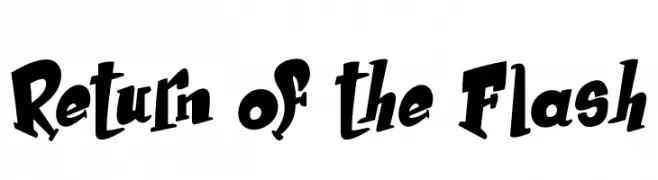
A bold, playful font with dynamic curves and unique character shapes.
 Herunterladen 83 Downloads@WebFont
 -
( MaximDude's Fonts - maximdude.deviantart.com )
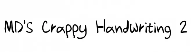
A playful, handwritten-style font with irregular, whimsical strokes.
![MD's Crappy Handwriting 2 Frei Schriftart Herunterladen]() Herunterladen 83 Downloads@WebFont
Herunterladen 83 Downloads@WebFont -
( Fonts by junkohanhero - Personal-use only. For commercial use please contact owner. )
A distressed, grunge-style font with a bold, rugged appearance.
![Damage Red Frei Schriftart Herunterladen]() Herunterladen 83 Downloads@WebFont
Herunterladen 83 Downloads@WebFont -
( Fonts by MJB Letters - Muhammad Mujibulloh - Personal-use only. For commercial use please contact owner. )
An elegant, flowing script font with modern, decorative elements.
![sheyla Frei Schriftart Herunterladen]() Herunterladen 83 Downloads@WebFont
Herunterladen 83 Downloads@WebFont -
( Iconian Fonts - Daniel Zadorozny - www.iconian.com )
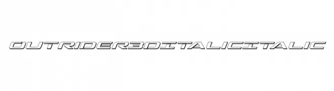
A dynamic, 3D italic font with a futuristic and bold design.
![Outrider 3D Italic Italic Frei Schriftart Herunterladen]() Herunterladen 83 Downloads@WebFont
Herunterladen 83 Downloads@WebFont -
( Fonts by Haksen Studio - Sarwo Edhi Prayitno - Personal-use only. For commercial use please contact owner. )
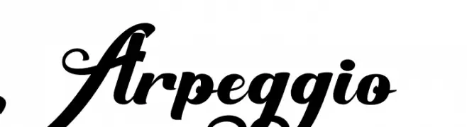
An elegant, flowing script font with ornate uppercase and smooth lowercase letters.
![Arpeggio Frei Schriftart Herunterladen]() Herunterladen 83 Downloads@WebFont
Herunterladen 83 Downloads@WebFont -
( Fonts by Televo - Personal-use only. For commercial use please contact owner. )
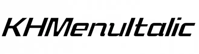
A sleek, modern italic font with a geometric and dynamic style.
![KHMenu Italic Frei Schriftart Herunterladen]() Herunterladen 83 Downloads@WebFont
Herunterladen 83 Downloads@WebFont -
![Hyperbowl Bullseye Regular Frei Schriftart Herunterladen]() Herunterladen 83 Downloads@WebFont
Herunterladen 83 Downloads@WebFont -
( Fonts by skomii - Personal-use only. For commercial use please contact owner. )
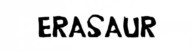
A playful, hand-drawn font with bold, irregular strokes.
![Erasaur Frei Schriftart Herunterladen]() Herunterladen 83 Downloads@WebFont
Herunterladen 83 Downloads@WebFont -
( imagex - www.imagex-fonts.com )
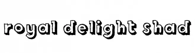
A bold, playful font with a three-dimensional shadow effect.
![Royal Delight Shad Frei Schriftart Herunterladen]() Herunterladen 83 Downloads@WebFont
Herunterladen 83 Downloads@WebFont -
( Noto is a trademark of Google Inc. Noto fonts are open source. All Noto fonts are published under the SIL Open Font License, Version 1.1 )
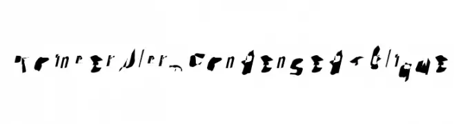
A bold, condensed font with a modern and robust style.
![Noto Sans Tamil Condensed Black Frei Schriftart Herunterladen]() Herunterladen 83 Downloads@WebFont
Herunterladen 83 Downloads@WebFont -
( Fonts by CannotIntoSpaceFonts - KineticPlasma Fonts - Personal-use only. For commercial use please contact owner. )
A playful, handwritten font with smooth, flowing curves and a casual style.
![Mew? Italic Frei Schriftart Herunterladen]() Herunterladen 83 Downloads@WebFont
Herunterladen 83 Downloads@WebFont -
( Fonts by Iconian Fonts - Daniel Zadorozny - Personal-use only. For commercial use please contact owner. )
A bold, expanded, and italicized font with a modern and dynamic style.
![Watchtower Expanded Italic Frei Schriftart Herunterladen]() Herunterladen 83 Downloads@WebFont
Herunterladen 83 Downloads@WebFont -
( Fonts by Billy Argel Fonts - www.billyargel.com - Personal-use only. For commercial use please contact owner. )
A bold, decorative font with a playful, dripping style ideal for festive designs.
![PARTYBOYPERSONALUSE-XBdXCn Frei Schriftart Herunterladen]() Herunterladen 83 Downloads@WebFont
Herunterladen 83 Downloads@WebFont -
( Fonts by Ibra Creative Studio )
A playful, bold font with a cartoonish style and rounded edges.
![Comicoon Regular Frei Schriftart Herunterladen]() Herunterladen 83 Downloads@WebFont
Herunterladen 83 Downloads@WebFont -
( Fonts by cutieFont - Personal-use only. For commercial use please contact owner. )
A playful font with heart motifs, perfect for romantic and whimsical designs.
![Flower Of Love Frei Schriftart Herunterladen]() Herunterladen 83 Downloads@WebFont
Herunterladen 83 Downloads@WebFont -
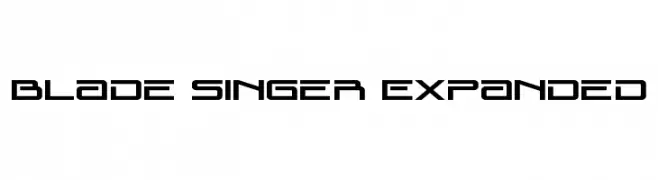
( Fonts by Daniel Zadorozny - www.iconian.com - Personal-use only. For commercial use please contact owner. )
A futuristic, geometric font with sharp angles and clean lines.
![Blade Singer Expanded Frei Schriftart Herunterladen]() Herunterladen 83 Downloads@WebFont
Herunterladen 83 Downloads@WebFont -
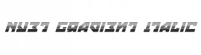
( Fonts by Daniel Zadorozny - www.iconian.com - Free for personal use )
A bold, italic font with a gradient line effect, exuding a futuristic and dynamic style.
![Nyet Gradient Italic Frei Schriftart Herunterladen]() Herunterladen 83 Downloads@WebFont
Herunterladen 83 Downloads@WebFont -
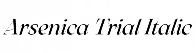
( Fonts by Zetafonts - Personal-use only. For commercial use please contact owner. )
An elegant italic serif font with high contrast and flowing curves.
![Arsenica Trial Italic Frei Schriftart Herunterladen]() Herunterladen 83 Downloads@WebFont
Herunterladen 83 Downloads@WebFont -
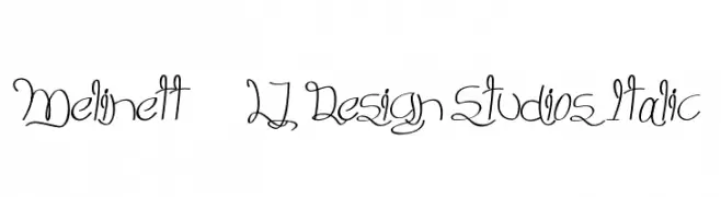
( LJ Design Studios - www.ljdesignstudios.com )
An elegant, flowing script font with intricate loops and swirls.
![Melinett 3 - LJ-Design Studios Italic Frei Schriftart Herunterladen]() Herunterladen 83 Downloads@WebFont
Herunterladen 83 Downloads@WebFont -
( Fonts by peterdraw - Ahmad Syarif Afandi - Personal-use only. For commercial use please contact owner. )
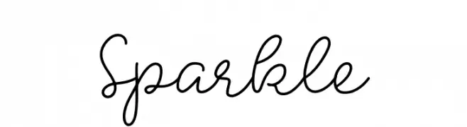
A playful and elegant script font with smooth, flowing lines and a handwritten charm.
![Sparkle Frei Schriftart Herunterladen]() Herunterladen 83 Downloads@WebFont
Herunterladen 83 Downloads@WebFont -
( Cioroianu Stefan Cristian )
A flowing, cursive font with elegant, interconnected characters.
![Cioroianu font Frei Schriftart Herunterladen]() Herunterladen 83 Downloads@WebFont
Herunterladen 83 Downloads@WebFont -
( imagex - www.imagex-fonts.com )
A playful, hand-drawn font with bold outlines and a whimsical style.
![Scoubidou Rap Frei Schriftart Herunterladen]() Herunterladen 83 Downloads@WebFont
Herunterladen 83 Downloads@WebFont -
![TheInequalityGrapher Frei Schriftart Herunterladen]() Herunterladen 83 Downloads@WebFont
Herunterladen 83 Downloads@WebFont -
( Fonts by Andi Moz )
Tall, elegant script with dramatic contrast and flourishes.
![Carmine Frei Schriftart Herunterladen]() Herunterladen 83 Downloads@WebFont
Herunterladen 83 Downloads@WebFont -
( Fonts by Haksen Studio - Sarwo Edhi Prayitno - Personal-use only. For commercial use please contact owner. )
A bold, expressive script font with flowing, cursive letterforms.
![Biscuit Frei Schriftart Herunterladen]() Herunterladen 83 Downloads@WebFont
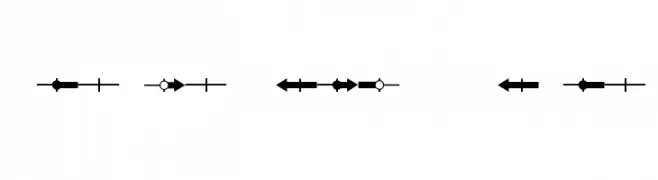
Herunterladen 83 Downloads@WebFont -
![Pointer UltraCondensed Oblique Frei Schriftart Herunterladen]() Herunterladen 83 Downloads@WebFont
Herunterladen 83 Downloads@WebFont -
( Fonts by Kat`s Fun Fonts - Personal-use only. For commercial use please contact owner. )
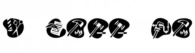
Icon-based font illustrating different careers and professions.
![KR Career Day Frei Schriftart Herunterladen]() Herunterladen 83 Downloads@WebFont
Herunterladen 83 Downloads@WebFont -
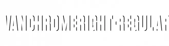
( Fonts by Raymond Larabie - Personal-use only. For commercial use please contact owner. )
A modern, stencil-inspired font with sharp, angular cuts and dynamic negative space.
![VanchromeRight-Regular Frei Schriftart Herunterladen]() Herunterladen 83 Downloads@WebFont
Herunterladen 83 Downloads@WebFont -
( Noto is a trademark of Google Inc. Noto fonts are open source. All Noto fonts are published under the SIL Open Font License, Version 1.1 )
A highly bold, condensed sans-serif with geometric, modern shapes.
![Noto Sans Hebrew Condensed ExtraBold Frei Schriftart Herunterladen]() Herunterladen 83 Downloads@WebFont
Herunterladen 83 Downloads@WebFont -
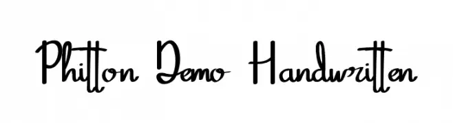
( Fonts by Edric Studio - Personal-use only. For commercial use please contact owner. )
A playful and expressive handwritten font with fluid strokes and dynamic slant.
![Phitton Demo Handwritten Frei Schriftart Herunterladen]() Herunterladen 83 Downloads@WebFont
Herunterladen 83 Downloads@WebFont -
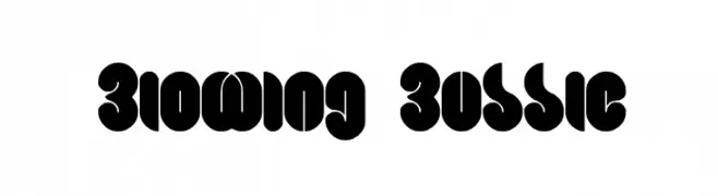
( Fonts by Wino S Kadir - weknow - www.revolge.com/shop/weknow/ - Personal-use only. For commercial use please contact owner. )
A bold, playful font with bubble-like, rounded characters.
![Blowing Bubble Frei Schriftart Herunterladen]() Herunterladen 83 Downloads@WebFont
Herunterladen 83 Downloads@WebFont -
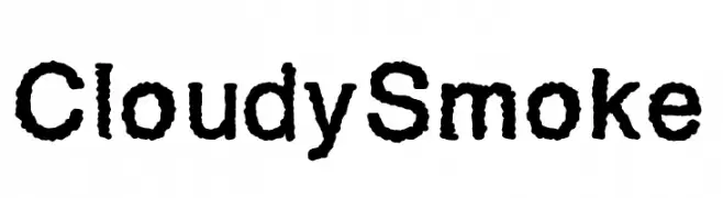
( Fonts by Ptp - Personal-use only. For commercial use please contact owner. )
A textured, bold font with a smoky, organic appearance.
![CloudySmoke Frei Schriftart Herunterladen]() Herunterladen 83 Downloads@WebFont
Herunterladen 83 Downloads@WebFont -
![Through The Black Frei Schriftart Herunterladen]() Herunterladen 83 Downloads@WebFont
Herunterladen 83 Downloads@WebFont -
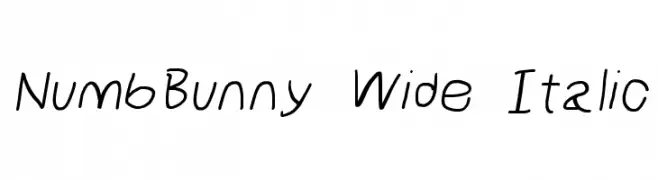
( Fonts by Cannot Into Space Fonts )
A playful, wide, and italic handwritten font with a whimsical touch.
![NumbBunny Wide Italic Frei Schriftart Herunterladen]() Herunterladen 83 Downloads@WebFont
Herunterladen 83 Downloads@WebFont


Welche Schriften sind gerade am populärsten?
Poppins, Roboto, Montserrat, Open Sans und Lato sind wegen ihrer klaren Formen und breiten Einsetzbarkeit sehr gefragt – von Markenauftritt über Landingpages bis hin zu Postern.
Welche Fonts eignen sich für Logos?
Geometrische Sans‑Serifs (z. B. Poppins, Familien im Gotham‑Stil) sind ein häufiger Griff für sauberes, skalierbares Branding. Für eine persönlichere Note bleiben Scripts und Handschrift‑Stile beliebt. Kombinieren Sie einen prägnanten Headline‑Font mit einer neutralen Brotschrift für Wiedererkennung und Harmonie.
Wie oft wird die Top‑Liste aktualisiert?
Regelmäßig – basierend auf realen Downloads und Interaktionen. Schauen Sie öfter vorbei, um aufstrebende Favoriten früh zu entdecken.
💡 Tipp: Seite bookmarken – Trends wechseln schnell, und heutige Top‑Schriften inspirieren morgen vielleicht das Rebranding.