Willkommen bei den Top‑Schriften – hier treffen Beliebtheit und Qualität aufeinander. Das sind die in diesem Jahr am häufigsten heruntergeladenen und genutzten Fonts. Wenn Sie sichere Optionen für Logo, Web oder Social suchen, starten Sie hier.
Jeder Top‑Font überzeugt durch Balance, Lesbarkeit und Vielseitigkeit. Sie finden moderne Sans‑Serifs, elegante Scripts, Vintage‑Serifs und minimalistische Displays.
-
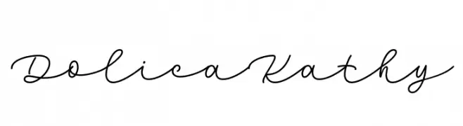
( Fonts by Situjuh Nazara - 7ntypes.com - Personal-use only. For commercial use please contact owner. )
A flowing, cursive script font with elegant, interconnected strokes.
 Herunterladen 83 Downloads@WebFont
 -
![Hyperbowl Bullseye Regular Frei Schriftart Herunterladen]() Herunterladen 83 Downloads@WebFont
Herunterladen 83 Downloads@WebFont -
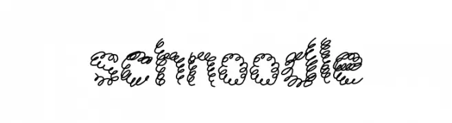
( Fonts by Geronimo Fonts - Personal-use only. For commercial use please contact owner. )
A whimsical, curly font with playful loops and swirls.
![schnoodle Frei Schriftart Herunterladen]() Herunterladen 83 Downloads@WebFont
Herunterladen 83 Downloads@WebFont -
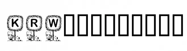
( Fonts by Kat`s Fun Fonts - Personal-use only. For commercial use please contact owner. )
A decorative font with uppercase letters framed in intricate tree designs.
![KR Washington Frei Schriftart Herunterladen]() Herunterladen 83 Downloads@WebFont
Herunterladen 83 Downloads@WebFont -
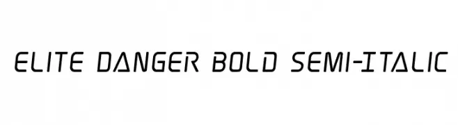
( Fonts by Iconian Fonts )
A bold, semi-italic, geometric font with a modern and futuristic style.
![Elite Danger Bold Semi-Italic Frei Schriftart Herunterladen]() Herunterladen 83 Downloads@WebFont
Herunterladen 83 Downloads@WebFont -
( Fonts by Billy Argel Fonts - www.billyargel.com - Personal-use only. For commercial use please contact owner. )
A bold, decorative font with a playful, dripping style ideal for festive designs.
![PARTYBOYPERSONALUSE-XBdXCn Frei Schriftart Herunterladen]() Herunterladen 83 Downloads@WebFont
Herunterladen 83 Downloads@WebFont -
( Fonts by Ibra Creative Studio )
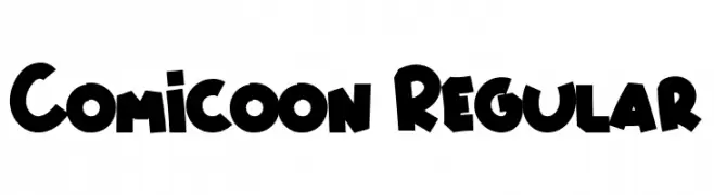
A playful, bold font with a cartoonish style and rounded edges.
![Comicoon Regular Frei Schriftart Herunterladen]() Herunterladen 83 Downloads@WebFont
Herunterladen 83 Downloads@WebFont -
( Fonts by Md Shohail Bhuian )
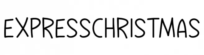
A playful, handwritten font with a casual and friendly appearance.
![Express Christmas Frei Schriftart Herunterladen]() Herunterladen 83 Downloads@WebFont
Herunterladen 83 Downloads@WebFont -
( Fonts by Daniel Zadorozny - www.iconian.com - Personal-use only. For commercial use please contact owner. )
A futuristic, geometric font with sharp angles and clean lines.
![Blade Singer Expanded Frei Schriftart Herunterladen]() Herunterladen 83 Downloads@WebFont
Herunterladen 83 Downloads@WebFont -
( Fonts by Daniel Zadorozny - www.iconian.com )
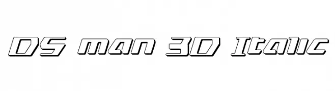
A bold, italic, 3D font with outlined characters and a futuristic style.
![DS man 3D Italic Frei Schriftart Herunterladen]() Herunterladen 83 Downloads@WebFont
Herunterladen 83 Downloads@WebFont -
( Fonts by Kat`s Fun Fonts - Personal-use only. For commercial use please contact owner. )
A festive, decorative font with New Year's themed illustrations.
![KR Welcome 2002 Pt 1 Frei Schriftart Herunterladen]() Herunterladen 83 Downloads@WebFont
Herunterladen 83 Downloads@WebFont -
( Fonts by wonoayu79 - Agung Harto - Personal-use only. For commercial use please contact owner. )
A bold, expressive script font with dynamic strokes and elegant flow.
![bright light Regular Frei Schriftart Herunterladen]() Herunterladen 83 Downloads@WebFont
Herunterladen 83 Downloads@WebFont -
( Fonts by Daniel Zadorozny - www.iconian.com - Free for personal use )
A bold, italic font with a gradient line effect, exuding a futuristic and dynamic style.
![Nyet Gradient Italic Frei Schriftart Herunterladen]() Herunterladen 83 Downloads@WebFont
Herunterladen 83 Downloads@WebFont -
( Cioroianu Stefan Cristian )
A flowing, cursive font with elegant, interconnected characters.
![Cioroianu font Frei Schriftart Herunterladen]() Herunterladen 83 Downloads@WebFont
Herunterladen 83 Downloads@WebFont -
( Ambyr Gregg - bandogora.tumblr.com )
A modern, geometric font with thin strokes and angular design.
![NisabaRegular Frei Schriftart Herunterladen]() Herunterladen 83 Downloads@WebFont
Herunterladen 83 Downloads@WebFont -
( Måns Grebäck - www.mansgreback.com )
A sleek, thin, italicized font with a modern and elegant design.
![Kandira PERSONAL Thin Italic Frei Schriftart Herunterladen]() Herunterladen 83 Downloads@WebFont
Herunterladen 83 Downloads@WebFont -
( imagex - www.imagex-fonts.com )
A playful, hand-drawn font with bold outlines and a whimsical style.
![Scoubidou Rap Frei Schriftart Herunterladen]() Herunterladen 83 Downloads@WebFont
Herunterladen 83 Downloads@WebFont -
![TheInequalityGrapher Frei Schriftart Herunterladen]() Herunterladen 83 Downloads@WebFont
Herunterladen 83 Downloads@WebFont -
( Fonts by Andi Moz )
Tall, elegant script with dramatic contrast and flourishes.
![Carmine Frei Schriftart Herunterladen]() Herunterladen 83 Downloads@WebFont
Herunterladen 83 Downloads@WebFont -
( Fonts by Alit Design - Alit Suarnegara - Personal-use only. For commercial use please contact owner. )
A playful, snow-themed decorative font with bold, chunky characters.
![Monday coldness snow free vertion Regular Frei Schriftart Herunterladen]() Herunterladen 83 Downloads@WebFont
Herunterladen 83 Downloads@WebFont -
( Fonts by Motokiwo - Anton Cahyono - Personal-use only. For commercial use please contact owner. )
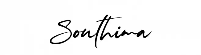
A dynamic, cursive script font with fluid, interconnected strokes.
![Southima Frei Schriftart Herunterladen]() Herunterladen 83 Downloads@WebFont
Herunterladen 83 Downloads@WebFont -
( Typodermic Fonts - Ray Larabie - www.typodermicfonts.com/ )
A modern, geometric sans-serif font with clean lines and balanced proportions.
![MesmerizeSeRg-Regular Frei Schriftart Herunterladen]() Herunterladen 83 Downloads@WebFont
Herunterladen 83 Downloads@WebFont -
( Fonts by douglas vitkauskas - Personal-use only. For commercial use please contact owner. )
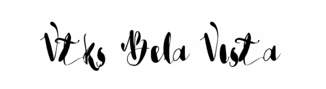
A whimsical, cursive font with elegant loops and dynamic contrast.
![Vtks Bela Vista Frei Schriftart Herunterladen]() Herunterladen 83 Downloads@WebFont
Herunterladen 83 Downloads@WebFont -
( Noto is a trademark of Google Inc. Noto fonts are open source. All Noto fonts are published under the SIL Open Font License, Version 1.1 )
A highly bold, condensed sans-serif with geometric, modern shapes.
![Noto Sans Hebrew Condensed ExtraBold Frei Schriftart Herunterladen]() Herunterladen 83 Downloads@WebFont
Herunterladen 83 Downloads@WebFont -
( Noto is a trademark of Google Inc. Noto fonts are open source. All Noto fonts are published under the SIL Open Font License, Version 1.1 )
Modern sans-serif Hebrew font with semi-condensed style.
![Noto Sans Hebrew SemiCondensed SemiBold Frei Schriftart Herunterladen]() Herunterladen 83 Downloads@WebFont
Herunterladen 83 Downloads@WebFont -
( Fonts by Ptp - Personal-use only. For commercial use please contact owner. )
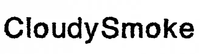
A textured, bold font with a smoky, organic appearance.
![CloudySmoke Frei Schriftart Herunterladen]() Herunterladen 83 Downloads@WebFont
Herunterladen 83 Downloads@WebFont -
( Flop Design - www.flopdesign.com/ )
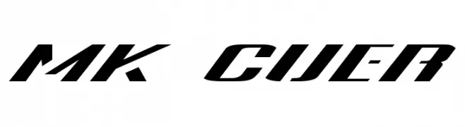
A bold, italicized font with a dynamic and futuristic style.
![MK Cuer Frei Schriftart Herunterladen]() Herunterladen 83 Downloads@WebFont
Herunterladen 83 Downloads@WebFont -
![Through The Black Frei Schriftart Herunterladen]() Herunterladen 83 Downloads@WebFont
Herunterladen 83 Downloads@WebFont -
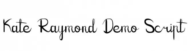
( Fonts by Edric Studio - Personal-use only. For commercial use please contact owner. )
A playful and elegant script font with flowing, interconnected letters.
![Kate Raymond Demo Script Frei Schriftart Herunterladen]() Herunterladen 83 Downloads@WebFont
Herunterladen 83 Downloads@WebFont -
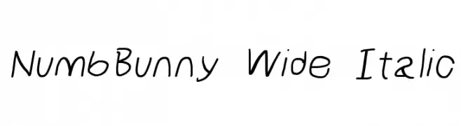
( Fonts by Cannot Into Space Fonts )
A playful, wide, and italic handwritten font with a whimsical touch.
![NumbBunny Wide Italic Frei Schriftart Herunterladen]() Herunterladen 83 Downloads@WebFont
Herunterladen 83 Downloads@WebFont -
( Fonts by Sulthanstudio - Nasrullah Nasrullah - Personal-use only. For commercial use please contact owner. )
An elegant script font with flowing, interconnected letters and a classic appearance.
![Saylove Frei Schriftart Herunterladen]() Herunterladen 83 Downloads@WebFont
Herunterladen 83 Downloads@WebFont -
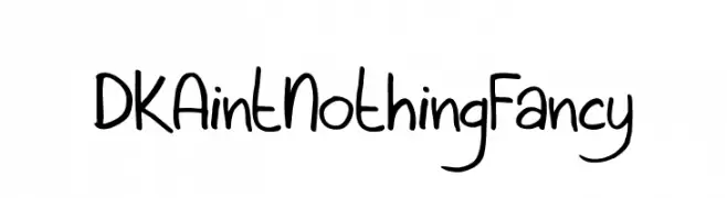
( Hanoded - David Kerkhoff - www.hanodedfonts.com )
A playful, handwritten font with smooth, rounded edges and a casual style.
![DKAintNothingFancy Frei Schriftart Herunterladen]() Herunterladen 83 Downloads@WebFont
Herunterladen 83 Downloads@WebFont -
( Fonts by Syaf Rizal - Khurasan - Personal-use only. For commercial use please contact owner. )
A bold, flowing script font with a dynamic and elegant handwritten style.
![Ruang Frei Schriftart Herunterladen]() Herunterladen 83 Downloads@WebFont
Herunterladen 83 Downloads@WebFont -
( Fonts by Cannot Into Space Fonts )
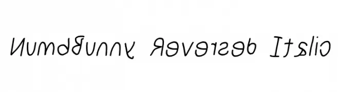
A playful, reversed italic handwritten font with a whimsical style.
![NumbBunny Reversed Italic Frei Schriftart Herunterladen]() Herunterladen 83 Downloads@WebFont
Herunterladen 83 Downloads@WebFont -
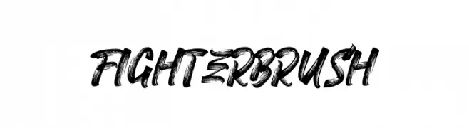
( Fonts by Typeline Studio - Yadhie Setiawan - Personal-use only. For commercial use please contact owner. )
A bold, brushstroke-style font with dynamic, textured characters.
![FIGHTER BRUSH Frei Schriftart Herunterladen]() Herunterladen 83 Downloads@WebFont
Herunterladen 83 Downloads@WebFont


Welche Schriften sind gerade am populärsten?
Poppins, Roboto, Montserrat, Open Sans und Lato sind wegen ihrer klaren Formen und breiten Einsetzbarkeit sehr gefragt – von Markenauftritt über Landingpages bis hin zu Postern.
Welche Fonts eignen sich für Logos?
Geometrische Sans‑Serifs (z. B. Poppins, Familien im Gotham‑Stil) sind ein häufiger Griff für sauberes, skalierbares Branding. Für eine persönlichere Note bleiben Scripts und Handschrift‑Stile beliebt. Kombinieren Sie einen prägnanten Headline‑Font mit einer neutralen Brotschrift für Wiedererkennung und Harmonie.
Wie oft wird die Top‑Liste aktualisiert?
Regelmäßig – basierend auf realen Downloads und Interaktionen. Schauen Sie öfter vorbei, um aufstrebende Favoriten früh zu entdecken.
💡 Tipp: Seite bookmarken – Trends wechseln schnell, und heutige Top‑Schriften inspirieren morgen vielleicht das Rebranding.