Willkommen bei den Top‑Schriften – hier treffen Beliebtheit und Qualität aufeinander. Das sind die in diesem Jahr am häufigsten heruntergeladenen und genutzten Fonts. Wenn Sie sichere Optionen für Logo, Web oder Social suchen, starten Sie hier.
Jeder Top‑Font überzeugt durch Balance, Lesbarkeit und Vielseitigkeit. Sie finden moderne Sans‑Serifs, elegante Scripts, Vintage‑Serifs und minimalistische Displays.
-
 Herunterladen 1725 Downloads@WebFont
 -
( Fonts by Khurasan )
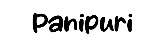
A bold, rounded handwritten font with a playful and casual style.
![Panipuri Frei Schriftart Herunterladen]() Herunterladen 1724 Downloads@WebFont
Herunterladen 1724 Downloads@WebFont -
( Jroh Creative - jrohcreative.com/ )
A bold, flowing script font with high contrast and elegant, connected characters.
![TradeMarkDemo-Regular Frei Schriftart Herunterladen]() Herunterladen 1724 Downloads@WebFont
Herunterladen 1724 Downloads@WebFont -
( Fonts by Hideki Katayama - com4t-fff.seesaa.net )
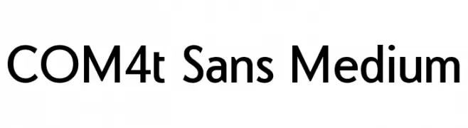
A clean, modern sans-serif font with uniform stroke width and excellent readability.
![COM4t Sans Medium Frei Schriftart Herunterladen]() Herunterladen 1724 Downloads@WebFont
Herunterladen 1724 Downloads@WebFont -
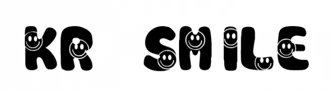
![KR Smile Frei Schriftart Herunterladen]() Herunterladen 1724 Downloads@WebFont
Herunterladen 1724 Downloads@WebFont -
( Fonts by Abdulmakesfonts )
A bold, geometric font with angular lines and a modern block-like appearance.
![Kroftsmann Frei Schriftart Herunterladen]() Herunterladen 1724 Downloads@WebFont
Herunterladen 1724 Downloads@WebFont -
( Fonts by ShyFonts )
A bold, modern font with a condensed and impactful design.
![SF Willamette Frei Schriftart Herunterladen]() Herunterladen 1724 Downloads@WebFont
Herunterladen 1724 Downloads@WebFont -
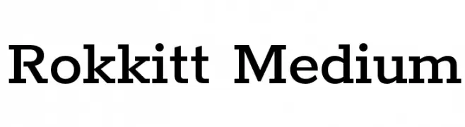
( Copyright 2016 The Rokkit Project Authors (contact@sansoxygen.com) )
A classic slab serif font with strong geometric shapes and a balanced structure.
![Rokkitt Medium Frei Schriftart Herunterladen]() Herunterladen 1723 Downloads@WebFont
Herunterladen 1723 Downloads@WebFont -
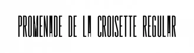
( Fonts by HENRIavecunK. Personal-use only. For commercial use please contact owner. )
A tall, narrow, and modern font with high contrast and elegant design.
![Promenade de la Croisette Regular Frei Schriftart Herunterladen]() Herunterladen 1723 Downloads@WebFont
Herunterladen 1723 Downloads@WebFont -
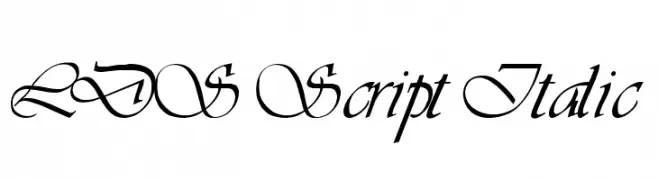
( Fonts by Digital Graphics Labs - www.digitalgraphiclabs.com )
An elegant, cursive font with intricate swashes and a refined, artistic style.
![LDS Script Italic Frei Schriftart Herunterladen]() Herunterladen 1723 Downloads@WebFont
Herunterladen 1723 Downloads@WebFont -
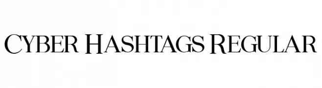
( Fonts by Vladimir Nikolic - www.creativefabrica.com/designer/vladimirnikolic/ - Personal-use only. For commercial use please contact owner. )
A classic serif font with elegant strokes and balanced proportions.
![Cyber Hashtags Regular Frei Schriftart Herunterladen]() Herunterladen 1722 Downloads@WebFont
Herunterladen 1722 Downloads@WebFont -
( Fonts by a Bigelow&Holmes . Personal-use only. For commercial use please contact owner. )
A classic serif typeface with elegant, balanced strokes and high readability.
![Luxi Serif Regular Frei Schriftart Herunterladen]() Herunterladen 1722 Downloads@WebFont
Herunterladen 1722 Downloads@WebFont -
( Copyright 2012 The Encode Project Authors (impallari@gmail.com), with Reserved Font Name "Encode Sansâ€. )
A bold, modern sans-serif font with clean lines and strong visual impact.
![Encode Sans Bold Frei Schriftart Herunterladen]() Herunterladen 1722 Downloads@WebFont
Herunterladen 1722 Downloads@WebFont -
( Fonts by Bumbayo Font Fabrik )
A bold, distressed font with a vintage, textured appearance.
![Zubajda Str Frei Schriftart Herunterladen]() Herunterladen 1722 Downloads@WebFont
Herunterladen 1722 Downloads@WebFont -
![Maximus Bold Italic Frei Schriftart Herunterladen]() Herunterladen 1722 Downloads@WebFont
Herunterladen 1722 Downloads@WebFont -
( Fonts by Arkandis Digital Foundry )
A bold, classic serif font with high contrast and pronounced serifs.
![TribunADFStd-Bold Frei Schriftart Herunterladen]() Herunterladen 1722 Downloads@WebFont
Herunterladen 1722 Downloads@WebFont -
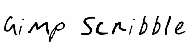
![Gimp Scribble Frei Schriftart Herunterladen]() Herunterladen 1722 Downloads@WebFont
Herunterladen 1722 Downloads@WebFont -
( Fonts by Graham Meade - GemFonts )
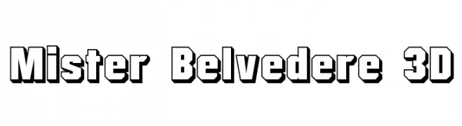
A bold, 3D font with a retro, impactful style.
![Mister Belvedere 3D Frei Schriftart Herunterladen]() Herunterladen 1722 Downloads@WebFont
Herunterladen 1722 Downloads@WebFont -
( Fonts by Nick Curtis - www.nicksfonts.com )
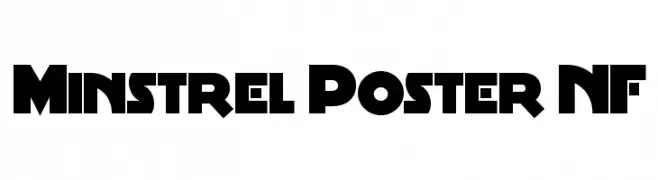
A bold, geometric font with a modern retro vibe and decorative elements.
![Minstrel Poster NF Frei Schriftart Herunterladen]() Herunterladen 1722 Downloads@WebFont
Herunterladen 1722 Downloads@WebFont -
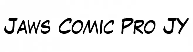
( Fonts by Comic Pro JY Sponsoren Schriftart )
A playful, handwritten font with bold, rounded strokes and a casual, friendly appearance.
![Jaws Comic Pro JY Frei Schriftart Herunterladen]() Herunterladen 1722 Downloads
Herunterladen 1722 Downloads -
![Boogaloo 1.0 Frei Schriftart Herunterladen]() Herunterladen 1722 Downloads@WebFont
Herunterladen 1722 Downloads@WebFont -
( blue studio09 )
A delicate, flowing script font with an elegant, handwritten style.
![Bettrish Frei Schriftart Herunterladen]() Herunterladen 1721 Downloads@WebFont
Herunterladen 1721 Downloads@WebFont -
( Fonts by Apostrophic Lab )
A bold, geometric font with clean lines and a modern aesthetic.
![Ashby Bold Frei Schriftart Herunterladen]() Herunterladen 1721 Downloads@WebFont
Herunterladen 1721 Downloads@WebFont -
( Fonts by !Exclamachine Type Foundry )
A bold, distressed font with a horizontal line pattern and artistic flair.
![!LestaticCSS Frei Schriftart Herunterladen]() Herunterladen 1720 Downloads@WebFont
Herunterladen 1720 Downloads@WebFont -
( Fonts by www.waltervelezart.com )
A bold, geometric font with sharp, angular letterforms and a modern, impactful style.
![Minotaur Phatte Frei Schriftart Herunterladen]() Herunterladen 1720 Downloads@WebFont
Herunterladen 1720 Downloads@WebFont -
![ER Univers 866 Bold Frei Schriftart Herunterladen]() Herunterladen 1720 Downloads
Herunterladen 1720 Downloads -
( Fonts by Fontfabric - Svetoslav Simov - Personal-use only. For commercial use please contact owner. )
A bold, modern font with clean, geometric lines and excellent readability.
![Nexa-Trial Black Frei Schriftart Herunterladen]() Herunterladen 1719 Downloads@WebFont
Herunterladen 1719 Downloads@WebFont -
( Fonts by Woodcutter )
A symbol-based font with diverse eagle motifs.
![Eagle Frei Schriftart Herunterladen]() Herunterladen 1719 Downloads@WebFont
Herunterladen 1719 Downloads@WebFont -
( Fonts by Castcraft Software - opti.netii.net - check the website before use )
A bold, classic serif font with elegant and traditional Italian influences.
![OPTIItalianOldstyle-Bold Frei Schriftart Herunterladen]() Herunterladen 1719 Downloads@WebFont
Herunterladen 1719 Downloads@WebFont -
![BDP Clien Bold Frei Schriftart Herunterladen]() Herunterladen 1719 Downloads@WebFont
Herunterladen 1719 Downloads@WebFont -
( Fonts by www.blambot.com )
A bold, distressed font with a grunge aesthetic and rough, uneven strokes.
![YouMurdererBB Frei Schriftart Herunterladen]() Herunterladen 1719 Downloads@WebFont
Herunterladen 1719 Downloads@WebFont -
![Primer Print Medium Frei Schriftart Herunterladen]() Herunterladen 1719 Downloads@WebFont
Herunterladen 1719 Downloads@WebFont -
( Fonts by Nick Curtis - www.nicksfonts.com )
A bold, geometric font with strong lines and a modern, vintage appeal.
![Becker Black NF Frei Schriftart Herunterladen]() Herunterladen 1719 Downloads@WebFont
Herunterladen 1719 Downloads@WebFont -
( Fonts by Divide By Zero! - fonts.tom7.com )
A dynamic, hand-drawn font with bold, expressive strokes and playful character.
![Colophon DBZ Frei Schriftart Herunterladen]() Herunterladen 1719 Downloads@WebFont
Herunterladen 1719 Downloads@WebFont -
( Fonts by Darrell Flood - Personal-use only. For commercial use please contact owner. )
A bold, geometric font with a futuristic, edgy design.
![Cyberjunkies Frei Schriftart Herunterladen]() Herunterladen 1718 Downloads@WebFont
Herunterladen 1718 Downloads@WebFont


Welche Schriften sind gerade am populärsten?
Poppins, Roboto, Montserrat, Open Sans und Lato sind wegen ihrer klaren Formen und breiten Einsetzbarkeit sehr gefragt – von Markenauftritt über Landingpages bis hin zu Postern.
Welche Fonts eignen sich für Logos?
Geometrische Sans‑Serifs (z. B. Poppins, Familien im Gotham‑Stil) sind ein häufiger Griff für sauberes, skalierbares Branding. Für eine persönlichere Note bleiben Scripts und Handschrift‑Stile beliebt. Kombinieren Sie einen prägnanten Headline‑Font mit einer neutralen Brotschrift für Wiedererkennung und Harmonie.
Wie oft wird die Top‑Liste aktualisiert?
Regelmäßig – basierend auf realen Downloads und Interaktionen. Schauen Sie öfter vorbei, um aufstrebende Favoriten früh zu entdecken.
💡 Tipp: Seite bookmarken – Trends wechseln schnell, und heutige Top‑Schriften inspirieren morgen vielleicht das Rebranding.