Willkommen bei den Top‑Schriften – hier treffen Beliebtheit und Qualität aufeinander. Das sind die in diesem Jahr am häufigsten heruntergeladenen und genutzten Fonts. Wenn Sie sichere Optionen für Logo, Web oder Social suchen, starten Sie hier.
Jeder Top‑Font überzeugt durch Balance, Lesbarkeit und Vielseitigkeit. Sie finden moderne Sans‑Serifs, elegante Scripts, Vintage‑Serifs und minimalistische Displays.
-
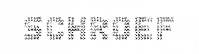
( CROLrene )
A decorative font made of screw-like symbols, offering a mechanical and industrial aesthetic.
 Herunterladen 83 Downloads@WebFont
 -
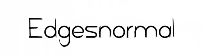
( SamOnt )
A sharp, edgy font with angular strokes and pointed serifs.
![Edges normal Frei Schriftart Herunterladen]() Herunterladen 83 Downloads@WebFont
Herunterladen 83 Downloads@WebFont -
( Fonts by Balpirick Studio - https://www.creativefabrica.com/designer/balpirick/ref/308299/ - Personal-use only. For commercial use please contact owner. )
A playful, casual handwritten font with flowing, slightly irregular letterforms.
![Simplemind Frei Schriftart Herunterladen]() Herunterladen 83 Downloads@WebFont
Herunterladen 83 Downloads@WebFont -
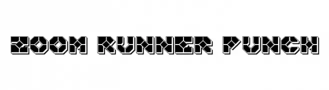
( Fonts by Iconian Fonts )
A bold, geometric font with a futuristic, digital aesthetic.
![Zoom Runner Punch Frei Schriftart Herunterladen]() Herunterladen 83 Downloads@WebFont
Herunterladen 83 Downloads@WebFont -
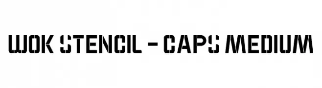
( Fonts by qtypography - Qassim Haider - Personal-use only. For commercial use please contact owner. )
A bold, geometric stencil font with a modern industrial style.
![WOK STENCIL - CAPS Medium Frei Schriftart Herunterladen]() Herunterladen 83 Downloads@WebFont
Herunterladen 83 Downloads@WebFont -
( Christian Munk - fontstruct.com/fontstructors/25776/cmunk )
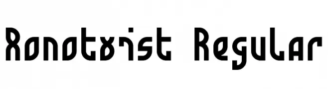
A bold, geometric font with a modern and playful twist.
![Monotwist Regular Frei Schriftart Herunterladen]() Herunterladen 83 Downloads@WebFont
Herunterladen 83 Downloads@WebFont -
( Iconian Fonts - Daniel Zadorozny - www.iconian.com )
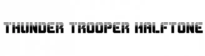
A bold, futuristic font with a halftone effect and digital aesthetic.
![Thunder Trooper Halftone Frei Schriftart Herunterladen]() Herunterladen 83 Downloads@WebFont
Herunterladen 83 Downloads@WebFont -
( Fonts by twinletter - Rozikan - Personal-use only. For commercial use please contact owner. )
A modern, italic font with bold strokes and a dynamic slant.
![Soegja Italic Frei Schriftart Herunterladen]() Herunterladen 83 Downloads@WebFont
Herunterladen 83 Downloads@WebFont -
( Fonts by Kat`s Fun Fonts - Personal-use only. For commercial use please contact owner. )
A playful, hand-drawn font with quirky, irregular letterforms.
![KR Gardenz Frei Schriftart Herunterladen]() Herunterladen 83 Downloads@WebFont
Herunterladen 83 Downloads@WebFont -
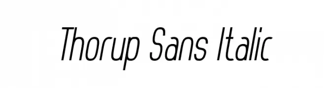
( Dan Thorup - www.danthorup.dk )
A sleek, modern italic font with a condensed width and medium contrast.
![Thorup Sans Italic Frei Schriftart Herunterladen]() Herunterladen 83 Downloads@WebFont
Herunterladen 83 Downloads@WebFont -
( Fonts by Rivo Dwi Adriansyah - Personal-use only. For commercial use please contact owner. )
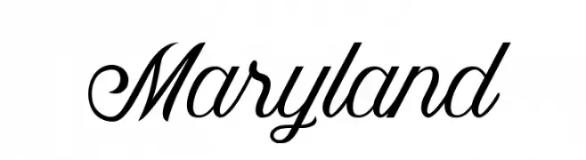
An elegant script font with flowing, cursive letterforms and intricate flourishes.
![Maryland Frei Schriftart Herunterladen]() Herunterladen 83 Downloads@WebFont
Herunterladen 83 Downloads@WebFont -
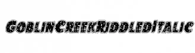
![Goblin Creek Riddled Italic Frei Schriftart Herunterladen]() Herunterladen 83 Downloads@WebFont
Herunterladen 83 Downloads@WebFont -
( Fonts by Daniel Zadorozny - www.iconian.com - Personal-use only. For commercial use please contact owner. )
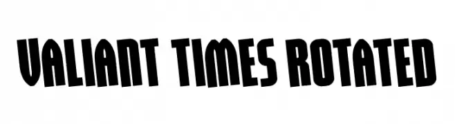
A bold, condensed font with a dynamic slant and strong visual impact.
![Valiant Times Rotated Frei Schriftart Herunterladen]() Herunterladen 83 Downloads@WebFont
Herunterladen 83 Downloads@WebFont -
( Fonts by www.dcoxy.com )
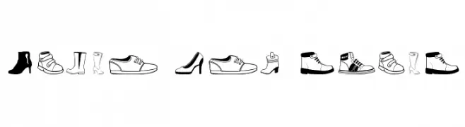
Outlined, hand-drawn icons of women's shoes in a playful style.
![Women And Shoes Frei Schriftart Herunterladen]() Herunterladen 83 Downloads@WebFont
Herunterladen 83 Downloads@WebFont -
( Fonts by www.woodcutter.es - woodcutter Manero - Personal-use only. For commercial use please contact owner. )
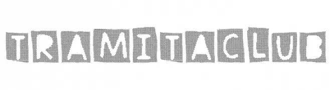
A playful, handcrafted font with bold, irregular shapes enclosed in squares.
![Tramita club Frei Schriftart Herunterladen]() Herunterladen 83 Downloads@WebFont
Herunterladen 83 Downloads@WebFont -
( Fonts by Kat`s Fun Fonts - Personal-use only. For commercial use please contact owner. )
An artistic, floral-inspired decorative font with intricate embellishments.
![KR Fleur Flair 3 Frei Schriftart Herunterladen]() Herunterladen 83 Downloads@WebFont
Herunterladen 83 Downloads@WebFont -
( Fonts by ilhamtaro - Personal-use only. For commercial use please contact owner. )
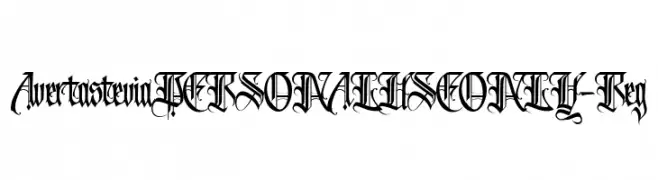
An ornate, Gothic-style font with intricate detailing and dramatic flair.
![AvertasteviaPERSONALUSEONLY-Reg Frei Schriftart Herunterladen]() Herunterladen 83 Downloads@WebFont
Herunterladen 83 Downloads@WebFont -
( Vladimir Nikolic - www.coroflot.com/vladimirnikolic )
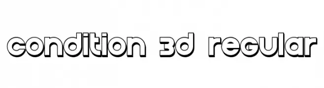
A bold, playful 3D font with rounded characters and a consistent stroke width.
![Condition 3D Regular Frei Schriftart Herunterladen]() Herunterladen 83 Downloads@WebFont
Herunterladen 83 Downloads@WebFont -
( Fonts by Dm Letter Studio )
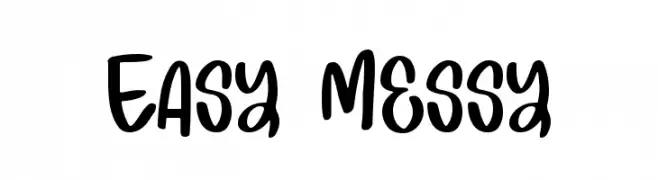
Playful and bold handwritten font.
![Easy Messy Frei Schriftart Herunterladen]() Herunterladen 83 Downloads@WebFont
Herunterladen 83 Downloads@WebFont -
( Fonts by Daniel Zadorozny - www.iconian.com - Personal-use only. For commercial use please contact owner. )
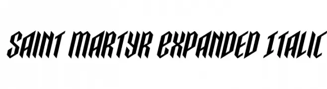
A bold, italic, and expanded font with high contrast and geometric style.
![Saint Martyr Expanded Italic Frei Schriftart Herunterladen]() Herunterladen 83 Downloads@WebFont
Herunterladen 83 Downloads@WebFont -
( Fonts by Runsell Studio - Personal-use only. For commercial use please contact owner. )
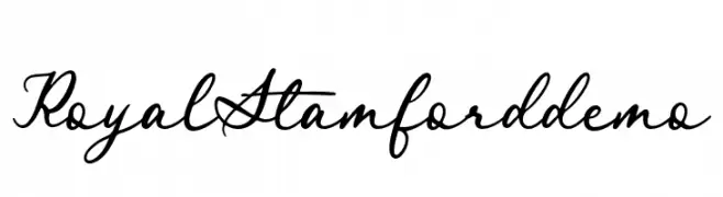
A graceful script font with fluid, connected strokes and elegant curves.
![RoyalStamforddemo Frei Schriftart Herunterladen]() Herunterladen 83 Downloads@WebFont
Herunterladen 83 Downloads@WebFont -
( Iconian Fonts - Daniel Zadorozny - www.iconian.com )
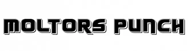
A bold, geometric font with a modern, futuristic style and strong contrast.
![Moltors Punch Frei Schriftart Herunterladen]() Herunterladen 83 Downloads@WebFont
Herunterladen 83 Downloads@WebFont -
( Iconian Fonts - Daniel Zadorozny - www.iconian.com )
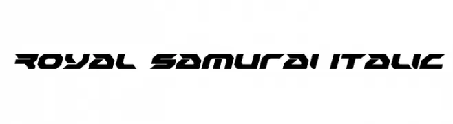
A bold, angular, and italic font with a futuristic and dynamic style.
![Royal Samurai Italic Frei Schriftart Herunterladen]() Herunterladen 83 Downloads@WebFont
Herunterladen 83 Downloads@WebFont -
( Mikrojihad Font - fontbundles.net/mikrojihad )
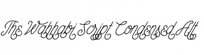
An elegant, flowing script font with intricate, condensed letterforms.
![The Wahhabi Script Condensed Alt Frei Schriftart Herunterladen]() Herunterladen 83 Downloads@WebFont
Herunterladen 83 Downloads@WebFont -
( Fonts by Misti`s Fonts - mistifonts.com - Personal-use only. For commercial use please contact owner. )
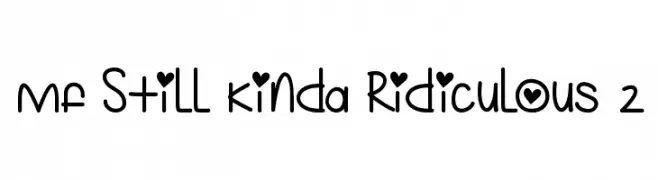
A playful, handwritten font with quirky, heart-themed elements.
![Mf Still Kinda Ridiculous 2 Frei Schriftart Herunterladen]() Herunterladen 83 Downloads@WebFont
Herunterladen 83 Downloads@WebFont -
( Fonts by Kong Font - Personal-use only. For commercial use please contact owner. )
A cursive, handwritten font with elegant, flowing lines.
![MirrorPool Frei Schriftart Herunterladen]() Herunterladen 83 Downloads@WebFont
Herunterladen 83 Downloads@WebFont -
( Fonts by rudistudio - Rizki Wahyudi - Personal-use only. For commercial use please contact owner. )
A playful, casual handwritten font with fluid, connected strokes.
![Cilupba Frei Schriftart Herunterladen]() Herunterladen 83 Downloads@WebFont
Herunterladen 83 Downloads@WebFont -
( Iconian Fonts - Daniel Zadorozny - www.iconian.com )
A bold, gothic-inspired font with sharp, angular edges.
![Kreature Kombat Frei Schriftart Herunterladen]() Herunterladen 83 Downloads@WebFont
Herunterladen 83 Downloads@WebFont -
( Fonts by rurr )
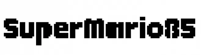
A bold, pixelated typeface with a retro, digital aesthetic.
![SuperMario85 Frei Schriftart Herunterladen]() Herunterladen 83 Downloads@WebFont
Herunterladen 83 Downloads@WebFont -
( Fonts by Woodcutter )
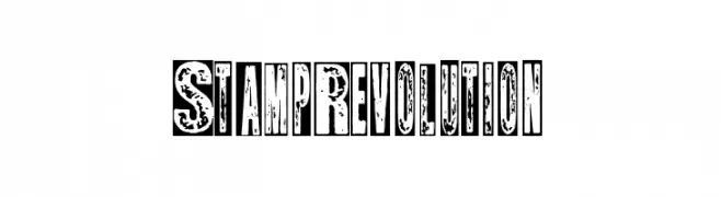
A bold, distressed font with a vintage, grunge aesthetic.
![Stamp Revolution Frei Schriftart Herunterladen]() Herunterladen 83 Downloads@WebFont
Herunterladen 83 Downloads@WebFont -
( Fonts by www.selawetype.com - Personal-use only. FOR DONATION https://www.paypal.me/selawe . For commercial use please contact owner. )
A dynamic and elegant cursive script font with bold, flowing characters.
![Sandiaga Frei Schriftart Herunterladen]() Herunterladen 83 Downloads@WebFont
Herunterladen 83 Downloads@WebFont -
( Iconian Fonts - Daniel Zadorozny - www.iconian.com )
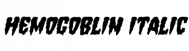
A bold, jagged font with a horror-themed aesthetic.
![Hemogoblin Italic Frei Schriftart Herunterladen]() Herunterladen 83 Downloads@WebFont
Herunterladen 83 Downloads@WebFont -
( Fonts by Kurnia Setyadi - Personal-use only. For commercial use please contact owner. )
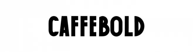
A bold, geometric font with high contrast and a slightly condensed style.
![Caffe Bold Frei Schriftart Herunterladen]() Herunterladen 83 Downloads@WebFont
Herunterladen 83 Downloads@WebFont -
( Fonts by 38.lineart - Muhammad Ridha Agusni - Personal-use only. For commercial use please contact owner. )
A bold, brush-style font with dynamic, irregular strokes.
![Hiroshima Frei Schriftart Herunterladen]() Herunterladen 83 Downloads@WebFont
Herunterladen 83 Downloads@WebFont -
( Fonts by Marika Sartori )
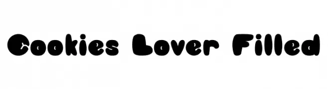
A playful, bold font with rounded, bubbly letterforms.
![Cookies Lover Filled Frei Schriftart Herunterladen]() Herunterladen 83 Downloads@WebFont
Herunterladen 83 Downloads@WebFont


Welche Schriften sind gerade am populärsten?
Poppins, Roboto, Montserrat, Open Sans und Lato sind wegen ihrer klaren Formen und breiten Einsetzbarkeit sehr gefragt – von Markenauftritt über Landingpages bis hin zu Postern.
Welche Fonts eignen sich für Logos?
Geometrische Sans‑Serifs (z. B. Poppins, Familien im Gotham‑Stil) sind ein häufiger Griff für sauberes, skalierbares Branding. Für eine persönlichere Note bleiben Scripts und Handschrift‑Stile beliebt. Kombinieren Sie einen prägnanten Headline‑Font mit einer neutralen Brotschrift für Wiedererkennung und Harmonie.
Wie oft wird die Top‑Liste aktualisiert?
Regelmäßig – basierend auf realen Downloads und Interaktionen. Schauen Sie öfter vorbei, um aufstrebende Favoriten früh zu entdecken.
💡 Tipp: Seite bookmarken – Trends wechseln schnell, und heutige Top‑Schriften inspirieren morgen vielleicht das Rebranding.