Willkommen bei den Top‑Schriften – hier treffen Beliebtheit und Qualität aufeinander. Das sind die in diesem Jahr am häufigsten heruntergeladenen und genutzten Fonts. Wenn Sie sichere Optionen für Logo, Web oder Social suchen, starten Sie hier.
Jeder Top‑Font überzeugt durch Balance, Lesbarkeit und Vielseitigkeit. Sie finden moderne Sans‑Serifs, elegante Scripts, Vintage‑Serifs und minimalistische Displays.
-
( Fonts by Edric Studio - Personal-use only. For commercial use please contact owner. )
A playful, handwritten font with thin, flowing lines and a whimsical style.
 Herunterladen 83 Downloads@WebFont
 -
( Fonts by Hudzaifah Studio - Personal-use only. For commercial use please contact owner. )
A playful, artistic script font with a handwritten, whimsical style.
![Abiali Frei Schriftart Herunterladen]() Herunterladen 83 Downloads@WebFont
Herunterladen 83 Downloads@WebFont -
( Fonts by Miftah Arzaq - Personal-use only. For commercial use please contact owner. )
A spooky, Halloween-themed decorative font with dripping effects and playful elements.
![Halloween Witches Display Frei Schriftart Herunterladen]() Herunterladen 83 Downloads@WebFont
Herunterladen 83 Downloads@WebFont -
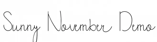
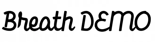
( Fonts by Trim Studio - Deri Kurnia - Personal-use only. For commercial use please contact owner. )
A bold, handwritten script font with a playful and dynamic style.
![Breath DEMO Frei Schriftart Herunterladen]() Herunterladen 83 Downloads@WebFont
Herunterladen 83 Downloads@WebFont -
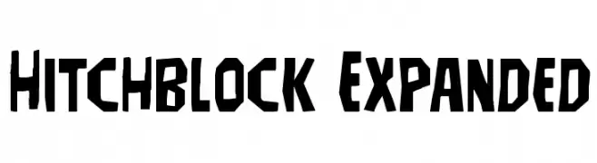
( Iconian Fonts - Daniel Zadorozny - www.iconian.com )
A bold, geometric font with angular shapes and a modern style.
![Hitchblock Expanded Frei Schriftart Herunterladen]() Herunterladen 83 Downloads@WebFont
Herunterladen 83 Downloads@WebFont -
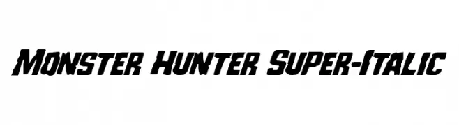
( Iconian Fonts - Daniel Zadorozny - www.iconian.com )
A bold, italic, and dynamic font with sharp, angular characters.
![Monster Hunter Super-Italic Frei Schriftart Herunterladen]() Herunterladen 83 Downloads@WebFont
Herunterladen 83 Downloads@WebFont -
( Fonts by www.selawetype.com - Personal-use only. FOR DONATION https://www.paypal.me/selawe . For commercial use please contact owner. )
A bold, angular, brush-like font with a dynamic and rebellious style.
![TAKASIH Frei Schriftart Herunterladen]() Herunterladen 83 Downloads@WebFont
Herunterladen 83 Downloads@WebFont -
( Ace of Space - www.aceofspace.com )
A whimsical font with letters inside turkey silhouettes, perfect for festive themes.
![thanks1 Frei Schriftart Herunterladen]() Herunterladen 83 Downloads@WebFont
Herunterladen 83 Downloads@WebFont -
( Fonts by Hallotudio - Ahmad Fatkhul Munib - Personal-use only. For commercial use please contact owner. )
A tall, narrow, and modern font with clean lines and minimal curves.
![Stephanie Frei Schriftart Herunterladen]() Herunterladen 83 Downloads@WebFont
Herunterladen 83 Downloads@WebFont -
( Donationware )
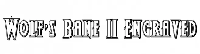
A bold, engraved font with a vintage, three-dimensional style.
![Wolf's Bane II Engraved Frei Schriftart Herunterladen]() Herunterladen 83 Downloads@WebFont
Herunterladen 83 Downloads@WebFont -
( Tahir Jamil )
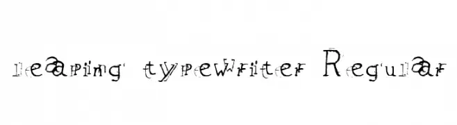
A quirky, distressed typewriter-style font with a vintage aesthetic.
![leaping typewriter Regular Frei Schriftart Herunterladen]() Herunterladen 83 Downloads@WebFont
Herunterladen 83 Downloads@WebFont -
( Fonts by Daniel Zadorozny - www.iconian.com - Free for personal use )
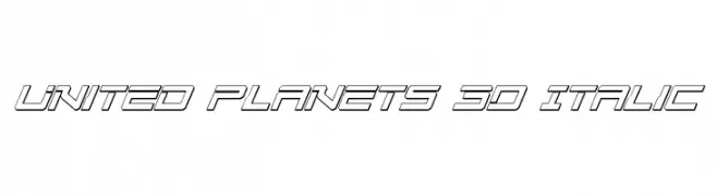
A futuristic 3D italic font with geometric and dynamic design.
![United Planets 3D Italic Frei Schriftart Herunterladen]() Herunterladen 83 Downloads@WebFont
Herunterladen 83 Downloads@WebFont -
( Fonts by Deniz86 - Rahmat Hidayat - Personal-use only. For commercial use please contact owner. )
A playful, decorative font with a handwritten style and medium contrast.
![Glitter Free Frei Schriftart Herunterladen]() Herunterladen 83 Downloads@WebFont
Herunterladen 83 Downloads@WebFont -
( Fonts by Erik Studio - Personal-use only. For commercial use please contact owner. )
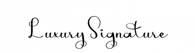
An elegant script font with flowing, cursive letterforms and luxurious swirls.
![Luxury Signature Frei Schriftart Herunterladen]() Herunterladen 83 Downloads@WebFont
Herunterladen 83 Downloads@WebFont -
( Fonts by Octotype - www.foundmyfont.com - Personal-use only. For commercial use please contact owner. )
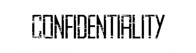
A bold, distressed font with a grunge texture and strong presence.
![CONFIDENTIALITY Frei Schriftart Herunterladen]() Herunterladen 83 Downloads@WebFont
Herunterladen 83 Downloads@WebFont -
( Fonts by Suamzu Art - Personal-use only. For commercial use please contact owner. )
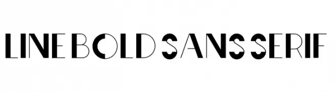
A bold, geometric sans-serif font with high contrast and unique cutouts.
![Line Bold Sans serif Frei Schriftart Herunterladen]() Herunterladen 83 Downloads@WebFont
Herunterladen 83 Downloads@WebFont -
( Fonts by CannotIntoSpaceFonts - KineticPlasma Fonts - Personal-use only. For commercial use please contact owner. )
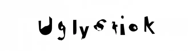
A chaotic and abstract font with fragmented, distorted letterforms.
![Ugly Stick Frei Schriftart Herunterladen]() Herunterladen 83 Downloads@WebFont
Herunterladen 83 Downloads@WebFont -
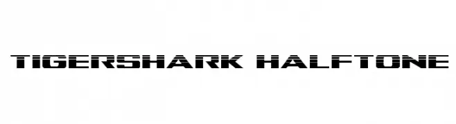
( Iconian Fonts - Daniel Zadorozny - www.iconian.com )
A bold, geometric font with a halftone pattern for a modern, edgy look.
![Tigershark Halftone Frei Schriftart Herunterladen]() Herunterladen 83 Downloads@WebFont
Herunterladen 83 Downloads@WebFont -
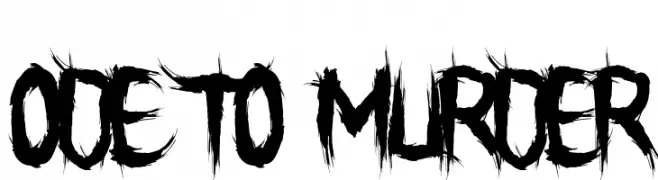
( Fonts by Font Monger - Chris Vile - Personal-use only. For commercial use please contact owner. )
A bold, jagged, brush-like font with a raw and intense style.
![Ode To Murder Frei Schriftart Herunterladen]() Herunterladen 83 Downloads@WebFont
Herunterladen 83 Downloads@WebFont -
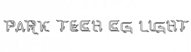
( Fonts by Galdino Otten - galdinootten.com )
A futuristic, circuit-inspired font with intricate linework and electronic motifs.
![Park Tech CG Light Frei Schriftart Herunterladen]() Herunterladen 83 Downloads@WebFont
Herunterladen 83 Downloads@WebFont -
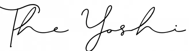
( Fonts by Chichucha - Christoph Nino - Personal-use only. For commercial use please contact owner. )
A fluid, cursive handwritten font with elegant, connected letters.
![The Yoshi Frei Schriftart Herunterladen]() Herunterladen 83 Downloads@WebFont
Herunterladen 83 Downloads@WebFont -
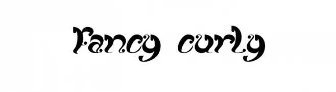
( Fonts by Wino S Kadir - weknow - www.revolge.com/shop/weknow/ - Personal-use only. For commercial use please contact owner. )
An ornate, curly font with bold strokes and intricate swirls.
![fancy curly Frei Schriftart Herunterladen]() Herunterladen 83 Downloads@WebFont
Herunterladen 83 Downloads@WebFont -
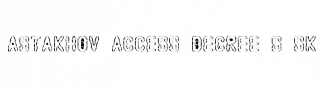
( Fonts by Dmitry Astakhov - www.behance.net/adonis-abe1e - Personal-use only. For commercial use please contact owner. )
A bold, distressed stencil-style font with an industrial, rugged appearance.
![Astakhov Access Degree S Sk Frei Schriftart Herunterladen]() Herunterladen 83 Downloads@WebFont
Herunterladen 83 Downloads@WebFont -
( Noto is a trademark of Google Inc. Noto fonts are open source. All Noto fonts are published under the SIL Open Font License, Version 1.1 )
A bold, semi-condensed font ideal for impactful headlines.
![Noto Sans Sinhala UI SemiCondensed ExtraBold Frei Schriftart Herunterladen]() Herunterladen 83 Downloads@WebFont
Herunterladen 83 Downloads@WebFont -
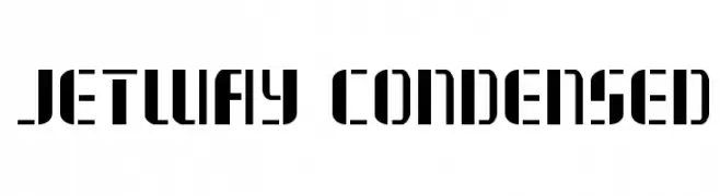
( Fonts by Daniel Zadorozny - www.iconian.com )
A bold, geometric stencil font with a modern, industrial style.
![Jetway Condensed Frei Schriftart Herunterladen]() Herunterladen 83 Downloads@WebFont
Herunterladen 83 Downloads@WebFont -
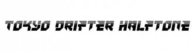
( Iconian Fonts - Daniel Zadorozny - www.iconian.com )
A bold, futuristic font with a dynamic halftone effect and sharp geometric shapes.
![Tokyo Drifter Halftone Frei Schriftart Herunterladen]() Herunterladen 83 Downloads@WebFont
Herunterladen 83 Downloads@WebFont -
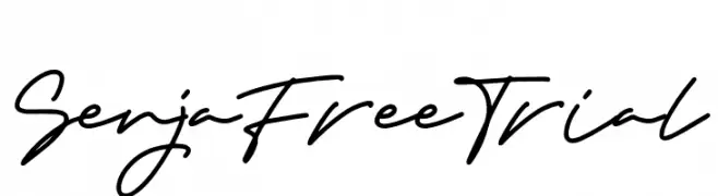
( Fonts by Typefactoryco )
A bold, cursive font with a fluid, handwritten style.
![Senja Free Trial Frei Schriftart Herunterladen]() Herunterladen 83 Downloads@WebFont
Herunterladen 83 Downloads@WebFont -
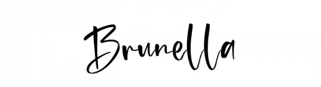
( Fonts by Aukimvisuel - Personal-use only. For commercial use please contact owner. )
A lively, expressive script font with a modern, handwritten style.
![Brunella Frei Schriftart Herunterladen]() Herunterladen 83 Downloads@WebFont
Herunterladen 83 Downloads@WebFont -
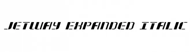
( Fonts by Daniel Zadorozny - www.iconian.com )
A bold, expanded, and italicized font with a modern and dynamic style.
![Jetway Expanded Italic Frei Schriftart Herunterladen]() Herunterladen 83 Downloads@WebFont
Herunterladen 83 Downloads@WebFont -
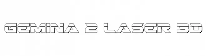
( Fonts by Daniel Zadorozny - www.iconian.com )
A bold, futuristic font with a 3D geometric design.
![Gemina 2 Laser 3D Frei Schriftart Herunterladen]() Herunterladen 83 Downloads@WebFont
Herunterladen 83 Downloads@WebFont -
( Fonts by Daniel Zadorozny - www.iconian.com - Personal-use only. For commercial use please contact owner. )
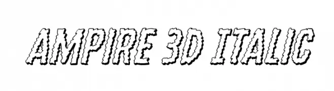
A bold, 3D italic font with a playful and dynamic style.
![Ampire 3D Italic Frei Schriftart Herunterladen]() Herunterladen 83 Downloads@WebFont
Herunterladen 83 Downloads@WebFont -
( Fonts by Daniel Zadorozny - www.iconian.com )
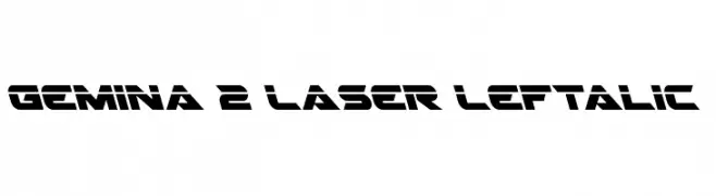
A bold, futuristic font with sharp angles and geometric shapes, ideal for tech and sci-fi themes.
![Gemina 2 Laser Leftalic Frei Schriftart Herunterladen]() Herunterladen 83 Downloads@WebFont
Herunterladen 83 Downloads@WebFont -
( Fonts by Goodrichees - Ainur Fariz - Personal-use only. For commercial use please contact owner. )
A modern, narrow font with consistent stroke width and balanced spacing.
![Sweet Milk Frei Schriftart Herunterladen]() Herunterladen 82 Downloads@WebFont
Herunterladen 82 Downloads@WebFont -
( Fonts by Vladimir Nikolic - www.creativefabrica.com/designer/vladimirnikolic/ - Personal-use only. For commercial use please contact owner. )
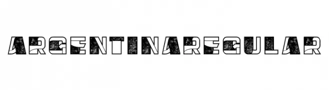
A bold, decorative font with a distressed texture and geometric design.
![Argentina Regular Frei Schriftart Herunterladen]() Herunterladen 82 Downloads@WebFont
Herunterladen 82 Downloads@WebFont -
( Fonts by Letterara - Thomas Aradea - Personal-use only. For commercial use please contact owner. )
A fluid, cursive font with a handwritten style and elegant connections.
![Bestowens family Frei Schriftart Herunterladen]() Herunterladen 82 Downloads@WebFont
Herunterladen 82 Downloads@WebFont


Welche Schriften sind gerade am populärsten?
Poppins, Roboto, Montserrat, Open Sans und Lato sind wegen ihrer klaren Formen und breiten Einsetzbarkeit sehr gefragt – von Markenauftritt über Landingpages bis hin zu Postern.
Welche Fonts eignen sich für Logos?
Geometrische Sans‑Serifs (z. B. Poppins, Familien im Gotham‑Stil) sind ein häufiger Griff für sauberes, skalierbares Branding. Für eine persönlichere Note bleiben Scripts und Handschrift‑Stile beliebt. Kombinieren Sie einen prägnanten Headline‑Font mit einer neutralen Brotschrift für Wiedererkennung und Harmonie.
Wie oft wird die Top‑Liste aktualisiert?
Regelmäßig – basierend auf realen Downloads und Interaktionen. Schauen Sie öfter vorbei, um aufstrebende Favoriten früh zu entdecken.
💡 Tipp: Seite bookmarken – Trends wechseln schnell, und heutige Top‑Schriften inspirieren morgen vielleicht das Rebranding.