Willkommen bei den Top‑Schriften – hier treffen Beliebtheit und Qualität aufeinander. Das sind die in diesem Jahr am häufigsten heruntergeladenen und genutzten Fonts. Wenn Sie sichere Optionen für Logo, Web oder Social suchen, starten Sie hier.
Jeder Top‑Font überzeugt durch Balance, Lesbarkeit und Vielseitigkeit. Sie finden moderne Sans‑Serifs, elegante Scripts, Vintage‑Serifs und minimalistische Displays.
-
( Fonts by Kat`s Fun Fonts - Personal-use only. For commercial use please contact owner. )
A playful, handwritten font with a rebellious and energetic style.
 Herunterladen 82 Downloads@WebFont
 -
( Digital Magic - www.graphicdesignplus.com/helen/digitalmagic/ )
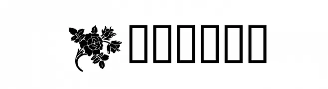
A collection of decorative floral and ornamental motifs.
![Design3 Frei Schriftart Herunterladen]() Herunterladen 82 Downloads@WebFont
Herunterladen 82 Downloads@WebFont -
( Noto is a trademark of Google Inc. Noto fonts are open source. All Noto fonts are published under the SIL Open Font License, Version 1.1 )
A clean, thin, and modern font ideal for digital interfaces.
![Noto Sans Bengali UI Thin Frei Schriftart Herunterladen]() Herunterladen 82 Downloads@WebFont
Herunterladen 82 Downloads@WebFont -
( Fonts by Wino S Kadir - weknow - www.revolge.com/shop/weknow/ - Personal-use only. For commercial use please contact owner. )
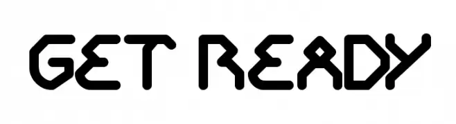
A bold, geometric font with a futuristic and edgy design.
![GET READY Frei Schriftart Herunterladen]() Herunterladen 82 Downloads@WebFont
Herunterladen 82 Downloads@WebFont -
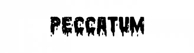
( Fonts by www.woodcutter.es - woodcutter Manero - Personal-use only. For commercial use please contact owner. )
A bold, dripping font perfect for horror-themed designs.
![Peccatum Frei Schriftart Herunterladen]() Herunterladen 82 Downloads@WebFont
Herunterladen 82 Downloads@WebFont -
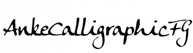
( Fonts by FontGrube AH - Andreas Höfeld - Personal-use only. For commercial use please contact owner. )
A dynamic calligraphic font with elegant, flowing strokes.
![Anke Calligraphic FG Frei Schriftart Herunterladen]() Herunterladen 82 Downloads@WebFont
Herunterladen 82 Downloads@WebFont -
( Fonts by Madatype Studio )
A playful, bold, and rounded hand-drawn font.
![Loster Frei Schriftart Herunterladen]() Herunterladen 82 Downloads@WebFont
Herunterladen 82 Downloads@WebFont -
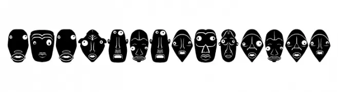
( Fonts by Vladimir Nikolic )
Expressive, mask-inspired decorative font with bold, graphic faces.
![Isitolo Regular Frei Schriftart Herunterladen]() Herunterladen 82 Downloads@WebFont
Herunterladen 82 Downloads@WebFont -
![Broken Black Condensed Oblique Frei Schriftart Herunterladen]() Herunterladen 82 Downloads@WebFont
Herunterladen 82 Downloads@WebFont -
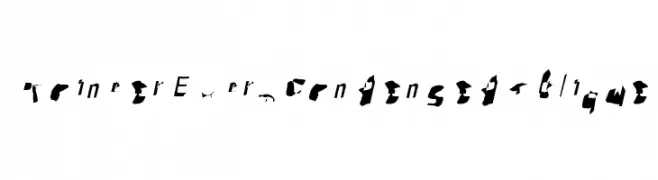
( Fonts by Muksal Creative - Personal-use only. For commercial use please contact owner. )
A playful, cursive font with a whimsical, handwritten style.
![Antaro Frei Schriftart Herunterladen]() Herunterladen 82 Downloads@WebFont
Herunterladen 82 Downloads@WebFont -
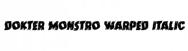
( Iconian Fonts - Daniel Zadorozny - www.iconian.com )
A bold, warped, and italic font with a dynamic and edgy style.
![Dokter Monstro Warped Italic Frei Schriftart Herunterladen]() Herunterladen 82 Downloads@WebFont
Herunterladen 82 Downloads@WebFont -
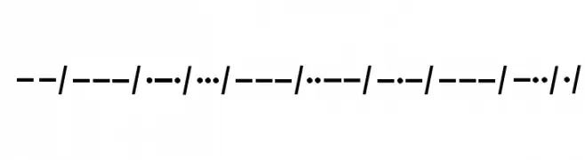
( Morten L T )
The image shows Morse code, not a typographic font.
![Morso kode Frei Schriftart Herunterladen]() Herunterladen 82 Downloads@WebFont
Herunterladen 82 Downloads@WebFont -
( Fonts by Edric Studio - Personal-use only. For commercial use please contact owner. )
A playful, modern font with tall, narrow letters and smooth, rounded strokes.
![Cooling Down Demo Frei Schriftart Herunterladen]() Herunterladen 82 Downloads@WebFont
Herunterladen 82 Downloads@WebFont -
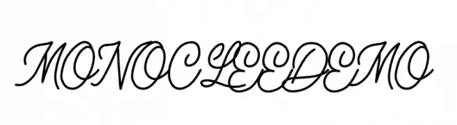
( Fonts by Elbanadha Creative - Personal-use only. For commercial use please contact owner. )
A graceful script font with flowing, connected letters and a sophisticated style.
![MONOCLEE DEMO Frei Schriftart Herunterladen]() Herunterladen 82 Downloads@WebFont
Herunterladen 82 Downloads@WebFont -
( Fonts by Indriyanti - Personal-use only. For commercial use please contact owner. )
A graceful script font with fluid, cursive strokes and elegant curves.
![Nofhistica Frei Schriftart Herunterladen]() Herunterladen 82 Downloads@WebFont
Herunterladen 82 Downloads@WebFont -
( Fonts by Daniel Zadorozny - www.iconian.com - Personal-use only. For commercial use please contact owner. )
A bold, italicized font with a gradient stripe design, exuding a futuristic and dynamic style.
![Emerald Beacon Gradient Italic Frei Schriftart Herunterladen]() Herunterladen 82 Downloads@WebFont
Herunterladen 82 Downloads@WebFont -
![Pointer ExtraCondensed Oblique Frei Schriftart Herunterladen]() Herunterladen 82 Downloads@WebFont
Herunterladen 82 Downloads@WebFont -
( Fonts by Winter Design Studio - winty5.wixsite.com/noahtheawesome/ - Personal-use only. For commercial use please contact owner. )
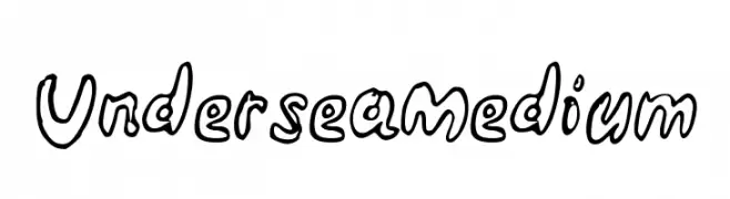
A playful, hand-drawn font with bold, outlined characters and a whimsical style.
![Undersea Medium Frei Schriftart Herunterladen]() Herunterladen 82 Downloads@WebFont
Herunterladen 82 Downloads@WebFont -
( Fonts by Parker Creative - Alan Parker - Personal-use only. For commercial use please contact owner. )
A distressed, textured font with a vintage, rugged appearance.
![Broadwell-Personal-Use-Only-Distressed Frei Schriftart Herunterladen]() Herunterladen 82 Downloads@WebFont
Herunterladen 82 Downloads@WebFont -
( Fonts by kizzles the cat - Personal-use only. For commercial use please contact owner. )
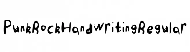
A bold, hand-drawn font with a punk rock vibe and irregular, dynamic shapes.
![Punk Rock Handwriting Regular Frei Schriftart Herunterladen]() Herunterladen 82 Downloads@WebFont
Herunterladen 82 Downloads@WebFont -
( Iconian Fonts - Daniel Zadorozny - www.iconian.com )
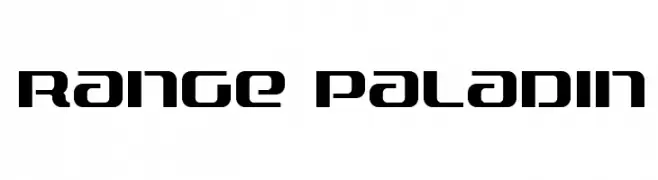
A bold, futuristic font with geometric and angular design elements.
![Range Paladin Frei Schriftart Herunterladen]() Herunterladen 82 Downloads@WebFont
Herunterladen 82 Downloads@WebFont -
( Fonts by Vigilante Typeface Corporation Larry Yerkes. Personal-use only. For commercial use please contact owner. )
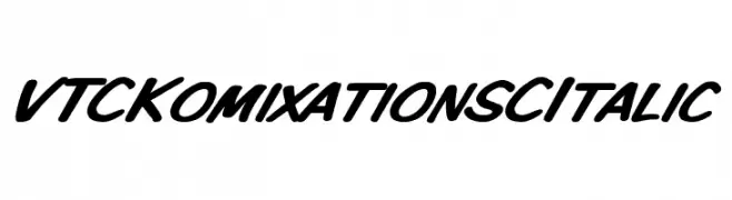
A bold, italicized font with a playful and dynamic style.
![VTCKomixationSCItalic Frei Schriftart Herunterladen]() Herunterladen 82 Downloads@WebFont
Herunterladen 82 Downloads@WebFont -
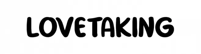
( Fonts by Md Shohail Bhuian - Personal-use only. For commercial use please contact owner. )
A playful, bold font with rounded, thick strokes and a friendly appearance.
![Love Taking Frei Schriftart Herunterladen]() Herunterladen 82 Downloads@WebFont
Herunterladen 82 Downloads@WebFont -
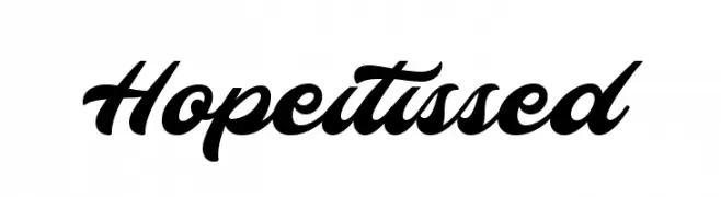
( 7NTypes - Situjuh Nazara - 7ntypes.com )
A bold, flowing script font with elegant, rounded curves.
![Hopeitissed Frei Schriftart Herunterladen]() Herunterladen 82 Downloads@WebFont
Herunterladen 82 Downloads@WebFont -
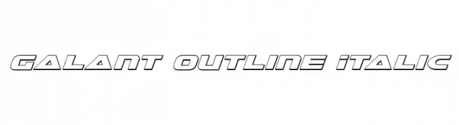
( Iconian Fonts - Daniel Zadorozny - www.iconian.com )
A modern, italic outline font with bold, geometric characters.
![Galant Outline Italic Frei Schriftart Herunterladen]() Herunterladen 82 Downloads@WebFont
Herunterladen 82 Downloads@WebFont -
( Haqqu.info - www.haqqu.info )
A classic serif font with elegant strokes and a timeless appearance.
![MVDawlatulIslam Frei Schriftart Herunterladen]() Herunterladen 82 Downloads@WebFont
Herunterladen 82 Downloads@WebFont -
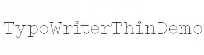
( Fonts by StudioTypo - Personal-use only. For commercial use please contact owner. )
A thin, monospaced typewriter-style font with a clean, minimalist design.
![Typo Writer Thin Demo Frei Schriftart Herunterladen]() Herunterladen 82 Downloads@WebFont
Herunterladen 82 Downloads@WebFont -
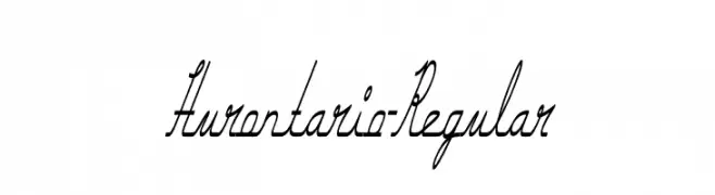
( Personal-use only. For commercial use please contact owner. )
A flowing, cursive script font with elegant, interconnected characters.
![Hurontario-Regular Frei Schriftart Herunterladen]() Herunterladen 82 Downloads@WebFont
Herunterladen 82 Downloads@WebFont -
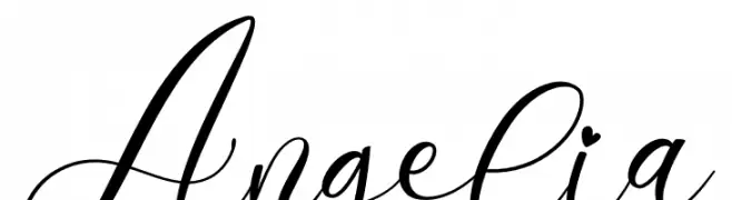
( Fonts by Yumna Family - yumna Type - Personal-use only. For commercial use please contact owner. )
An elegant, flowing script font with graceful loops and cursive strokes.
![Angelia Frei Schriftart Herunterladen]() Herunterladen 82 Downloads@WebFont
Herunterladen 82 Downloads@WebFont -
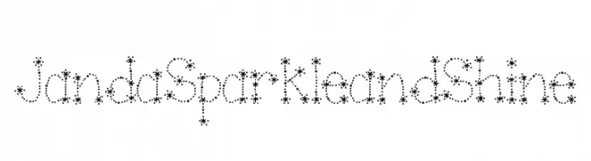
( Free for personal use - kimberlygeswein.com )
A playful, star-dotted font perfect for adding sparkle to creative projects.
![Janda Sparkle and Shine Frei Schriftart Herunterladen]() Herunterladen 82 Downloads@WebFont
Herunterladen 82 Downloads@WebFont -
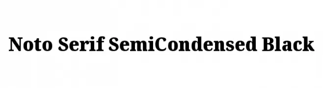
( Noto is a trademark of Google Inc. Noto fonts are open source. All Noto fonts are published under the SIL Open Font License, Version 1.1 )
A bold, semi-condensed serif typeface with high contrast and classic elegance.
![Noto Serif SemiCondensed Black Frei Schriftart Herunterladen]() Herunterladen 82 Downloads@WebFont
Herunterladen 82 Downloads@WebFont -
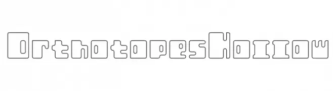
( Incstone Design, by Megami Studios - Rob Barba - www.incstonedesign.com/ )
A geometric, hollow font with a modern and futuristic design.
![Orthotopes Hollow Frei Schriftart Herunterladen]() Herunterladen 82 Downloads@WebFont
Herunterladen 82 Downloads@WebFont -
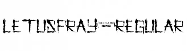
( Chris Vile - www.chrisvile.com )
A rugged, distressed font with sharp, jagged edges and a bold, impactful style.
![LetusPray-Regular Frei Schriftart Herunterladen]() Herunterladen 82 Downloads@WebFont
Herunterladen 82 Downloads@WebFont -
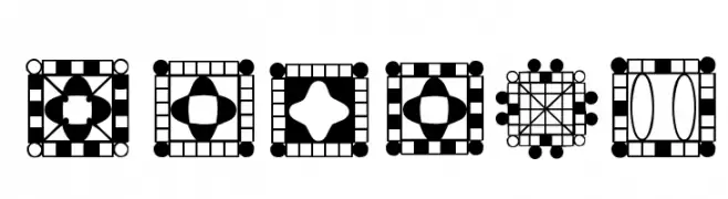
( Digital Magic - www.graphicdesignplus.com/helen/digitalmagic/ )
Intricate square patterns with geometric shapes, not a valid font.
![HDGEMS9 Frei Schriftart Herunterladen]() Herunterladen 82 Downloads@WebFont
Herunterladen 82 Downloads@WebFont -
( Fonts by Vladimir Nikolic )
A bold, 3D font with a modern, geometric style and shadow effects.
![Portfolio 3D Extravagant Regular Frei Schriftart Herunterladen]() Herunterladen 82 Downloads@WebFont
Herunterladen 82 Downloads@WebFont


Welche Schriften sind gerade am populärsten?
Poppins, Roboto, Montserrat, Open Sans und Lato sind wegen ihrer klaren Formen und breiten Einsetzbarkeit sehr gefragt – von Markenauftritt über Landingpages bis hin zu Postern.
Welche Fonts eignen sich für Logos?
Geometrische Sans‑Serifs (z. B. Poppins, Familien im Gotham‑Stil) sind ein häufiger Griff für sauberes, skalierbares Branding. Für eine persönlichere Note bleiben Scripts und Handschrift‑Stile beliebt. Kombinieren Sie einen prägnanten Headline‑Font mit einer neutralen Brotschrift für Wiedererkennung und Harmonie.
Wie oft wird die Top‑Liste aktualisiert?
Regelmäßig – basierend auf realen Downloads und Interaktionen. Schauen Sie öfter vorbei, um aufstrebende Favoriten früh zu entdecken.
💡 Tipp: Seite bookmarken – Trends wechseln schnell, und heutige Top‑Schriften inspirieren morgen vielleicht das Rebranding.